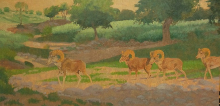
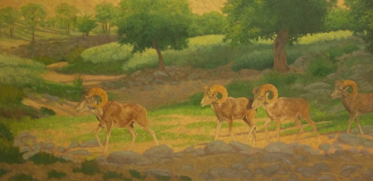
Continuing on from last week, I knew that I was going to do a big painting (big for me, at this point) when the five rams walked across the stream bed in the beautiful morning light.
I also knew that it would be a complex piece that would take more planning than I’d done in the past. I’ve started a couple of big paintings, only to have them bog down and fail because, while I did do preliminary sketches and drawings, I found that I hadn’t really solved some critical problems and then was faced with figuring them out on the canvas. A recipe for frustration and failure.
Not this time. First, I thought about what it was that made me want to paint this scene. It was not only the argali, but the interesting alternating pattern of light and shadow, which started in the foreground and went all the way back. And it was important that it be about my emotional response to this very special experience.
Here’s one of the reference shots. I create Albums in Aperture where I can put all the images I’m using on a painting. In this case, thirteen. Here’s the lead ram.
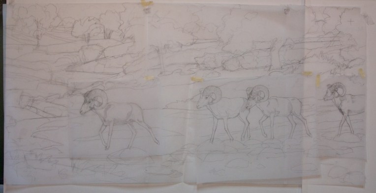
Since I had a pretty clear image in my head of where I wanted to end up, I didn’t do thumbnails this time. And, having struggled with understanding how to work larger, I decided to start larger right away. This is the first layout, done on 19×24″ Canson Calque tracing paper.
As you can see, I adjusted the proportions as needed. I wanted the emphasis to be on the rams, but still show enough of the background to place them in a specific setting and show that alternating light and shadow pattern.
You will also notice that I have an even number of animals, which breaks a “rule”. But they are in an uneven number of “groups”. This doesn’t happen by accident. Or if it does, then there is a conscious decision to keep it.
I had also done a finished drawing of the two rams, which some of you saw a few months ago on Facebook (you can “Like” my public page here).
 The next step was to do a small color rough to figure out how I would achieve the visual effect I was looking for. This is on a 6×8″ canvasboard. I blocked out the part that didn’t fit the proportion.
What was critical was to play up the golden light on the ram’s horns and to make sure the argali were the objects of highest contrast by placing them against the central shadow shape. Notice that I’m just painting blobs of color to get the relationships down.
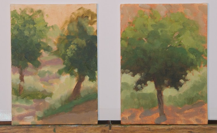
The central tree has a cast shadow. This is something that has given me trouble in the past. The shapes, edges and value relationships have to be just right. So I did a couple of studies of just that tree, along with another to figure out some of the same things where the stream bed goes back into space.
Now it was time to do a large value study, 12×24″. I adjusted the relative position of the rams, moving the pair forward a little.
I had to know if what I had come up with would work at the final size I had decided upon- 24×48″. This is where I’d gotten into trouble before. I asked an artist colleague for advice and he said to take my finished drawing to a copy place and have it blown up to the final size, which I think is a really good idea.
But I chose to try something else. I have found great value in the re-drawing process. It allows me to refine, correct, simplify and really learn to know my subjects in a way that would not be possible if I simply did a drawing, transferred it and started to paint, or worse, heaven forbid, projected them. The depth of understanding and flexibility I get is critical to the quality of my finished product.
First I put a sheet of tracing paper over the drawing above and drew a one inch grid on it.
Then I placed my untoned canvasboard on the easel and ruled a grid on it in pencil. I taped tracing paper to it. It took three sheets to cover it. I lightly sketched a transfer drawing so that every element was in the right spot.
Once the background was laid in, I taped on three more pieces of tracing paper and did the final pencil drawings of each argali. Now I had this:
Because the argali were all on their own pieces of paper, I could do a final check on position and easily move them if needed. I also now had the whole composition at the final size and could see that it did, in fact, work. Whew!
I removed the tracing paper, toned the canvas, re-attached it and, using a No. 7 pencil and a sheet of homemade graphite transfer paper, transferred the drawing.
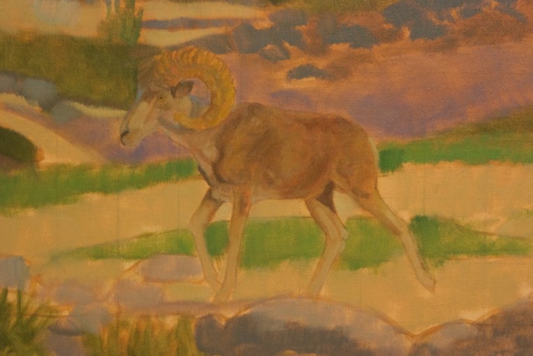
Using the tracing paper drawings as a guide and referring back to the photo reference if necessary, I carefully re-drew the argali with a brush, figuring I’d get the most important elements down first. Here’s a close-up which also shows the loose lay-on of the background. Notice that you can see three of the four hooves. They vanish later as I decide to add additional and larger rocks to create more of a visual separation between the sheep and the viewer.
Here’s the finished drawing, with basic values starting to be indicated. Notice that the rocks in the foreground and middle ground are just roughed in. No need to spend a lot of time on them at this point.
Finally it was time to start adding color! I work all over a canvas in a sitting, keeping the edges soft and letting colors “bleed” into each other. This lets me control where the harder edges will be later on. I’ll also “lose” the drawing, knowing that, having drawn the animals multiple times, I can “find them” again with no problem. First I established the shadow shapes, letting the undertone be the light.
Here’s a close-up of the lead ram in progress. Still keeping it loose, but working on light and shadow and correct structure.
I started to see a problem in the forequarters and it nagged at me for a couple of sittings until I realized that the leg closest to the viewer was too far forward. Moving it and the shoulder back about a quarter of an inch solved the problem. His head was also a little too small. That’s a big advantage of working this way. I can make changes at any point in the process, which turned out to be really important when I was trying to keep track of so many pictorial elements and their relationships to each other.
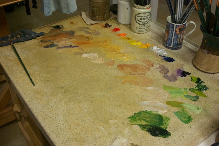
Let’s take a quick break. Here’s my palette. For this painting, I used my standard color range: transparent oxide red, cadmium red medium, cadmium orange, yellow ochre light, cadmium yellow pale, cadmium yellow, titanium white, ultramarine blue, Winsor violet (dioxine), sap green, terra verte, chromium oxide green.
Missing this time around is cobalt blue and magnesium blue hue. I mix my own earth colors and greys. My black is a mix of transparent oxide red and ultramarine blue. I can easily shift the color temperature by changing the proportions.
The palette itself is a scrap of Swanstone solid surface countertop. I got the idea from another art blog and I like it much better than the glass one I’d been using.
Ok, back to the painting. I’m probably about mid-way through at this point. All the value relationships are set (at least I thought so) and basic colors are on.
Oh, darn. I realized that having all the rams in the same light wasn’t very interesting. I went back to my reference images and found a nice shot of the very first one coming out of the shadows. Now I needed to put the fourth ram in that light. Aperture is great for this since it lets you show multiple images at once.
Much better. Having solved that final, somewhat major problem, it was now a matter of simply pushing on, solving all the problems, making decisions, tweaking and tweaking (what Scott Christensen more elegantly calls “orchestration”).
Until, finally, after far longer than I have ever spent on a single painting, it was done.


