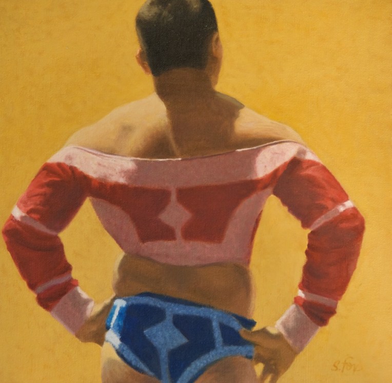
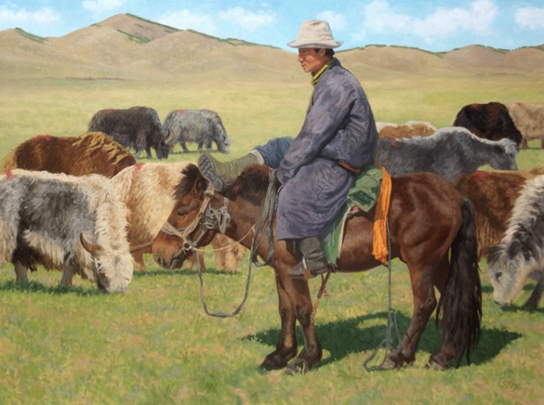
“Mongol Wrestler” oil 12×12″ $950 (Salmagundi Club Summer Exhibition, Certificate of Merit)
I’ve always remembered one of the first things my Illustration II teacher at the Academy of Art told us, which is that “the simpler statement is the stronger statement”. Easy to say, surprisingly hard to do. It’s easy to just accept what’s in front of you and put it in your painting or drawing, whether it’s individual the leaves on a tree or every hair of a coat of fur. It’s much more challenging (and ultimately rewarding) to edit and leave things out. That, however, is a judgement call and the possibility exists that one will make the wrong choice. Scary! Actually, it’s inevitable. But that’s ok as long as one is honest about it and is willing to keep trying. While a good teacher or experienced artist friend can help, ultimately you have to decide what to do based on your vision (you DO have a vision of where you want to end up, right?) of where and how to simplify. In future posts I’ll be discussing a variety of ways to approach simplifying your image.
Example: here’s a 12×12″ oil I did of a Mongolian wrestler. I started by deciding that the painting would be about his pose and the light/shadow pattern. Also the positive shape of the pose and the negative shapes that were then created in the background. I cropped the figure VERY carefully, taking into account the overlap of the frame. When I shot the reference photo kinds of stuff were going on around him on the event field, none of which I needed and which would just get in the way. The gutsy move for me was the golden yellow background. I had to control both color and value so that the subject would still pop out, but keep that sun-drenched feeling. It worked. But if it hadn’t I would have painted over it with something else, most likely still letting a bit of it show through. “Mongol Wrestler” was awarded a Certificate of Merit in the Salmagundi Club’s Members Show in 2017.
–This is one example of what I’m offering on my Patreon site…solid, experience-based information. Please consider becoming one of my valued Patrons! https://www.patreon.com/susanfox/posts
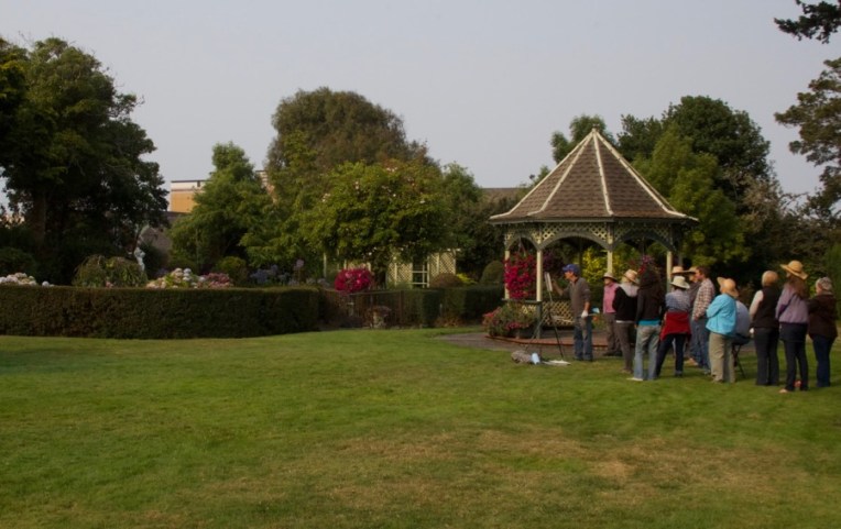
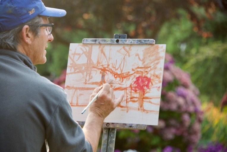
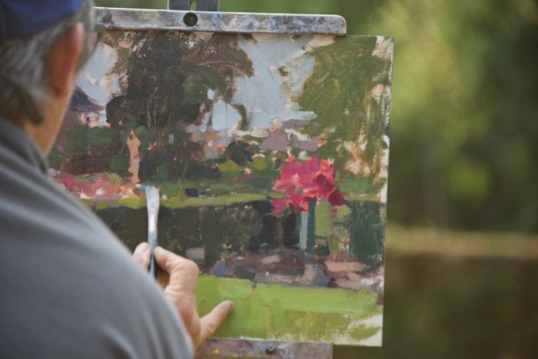
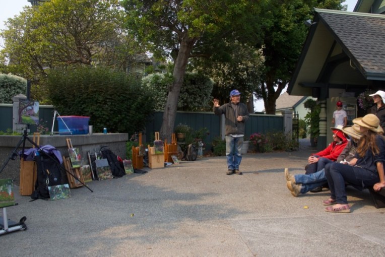
Jim McVicker doing a painting demo in the garden of the Carson Mansion, home of the Ingomar Club. He’s painting the area on the left with the hedge, a pot of petunias and a white statue.
As part of my regular routine I post to my blog on Fridays. I missed last Friday and for a very good reason….I was attending a local plein air painting workshop with nationally-known local artist Jim McVicker. I’ve known Jim for years and we own two small pieces of his work, but I’d never been able to learn from him before and this was a great chance right near home.
One thing I was very interested in was his start. He’s really a “pure” painter, having started with a brush in hand. I started out as a kid who loved to draw and didn’t take up painting in oil until 1995.
I photographed two of his demos, one from the first day at a beach that borders Trinidad Bay adjacent to the small fishing town of Trinidad, about fifteen minutes from our place, and the second in Eureka at the garden of the Ingomar Club which is located in the Carson Mansion, known as the “most photographed Victorian in the country”.
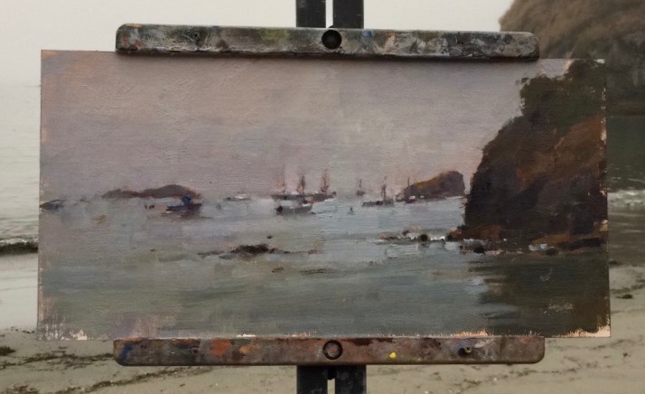
I’ll start with Trinidad. It was an overcast day, but the sun did come out in the afternoon.
Ok, so this kind of blew me away….Jim’s first marks on the canvas. And they show the difference between someone who takes a painter’s approach and someone like me who starts their indication in line to define shapes.
When he laid in that large area of dark for the base of the rock, my brain kind of freaked out…”OMG that’s SO DARK!” It was a LOT darker than the actual rock, even allowing for knowing that one brings lights in over darks as a general approach in oil painting. This is why it’s so valuable to get to see how other painters work and see.
I want to thank the gull for adding a bit of additional interest…
Jim talked about working all over the canvas, not going from object to object, an approach that I heartily agree with and practice myself.
Adding tones to the water and last color notes in various spots.
Final touches.
The finished painting of fishing boats in the harbor.
And then the sun came out, of course.
Yesterday, at the Ingomar Club in Eureka, it was overcast from the smoke of forest fires that are burning in southern Oregon, but there was still distinct light and shadow.
This start really shows the abstract underpinning that the painting will be built on.
Working all over the canvas.
Laying in the dark of the hedge.
Adding the background trees. He actually did very little with them after this first step.
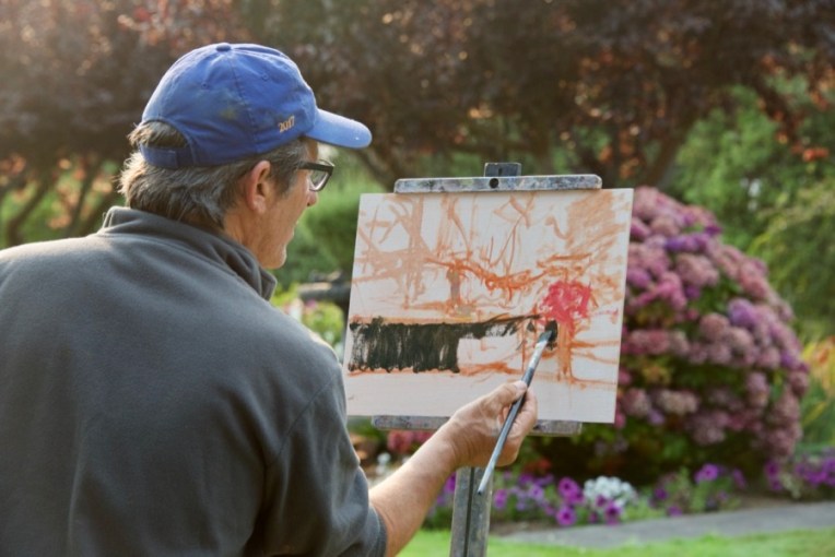
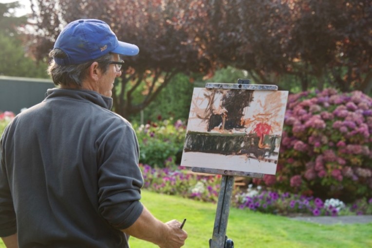
All the areas blocked in now. He can choose how far to go on any particular part or just leave it as is.
Notice that he is painting shapes, color, values and edges, not objects. There is no need to paint the individual petunia flowers in the pot on the right.
Bringing up the value of the grass, which is in sun light. It’s a warmer tone than what’s underneath, but still fairly cool. The hydrangas on the center left are pretty much as he first laid them in with the addition of some foliage around the flower shapes.
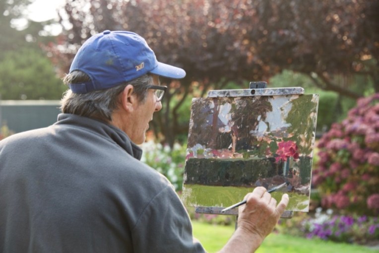
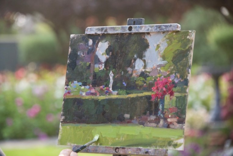
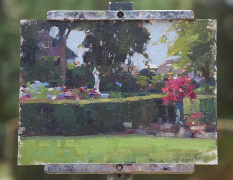
The finished painting.
Detail of the right side. I mentioned to him afterwards that I would have skipped putting in the background buildings, but that I know he also does cityscapes. I’m not personally that interested in man-made things as subjects so it was interesting for me to see his different choice.
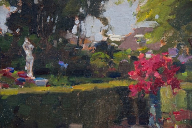
Detail of the central tree. Oh, those “sky holes” . Necessary, but tricky to pull off. They require a solid knowledge of how tree trunks, branches and foliage are related. Random spots of sky color won’t do it. Jim also pointed out that sky holes need to be a little darker in value than the rest of the sky or they’ll stand out too much. It’s the little things…
So what did I do during the workshop? Well, the Trinidad painting was a bust. I had thought the sun would come out so set it up for that, but as the time went by and that didn’t happen, I switched to adding the fog drifting past the huge rock next to the dock which was my subject (and that of many other local artists). I was also using a canvas panel that became part of the problem. Talked with Jim about it and he said that if the panel surface is wrong and is not working it becomes a real battle. That’s what happened to me and the panel won. Won’t say what the brand was because all the matters is that it didn’t work for me.
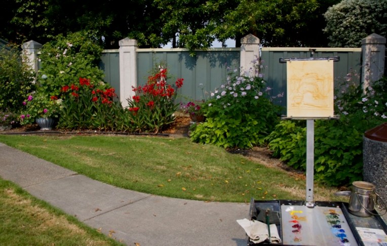
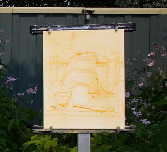
Yesterday was much better. Nice light, a panel that I knew would work and a fun subject.
There were big free-standing beds of roses and dahlias, a gazebo, the statue and other features, but my eye was caught by the intense red cana lilies next to a pot of deep cool pink dahlias and the warm foliage greens against the cool green fence.
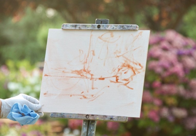
Jim likes to often use Rembrandt Transparent oxide red for a tone to knock back the white of the panel. I use it sometimes, but generally prefer Winsor-Newton raw sienna for the tone and my initial lay-in. You can see that I also do a rough lay-in with a brush.
My finished first pass. I debated about when to put in the red cannas and opted to do it early on to keep the color as pure and saturated as possible and then paint the foliage around them.
The finished piece, a 10×8″.
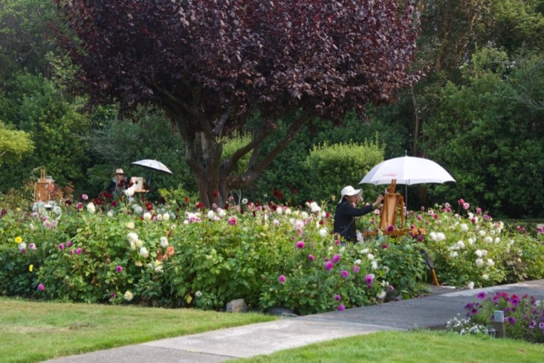
Some of the other participants in the beautiful garden.
Finally our painting time was over and we had a critique session. The man from the club was kind enough to offer beer and wine to any who were interested. Also, you can see from the warm light on the pavement the effect of the smoke from the Oregon wildfires.
Jim was very positive about my painting, which I greatly appreciated. He pointed out two things that were spot on. One was that I’d added a lot of white to the earth tone I used for the dirt and that had given it a chalky look. Also that the grass was too dark in value for the light and sun that were on it, also quite correct.
So this morning I put the painting back on the easel in my studio and made those corrections, plus a few other little things that bugged me.
Now the ground is in tune with the rest of the piece.
I want to thank Claudia Lima, who put together the workshop and did a great job! And, of course, Jim McVicker. Thanks, Jim!
“The Annuciation”, Hans Memling, 1465-75, oil on wood
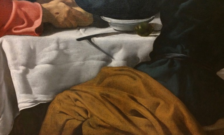
I spent most of a day at the Met during my recent trip to New York for the Explorers Club 113th Annual Dinner (I’m a Fellow of the Club). I’m working on an idea for a painting that involves drapery folds, something I haven’t done much since art school. I realized that I had a golden opportunity to learn from the best by taking drapery detail shots that I can study and, if I want, do studies from. I also did a few sketches, but it was Saturday and I couldn’t stand too long in front of anything. It was really interesting to focus on one pictorial element and see how different artists of the past solved the problem. Here are some examples. I’ve identified the painting and the artist. You can see the entire work on the Met site. I’d also like to note that the Met recently digitized and made available for use without restriction images of over 400,000 works in their collections.
(Photos taken with a iPhone 5S, which did a pretty good job all in all)
“The Annunciation” by Hans Memling, 1465-75, oil on wood“Portrait of a Man” by Frans Hals, 1636-38, oil on canvas“The Supper at Emaus” by Velasquez, 1622-23, oil on canvas“The Supper at Emaus” by Velasquex, 1622-23, oil on canvas“The Fortune Teller” by Georges de La Tour, prob. 1630s, oil on canvas“Self-portrait with Two Pupils…” by Adelaide Labille Guiard, 1785, oil on canvas“The Death of Socrates” by Jacques Louis David, 1787, oil on canvas“Ada Rehan” by John singer Sargent, 1894-95, oil on canvasDetail- the dark areas are single strokes put over the lighter areas; just kill me now“Madame X” by John Singer Sargent, 1883-84, oil on canvas“Mrs. Hugh Hammersley” by John Singer Sargent, 1892, oil on canvas“The Wyndham Sisters…” by John Singer Sargent, 1899, oil on canvas“King Lear, Act 1, Scene 1” by Edwin Austin Abbey, 1898, oil on canvas“King Lear, Act 1, Scene 1” by Edwin Austin Abbey, 1898, oil on canvas
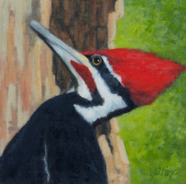
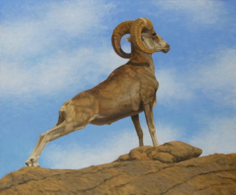
Piliated Woodpecker oil 6×6″- observed and photographed in the Okefenokee Swamp National Wildlife Refuge, Georgia
The juried show season is under way! I keep a long rectangular white board hanging on the wall next to my desk, divided into squares for each month, on which I list the shows I plan, to or am thinking about, entering. Sometimes I enter work I already have on hand and sometimes I do new work just for that exhibition. In this case, these have been submitted for the Spring Auction at the Salmagundi Club. Entry in their shows, for which all but one are members only, is free and it’s a chance to get my work seen in New York. Not easy when you live in northern California. Notification will be later this month. I’ll let you know what happens. But, in or out, I had fun doing them and will be painting more small pieces like these in the future, which I plan to list on eBay.
Except for a stint in September, I’ve gotten very little oil painting time in since May of last year. So these pieces served two goals.. One, to get back in the groove, and two, to create some small works that will be easy to ship and, with luck, attract buyers.
I chose for my subjects three east coast species of birds. Two I saw on my trip to Georgia and New York State last March and the other a few years ago when I and two artist friends went to Assateague and Chincoteague Islands on a very fun road trip.
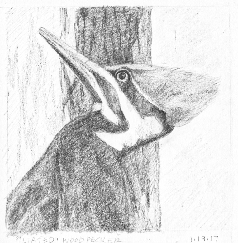
I wanted the emphasis to be on the birds with just a suggestion of location and habitat. So simple shapes and planning positive and negative shapes. I started with graphite drawings. I don’t do a lot of birds so I needed to make sure I understood what I was seeing in my reference photos and that I had the value pattern I wanted.
For this male piliated woodpecker I planned the composition to have the darkest dark behind the bird’s head to pop out the black and white head pattern and also the red. It’s a warmer dark than the black of the bird, so there’s also a temperature shift. There are three shapes: the bird, the tree trunk and the background. I used green because it’s the complement of red. In my reference photo, it being March, none of the trees had leaves and everything was brown. But so what? I’m the artist and can do anything I want.
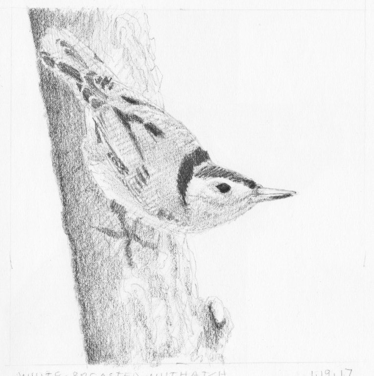
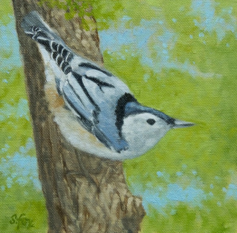
This is a white-breasted nuthatch that came to a bird feeder outside the window of an artist friend’s home I was staying at in the Hudson River Valley. I’d heard of them but had never seen one, so was happy to get some good reference. I didn’t want to include the feeder so I put the bird on a tree trunk instead, using a photo I shot of the trees that surround the home of famous Hudson Valley artist Thomas Cole, not far from my friend’s home, so I knew it would be correct.
White-breated Nuthatch oil 6×6″
For the background I wanted the suggestion of foliage with some sky showing through, which are called “sky holes”. I did the them quickly over the green. And pulled a little of the latter over the tree trunk to connect the foreground and background. Once again, three elements…the bird, tree trunk and background. No fussing.
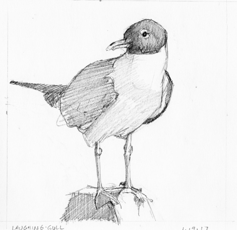
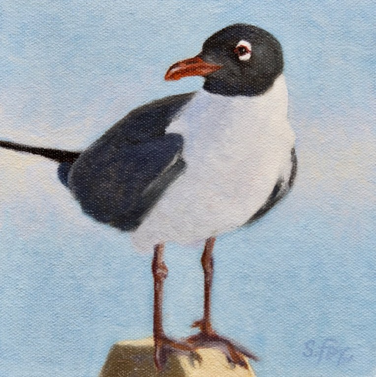
This laughing gull was perched on a post between a parking lot and the beach on Chincoteague Island. He was quite a good model and I had an excellent choice of reference to choose from. I’ll probably paint him again sometime. For this composition I went with one shape, the bird on his perch, against a plain background. No beach, surf or cars like were in the reference photo. Didn’t need or want them.
Laughing Gull oil 6×6″
As you can see, the gull’s proportions changed some from the drawing as I made corrections as needed on the painting while I consulted my reference photo. The blue sky alone didn’t seem like quite enough, so I added a soft band of warm white behind the bird. Notice also that I didn’t paint a single feather, but just treated each area as a shape that has a specific value and color. I had to get out a fine-tipped round synthetic brush to do the eye and bill, but I generally use Grand Prix Silver Brushes. I always use the biggest brush I can that will still get the job done.
I can’t remember a time when I didn’t draw. I’ve had the good fortune to been able to work in art-related fields all my adult life, first as a sign painter and graphic designer starting when I was 22 years old, then as an illustrator and finally, since 1997, a fine artist painting in oil and specializing in animals. I’ve learned a few things over the years, both from experience and from other artists, and would like to pass them on to you.
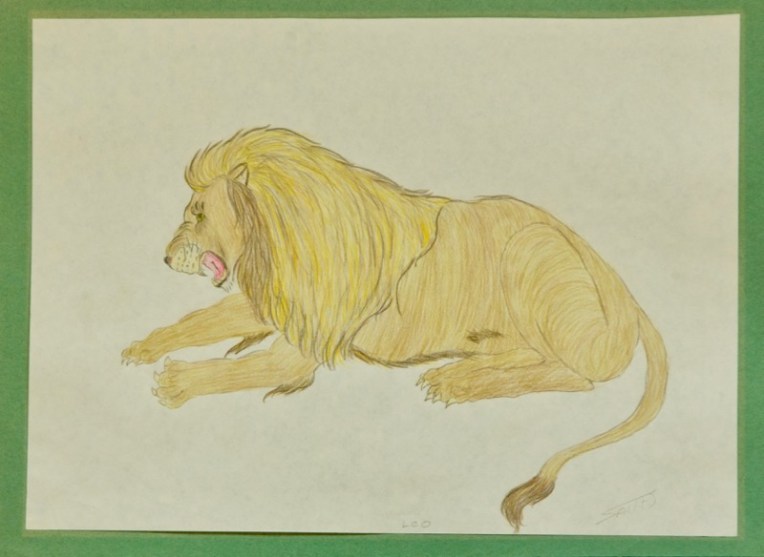
I always drew animals, sometimes copying them from Walter T. Foster art instruction books, which I still have. I think I was around ten when I did this lion.
1. Painting is drawing, in the sense of making marks on a surface with conscious intent, whether you’re a representational or abstract artist. Develop that intentionality.
2. You have to gain competence in: design/composition, drawing, value, color and edges. If you can afford it, buy Richard Schmid’s book “All I Know About Painting” or google each topic.
I always seemed to have a knack for whimsical animals. I don’t feel that I was born with any particular artistic gift, just the drive to draw, but somehow animals came easily, including eye expression. It just happens. This is a mixed media piece I did after I went back to art school and got an illustration degree in 1989.
3. It’s not about detail or fidelity to a photograph as the one true criteria for the quality of a work of art. It’s about expressing your personal artistic vision however that manifests. Don’t do detail because you never learned to edit. Learn to simplify. Which is actually pretty hard, but will liberate you in ways you can’t imagine. Don’t use photos unless you know how to compensate for the way they flatten and distort. It’s obvious to an educated eye when an artist has accepted a photo as truth and simply reproduced it, faults and all.
4. Learn from the best, but find your own path. As they told us in art school, be the best you you can be, not a second-rate someone else.
I’ve taken quite a few plein air workshops over the years even though I’m a studio painter. It’s good to get out in the fresh air and paint from life, enjoying the process and not worrying about the result. So it’s a busman’s holiday for me. No pressure.
5. Never be afraid to reevaluate your approach and process, scary as that might be. Some artists cling to how they work like it’s a life preserver without which they’d drown. Find a way to let go of that. The risk isn’t as big as you think it is.
6. There are no mistakes, only “what’s next?” This is from my oil painting teacher who I studied with privately for over two years. It got me off that big “OMG I’m going to RUIN IT!” hook.
My process has changed over the years and will continue to in the future. I now almost always do a finished drawing of my subject. I used to wing it on the canvas and that got me into a lot of trouble sometimes, with the work suffering from trying to solve problems as I painted, which kept me from focusing on my brushwork and other aspects of the finish. Much better to have made that correction of the head and neck on the drawing than on the painting. The farther in you are when you see a mistake the harder it is to make yourself wipe it off and fix it. But fix it you must.
7.Plan for “downtime” each year to recharge your creative batteries. Don’t do any art or try a new media/paper/style. It’s a chance to grow with no risk.
8. Keep a sketchbook. Use it. Consider doing a drawing a day for a week, a month, a year. Have fun. Try lots of different pencils and pens. Do them fast. Set a timer for a minute, five minutes, etc. Sketch an egg, a glass of water, an egg in a glass of water, your dog or cat, whatever you want. Look into learning contour drawing. A little tricky to get the hang of but lots of fun once you do. Hone those motor skills to keep them fresh and available.
And the preliminary drawings pay off in the finished work . This painting “A Good Stretch” was accepted into the 2015 Society of Animal Artists international juried exhibition “Art and the Animal”.
9. Gain a basic familiarity with the history of art. Who knows what inspiration you may find. I used to pick a new poet a month to check out. Google around and pick a new artist every month to learn about. Go back to the beginning and be humbled by cave paintings.
10. Don’t be too satisfied with your work or too hard on yourself. Find a balance and keep moving forward.
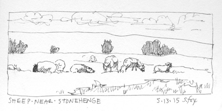
Location sketch done during a trip to England in 2015. It probably took about five minutes.
11. Seek out and listen to competent criticism of your work. Access to another artist’s educated eye and input is invaluable. Damp down that little voice that says “Yes, but…”
12. If the only thing that will make you truly happy in life is to create art, do not let anyone discourage you. Ever.
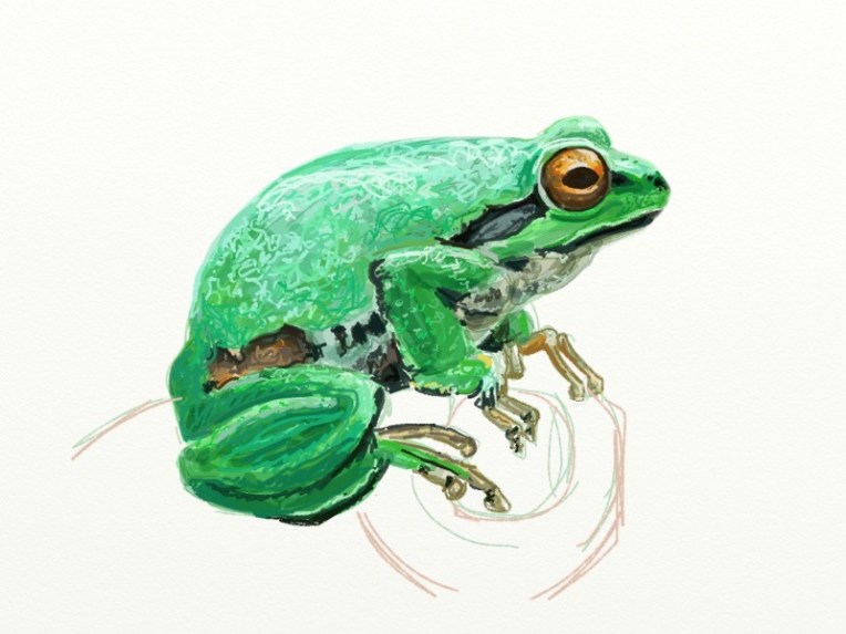
I mess about with a variety of media just for fun. This frog was done on my iPad.
I am proud to announce that I am now represented on the west coast by Strawberry Rock Gallery, located just up the road from me in Trinidad, California. They’ll be showing a complete selection of my work, including my Mongolia subjects like the painting above. Strawberry Rock is a full-service, locally-owned gallery. They just picked up the first round of my art yesterday, so I’m not on their website yet, but I’ll post the link when it is.
********
Artists are always on the lookout for the best places to buy supplies and equipment. I thought I’d share some of my favorites which have proved themselves over the years. None of the companies know I’m posting this so this list represents my honest opinions.
1. Hughes Easels– I’ve had mine for over ten years now and have never for a moment regretted spending the money for what is the best easel available. I bought the Model #4000 with two masts and highly recommend that choice since it holds large and/or long pieces more securely than one mast and lets me put diptych or triptych pieces next to each other or two smaller pieces side by side. Hughes Easels
2. Silver Brush Grand Prix- Like most painters I’ve tried a variety of brushes over the years and these are the ones I keep coming back to. I wear them down to half their length before they finally stop working and they hold a decent tip to the end. They have just the amount of spring and flexibility I like, having worked as a sign painter at the beginning of my art career. I’m ambivalent about using natural bristle brushes from an animal welfare standpoint, but have been unable to find a substitute, although the Silver Brush Bristlon comes close. Silver Brush Grand Prix
3. Winsor & Newton oil and watercolors– I do use specific oil colors from a couple of other brands, but good old WN has been my choice since I started painting in oils in 1997. Not sexy or expensive compared to many brands, but reliable and a pleasure to paint with. Also a good choice for someone starting out because painting is hard enough as it is without handicapping yourself by using cheap student-grade paint with low pigment/high filler content. I’ve used their watercolors since art school and after a long hiatus am using them again for location painting. Winsor & Newton
4. Strathmore Series 300 Bristol, Vellum Surface– My basic “good” drawing paper. It has just the amount of tooth that I like for drawing with pencils, Wolff’s Carbon pencils and General’s charcoal pencils. I keep pads of it in various sizes. I’ve tried the higher end Series 400, but don’t like the way it feels under the pencil. So the takeaway for this is that you need to try different papers until you find one you personally like (and, with luck, it won’t be the most expensive one). Canson makes an inexpensive recycled paper that I like for preliminary drawings. Strathmore
5. RayMar Canvas Panels– I switched to these years ago and have never looked back. Panels, as opposed to the traditional stretched canvas, became popular when plein air painting took off and, in fact, I first encountered them a a plein air workshop. I love RayMar’s cotton canvas panels which have just the right amount of tooth for me. Two major advantages of panels are that they take up a lot less linear shelf space than stretched canvas and the hard back means not having to worry about the canvas being dinged or a hole poked in it, so transporting paintings is a lot less stressful. They sell packs of standard sizes, but will happily do custom cuts up to 48″. Their quality has been absolutely consistent over the years and they’re a family-owned business. RayMar Art
Finally, something new (at least to me) that I’m just trying out but am very excited about. Forget Renaissance-era grid transfers, graphite transfers and oil transfers…
6. Optima Digital Projector– I have tried so many ways over the years to get a preliminary drawing done on paper onto the canvas, the grid being the main one. I’ve also tried doing the drawing at the final size and using a graphite transfer sheet. I recently learned about oil transfers from a great art site called “Underpaintings” (I’ve subscribed). But those methods I found time-consuming and imprecise, which just made for more work to get the drawing correct on the canvas. However, suddenly one fine day my subconscious must have finished its work because this idea popped into my head….why not do my drawings at whatever size and in whatever media I want? Then, depending on size, either scan or photograph them and dump them into Aperture, the image management software on my iMac. Plug the digital projector into the computer and project the drawing onto the canvas, then simply and precisely sketch it in. And, yes, I know I can do the same with the photos and will probably do that in the future for some simple subjects since I know how to draw, but what I love is being able to work from my drawings which is how I learn “what my subject looks like” in a way that I never could from just tracing a photo. So let me flatly say- THERE IS NO SUBSTITUTE FOR LEARNING HOW TO DRAW. I’ll probably do a future post about this transfer method as I move into my winter “painting season” and can document the process.
I’m getting ready to begin my Fall Painting Season and decided to start by tweaking my working process. Every successful representational painting has two things: solid composition and a strong, well-thought out value pattern. Of course drawing, color and edges are important also, but one can make the case that the design and values are critical. So I’ve spent the last few days doing small value studies of reference photos that I’m thinking about painting. I’m working on the drawing part at the same time, too. None of them took more than an hour or so.
They are all done on various types of watercolor paper I already have on hand, experimenting to see which one serves my purpose best, and with one color…Winsor Newton Payne’s Gray. The brush is a Round No. 10 Prolene by ProArts. The study sizes run from 6×6″ to 7×10″, so not very big.
I got the idea to use watercolor for preliminary value studies (instead of, for instance, pencils or oils) from my friend and colleague, nationally-known watercolorist David Rankin. You can read his information about what he calls “Gray Studies” here.
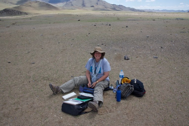
I like it because it’s fast, effective, fun and let’s me practice with the media I use on location when I’m in Mongolia.
So, if your paintings are looking kind of flat or you’re finding that using color is confusing your values, I highly recommend that you get the simple set of materials listed below and try this. It may be a bit of a struggle at first to truly grasp the difference between color and value (the relative light and dark of something separate from its color) and to move away from your reference in order to get the right amount of contrast in the right places (a viewer’s eye is going to go first to the area of highest contrast, so you need to make a conscious decision about where your focal point is), but hang in there, just keep adjusting and experimenting and you’ll be rewarded by a visible improvement in your work.
Materials list:
1 tube Winsor Newton Payne’s Gray transparent watercolor
1 small dish or whatever you think will work for a palette.
Watercolor paper (I’m using “stock on hand”….small blocks of Art Lana Lanaquarelle hot press, Arches cold press and Saunders Waterford cold press; or you can get sheets of 300 lb, which doesn’t have to be stretched). If you buy sheets then you will need something to mount them to. I use a rectangular scrap of foamcore taped around the edges with clear packing tape and then use 1/2″ drafting tape to hold the corners of the paper to the board.
1 brush- Use at least a no. 10 round or 1/2” flat; your choice of brand (I like the Robert Simmons Sapphire synthetics, but also have a couple of the Prolene and Dick Blick rounds)
Reference photos with strong light and shadow patterns.
Here’s some more of what I’ve been doing:
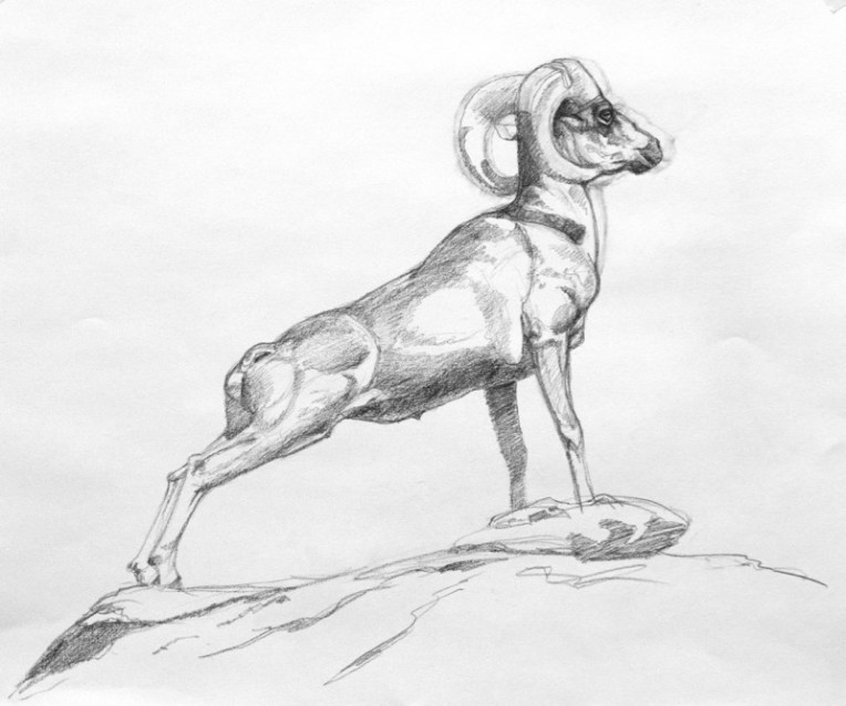
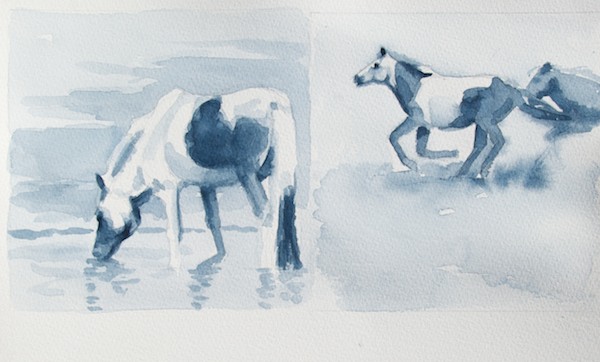
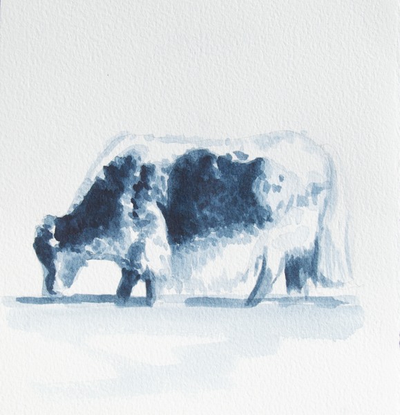
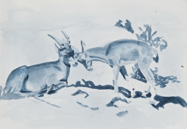
Horses; I deliberately chose to put the darker wash along the contour of the left horse’s head, mane and back to make the white, lightest area pop out. Notice that it stops at the eye where the shadow area begins, so that part of the background was left lighter.Short-tailed weasel or stoat; I learned from this one that my reference photo doesn’t have as much value contrast as it seemed when I picked it, so for this study I pushed the contrast between the weasel and the background. Still not happy with the shadow areas around the animal, so I’ll probably do another quick study just using shapes to get the values where I want them.Mongolian yakA more finished study of two Siberian ibex
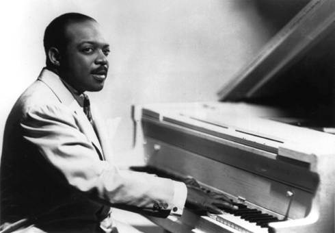
I “got into” jazz some years ago and quickly found that Count Basie was my favorite, particularly from his Kansas City days before he had a big orchestra. I’ve had this post in mind for quite awhile, but had to find the right video of him and then formulate why I believe his music is of value to visual artists.
Here’s what I think painters, or any artist really, can learn from listening to pieces like the one in the video:
1. Simplicity– Compared to everything going on in the orchestra, Basie plays very few notes in this version of “Good Time Blues”. It takes years of experience to be able to strip away all the “details” and play with such elegant simplicity. If you watch his older performances, he plays more conventionally. As he went along, he simplified his playing to an extremely sophisticated level. And, as one of my art teachers once said “The simpler statement is the stronger statement.” One could explore this idea with brushwork. Instead of ten strokes to define an area, can you do it in five? How much information can you convey in one? Can you say “grass” in 3 strokes instead of 300?
2. The spaces between the notes– artists call it “positive” and “negative” space. Both are equally important and a painting can be approached from either direction. In the Basie video, the spaces between the notes are every bit as important at the notes themselves. Watch the video for the notes, then watch it again for the spaces. When you do a drawing for a painting, do you check the negative spaces between the objects? If not, try it and see what happens to your visual perception. Try designing a painting by thinking about the negative shapes first.
3. Timing– Every one of those relatively few notes is played at EXACTLY the right instant. By this time in his career, his timing instincts were unerring and seemingly effortless. One can not imagine any note being the slightest bit earlier or later. How long is your brush actually in contact with the canvas? How does varying that change the appearance of the mark? How could you change the look of your painting by using this idea consciously?
Color is one of the things artists love about painting, but it can also be one of the most frustrating. There are lots of “rules” out there which try to make sense of it and they are a good starting point, but ultimately every artist, as with most other aspects of painting, has to find their own way.
Here are six thoughts on color, based on my own experience and information I’ve picked up over the years. Add some of your own in the comments!
1. Color is relative. How we perceive a color’s hue and value depends entirely on what’s around it.
2. Come up with a “color plan” for your painting. Decide if it will be monochrome, use complementary colors, analogous colors, etc. Do very small (5×7″ or smaller) color roughs, if necessary.
3. Value is how light or dark a color is, separate from what hue the color is. If you get the values right, you can do anything you want with the color.
4. A good rule of thumb is when you change the value, change the temperature. Warm highlights/cool shadows. Cool highlights/warm shadows.
5. While there are a variety of useful “rules” for using color, ultimately you do whatever works to let you say what you want to say.
6. Don’t be afraid of color. Go for it!
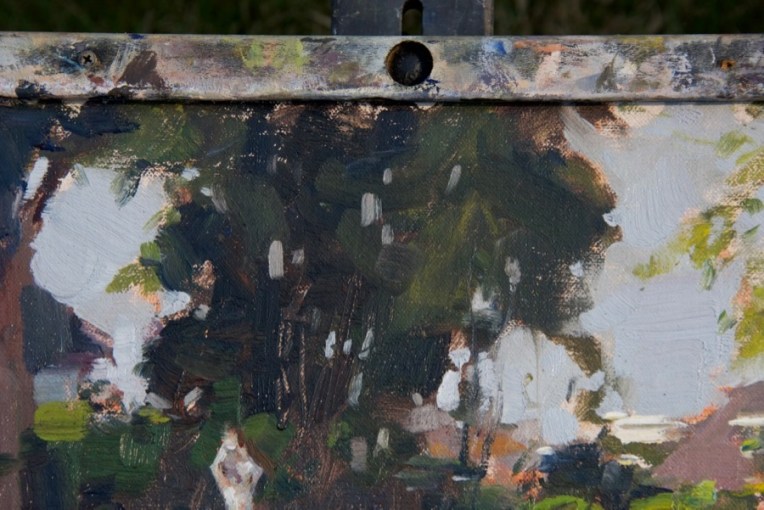
This post is illustrated with details from my latest painting in progress. Check back next Friday to see the whole thing, plus step-by-step photos.
And……I will have a major announcement on Monday about my next trip to Mongolia!