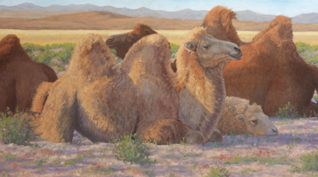
“Done for the Day” oil 17×30″ collection of the artist
Like has been true with many or my artist friends and colleagues, the combination of the election and a pandemic that’s now into its second year, has made it hard to focus on making art at times. I did three paintings in November and otherwise have been sketching on Monday afternoons with a group of artists who also have a background in illustration. I’ll be posting a “best of…” those here in the near future. While there will still be posts about the garden, the collies and such, this year I want to move more towards passing on some of what I’ve learned as someone who has worked in one art-related field or another since 1976.
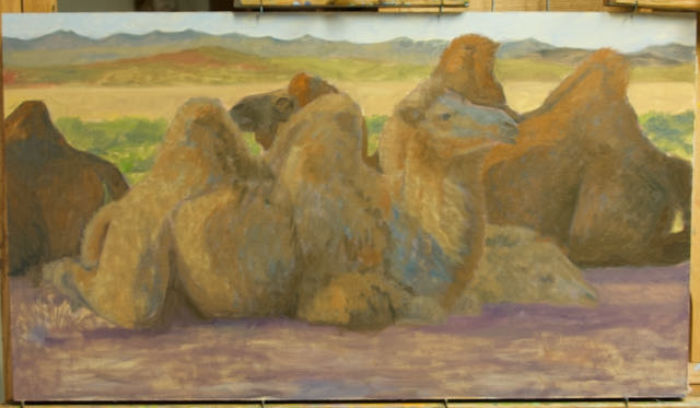
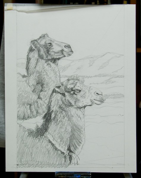
So, to start off, I’m going to share work-in-progress images of the above painting, which I did in 2009. It’s from a place I’ve been to in Mongolia a number of times. This white camel was still alive and at the visitor ger camp in Arburd Sands ( a dune complex that is one of the farthest north of the Gobi) where I stayed when I was last there in 2018.
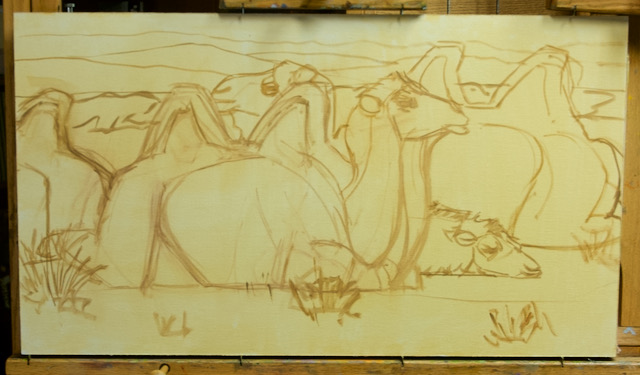
Stage 1
This is one way I often start a painting. I’ve already done some rough studies for the composition so I drew it onto the toned canvas with raw sienna and brush. I moved the brown camel behind her to get the humps into the painting, which sets up a rhythm with hers. It’s always good to remember not to get “married” to your reference. Do what it takes to get a good strong composition. Just because it’s in the photo doesn’t mean you have to paint it.
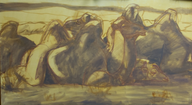
Stage 2
The next step was to rough in the shapes of the shadows. So now I have two values and can play off that for the rest of the painting. I also made some corrections to the drawing.
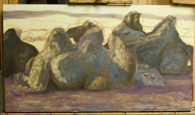
Stage 3
Now I’m starting to add colors, cool for the shadows on the camels and a warm violet tone for the sandy ground. I also continue to refine the drawing as I go along, tweaking and adjusting as necessary.
Stage 4
All the basic local colors are in now, generally darker than they’ll eventually be. I work more or less from dark to light. I’ve also started to add brushwork to create the wooly texture of their coats. The whole surface of the painting has paint on it now. I’ve got the drawing the way I want it.
Stage 5
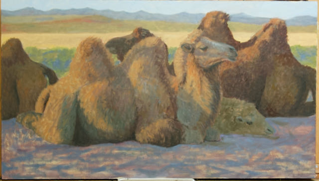
Closing in on the finish now. All the light and shadow areas are set. The ground and background are also ready for the final stages. For the camels it’s time to punch the values and color temperature, which needs to be much warmer to show that great late afternoon light. And below, once again is the finished painting. I ticked in the shrubs and ground plants at the end to make the ground more interesting and to introduce a color, green that repeats the vegetation behind the animals and is the complement of the warm reddish tones of the camels. It’s important to not get hung up on “local color”. Color is relative and depends on what a given color is next to and on the light the subject is in.
I was busy in the studio last week doing the second and third steps in preparing three new paintings to hit the canvas. I’ve been wanting to start using the Mongol horse race reference I’ve gathered over my twelve trips there since 2005 and the time has come. Above is a color study, below is the previous step, the value study, in which all the darks, lights, and mid-range tones are worked out separate from color. It’s an important roadmap for coloring mixing since how dark or light is settled and the artist then can focus on hue and color temperature (how warm or cool).
“Almost There”, graphite on paper, value study
Here’s the value and color studies for “Patient”.
And, finally, for “After the Race, Scraping Sweat”
I have not determined the final sizes yet but they’re not going to be too big.
In other art news, Inktober52 rolls on with me doing my weekly pen and in drawing to go with whatever the “Prompt” is. I post all of them on Instagram, the “official” social media platform for the event. You can see everything I’ve done so far here. I’ve also created a Board for them on Pinteresthere. I generally post new pieces on Tuesday.
Last week’s Inktober52 piece. The Prompt was “Fragile”
And, if you haven’t done so, here’s the link to my Fox Studio Etsy shop. I offer coloring pages created from animals I’ve photographed in my travels and original drawings and small oil paintings. Coming soon will be my hand-picked selection of dip pen nibs for artists.
Live events, as everyone knows, are either postponed or cancelled this year. For artists it means no live exhibitions or shows, galleries closed and workshops going virtual. However, I recently found out about and signed up for a new marketing effort just for artists...Artists Sunday, which will be on November 29. The idea, like the other themed shopping days after Thanksgiving, is to establish one just for artists/craftspeople. There will be national multimedia marketing campaign to encourage people to patronize the participants when shopping for gifts. I’m excited about the possibilities and am really looking forward to it. Look for new items in my Etsy shop and here on my website.
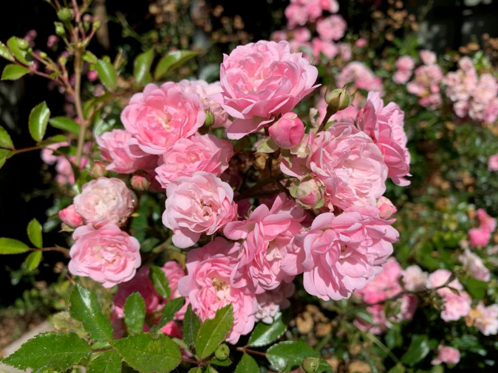
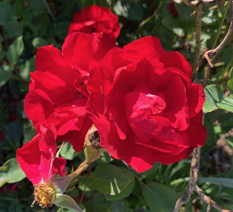
Rose ‘The Fairy’
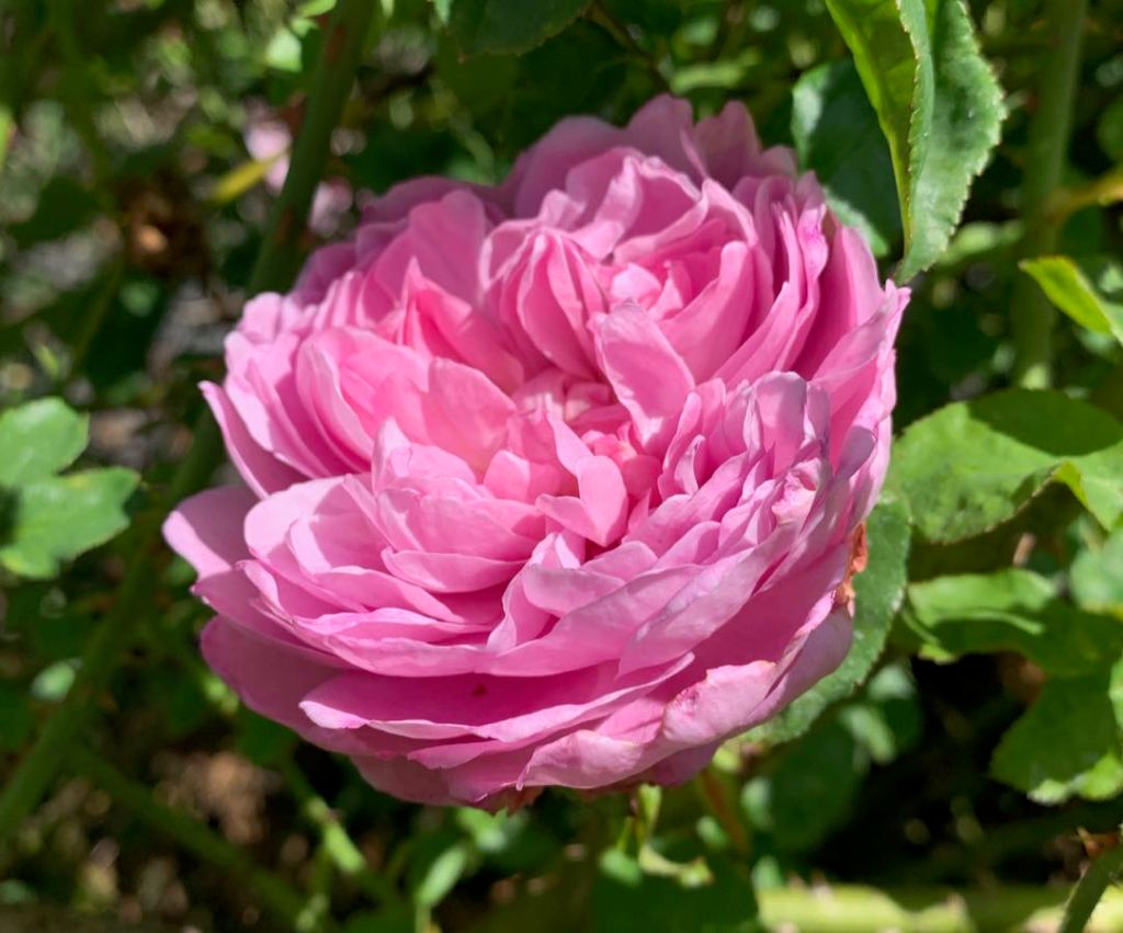
Starting last Saturday, we had almost a week of smoke, so no gardening/fall clean-up got done. It’s a gorgeous sunny day today and it looks like we’re going to have a “heat wave” over the next week with highs in the mid/high 70s, quite warm for here on the coast and since our acre is in a sheltered area at the end of our street it will hit 80 in the shade. In the meantime some of the roses aren’t done yet, some still blooming like The Fairy (above) and some getting in a last repeat bloom like the David Austin Rose ‘Charles Rennie Macintosh’ below.
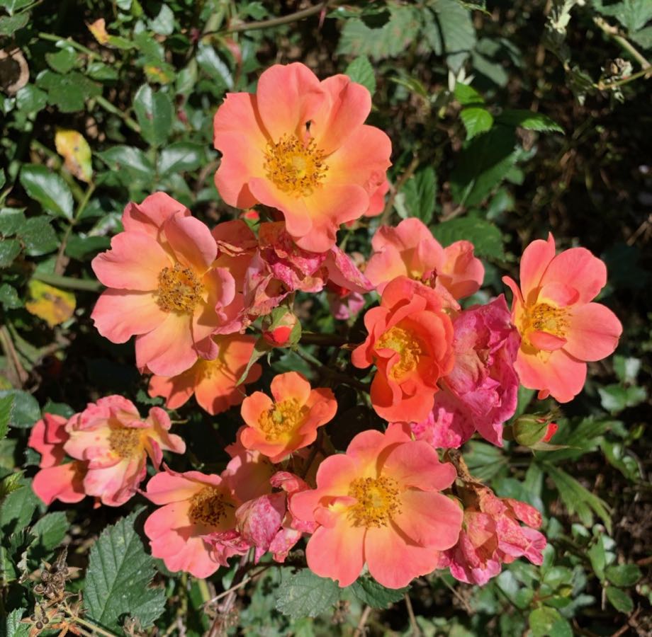
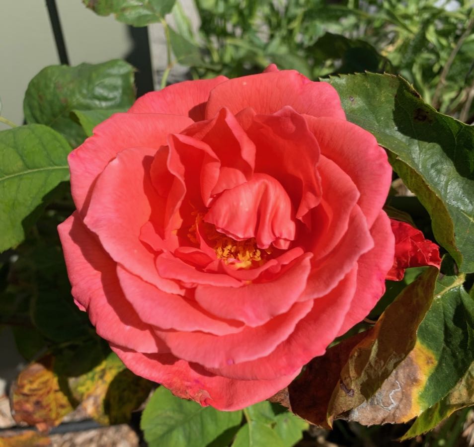
The Jackson Perkins ‘Happy Chappy’ ground cover rose hasn’t stopped blooming since spring. I love the warm colors.
There used to be a fabulous old rose nursery in Sebastopol, about four hours south of us, called Vintage Gardens. The sales part was closed when the fad for old roses died down, but the collection the owner amassed is still there and being maintained by The Friends of Vintage Roses. There was a blow-out final sale in which a few hundred old roses, many of them floribundas from the 50s-70s were under $10, a type that is not in fashion anymore. I bought over a dozen of them just to preserve them for the future, but also looked like they’d be great in the garden. And they are! And how could anyone resist a rose called “Lily Marlene? It’s one of the best reds I’ve seen. It’s also bullet proof and sturdy.
And, speaking of names, I HAD to have ‘Leaping Salmon’ given where I live on the north coast of California. This rose is a SPECTACULAR salmon pink in color and quite the climber, with huge long-lasting flowers.
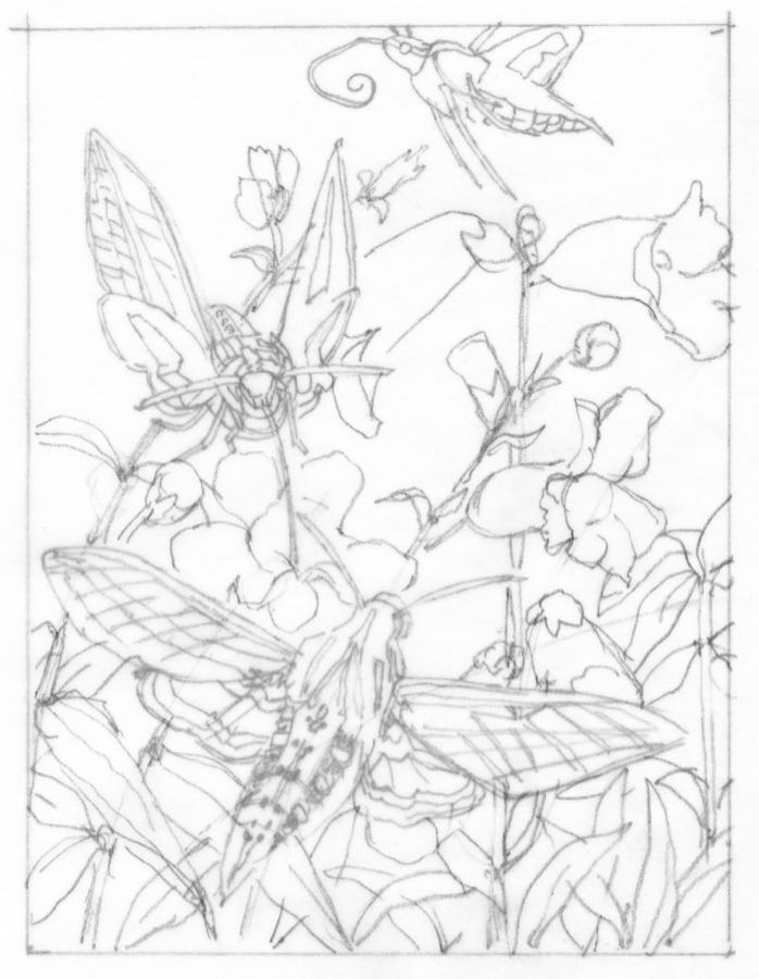
And finally, last year for the first time I participated in the creation of a coloring book, part of a series showing the wildlife and plants in various ecosystems of the US. The next one is under way and the theme this time is Pollinators. Without insects and other animals to pollinate plants our plant-based food supply would be in great, most likely fatal, danger. Bees are probably the best know pollinators and they’ll be well represented in the book. I did some research, though, and found that the white-lined sphinx moth I photographed in our garden years ago is a pollinator! I’ve used three of my photos to show the moth in action. This is where I start….with a pencil drawing that sets the composition. I’ll tweak it a bit more and it will be ready for inking on heavy vellum, which I’ll lay over the top of the drawing. I used photos of penstemon, also from our garden as the “target plant”. I’ll also be doing a second page with two Hawaiian honeycreepers and will show that one next week.
On the Covid-19 front, we had a post 4th of July spike in cases, mostly driven by large gatherings of locals and their guests. We seem to have gotten past the Labor Day weekend ok. Last Friday there were no new cases the previous day, the first time that’s happened in awhile. So unless something dramatic happens this will be the last “Life Goes On…” post because that’s how it is day to day now with following our regular routines, able to get haircuts, massages, etc. and do our regular shopping with no drama.
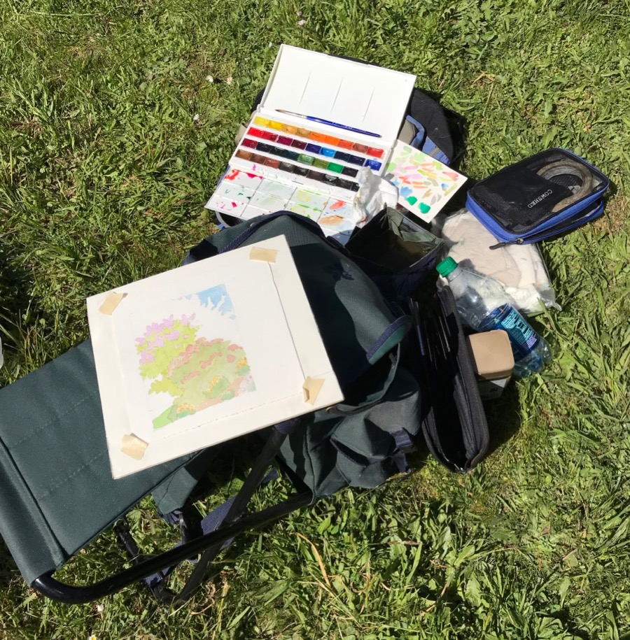
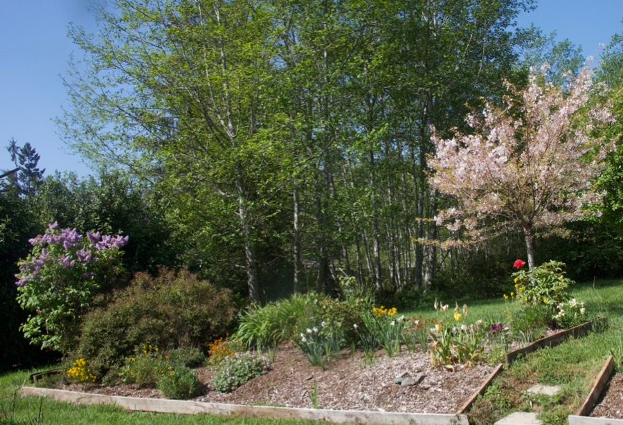
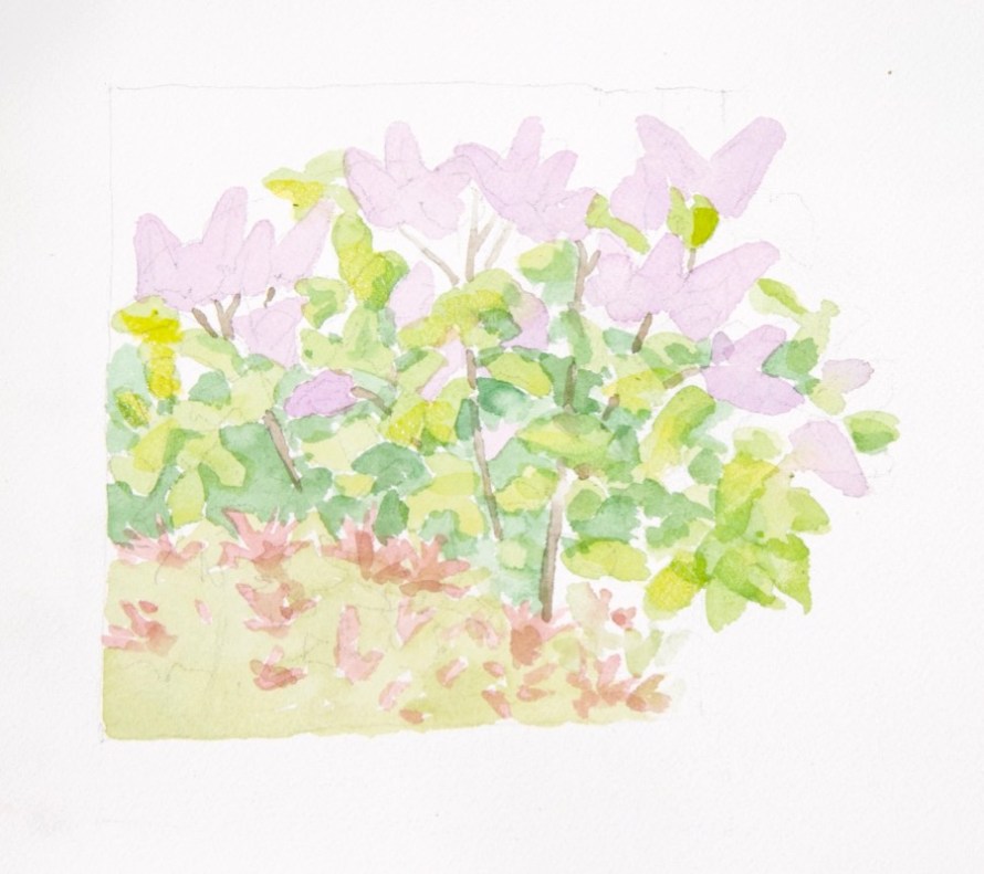
Spring has sprung so I’ve gotten out the past few days to paint and sketch in our garden. I use a Yarka full-pan set of paints, a variety of brushes and either a 9×12″ Arches cold press block or 8×8″ pieces of Sanders Waterford cold press taped to a piece of foamcore with taped edges.
The south side of what we call “The Long Border”
I really wanted to do the lilacs before they faded, so I focused on them.
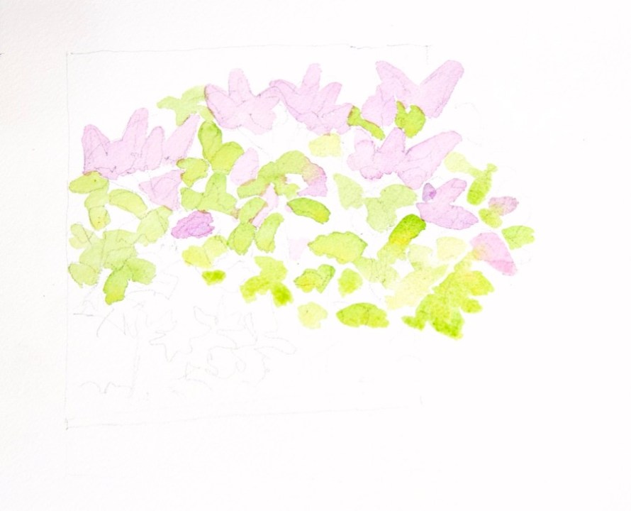
First washes
I got so involved in what I was doing that I forgot to take any other step photos of this first one. My goal was to limber up for the painting season and catch the lilacs against the dark green of the English laurel behind it. I stayed with really simple shapes working, as one does with watercolor, from light to dark.
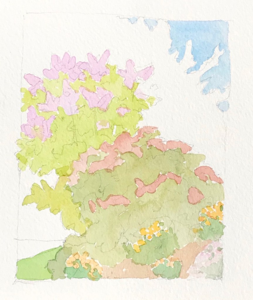
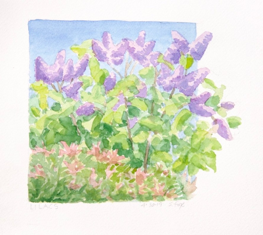
I then went around to the other side to do a close-in version of the lilacs.
I kept it loose, starting, as before, with a light pencil drawing and then laying in the lightest areas of color.
As you can see I treated the lilacs as simple shapes, not getting into painting individual flowers. I also paid attention to color temperature, starting warm in the lightest area and going cooler in the shadows.
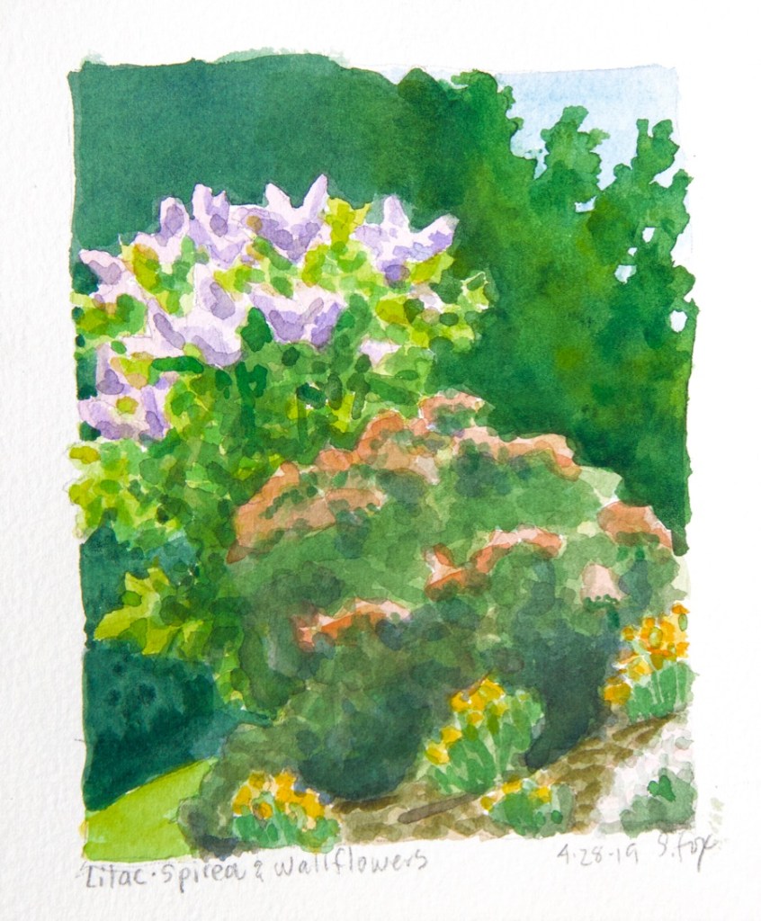
All in all, I’m pretty happy with the way they came out. The roses are just getting started so stay tuned…
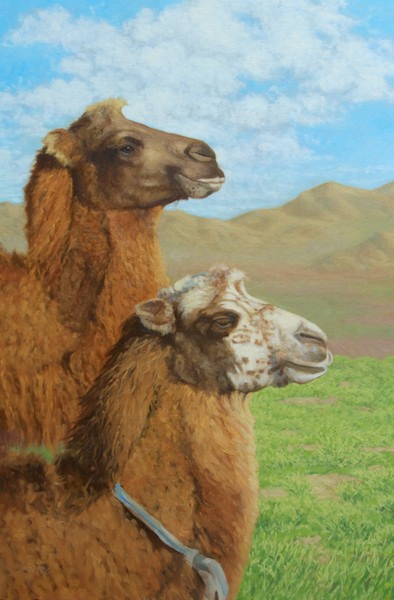
I’ve seen these camels a number of times now at a ger camp that I stay at, Arburd Sands. Nowhere else in my travels in Mongolia since 2005 have I ever seen one with a white face like this. He’s big, too. His legs have the same kind of spotted markings. These two were part of a large group belonging to a local herder. They were grazing and hanging around quite near to the camp. I sat and sketched them one morning along with taking a lot of photos.
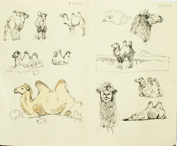
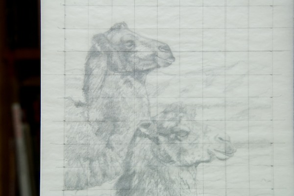
Here’s one of the pages of sketches I did in 2012 which includes the white-faced camel in the upper right.
And here’s the step by step of the painting:
The drawing and value study; 14×11″ graphite on drawing paper
I drew a one by one inch grid on a piece of tracing paper to do a traditional graphite transfer to the canvas panel
Here is the enlargement grid and drawing transfer. It doesn’t have to be exact, just close enough so that the elements are the right size and in the right place. I use a transfer sheet that I made myself by covering the back of a piece of tracing paper with lead from a soft pencil. I use a 7H pencil to do the actual transfer tracing.
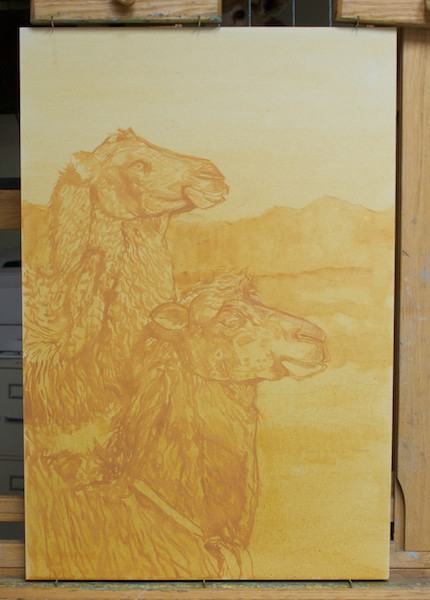
The Raymar canvasboard panel tinted with raw sienna. You can barely see the lines of the transfer if you look closely.
The initial brush drawing of the camels.
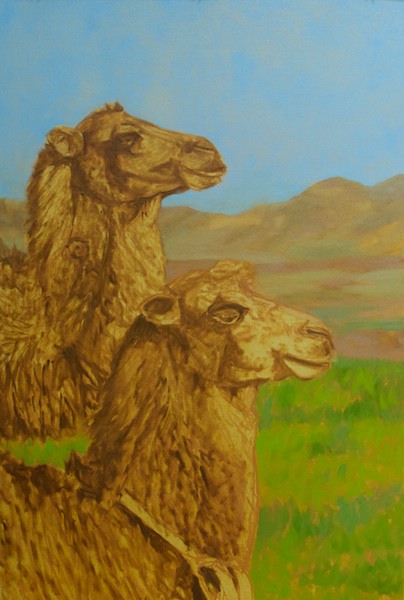
Now the background has been added.
The next step is to bring up the dark values of the camels, referring to my drawing as needed. I’m already indicating the wooly texture of their coats.
Initial color lay-in of the background.
First color pass on the camels. I correct the drawing as I go, if necessary. I decided that I really didn’t like the eye of the brown camel, so I went back to my reference and found another camel whose eye shape looked better.
I mostly finished the camels in one long sitting, but still went back and tweaked the heads a couple of times. I’ve now added clouds to the sky. I had originally planned to leave the sky just blue, but it didn’t feel right. I’ve also modeled the mountains in the background and started to work on the grass.
Once again: Bactrian Camels, Bayan-Onjuul Soum, Mongolia oil 30×20″
There are many artists who come up with a way of working that satisfies them and they never alter it. That would not be me. Every year about this time, I sit back and rethink my whole process of painting a picture. I’m perfectly willing to toss it all in the air and tweak and change whatever I think needs it. It’s very liberating.
I recently went to the Norman Rockwell show and was reminded of how thorough a process he used, how he broke down the elements of a picture and solved the problems as much as he could with each step, always leaving the door open for alterations down the road if needed. It’s the same procedure we were taught when I was getting a degree in illustration at the Academy of Art in the late 1980s. One didn’t need to do every step every time, but it was always there to fall back on if one got in trouble. (The steps are: thumbnails, rough drawing for composition, finished drawing, value study, color study, finish)
One of the things Rockwell did was very finished charcoal drawings at the final size. It always looked like a lot of work, even though I really love to draw, and I guess I never really got the point. I do now. I got into messes a couple of times in the past year, partly due to not solving all the drawing and value problems before I started to paint. I had begun doing drawings at the final size for the large pieces, but only outlines, no value. I’ve just started a series of three argali paintings and decided to take it up a notch.
I also needed to rethink how I got my image onto the canvas. I don’t have a projector anymore and don’t really want one. I’ve found a lot of value in drawing an animal multiple times because I really LEARN it. A painting shouldn’t be about saving time or doing it fast. It should be about doing what it takes to get it RIGHT.
One benefit of doing the drawings at the finished size is that it is then easy to make a tracing and do a graphite transfer. The alternative is the venerable grid system, which works just fine, but, dare I say it, takes a lot more time to no good purpose and, more importantly, didn’t give me as accurate a result.
These three pieces are compositionally simple. I have a clear idea in my head of where I want to end up. The main upfront decisions were how big and what proportions each one should be since they are intended to hang as a group, although they will be priced individually.
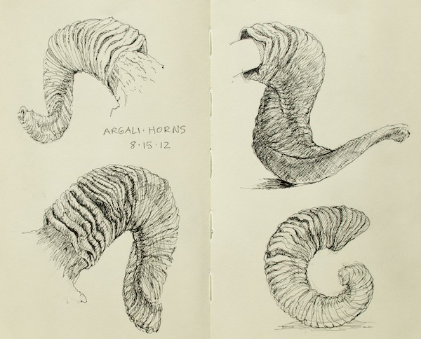
The reference photos (which I am not going to post due the vagaries of the internet) were taken during one action-packed hour with five argali rams at Ikh Nartiin Chuluu Nature Reserve in Mongolia in July 2010. And two afternoons I spent there this past August during an eleven day stay doing studies of argali horns at the research camp really paid off in being able to understand the horns in the photos.
I’ll start with that page from my sketch journal and then show you the steps so far for the three paintings. I didn’t do thumbnails or rough drawings, but went straight to finished working drawings of the animals, but still thinking about what the landscape will look like.
Argali horns, research camp, Ikh Nartiin Chuluu Nature Reserve, Mongolia, July 2012
Painting No. 1- Tentatively titled “Coming Through”, a big ram asserting his right to walk wherever he wants to, when he wants to
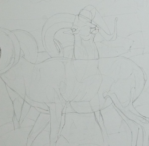
Beginning the graphite drawing; detail to show how I “drew through” the ram in back to make sure the parts all are in the right places. I used another piece of reference for the back legs since the ones in the photo didn’t read well.
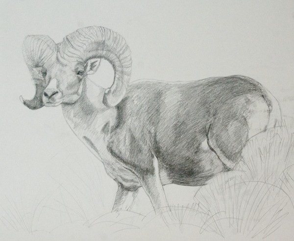
Finished drawing; graphite on vellum bristol
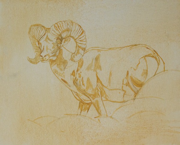
I put tracing paper over the drawing and did an outline only drawing to use for transferring the image to the canvas
Argali horns, research camp, Ikh Nartiin Chuluu Nature Reserve, Mongolia, July 2012
Painting No. 2- No title yet
Finished drawing; graphite on vellum bristol
Outline on tracing paper; I’m drawing shapes of structure and values
Brush drawing on canvas
Painting No. 3- No title yet
Graphite drawing; this was the third one and felt that I didn’t need to go all the way to the same point. It was more important to get all the size and position relationships between the rams correct. The one in the back looked very odd in the reference photo, so I changed out his head for a profile instead of three quarters view. Notice that the single ram and the group are on separate pieces of paper so I can move them around.
The tracing paper transfer version
The brush drawing
I should have a pretty good handle on argali horns by the time I’m done with all three paintings.
Color is one of the things artists love about painting, but it can also be one of the most frustrating. There are lots of “rules” out there which try to make sense of it and they are a good starting point, but ultimately every artist, as with most other aspects of painting, has to find their own way.
Here are six thoughts on color, based on my own experience and information I’ve picked up over the years. Add some of your own in the comments!
1. Color is relative. How we perceive a color’s hue and value depends entirely on what’s around it.
2. Come up with a “color plan” for your painting. Decide if it will be monochrome, use complementary colors, analogous colors, etc. Do very small (5×7″ or smaller) color roughs, if necessary.
3. Value is how light or dark a color is, separate from what hue the color is. If you get the values right, you can do anything you want with the color.
4. A good rule of thumb is when you change the value, change the temperature. Warm highlights/cool shadows. Cool highlights/warm shadows.
5. While there are a variety of useful “rules” for using color, ultimately you do whatever works to let you say what you want to say.
6. Don’t be afraid of color. Go for it!
This post is illustrated with details from my latest painting in progress. Check back next Friday to see the whole thing, plus step-by-step photos.
And……I will have a major announcement on Monday about my next trip to Mongolia!
Continuing on from last week, I knew that I was going to do a big painting (big for me, at this point) when the five rams walked across the stream bed in the beautiful morning light.
I also knew that it would be a complex piece that would take more planning than I’d done in the past. I’ve started a couple of big paintings, only to have them bog down and fail because, while I did do preliminary sketches and drawings, I found that I hadn’t really solved some critical problems and then was faced with figuring them out on the canvas. A recipe for frustration and failure.
Not this time. First, I thought about what it was that made me want to paint this scene. It was not only the argali, but the interesting alternating pattern of light and shadow, which started in the foreground and went all the way back. And it was important that it be about my emotional response to this very special experience.
Here’s one of the reference shots. I create Albums in Aperture where I can put all the images I’m using on a painting. In this case, thirteen. Here’s the lead ram.
Since I had a pretty clear image in my head of where I wanted to end up, I didn’t do thumbnails this time. And, having struggled with understanding how to work larger, I decided to start larger right away. This is the first layout, done on 19×24″ Canson Calque tracing paper.
As you can see, I adjusted the proportions as needed. I wanted the emphasis to be on the rams, but still show enough of the background to place them in a specific setting and show that alternating light and shadow pattern.
You will also notice that I have an even number of animals, which breaks a “rule”. But they are in an uneven number of “groups”. This doesn’t happen by accident. Or if it does, then there is a conscious decision to keep it.
I had also done a finished drawing of the two rams, which some of you saw a few months ago on Facebook (you can “Like” my public page here).
The next step was to do a small color rough to figure out how I would achieve the visual effect I was looking for. This is on a 6×8″ canvasboard. I blocked out the part that didn’t fit the proportion.
What was critical was to play up the golden light on the ram’s horns and to make sure the argali were the objects of highest contrast by placing them against the central shadow shape. Notice that I’m just painting blobs of color to get the relationships down.
The central tree has a cast shadow. This is something that has given me trouble in the past. The shapes, edges and value relationships have to be just right. So I did a couple of studies of just that tree, along with another to figure out some of the same things where the stream bed goes back into space.
Now it was time to do a large value study, 12×24″. I adjusted the relative position of the rams, moving the pair forward a little.
I had to know if what I had come up with would work at the final size I had decided upon- 24×48″. This is where I’d gotten into trouble before. I asked an artist colleague for advice and he said to take my finished drawing to a copy place and have it blown up to the final size, which I think is a really good idea.
But I chose to try something else. I have found great value in the re-drawing process. It allows me to refine, correct, simplify and really learn to know my subjects in a way that would not be possible if I simply did a drawing, transferred it and started to paint, or worse, heaven forbid, projected them. The depth of understanding and flexibility I get is critical to the quality of my finished product.
First I put a sheet of tracing paper over the drawing above and drew a one inch grid on it.
Then I placed my untoned canvasboard on the easel and ruled a grid on it in pencil. I taped tracing paper to it. It took three sheets to cover it. I lightly sketched a transfer drawing so that every element was in the right spot.
Once the background was laid in, I taped on three more pieces of tracing paper and did the final pencil drawings of each argali. Now I had this:
Because the argali were all on their own pieces of paper, I could do a final check on position and easily move them if needed. I also now had the whole composition at the final size and could see that it did, in fact, work. Whew!
I removed the tracing paper, toned the canvas, re-attached it and, using a No. 7 pencil and a sheet of homemade graphite transfer paper, transferred the drawing.
Using the tracing paper drawings as a guide and referring back to the photo reference if necessary, I carefully re-drew the argali with a brush, figuring I’d get the most important elements down first. Here’s a close-up which also shows the loose lay-on of the background. Notice that you can see three of the four hooves. They vanish later as I decide to add additional and larger rocks to create more of a visual separation between the sheep and the viewer.
Here’s the finished drawing, with basic values starting to be indicated. Notice that the rocks in the foreground and middle ground are just roughed in. No need to spend a lot of time on them at this point.
Finally it was time to start adding color! I work all over a canvas in a sitting, keeping the edges soft and letting colors “bleed” into each other. This lets me control where the harder edges will be later on. I’ll also “lose” the drawing, knowing that, having drawn the animals multiple times, I can “find them” again with no problem. First I established the shadow shapes, letting the undertone be the light.
Here’s a close-up of the lead ram in progress. Still keeping it loose, but working on light and shadow and correct structure.
I started to see a problem in the forequarters and it nagged at me for a couple of sittings until I realized that the leg closest to the viewer was too far forward. Moving it and the shoulder back about a quarter of an inch solved the problem. His head was also a little too small. That’s a big advantage of working this way. I can make changes at any point in the process, which turned out to be really important when I was trying to keep track of so many pictorial elements and their relationships to each other.
Let’s take a quick break. Here’s my palette. For this painting, I used my standard color range: transparent oxide red, cadmium red medium, cadmium orange, yellow ochre light, cadmium yellow pale, cadmium yellow, titanium white, ultramarine blue, Winsor violet (dioxine), sap green, terra verte, chromium oxide green.
Missing this time around is cobalt blue and magnesium blue hue. I mix my own earth colors and greys. My black is a mix of transparent oxide red and ultramarine blue. I can easily shift the color temperature by changing the proportions.
The palette itself is a scrap of Swanstone solid surface countertop. I got the idea from another art blog and I like it much better than the glass one I’d been using.
Ok, back to the painting. I’m probably about mid-way through at this point. All the value relationships are set (at least I thought so) and basic colors are on.
Oh, darn. I realized that having all the rams in the same light wasn’t very interesting. I went back to my reference images and found a nice shot of the very first one coming out of the shadows. Now I needed to put the fourth ram in that light. Aperture is great for this since it lets you show multiple images at once.
Much better. Having solved that final, somewhat major problem, it was now a matter of simply pushing on, solving all the problems, making decisions, tweaking and tweaking (what Scott Christensen more elegantly calls “orchestration”).
Until, finally, after far longer than I have ever spent on a single painting, it was done.
Then They Walked Out Into The Morning Light 24x48" oil
I find that I have a perfect opportunity to demonstrate how critical good reference is and what a difference familiarity with a species makes in how well one is able to draw and paint it. Besides showing off my latest work.
I first went to Mongolia on an Earthwatch Institute-sponsored project “Mongolian Argali” in the spring of 2005 at the Ikh Nartiin Chuluu Nature Reserve. I had two Nikon D70 digital SLRs that shot 6MB RAW files. Quite good at that time. My lens was a Tamron 100-300 with a 2x doubler, which made it slow, but did let me get decent stuff from quite a distance. I took 735 images of argali sheep during my two weeks on the project and I was hot to paint them when I got home. For reasons that are now lost in the mists of time, I chose the image below for my first head study (file under “What was I thinking?”)
Now, granted I could zoom in on it quite a bit and I was really interested in understanding the shapes, not details, but still. Why didn’t I pick one like this?
Much closer. Better light. Structure of things like the area around the eye easier to see. Maybe I was seduced by the beautiful set of horns on the ram. Oh well, live and learn.
In any case, I sent a jpg of the finished study to the Mongolian scientist I worked with and he thought I’d done a very good job, which was nice to know. But……the painting continued to bug me, so I did a re-paint. And then another. And futzed with it some more. And then life moved on, the painting was shelved and that was that. So now it’s kind of a mess and I’m not going to work on it again. The only image I have of it when it looked finished is on a promo page I did for myself. The image below is scanned from that, so it’s not great, but it does show my first attempt to paint an argali head.
Fast forward to this year’s trip during which I spent a week at Ikh Nartiin Chuluu and shot 852 images of argali. I now have Nikon D80s which have 12MB RAW files (you are shooting RAW format, aren’t you?) with a Nikon Nikkor AF VR-80-400 and the difference in the optics is obvious.
Here’s the shot before the reference shot. It’s a little out of focus, but I make it a practice to never, ever put my prime painting reference images on the internet. But my subject, the ram in the middle, has pretty much the same head position.
Now THAT’S some good stuff to paint from! Scroll back up to the previous image and see how flat the light is by comparison. I really handicapped myself right out of the gate.
I’ve now been painting and drawing argali for five years and have been back to the reserve to observe and photograph them four more times. I’ve also learned a lot more about their behavior and what their lives are like. All of that feeds into my paintings so I’m not just rendering their surface appearance, as too many wildlife artists are wont to do.
One piece of advice I would give to aspiring animal artists is to absolutely paint what you love when you feel the need to paint it, but consider focusing in on one or two species and get to know them really well in all aspects. I think you will soon perceive a difference in what you have put into a painting with those subjects versus those which you approach casually because you happen to have a photo that you like.
Here’s the step by step of the new painting:
Brush drawing, indication of shadow shapes, laying in a background tone; notice that it goes into the animal
Adding a cool tone to the shadow areas
Starting to model the forms of the head and horns; things look a little ugly at this point
Working on the light areas, continuing to define the form and structure
Almost there; time to punch up the areas that are most important
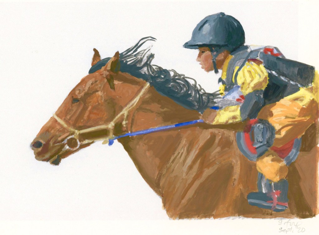
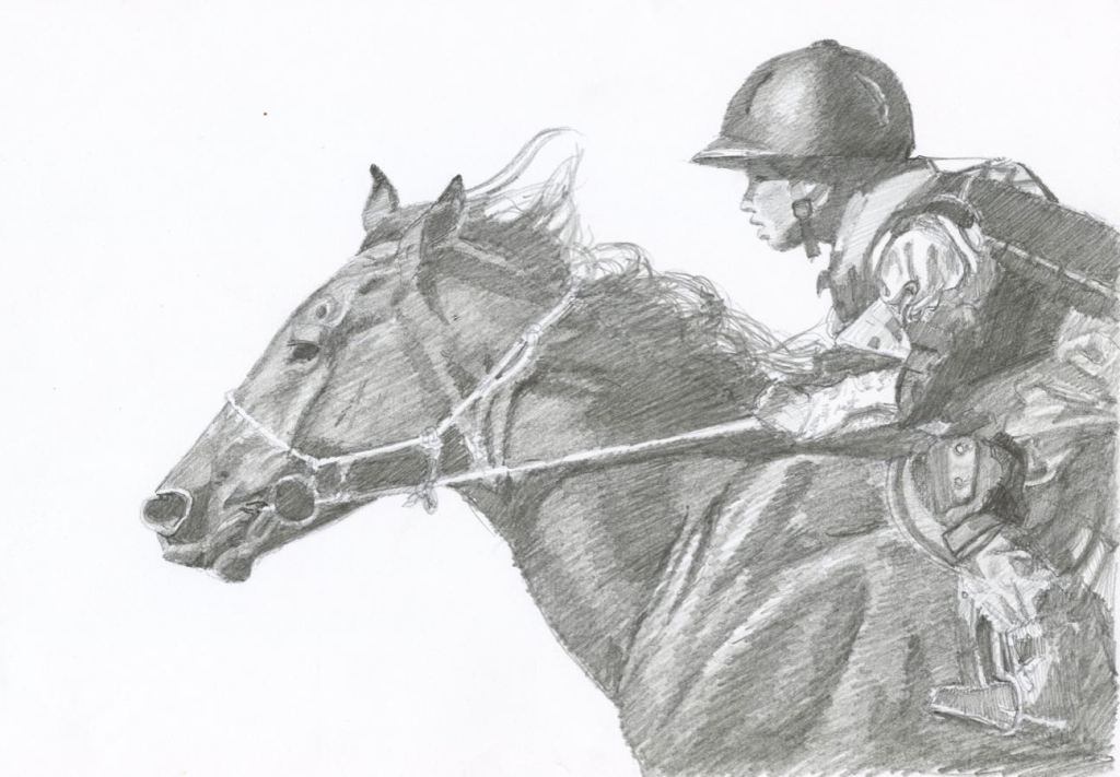
Mongol Horse #5-Evening Run 24x36" oil (price on request)
I was at Ikh Nartiin Chuluu Nature Reserve in Sept. of 2008. While sitting outside my ger, a small herd of local horses came wandering by. It was early evening and some of them were feeling frisky, like this stallion. I loved the quality of light on his reddish coat. The background shows some of the fantastic rock formations at Ikh Nart, which provide habitat for argali sheep and Siberian ibex.
Here’s the step and step creation of this painting:


")


