There are many artists who come up with a way of working that satisfies them and they never alter it. That would not be me. Every year about this time, I sit back and rethink my whole process of painting a picture. I’m perfectly willing to toss it all in the air and tweak and change whatever I think needs it. It’s very liberating.
I recently went to the Norman Rockwell show and was reminded of how thorough a process he used, how he broke down the elements of a picture and solved the problems as much as he could with each step, always leaving the door open for alterations down the road if needed. It’s the same procedure we were taught when I was getting a degree in illustration at the Academy of Art in the late 1980s. One didn’t need to do every step every time, but it was always there to fall back on if one got in trouble. (The steps are: thumbnails, rough drawing for composition, finished drawing, value study, color study, finish)
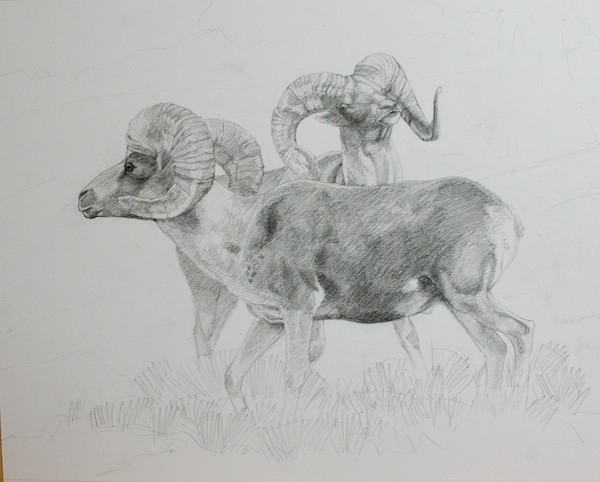
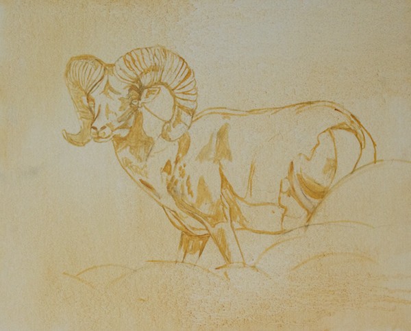
One of the things Rockwell did was very finished charcoal drawings at the final size. It always looked like a lot of work, even though I really love to draw, and I guess I never really got the point. I do now. I got into messes a couple of times in the past year, partly due to not solving all the drawing and value problems before I started to paint. I had begun doing drawings at the final size for the large pieces, but only outlines, no value. I’ve just started a series of three argali paintings and decided to take it up a notch.
I also needed to rethink how I got my image onto the canvas. I don’t have a projector anymore and don’t really want one. I’ve found a lot of value in drawing an animal multiple times because I really LEARN it. A painting shouldn’t be about saving time or doing it fast. It should be about doing what it takes to get it RIGHT.
One benefit of doing the drawings at the finished size is that it is then easy to make a tracing and do a graphite transfer. The alternative is the venerable grid system, which works just fine, but, dare I say it, takes a lot more time to no good purpose and, more importantly, didn’t give me as accurate a result.
These three pieces are compositionally simple. I have a clear idea in my head of where I want to end up. The main upfront decisions were how big and what proportions each one should be since they are intended to hang as a group, although they will be priced individually.
The reference photos (which I am not going to post due the vagaries of the internet) were taken during one action-packed hour with five argali rams at Ikh Nartiin Chuluu Nature Reserve in Mongolia in July 2010. And two afternoons I spent there this past August during an eleven day stay doing studies of argali horns at the research camp really paid off in being able to understand the horns in the photos.
I’ll start with that page from my sketch journal and then show you the steps so far for the three paintings. I didn’t do thumbnails or rough drawings, but went straight to finished working drawings of the animals, but still thinking about what the landscape will look like.
Argali horns, research camp, Ikh Nartiin Chuluu Nature Reserve, Mongolia, July 2012
Painting No. 1- Tentatively titled “Coming Through”, a big ram asserting his right to walk wherever he wants to, when he wants to
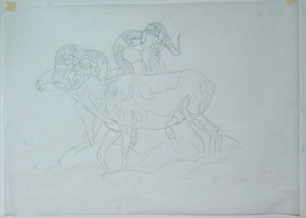
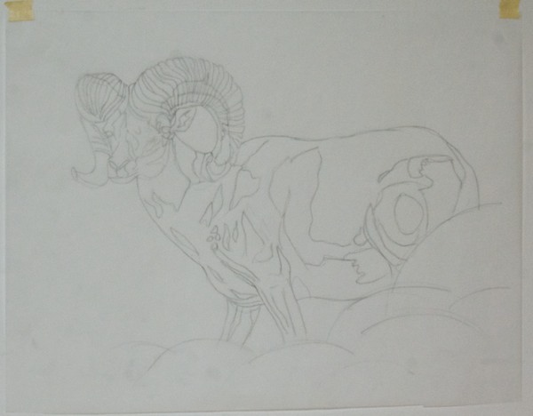
Beginning the graphite drawing; detail to show how I “drew through” the ram in back to make sure the parts all are in the right places. I used another piece of reference for the back legs since the ones in the photo didn’t read well.Finished drawing; graphite on vellum bristolI put tracing paper over the drawing and did an outline only drawing to use for transferring the image to the canvasArgali horns, research camp, Ikh Nartiin Chuluu Nature Reserve, Mongolia, July 2012
Painting No. 2- No title yet
Finished drawing; graphite on vellum bristolOutline on tracing paper; I’m drawing shapes of structure and valuesBrush drawing on canvas
Painting No. 3- No title yet
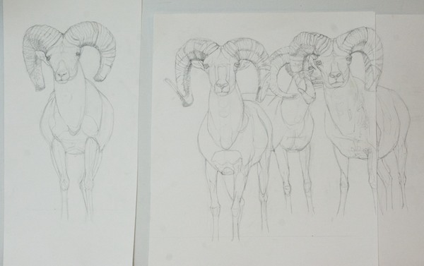
Graphite drawing; this was the third one and felt that I didn’t need to go all the way to the same point. It was more important to get all the size and position relationships between the rams correct. The one in the back looked very odd in the reference photo, so I changed out his head for a profile instead of three quarters view. Notice that the single ram and the group are on separate pieces of paper so I can move them around.The tracing paper transfer versionThe brush drawing
I should have a pretty good handle on argali horns by the time I’m done with all three paintings.
Mandarin Duck 5x7" oil on canvasboard now available
Once again, I’m listing small, affordable original oil paintings on eBay!
For the next week you can bid on any or all of three works. Two are 5×7″ and the bidding starts at $44.95. One is 4×4″ and starts at $34.95. These are one-of-a-kind originals, ready for framing.
I’ll be open this weekend, June 11-12 from 11am-5pm both days. Event information and directions to my studio for this wonderful Humboldt County event is here.
I’ll be open this weekend, June 11-12 from 11am-5pm both days. Event information and directions to my studio for this wonderful Humboldt County event is here.
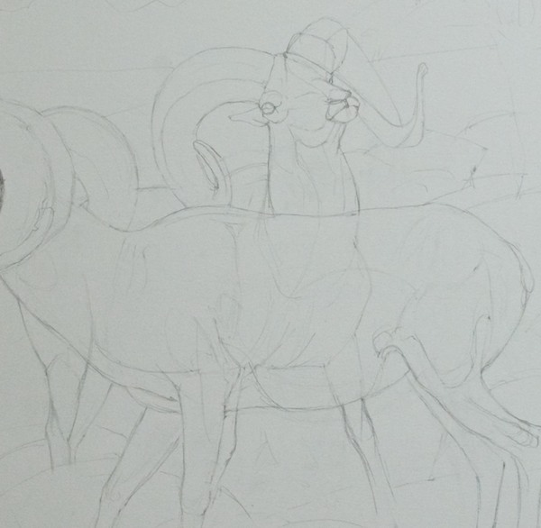
Continuing on from last week, I knew that I was going to do a big painting (big for me, at this point) when the five rams walked across the stream bed in the beautiful morning light.
I also knew that it would be a complex piece that would take more planning than I’d done in the past. I’ve started a couple of big paintings, only to have them bog down and fail because, while I did do preliminary sketches and drawings, I found that I hadn’t really solved some critical problems and then was faced with figuring them out on the canvas. A recipe for frustration and failure.
Not this time. First, I thought about what it was that made me want to paint this scene. It was not only the argali, but the interesting alternating pattern of light and shadow, which started in the foreground and went all the way back. And it was important that it be about my emotional response to this very special experience.
Here’s one of the reference shots. I create Albums in Aperture where I can put all the images I’m using on a painting. In this case, thirteen. Here’s the lead ram.
Since I had a pretty clear image in my head of where I wanted to end up, I didn’t do thumbnails this time. And, having struggled with understanding how to work larger, I decided to start larger right away. This is the first layout, done on 19×24″ Canson Calque tracing paper.
As you can see, I adjusted the proportions as needed. I wanted the emphasis to be on the rams, but still show enough of the background to place them in a specific setting and show that alternating light and shadow pattern.
You will also notice that I have an even number of animals, which breaks a “rule”. But they are in an uneven number of “groups”. This doesn’t happen by accident. Or if it does, then there is a conscious decision to keep it.
I had also done a finished drawing of the two rams, which some of you saw a few months ago on Facebook (you can “Like” my public page here).
The next step was to do a small color rough to figure out how I would achieve the visual effect I was looking for. This is on a 6×8″ canvasboard. I blocked out the part that didn’t fit the proportion.
What was critical was to play up the golden light on the ram’s horns and to make sure the argali were the objects of highest contrast by placing them against the central shadow shape. Notice that I’m just painting blobs of color to get the relationships down.
The central tree has a cast shadow. This is something that has given me trouble in the past. The shapes, edges and value relationships have to be just right. So I did a couple of studies of just that tree, along with another to figure out some of the same things where the stream bed goes back into space.
Now it was time to do a large value study, 12×24″. I adjusted the relative position of the rams, moving the pair forward a little.
I had to know if what I had come up with would work at the final size I had decided upon- 24×48″. This is where I’d gotten into trouble before. I asked an artist colleague for advice and he said to take my finished drawing to a copy place and have it blown up to the final size, which I think is a really good idea.
But I chose to try something else. I have found great value in the re-drawing process. It allows me to refine, correct, simplify and really learn to know my subjects in a way that would not be possible if I simply did a drawing, transferred it and started to paint, or worse, heaven forbid, projected them. The depth of understanding and flexibility I get is critical to the quality of my finished product.
First I put a sheet of tracing paper over the drawing above and drew a one inch grid on it.
Then I placed my untoned canvasboard on the easel and ruled a grid on it in pencil. I taped tracing paper to it. It took three sheets to cover it. I lightly sketched a transfer drawing so that every element was in the right spot.
Once the background was laid in, I taped on three more pieces of tracing paper and did the final pencil drawings of each argali. Now I had this:
Because the argali were all on their own pieces of paper, I could do a final check on position and easily move them if needed. I also now had the whole composition at the final size and could see that it did, in fact, work. Whew!
I removed the tracing paper, toned the canvas, re-attached it and, using a No. 7 pencil and a sheet of homemade graphite transfer paper, transferred the drawing.
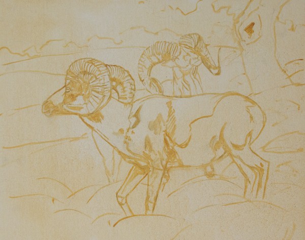
Using the tracing paper drawings as a guide and referring back to the photo reference if necessary, I carefully re-drew the argali with a brush, figuring I’d get the most important elements down first. Here’s a close-up which also shows the loose lay-on of the background. Notice that you can see three of the four hooves. They vanish later as I decide to add additional and larger rocks to create more of a visual separation between the sheep and the viewer.
Here’s the finished drawing, with basic values starting to be indicated. Notice that the rocks in the foreground and middle ground are just roughed in. No need to spend a lot of time on them at this point.
Finally it was time to start adding color! I work all over a canvas in a sitting, keeping the edges soft and letting colors “bleed” into each other. This lets me control where the harder edges will be later on. I’ll also “lose” the drawing, knowing that, having drawn the animals multiple times, I can “find them” again with no problem. First I established the shadow shapes, letting the undertone be the light.
Here’s a close-up of the lead ram in progress. Still keeping it loose, but working on light and shadow and correct structure.
I started to see a problem in the forequarters and it nagged at me for a couple of sittings until I realized that the leg closest to the viewer was too far forward. Moving it and the shoulder back about a quarter of an inch solved the problem. His head was also a little too small. That’s a big advantage of working this way. I can make changes at any point in the process, which turned out to be really important when I was trying to keep track of so many pictorial elements and their relationships to each other.
Let’s take a quick break. Here’s my palette. For this painting, I used my standard color range: transparent oxide red, cadmium red medium, cadmium orange, yellow ochre light, cadmium yellow pale, cadmium yellow, titanium white, ultramarine blue, Winsor violet (dioxine), sap green, terra verte, chromium oxide green.
Missing this time around is cobalt blue and magnesium blue hue. I mix my own earth colors and greys. My black is a mix of transparent oxide red and ultramarine blue. I can easily shift the color temperature by changing the proportions.
The palette itself is a scrap of Swanstone solid surface countertop. I got the idea from another art blog and I like it much better than the glass one I’d been using.
Ok, back to the painting. I’m probably about mid-way through at this point. All the value relationships are set (at least I thought so) and basic colors are on.
Oh, darn. I realized that having all the rams in the same light wasn’t very interesting. I went back to my reference images and found a nice shot of the very first one coming out of the shadows. Now I needed to put the fourth ram in that light. Aperture is great for this since it lets you show multiple images at once.
Much better. Having solved that final, somewhat major problem, it was now a matter of simply pushing on, solving all the problems, making decisions, tweaking and tweaking (what Scott Christensen more elegantly calls “orchestration”).
Until, finally, after far longer than I have ever spent on a single painting, it was done.
Then They Walked Out Into The Morning Light 24x48" oil
SAA members and guests at the opening weekend of the 49th Art and the Animal; Rolling Hills Wildlife Experience
This post was originally written for the Society’s Facebook public page and blog, but I wanted to share it here since I think what I have to say relates not just to what my thoughts are about applying to join the SAA, but also lays out in general some of my beliefs about what makes good animal art. It’s illustrated with images of various members of the Society, who I am proud to call my colleagues and friends.
The deadline for the next round of consideration is coming up in mid-April. I thought that, having participated in three membership juries now as a member of the Executive Board of the Society, I would offer some observations and tips that might be helpful to those of you who aspire to membership in the SAA.
A couple of notes before we start- First, I’m a painter and that’s what I know best. What I’m going to say applies to most other media, but creating a successful painting will be my main focus. Second, this article represents my personal views and is not an official statement by the SAA, any of its officers or the other board members. If you have any comments or questions, please direct them to me.
Now, to begin: I recommend that you do this exercise. Go to the Society’s website, visit the virtual museum and the individual websites of any member’s work that catches your eye. Then get out at least eight or ten of your own pieces. Line them up. Look at them objectively. This is not easy. We tend to be either too hard or too easy on ourselves. Do your best to be honest since that is when opportunities for growth happen.
The late Simon Combes giving a demonstration; Lewa Downs Wildlife Conservancy, 2004
Representational painting in general, and animal art in particular, have well-established criteria for what constitutes a “good” painting. These principles have evolved over a number of centuries. They are not “subjective”.
You are not in competition for a limited number of spots as would be true with a juried show. We usually have between two and three dozen applications to consider. We can accept all of them. Or none of them. Each applicant’s work is judged on its own merits.
Greg Beecham at the Quick Draw; Susan K. Black Foundation art conference, 2005 (Suzie Seerey-Lester to left)
Pick one piece that you honestly believe is at or is close to the level of the work of the artists who are already members.
You now need four more at or near that level, because one of the things that will sink an application fast is one or two good pieces followed by the jury seeing the next three or four go off the cliff. You will be judged by your weakest pieces. Consistency is very important.
Kent Ullberg gets inspired at the SAA 50th Anniversary event; San Diego Safari Park, 2010
Consistent in what? Glad you asked…
1. DRAWING: Animals have a physiological and behavioral reality that a competent animal artist has to understand and demonstrate to the jury. In other words, you need to be able to draw them with accuracy and understanding if you are a traditional representational artist and clear understanding if you are going to handle them in a more personally expressive way. You are hoping to join the ranks of animal artists who have been doing this, in some cases, for decades. They know if the drawing is correct or not. Which way a leg can bend, how a wing moves in flight or what the pattern of spots are on a leopard are not really subject to debate, however open they are to informed interpretation.
Karryl sculpts on location at the 50th Anniversary event; Rolling Hills Wildlife Experience, 2010
2. CRAFT: We want to see a solid understanding of your chosen media, whatever it is. If you decide to submit work in more than one media, then all of them need to be at an equal level of competence. Don’t submit a little of this and a little of that, hoping that something will stick, like spaghetti on a wall.
David Rankin on location, ready for anything at Torrey Lake: Susan K. Black Foundation art conference, 2005
3. DESIGN AND COMPOSITION: Do you have a solid grasp of design and composition? Have you made a conscious decision about every element of your piece? For instance, are the subjects in the majority of your submissions plopped automatically into the middle of the canvas or thoughtfully placed to carry out your central idea?
Andrew Denman gets worked over by an affectionate bobcat; he, Guy Combes and I visited the Sierra Endangered Big Cat Haven last year
4. PERSONAL VISION: Are you creating art based on a personal vision or simply copying photographs? (It is well-known that photographic images flatten and distort three-dimensional subjects like animals, so the artist must learn how to compensate for that if their goal is a realistic representation.) What do YOU have to say about lions and elk, butterflies and buzzards? Let your opinion, point of view and passion come through. HAVE an opinion, point of view and passion about your subjects.
John Seerey-Lester paints a mountain lion; Susan K. Black Foundation art conference, 2005
5. KNOWLEDGE: Do you understand basic animal anatomy? Do you understand the habitat of the species you are representing? Have you learned about their behavior as an inspiration for your work? Or is everyone just standing around? If you put an animal in a realistic setting, you are now a landscape painter too. Are both your animals and any habitat shown depicted at the same level? Or does one lag behind the other?
Yours truly hard at work in the Gobi, Mongolia 2010
Animals are specialized subject matter that require study and the accumulation of knowledge over time to represent successfully. There are no shortcuts.
We are looking for artists who have mastered their art and craft at a consistent level and who present us with a body of five works which all reflect that level.
Sometimes the Art Fairy floats down on gossamer wings and whispers something in your ear like….warthogs. And one must answer the call. So, I’m taking a break from my beloved Mongolian subjects and doing a painting of a warthog.
But first, here’s the azalea in full bloom that I can see outside one of my studio windows. It really brightens up a grey day.
On to the warthog. It’s from a reference shot I took during the October 2004 art workshop/safari in Kenya that I and ten other artists went on with the late Simon Combes. You can see pictures of the whole, wonderful trip here. The painting is 20×30″, a size that I use quite often.
Starting with the brush drawing done directly on the canvasLaying in the shapes of the shadowsFirst pass of all over colorSecond pass of color on the piggy
I’m currently working on a large painting that is the most complex one I’ve done yet. I’ll post it when it’s finished. But, in the meantime, I’ve kind of taken a break from it on and off to do something simpler and more straightforward, a head study of a takhi stallion I saw at Hustai National Park in 2006. I had a reference shot that I liked because of the shadow pattern, but as you’ll see there were adjustments that had to be made for it to work as a painting. I hope this step-by-step illustrates how important it is to not, as they told us in art school, get “married to your reference”.
My subject is on the right. A stallion keeping an eye on his mares on a sunny fall day.The reference photo. It's a little out of focus, but, hey, I'm an artist. 🙂When it's a simple subject like a head study, I dive right in with a brush drawing. Notice that I'm looking for basic shapes, not detail.First pass with color, laying in shadow areas.All-over basic color lay-in. Composition, drawing, value pattern set.About mid-way through. The stage is set for the fun part. Head is almost done and it's time to do the neck, ear and mane. I worked those folds for most of yesterday afternoon. They had to read correctly, but not stand out too much. Notice that by this point I've ditched the hard cast shadow because it was too visually distracting. I want viewers to look at his head, not his neck. I worked the boundary of the shadow until I got what I wanted, keeping the edge soft.The horse is done. Now I've started to put in a second color on the background. Not sure where I was going to go with it, but ended up liking it enough that I made it the final color. I liked the complementary color relationship between the reddish horse and the greenish background.Hustai Takhi Stallion 22x28" oil on canvasboard


