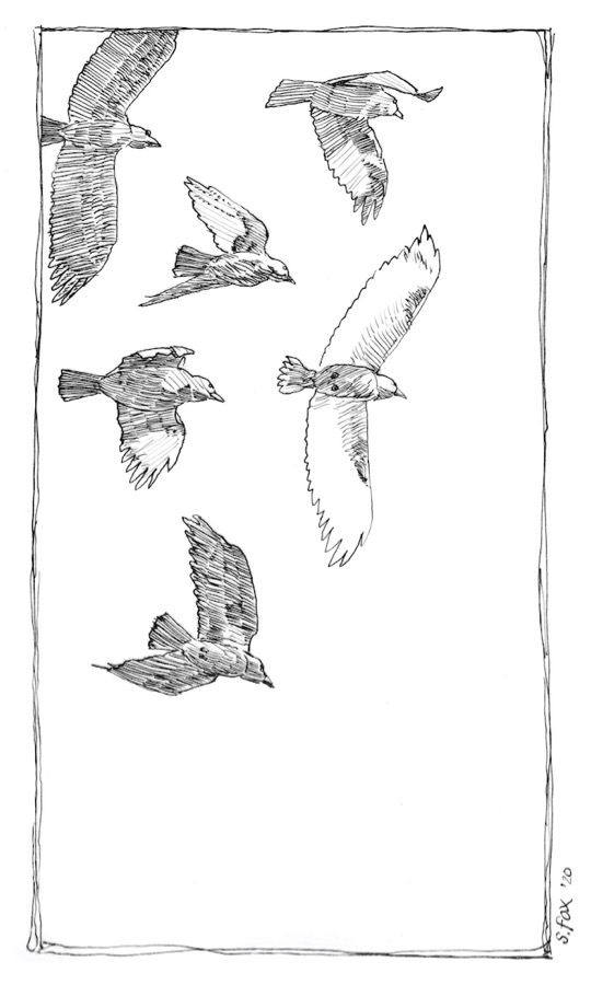
I’m excited about doing this new event from the folks who also created Inktober. It’s called Inktober52. As in a drawing a week for a year. Due to upcoming travel I’m pretty sure I won’t manage the full year but I’m going to do my best. They’re emailing us each week with a prompt. I missed last week but did a “make up” drawing yesterday and this week’s drawing this morning.
The prompt:: “Flight” (above) I’m planning to mostly use dip pens. “Rooks, Mongolia” A big flock of rooks (related to crows) flew over me on one of my trips to Mongolia. They were all black except one, which was white, very unusual. Esterbrook Drafting #825 nib on Canson Vidalon vellum.
The prompt: “Shadow” (below) “Patio Chair”- I’d been wanting to do something with the photo for awhile and there will probably be a painting at some point since the chair is a nice lavender, but this taught me how to draw it and work out basic values. Noodler’s Black on Canson Vidalon Vellum with a Perry & Co. #120EF nib.
I’ll have some paintings to show soon, but lately I’ve been mostly diving into dip pen and ink sketch studies, trying out various nibs I’ve been accumulating for the last year. I used dip pens for calligraphy and drawing back in the 1970s/1980s, but moved away from pen and ink for color illustration and then, for the last 20 years, oil painting.
Life moves on, changes are made and now I’m going to be painting somewhat less, but still entering a selection of good juried shows and doing subjects that I’ve wanted to get to for quite awhile. I’ve also realized that I don’t really enjoy painting on location. It’s always felt like, well, Work. But sketching? Never anything but a joy and a pleasure. So I’ll be doing my oil painting in the studio from now on and working on location in pen and ink, sometimes watercolor and maybe some other dry media like Berol color sticks.
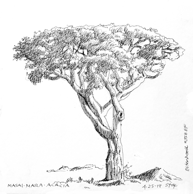
“Masai Mara Acacia” Esterbrook #358 EF on approx. 4×6″ Strathmore 300 vellum bristol
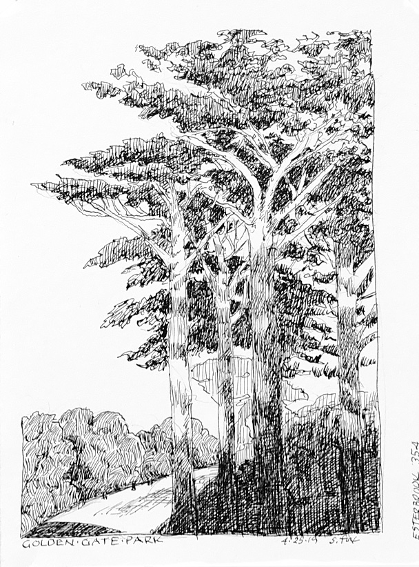
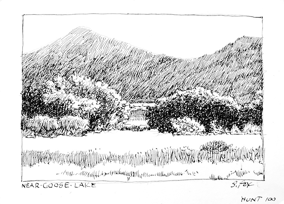
I’ve done these three landscape and tree studies in the last couple of days, trying out what are considered to be some of the finest nibs made specifically for artists.
I’ve also added handlettering back to the mix, something I’ve also did back in the last century. You can learn more about that and see three sketches that also use pen lettering over at my SketchWild site. Check it out and let me know what you think in the comments!
SketchWild is the new place to go for information, tutorials on sketching the natural world, including animals, in pen and ink and also watercolor. And sometimes both! Please click HERE to check it out and let me know what you’d like to learn about. I’ve been sketching on location since 1989, including Mongolia, England, Germany, Portugal, Romania and, in the USA, many states including Hawaii and a variety of national parks and wildlife refuges. And now I want to offer what I’ve learned and encourage people to pick up a sketchbook and pen or pencil to experience nature in a new way. (Note: Fox Studio, foxstudio.biz, isn’t going anywhere. I’ll still be posting my oil paintings, exhibition news and stories of my travels there, along with tips and techniques and the work of artists I admire.)
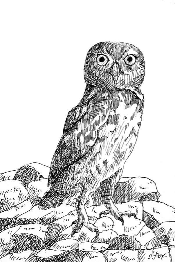
As I did last year, I’ve donated two pen and ink originals for the Explorers Club Annual Dinner auction. This year I decided to do birds that I’ve watched and photographed in Mongolia. I’ve seen little owls a number of times in a variety of locations…perched on a herder’s storage box near the shore of Orog Nuur, a remote lake in the Gobi, peeking out from behind a rock at Ikh Nartiin Chuluu Nature Reserve and a number of them sitting out by their burrows, which they’d dug into the ruined ramparts of an ancient Turkic settlement, Khar Balgas. Unlike the owls most of us are familiar with in every case it was full daylight.
“Hoopoe, Mongolia” 6×4″ pen and ink on paper
Hoopoes have a very large range…from Mongolia to Africa to Europe. I have found them to be one of the most challenging birds to get decent photos of. It’s almost like they tease you, letting you get…almost…there and then flying off to the next tree. But persistence has paid off at Ikh Nartiin Chuluu Nature Reserve in the valley where the research camp is located. My subject was one of a family group of three I spotted up on the top of the rocks in the late afternoon. I was able to approach just close enough by working my way towards them behind large rocks at the edge of the valley floor to get a number of photos with my 80-400 lens at maximum range.
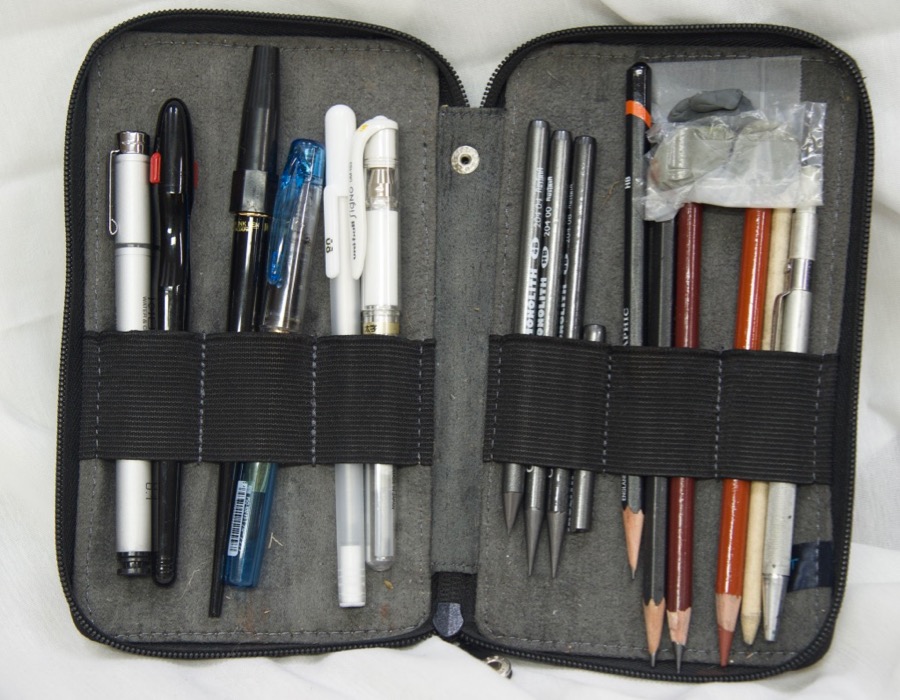
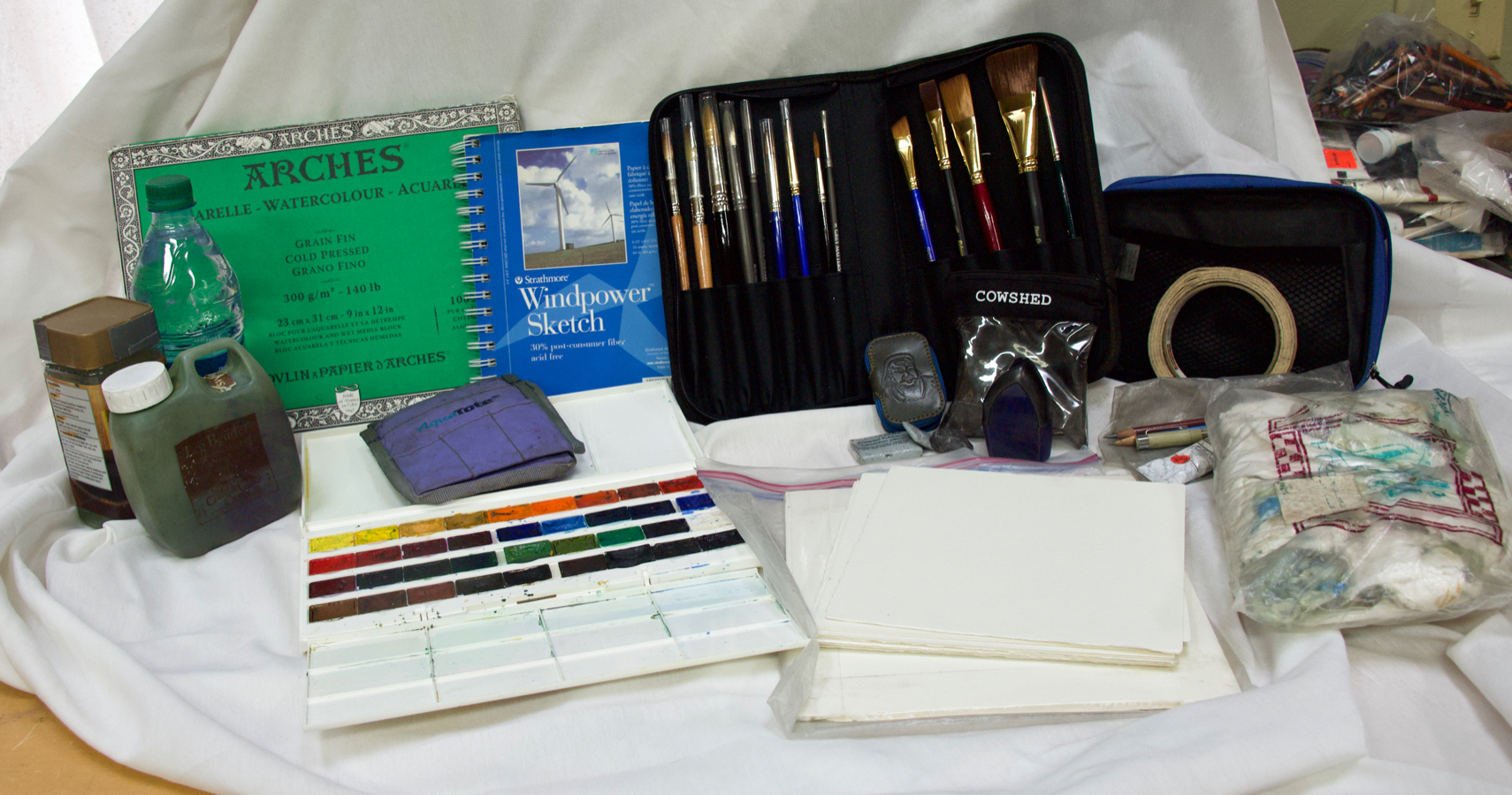
Most of you know me as an oil painter, but I’ve always loved to sketchand draw with pencils and pens and I also paint in watercolor on location. Dating back to 1989, I take at least a small sketchbook and kit like the one above with me when I travel.
I’ve enjoyed seeing sketching take-off as an international art phenomenon and I’ve decided to formally throw my well-loved field hat into the ring. Before the end of the month I’ll be debuting a new website dedicated to sketching called “SketchWild”. It will include not only my field and travel sketching and painting, but also art supply reviews, tutorials and online classes. Tell me in the comments what you’d like to learn!
My specialty and favorite subject has always been animals. I seem to be one of a surprisingly small number of artists who draw and paint from live animals and I’ll offering tutorials on how you can do that, too.
If you’ve never sketched before and want to try it but don’t know where to start or if you’re a landscape painter who occasionally wants to add animals like, say, a cow or horse, to your painting but don’t know how to draw them, I’ll be offering classes and/or sets of tutorials for both. I’ll also be offering instruction in pen and ink sketching/drawing with technical pens, fountain pens and dip pens regardless of subject and tutorials on sketching with an iPad, including a review of the variety of apps available. And there are a lot of them!
In the end it’s not about, or only about, making finished pretty pictures, but enjoying the process and seeing the world through art you’ve created yourself. Some of the best souvenirs you can take home are the sketches you did of what caught your eye.
To give you an idea of what I’ve done over the years, here’s a selection from my sketchbooks. Some, like the animals were done very quickly, in maybe one to three minutes, sometimes less. The landscapes hold still so I can spend more time on them. And if I can add an animal, so much the better!
Rolling Hills Wildlife Experience, 2010
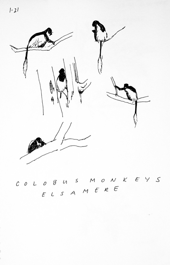
Monkeys don’t hold still for long so you have to work fast and see the basic shapes, in this case a quick indication of light and shadow to go with the drawing.
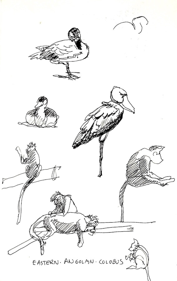
Colobus monkeys, Elsamere, Kenya, 1999
These colobus monkeys were fairly far up in the trees and jumping around so I simply and quickly sketched in the black bodies, leaving the white feathering the color of the paper.
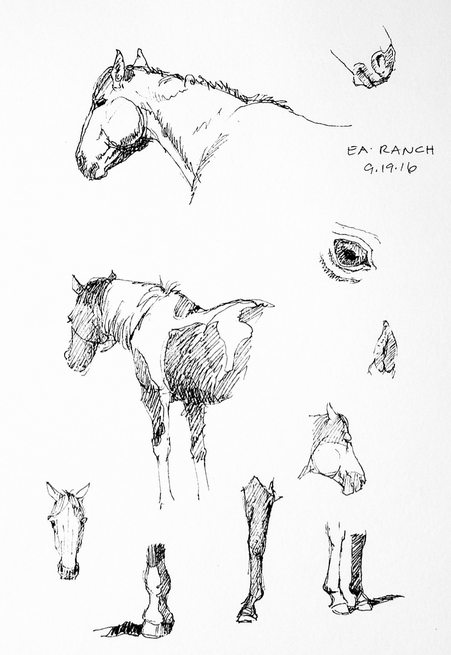
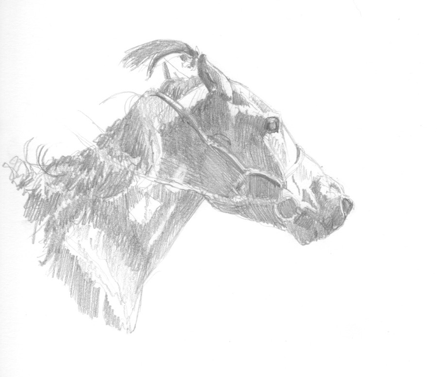
Horses, EA Ranch, Wyoming, 2014
The horses were in a corral standing around, so I had time to add things like the pinto markings and do eye, leg and hoof studies.
I was sitting up on the rocky hillside of a valley in the reserve when I did these quick sketches of the world’s largest mountain sheep. I’ve seen them many times and have painted them, so I “know what they look like”.
Berlin Zoo, 2004
These barbary sheep and tahr posed nicely for me so I was able to do much more finished sketches that I usually manage.
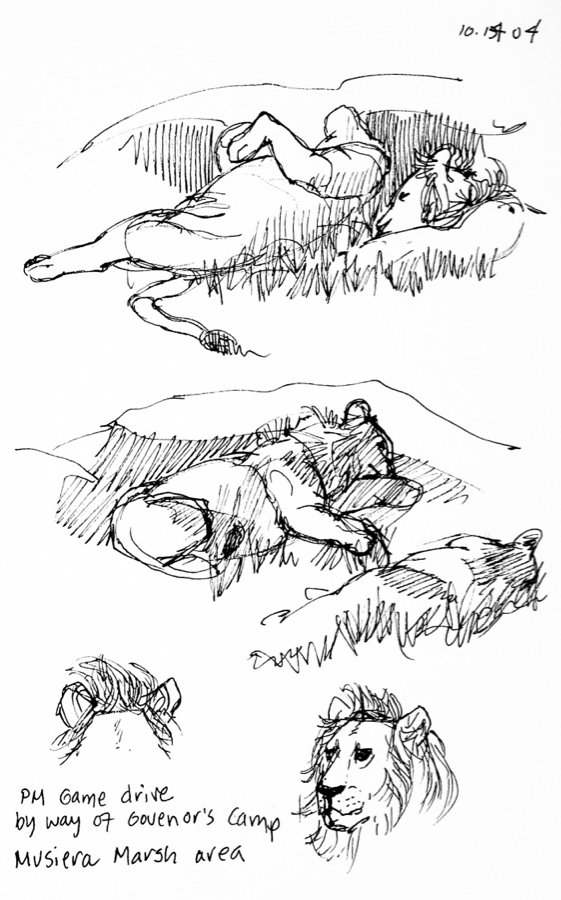
African Lions, Masai Mara, Kenya, 2004
I’ve had the good fortune to go to Kenya twice, once in 1999 and once in 2004 and would love to get back there sometime. We were driving to our campsite and came upon this lion and lioness in the throes of “temporary love”.
While animals are my favorites subject, I sketch pretty much anything interesting that crosses my path. I also like to record an animal’s habitat, which creates a specific kind memory that one doesn’t get from only taking photos.
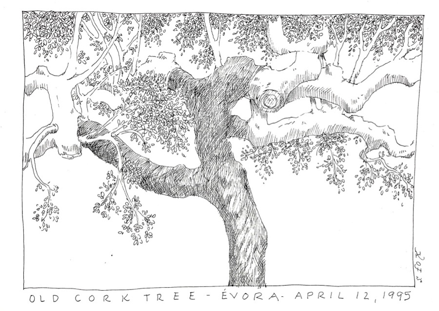
Cork tree, Portugal, 1995
On a trip to Portugal with a number of other artists we stayed at an old farmhouse that was surrounded by cork trees, the same ones that wine corks come from. They were full of character. I was interested in the twisting branches and trunk.
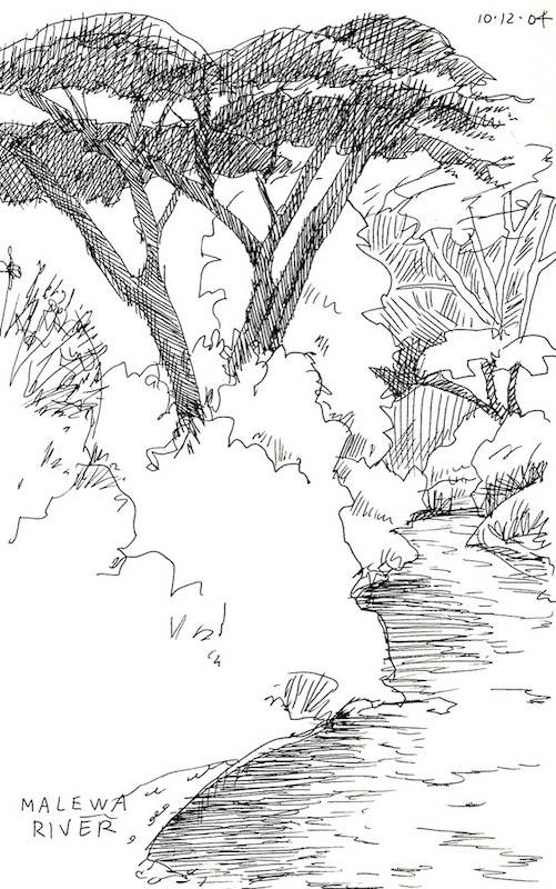
Malewa River, Kigio Wildlife Conservancy, Kenya, 2004
This scene was near the lodge we stayed at in the conservancy. I didn’t have a lot of time between breakfast and departure, so I focused on the river going back in space, the large, tree and left the rest of the vegetation as outlines.
I’ve had the good fortune to travel to England quite a bit over the years. I love drawing the wonderfully picturesque historic buildings.
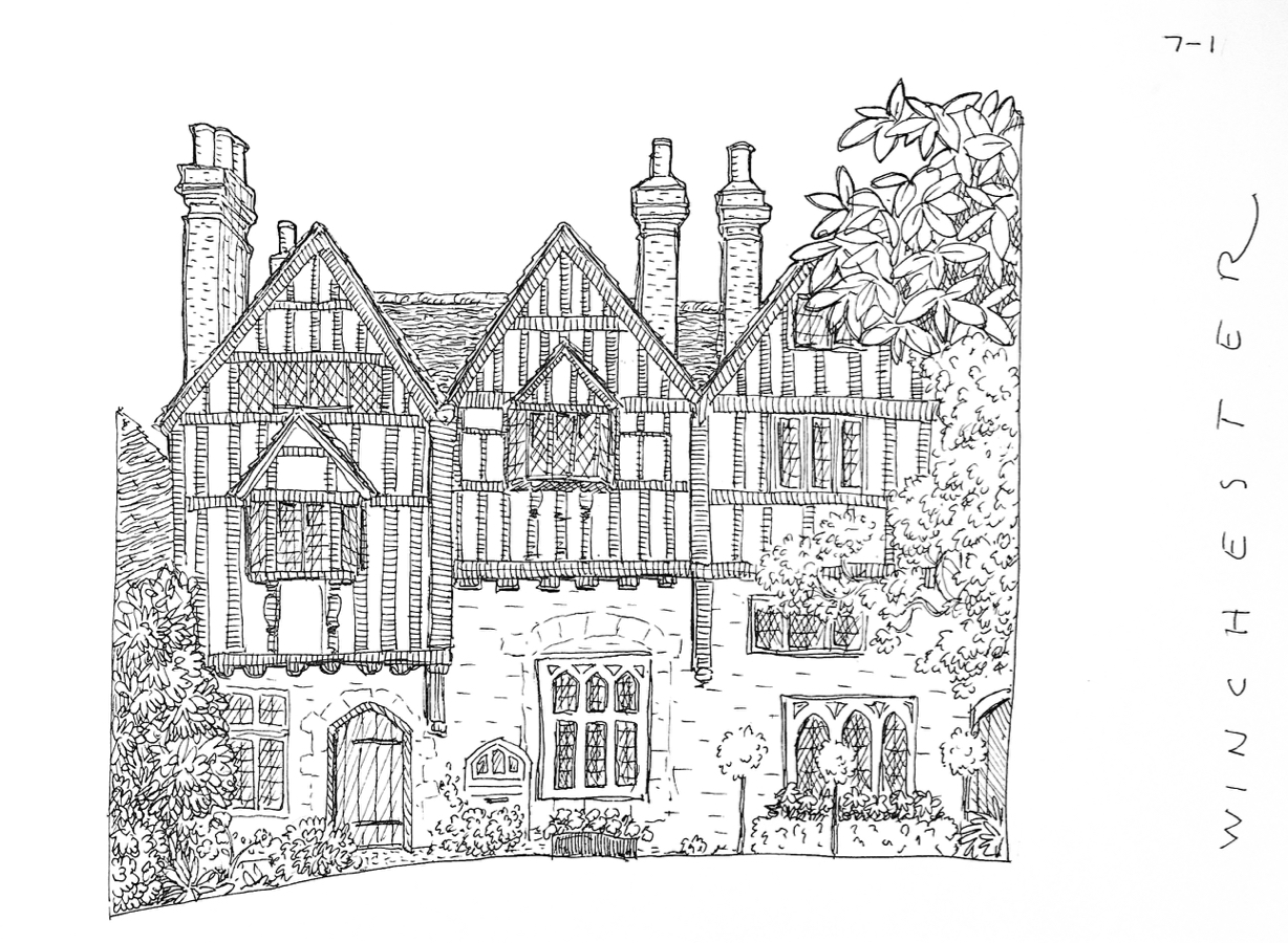
Winchester, England, 1995
I had plenty of time to lovingly sketch the half-timbering, windows and shrubs of this wonderful old building.
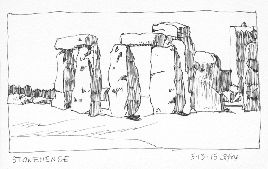
Stonehenge, England, 2015
Getting to sketch at Stonehenge a few years ago was a tremendous treat. In order to do a number of drawings from different angles I kept it really simple….the shapes of the stone themselves and then filling in the shadow sides.
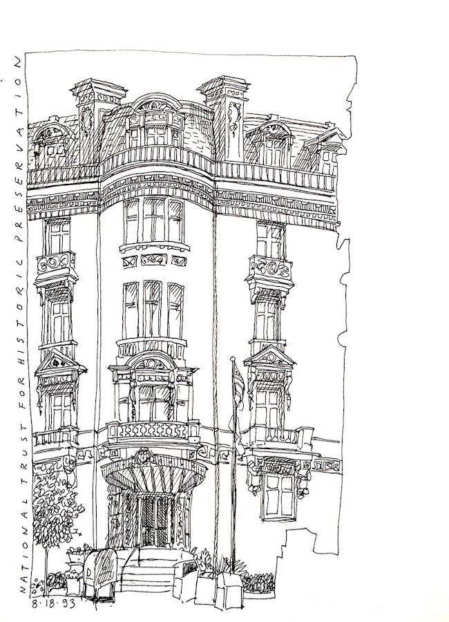
Washington D.C., 1993
I also sketch during trips around the USA. I enjoy playing around with edges, cropping in as needed. I didn’t want to bother with the building next to my subject, so I just left it as a silhouette in reverse.
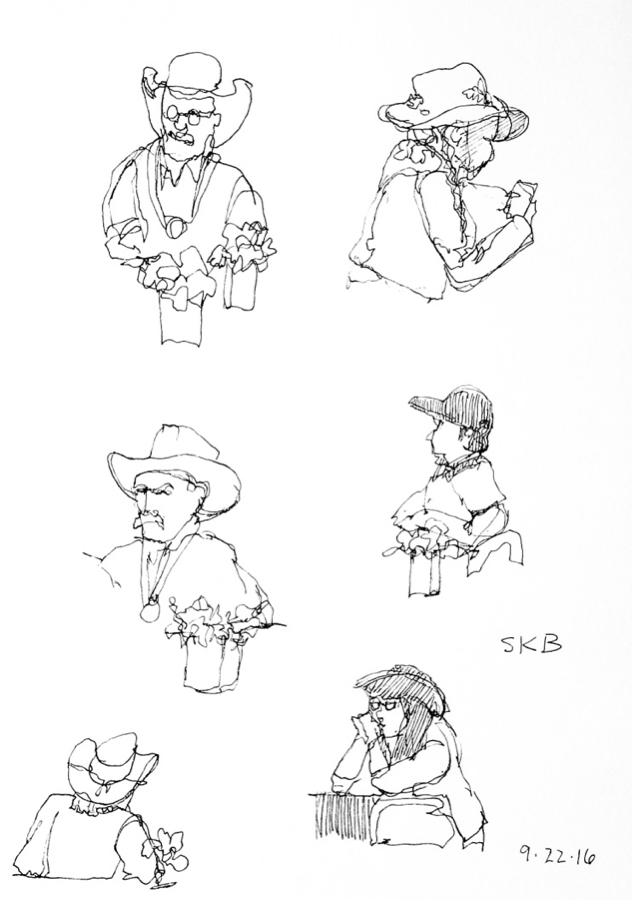
Susan K. Black Foundation workshop, Wyoming, 2016
When I did these super quick people sketches I was experimenting with contour drawing. None of them took more than a minute or so. I’ll be showing you how to do it.
The above sketches were done with pens, mostly Sakura Micron .01s. I also work in watercolor on location.
My current travel watercolor kit.
All of the above goes into an REI daypack.
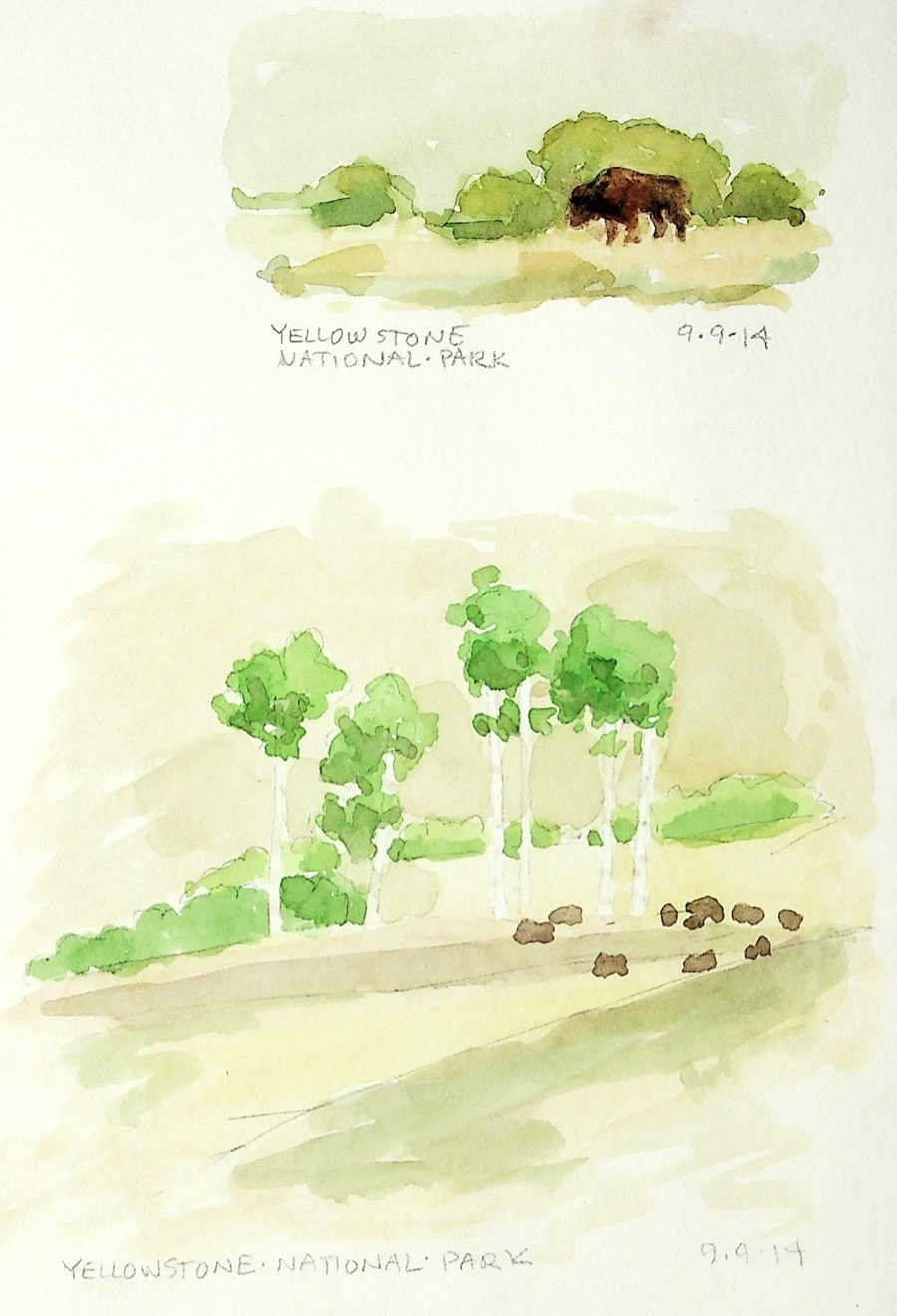
Bison, Yellowstone National Park, 2014
Quick watercolors just to capture the day and the bison.
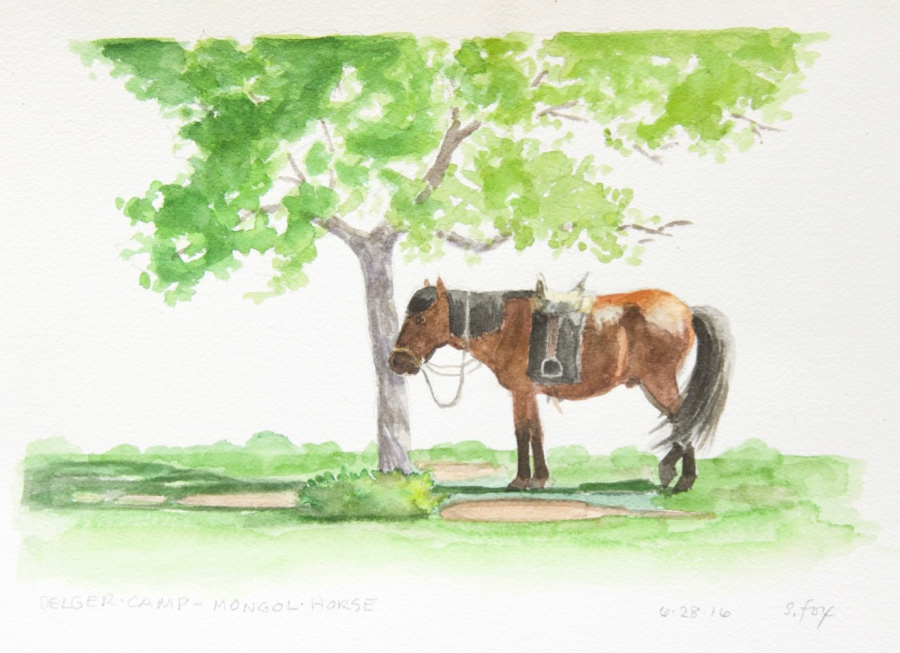
I spent a couple of hours on this painting, making sure that not only was the horse drawn correctly, but that the saddle and bridle were right. I went up close a number of times to check details. The horse would shift a bit, but then back into the position I’d drawn. Something to remember about sketching animals…they tend to move in a repeating pattern, so one can stop, wait, maybe start another sketch, then pick up the first one once your subject is back in place.
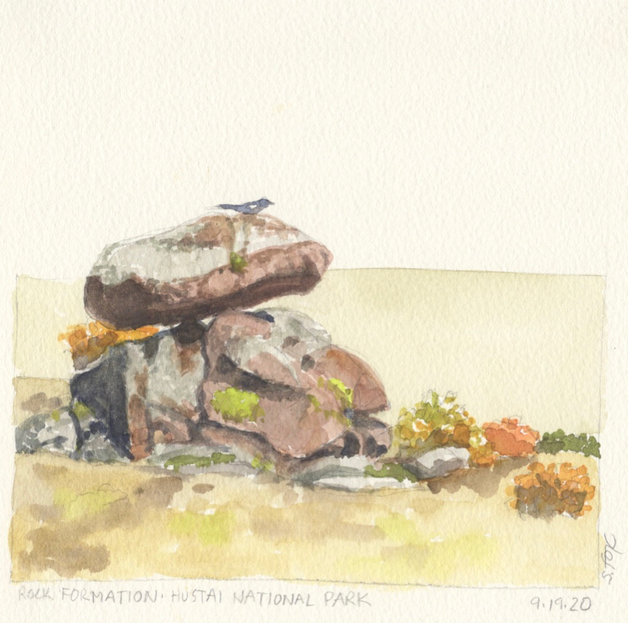
Bird on rock, Hustai National Park, 2012
I was sitting on a rock at Hustai, painting this interesting and colorful small rock formation and the surrounding fall foliage when the bird, I think it was a magpie, landed on the top one. I dropped my brush, grabbed a pencil and quickly sketched it in.
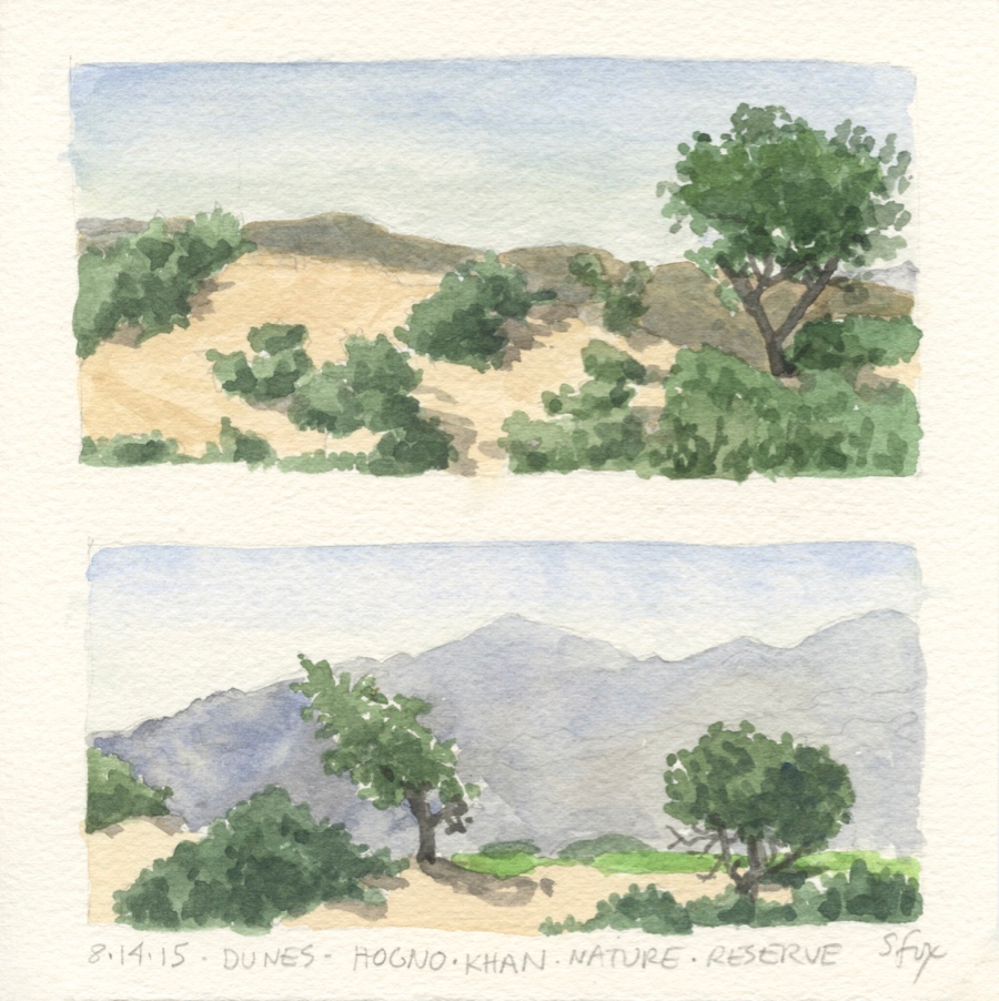
Dunes, Hogno Khan Nature Reserve, Mongolia, 2015
I carry a small stack of 8×8″ pieces of Sanders Waterford cold press watercolor paper with me in a gallon ziplock baggie, along with a small foamcore board with packing taped edges and a roll of drafting tape. I’ve found that I really like the small square size and can, as I did here, easily place two smaller horizontal format paintings on it.
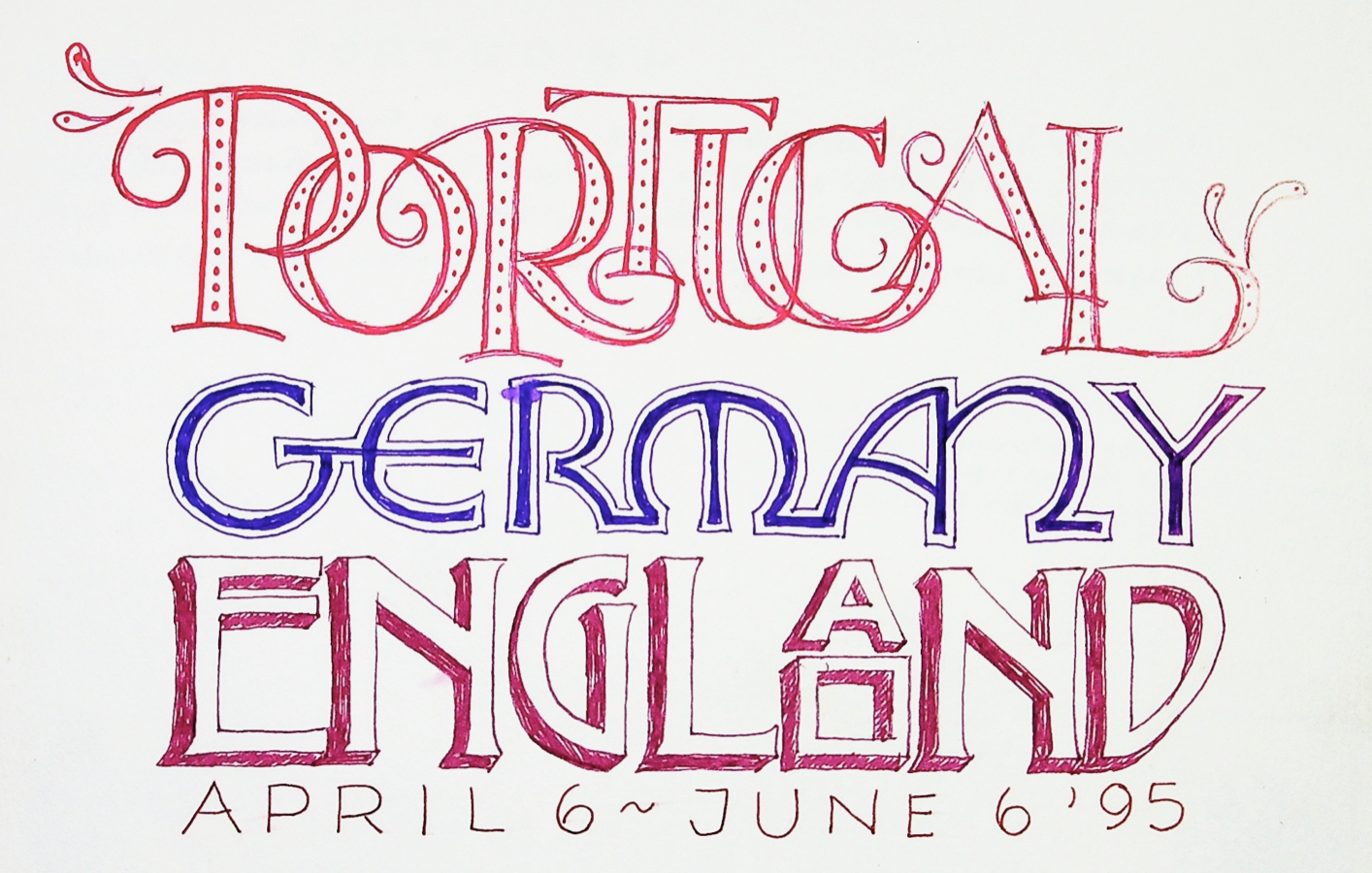
And, lastly, I’ve done calligraphy and handlettering for over forty years. Both are also undergoing a revival and I’m considering offering tutorials and maybe a online class or two for that. Here’s a few samples of my lettering…
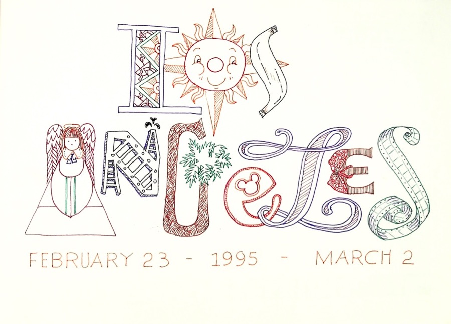
Title page for 1995 trip to Los Angeles
Title page for 2016 sketchbook
Journal title page, Mongolia, 2016
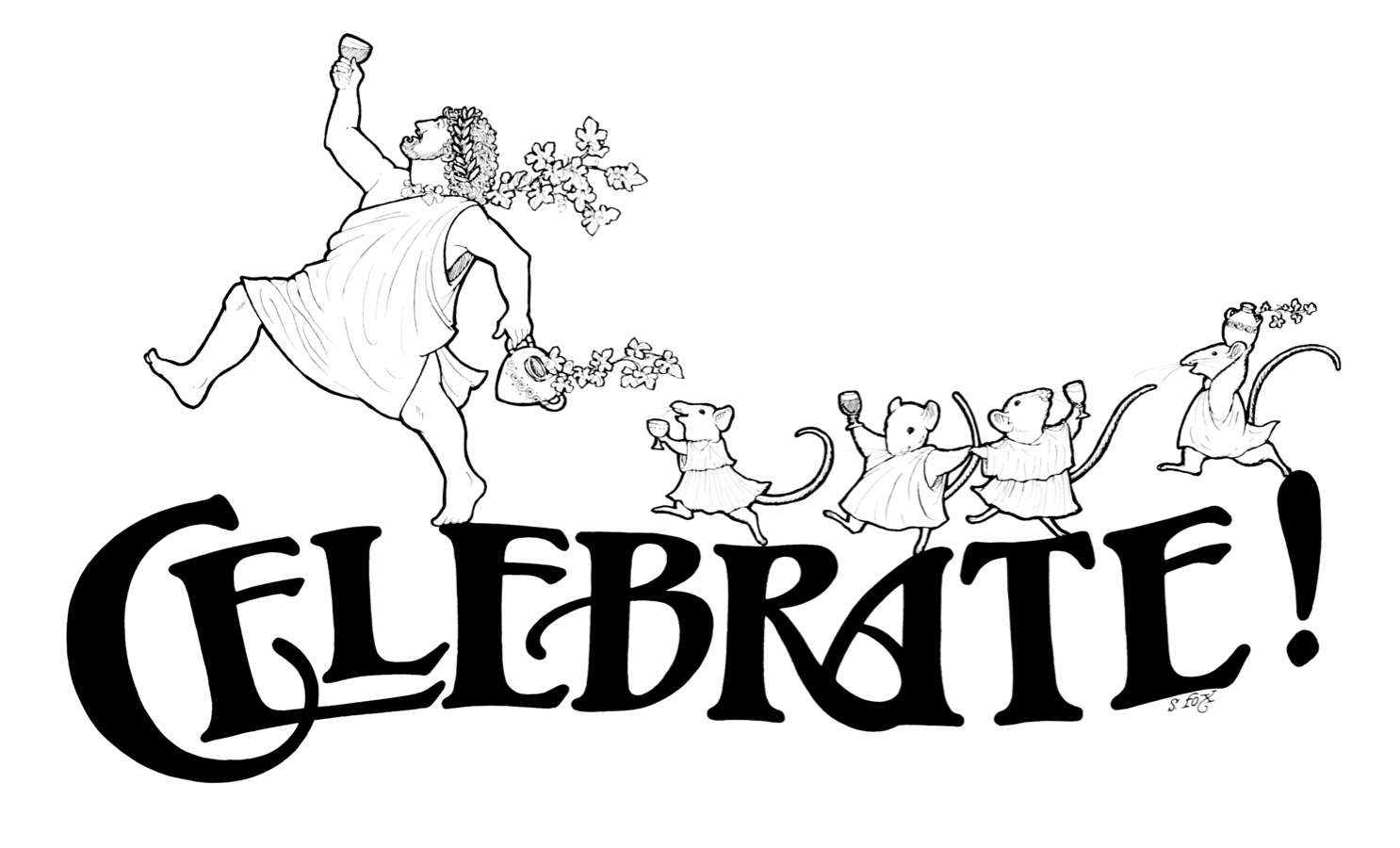
From my illustration days, the heading for wine tasting calendar,
I’ll be posting the latest news about SketchWild here on my regular website and also in my Facebook group, FoxStudio. Let me know in the comments what you think and what you’re interested in learning!
Inktober 5 – “Marabou Stork” Moving on now to my fountain and dip pens. I saw this marabou stork on a 2005 art workshop/safari in Kenya. He was one of a number storks and lots of vultures hanging around a cheetah kill. I used my Pilot EF pen for this one. I think it was a little too fine for the size of the drawing and the time I wanted to take to do it, around 90 minutes. But it turned out ok. I used my go-to drawing paper, Strathmore 300 vellum bristol.
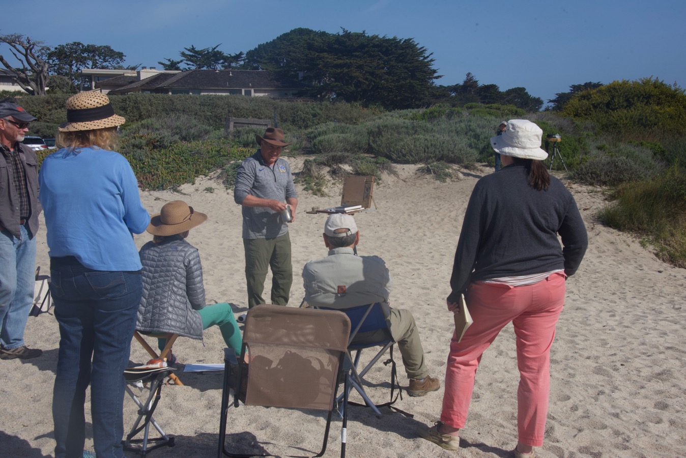
Paul gets the workshop under way with a demo at Carmel River State Beach.
I headed down the road April 21 for a plein air workshop with an artist I’ve admired for some time, Paul Kratter. I’ve always been sorry that I missed having him as an instructor in animal drawing, by just a year, at the Academy of Art University (then College) in San Francisco, where I earned a BFA Illustration in 1989. But we crossed paths and connected on Facebook a few years ago and I’m a great admirer of the plein air work he’s known for these days. It has the crispness and concise draftsmanship that one sees in the work of many artists who have an illustration background. So when I saw that he was going to be offering a workshop, “From Sketch to Painting”, within driving distance of where I live in Humboldt County, I signed up immediately.
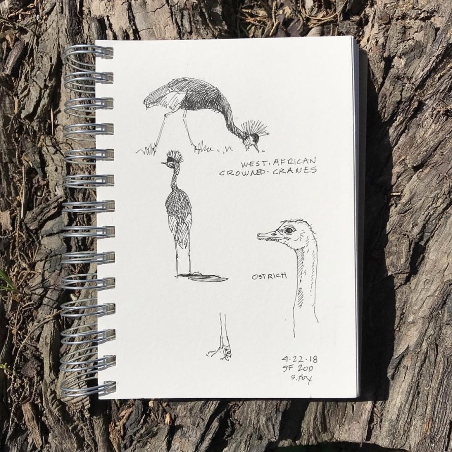
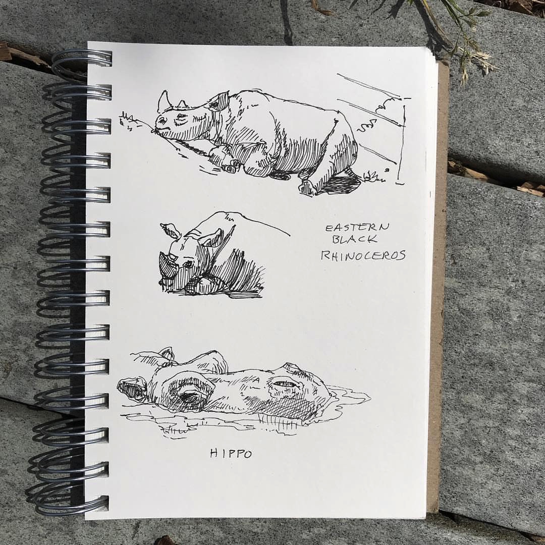
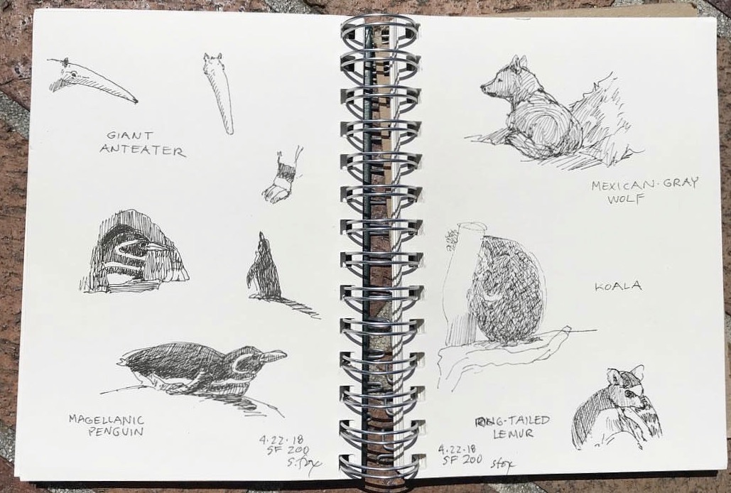
Looking to capitalize on the trip, I left a day early and went as far as San Francisco, staying the night at an inn right across from the San Francisco Zoo. Sketching live animals is something I’ve been doing since 1989, starting at the same zoo while I was at the Academy. I was there when they opened in the morning and left to head down to Carmel in the early afternoon. Here’s the results. I only had, at most, a minute or two to capture most of them. The hippo and penguins were nice enough to stay still a bit longer. The koala never even twitched. I used a Sakura Micron .01 pen in a 7×5″ Pentalic Nature Sketch sketchbook.
I arrived in Carmel, checked into my Airbnb room, got a bite of dinner, then went to Carmel Visual Arts to watch Paul do a demo by way of introducing what he was going to teach us over the next three days.
The next morning we all met at our first location, Carmel River State Beach, where Paul did another demo. I’ve personally never been much of a fan of them since in my experience they’ve mostly been about how the instructor paints with very little that was relevant to me and my goals as a painter. But both Paul’s and Scott Christensen’s (a local artist friend and I attended his 10-day plein air intensive ten years ago) were full of useful information.
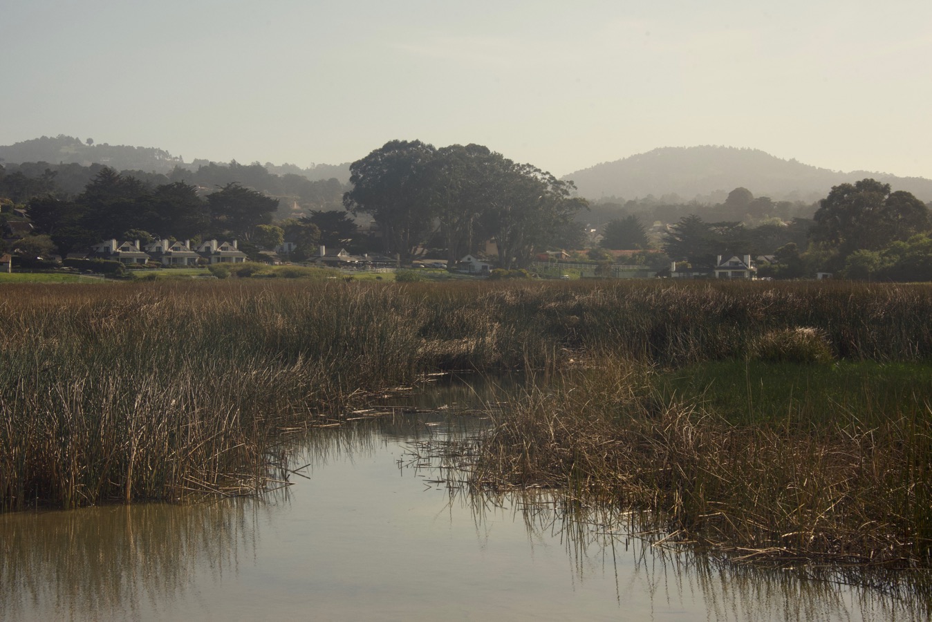
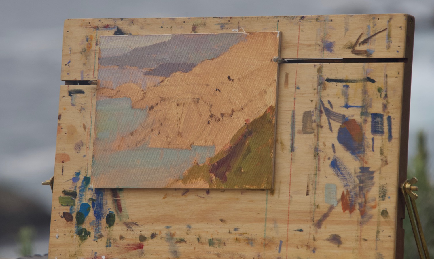
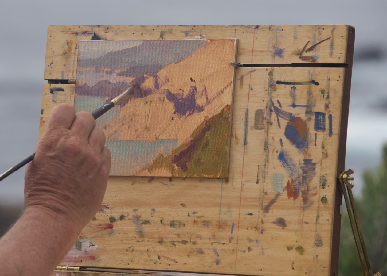
The motive or motif (plein air-speak for what the artist has chosen as her or his subject). Not the greatest light, but some decent atmospheric perspective, with the hills becoming lighter the farther back they were.
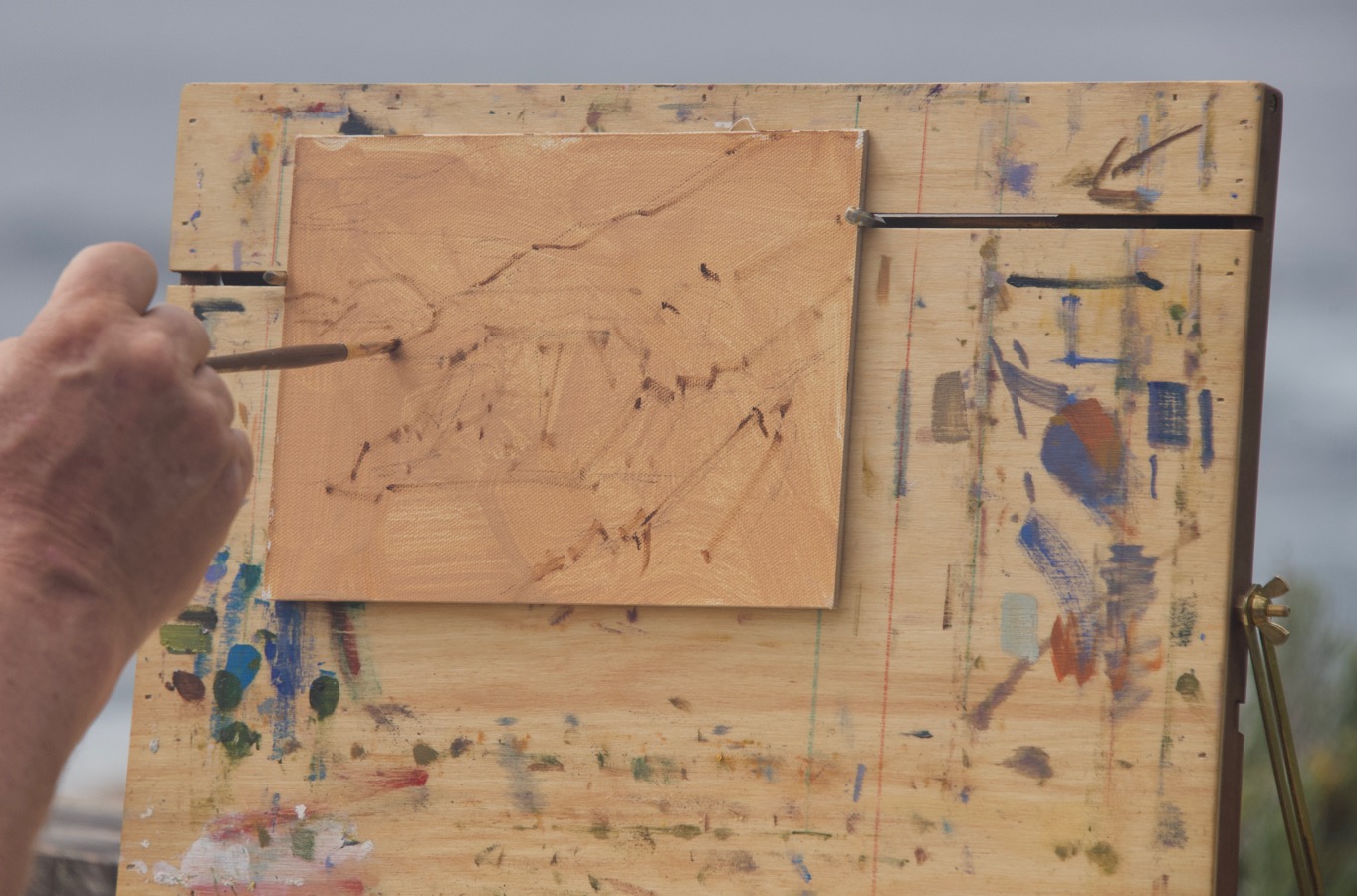
Paul uses an Open Box M that is mounted on a camera tripod. He starts with a brush drawing to indicate the main shapes (only 3-4 on a small piece) using a brush called a “bright”. It’s shorter and more square than a flat which is, well, a flat rectangle. He moved his hand in sharp, short strokes. No niggling, searching or doodling.
The finished demo. I was really interested in how he moved away from the literal colors, rearranged elements to suit him then, to top it off, changed what had become a blue sky back to the more atmospheric yellowish tone that you can see in the photo. Lots of food for thought, filtered through how I have seen my motifs when I’m out painting..
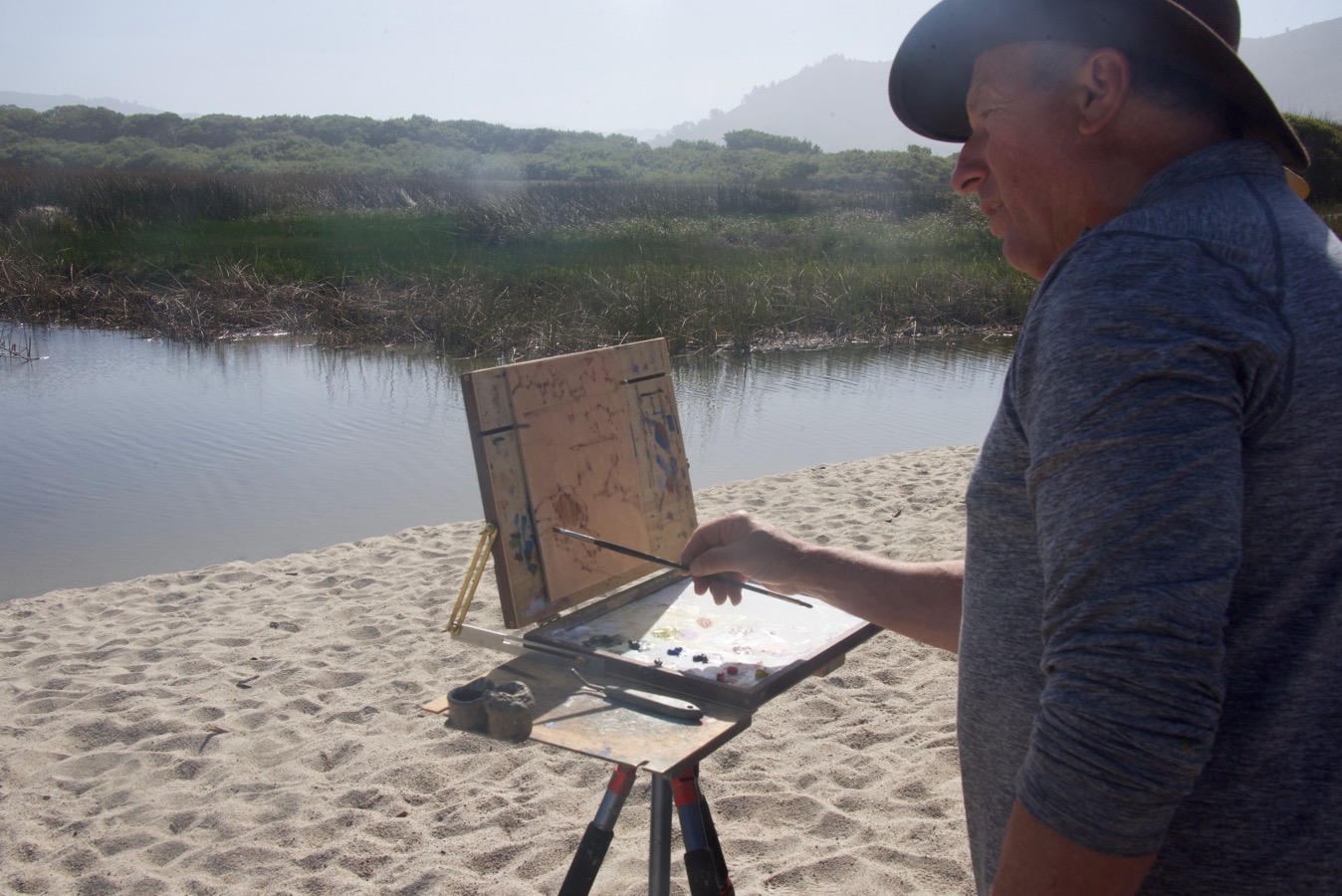
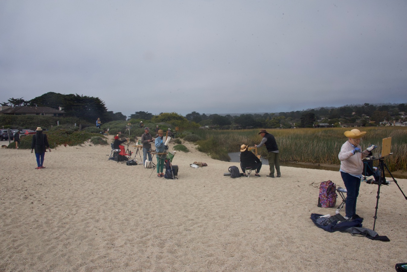
Plein air painters “on the job”. I had my old Soltek easel which has a VERY persnickity mechanism at the feet that doesn’t go well with sand or dirt. I’d anticipated this and brought some cutdown plastic bags that new brushes are packed in by art suppliers and rubber bands to hold them onto the ends of the legs. I have a pochade box I bought years ago at the Sennelier art shop in Paris and I’m going to switch to it before I go out again. How I mount it on my tripod will be the subject of a future post.
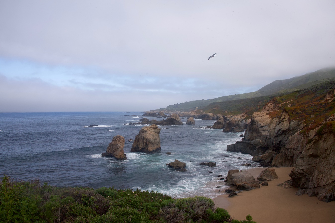
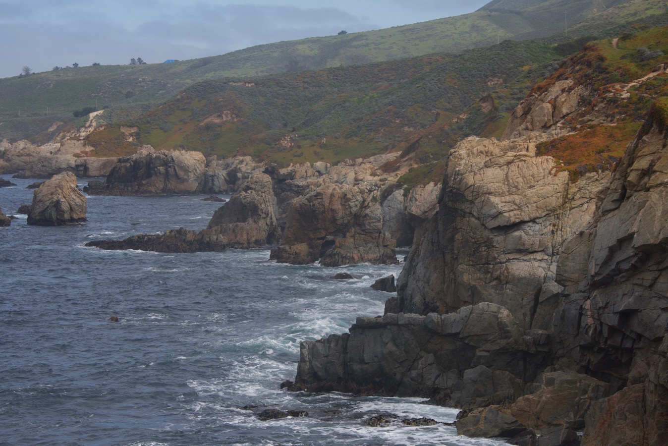
The next day found us at Garrapata State Park, where we were stuck having to choose between scenes like this…
This…
Or this…
I only watched the first part of his demo since I really wanted to get a first pass done on the piece I’d started before we had to break off and meet for dinner. I get a lot out of watching other artist’s “starts”.
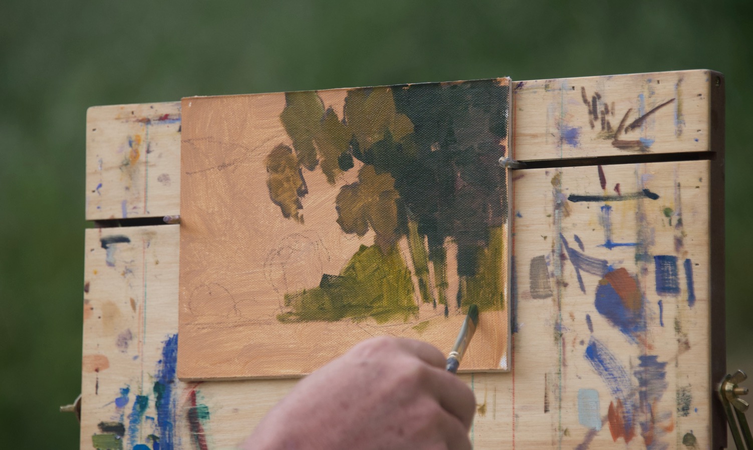
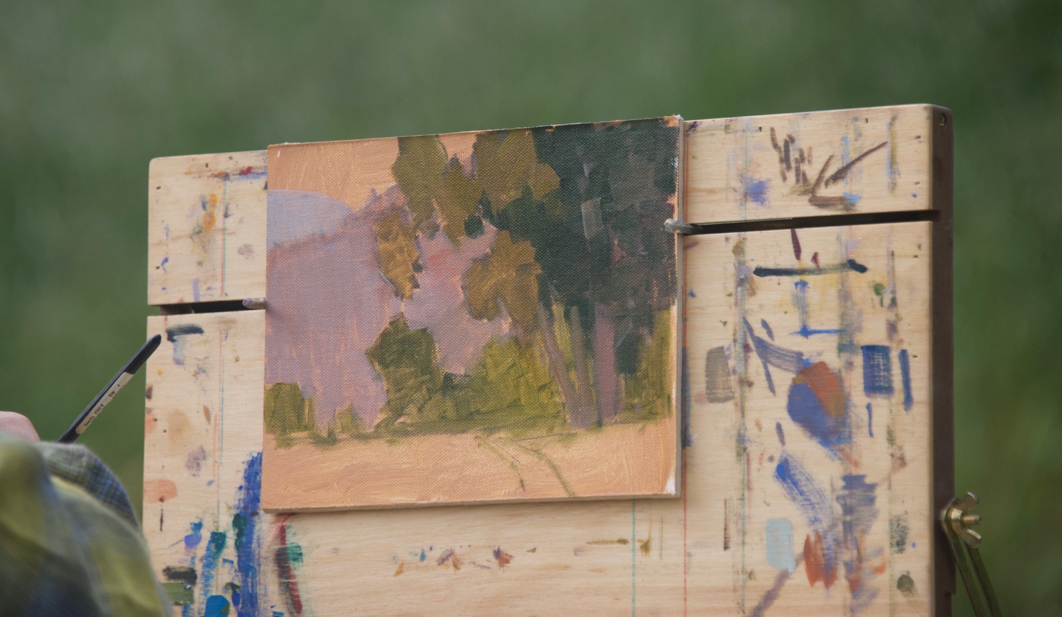
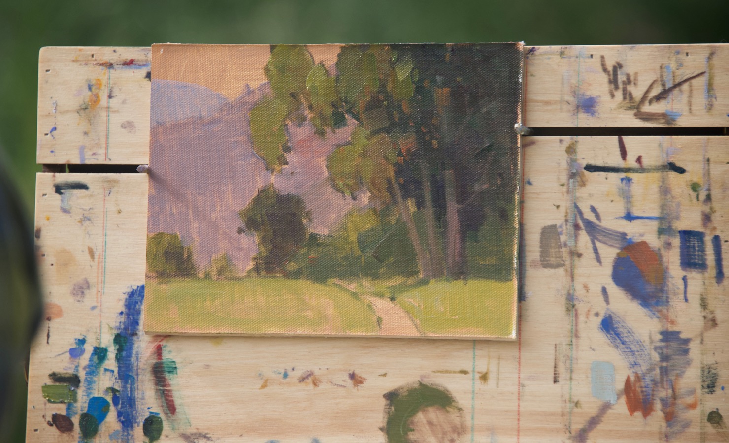
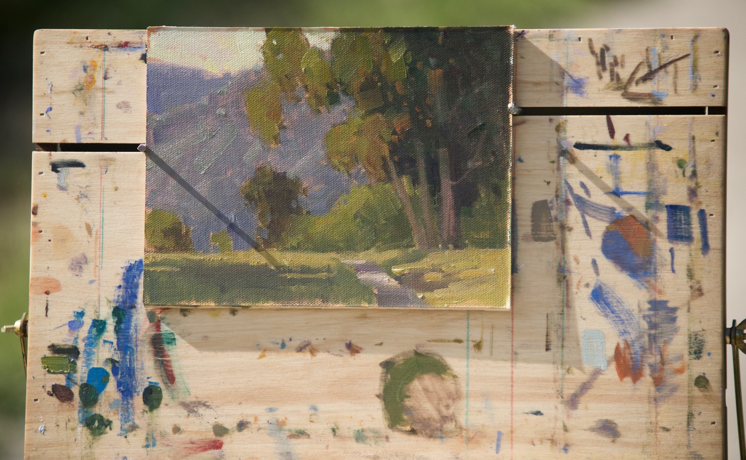
This is a good example of one of Paul’s starts. Basic shapes, no detail.
He then did a first pass with color, quickly filling in the shapes, paying attention to value relationships and color temperature. Farther away means lighter and cooler as the general rule.
He’s now adding the shapes of the shadows. Notice how loose they are. No hard edges.
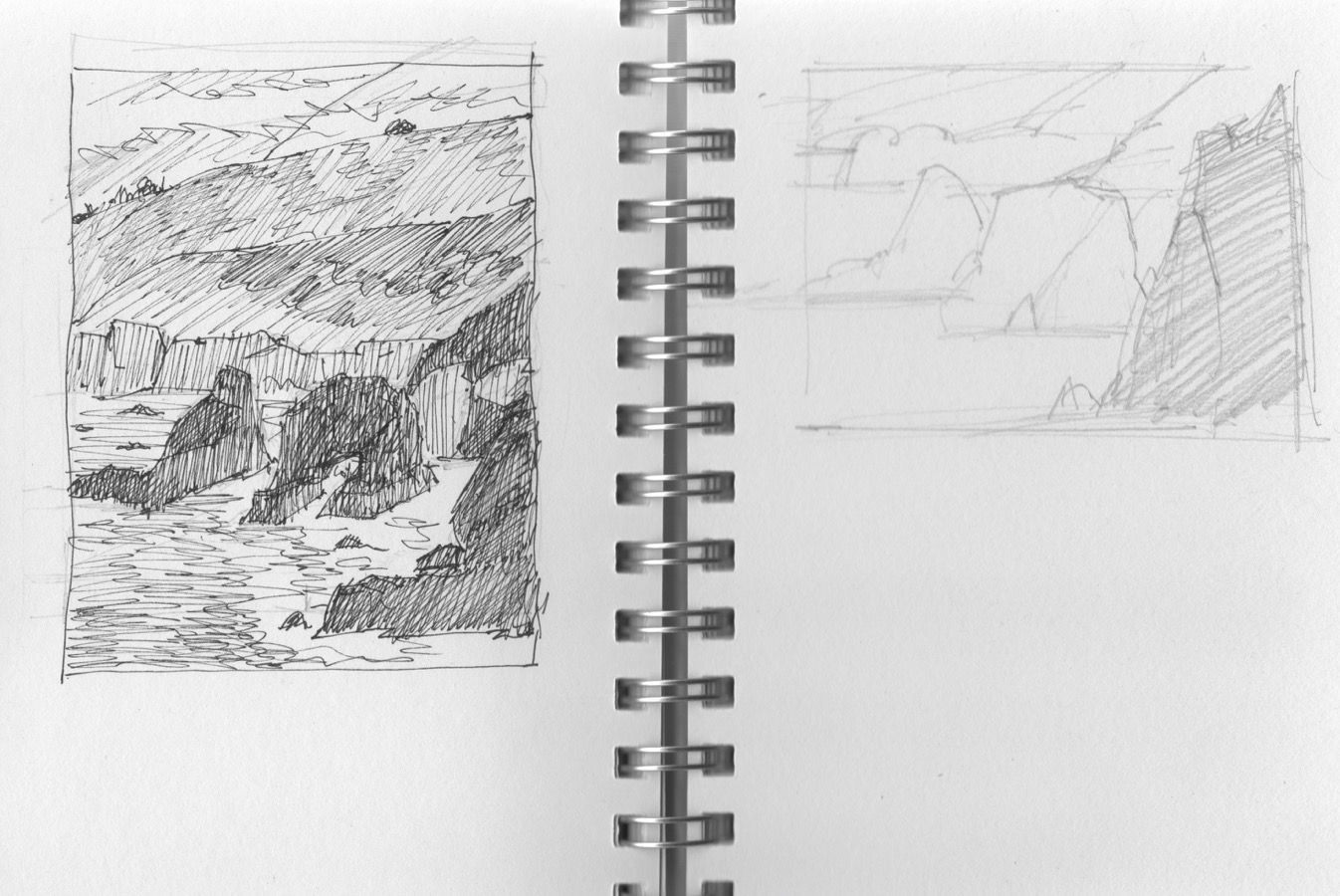
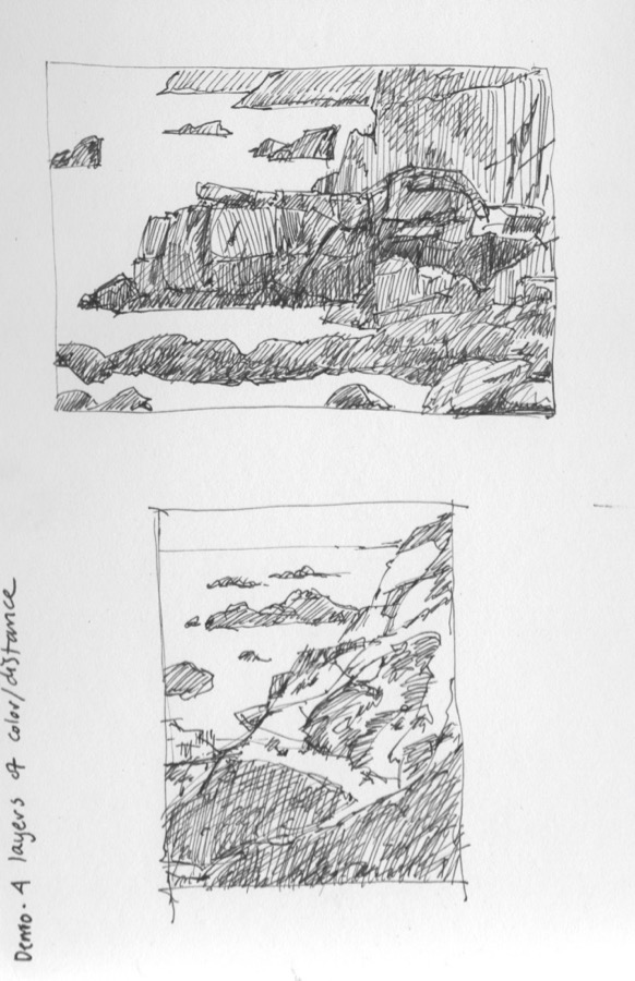
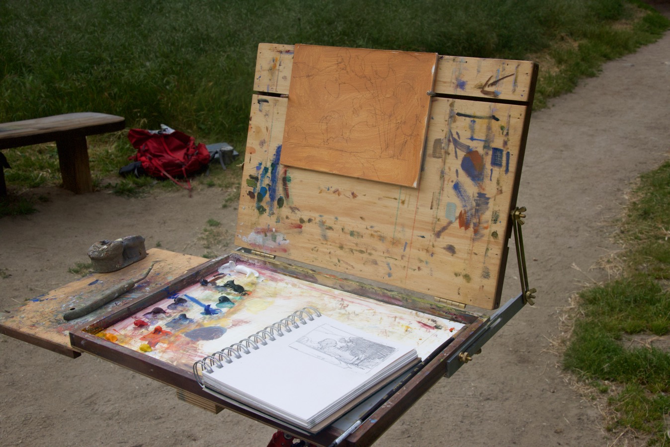
In the meantime, I’d spent the morning working on understanding how to do the preliminary sketches with a pen. I absolutely understood the value of doing them, but it took awhile to start to get the knack of it and make good choices. I made a hash of the first one. Paul was nice enough to do the sketch on the right to demonstrate finding just a few large shapes, which makes for a much stronger composition. He also thought that what I was most interested in would work better as a horizontal than vertical composition.
I soldiered on and finally felt like I was starting to get the hang of seeing what I was looking at in a better way.
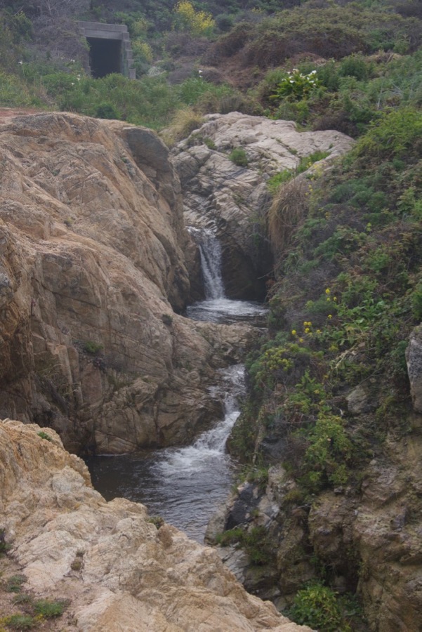
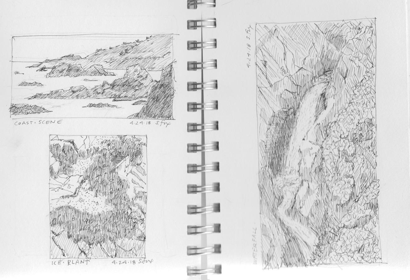
It got a little easier with each sketch. Then I tackled the waterfall. I ended up losing value contrast because of too many lines in the water. What a mess. After consultation with Paul and understanding where I’d gone wrong, when I got home I took an #11 Exacto knife and scrapped out the water. While not great, it was definitely an improvement. And I learned something valuable about keeping water the lightest value, the white paper color, as a starting default. It’s important not too get attached to sketches like this and to use them as a way to problem solve with pencil or pen, doing whatever it takes to fix or improve them. They’re simply a means to an end, but an important one.
Oh, yeah, I did have time for lunch, suffering for my art, but not much.
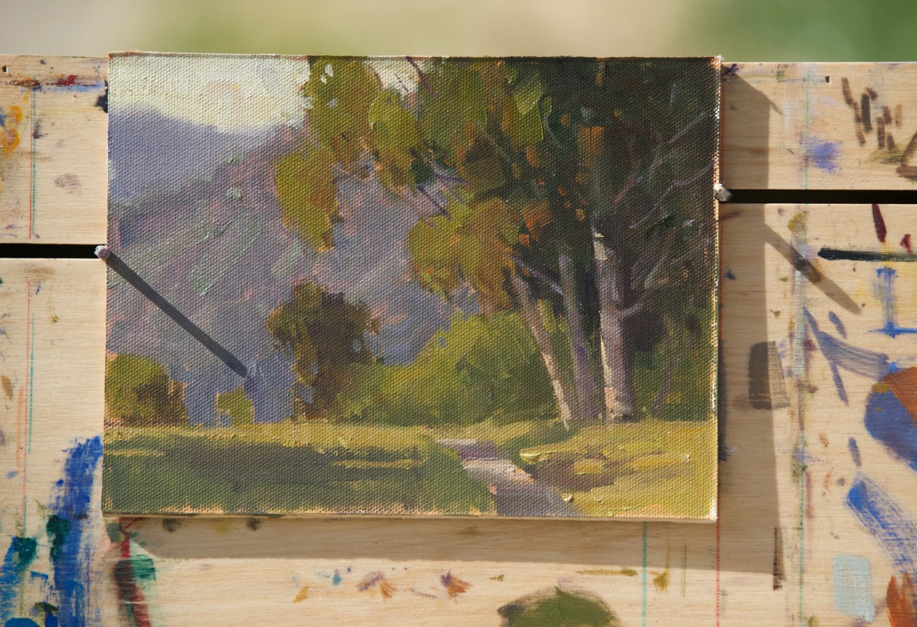
The third and final day we went out to a great regional open space to the east to try to get out of the coastal overcast. It was time for the iconic eucalyptus trees (introduced from Australia as they were) beloved by California plein air painters for over a century.
You can see Paul’s preliminary sketch and, faintly, the pencil layout on his panel. Here’s the sequence of the demo:
And I’m most pleased to say that this lovely painting is now in our personal collection.
I had also decided to paint the eucalyptus trees. I was definitely focused on the overall composition and value relationships in my sketch. Paul is a connoiseur of trees, looking for the same individuality that I seek when I’m drawing or painting an animal. He came by, saw my sketch and then took a few minutes to do a custom demo and talk about capturing light direction correctly. I love having examples like this to refer back to when I’m home, so thank you Paul!
The final piece I did in the workshop. Went to a smaller size and a larger, flat brush and got loose. I’m happy overall with the result and brought home something I can build on. I go to a workshop planning to “fail”, not make pretty pictures that simply repeat what I already know. Why pay money for that?
A big, big thank you to Rich Brimer, the Director at Carmel Visual Arts, for a very well designed and run workshop! I had a great time and learned a lot.
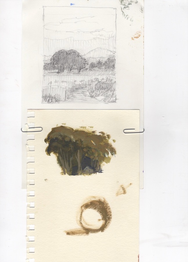
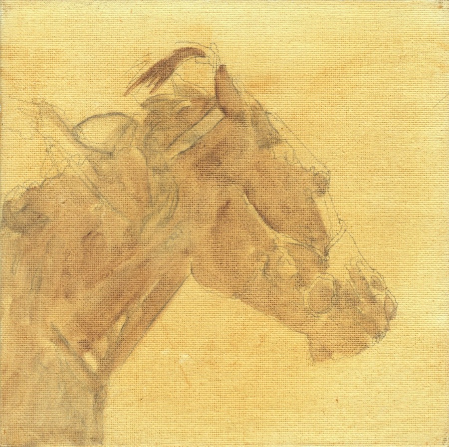
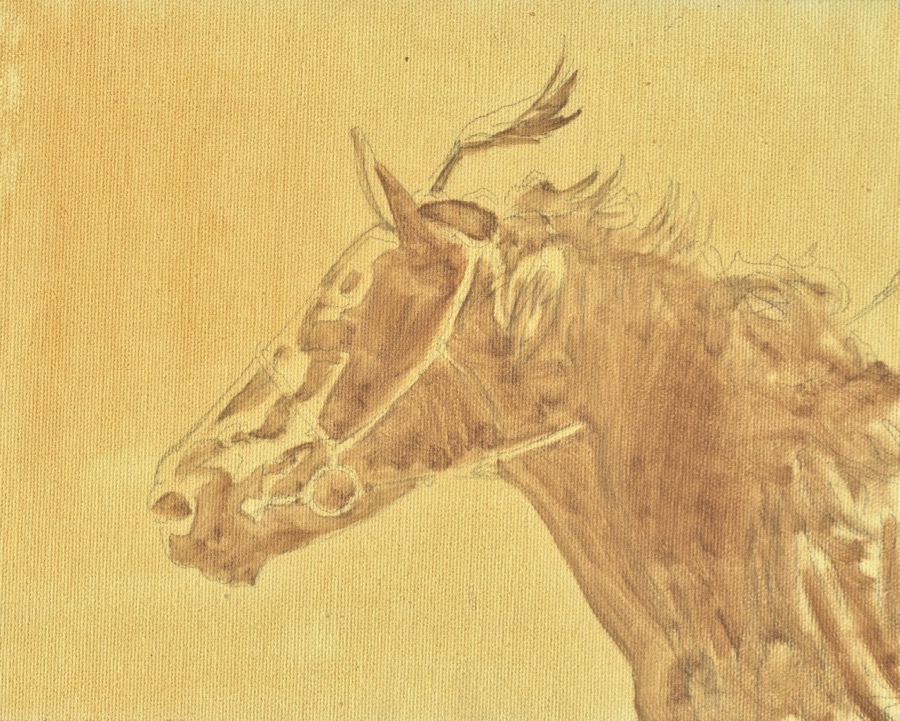
I’ve started a series of three small paintings of Mongolian race horses and thought I’d share the step-by-step of doing more than one painting at a time. First up was to choose my reference photos, picking three heads that would work together in a group.
I generally never post my reference images on the internet for obvious reasons, but in this case I wanted to show you the kind of photos I have to work with. The one above was taken at an aimag (province/state) naadam a couple of years ago. I was able to go out in the chase car for two races, so had a rare opportunity to shoot both stills and video not only as the jockeys, horses and trainers rode out to the starting point, but to travel parallel to the riders as they raced back. Looking through the many hundreds of race photos I’ve taken over the years I found a quite visible difference, which makes sense, in how fast the horses ran in the first part of the race and how much they’d slowed down by the last third or so. This really affected leg position and sense of the effort on the horse’s part as expressed in the body language.
But for this set of three I only wanted the heads, so was looking for variety in coloring, angle and generally interesting shapes of light and shadow. I started with drawings, thinking in terms of “notan” the Japanese method of simplifying an image down to two values….light and dark or light side/shadow side. I was also working on capturing the expression, the bridle and some of the shapes in the manes.
I had originally intended to include the rider’s hands and legs in the frame, but those shapes seemed distracting, especially cut off at the edges, so right now my plan is to leave them out. But that could change…
The top two pieces will be 8×8″. The one above will be 8×10″. So an arrangement of two squares with a rectangle between them.
The next step was to scan the drawings and project them onto the pre-toned canvas panels, sketching each one lightly with a pencil.
The panels were toned with Winsor Newton raw sienna. I indicated all the shadow shapes with a mix of that and a little Winsor Newton violet dioxazine, which creates a warm brown tone that is still related to the background tone.
I scanned the panels with my Epson XP-830 printer/scanner/copier and then imported them into Photos for cropping, color correction and any other adjustments. This works pretty well for small pieces that I want to post to my blog or other social media.
I like working this way because it gives me a lot of control over how much detail I add and where. I also like to leave “lost and found” shapes. What is important to me, though, is accuracy of both the horses and their tack, not detail per se. For me the game is to see how much I can simplify and leave out.
I’m sure there are artists out there who can happily grab whatever paper and drawing media they have at hand and get to it. I’m not one of them, at least not for my finished drawings that I will sell. And I’ve gotten pickier over the years. Every combination of paper and drawing media is different in feel, performance and result. Hence the comparison to Goldilocks. After a fairly major break for a variety of reasons, I’ve spent the last week or so getting back in the studio groove by revisiting a variety of combinations to see what is now “just right”.
I’m also planning to add human subjects back into to my oeuvre. It’s been awhile, so I collected a whole bunch of head shot photos from Google, many of movie stars because the lighting tends to be very good for revealing structure, dumped them into an Evernote and have started working from them, one feature at a time, starting with noses.
Facial features: Derwent Drawing Pencil Venetian Red, Wolff’s Carbon Pencil 6B, Cretacolor Monolith Pencil 6B and Cretacolor Monolith Pencil, 4B on Canson Mi-Tientes drawing paper, smooth side. One thing I like about the darker toned papers in that you can come in with the lightest lights using a Prismacolor white pencil, as I did with the noses and the eye. This is a pretty typical work sheet for me. Nothing fancy, nothing at stake, just focusing on how the media feels on the paper, but also working to get the anatomy correct
I also worked on bits of other toned paper, but didn’t like what I ended up with. I do like the brown-tone though. I moved on to either white or off-white papers, mostly the two mentioned below.
A famous nose- Cretacolor Monolith pencil on Strathmore 400 cold press bristol
Two famous noses- Derwent Graphic pencils on Strathmore 400 cold press bristol
Both media worked well on the Strathmore, which has a fairly hard finish, but stiil with a bit of tooth. Back to animals….
Baboon- Cretacolor Monolith pencil on Rives BFK paper (which has been a favorite for awhile)
Bat-eared fox, Derwent Venetian Red Drawing Pencil and baby impala, Cretacolor Monolith pencil on cream-colored Rives BFK paper
The Rives BFK is quite soft in comparison with the Strathmore. One nice thing about it is that one can erase it. A lot. Without a trace.
I wanted to explore getting a very crisp line and also laying down a tone on the Rives BFK. As I expected, it passed wtih flying colors. I used the same pencils as mentioned above: Wolff’s Carbon Pencil for the hawk’s head and bird leg, Cretacolor Monolith for the murre, Derwent Drawing Pencil in Venetian Red for the yellowthroat and A Derwent Graphic pencil for the quick sketch of a pine siskin
The last one I did before writing this post is the drawing of the vulture at the top. It is available for purchase. Message me on my contact page for price.