Ok, here it is, as promised. Sure to bring a million dollars at auction 1oo years after I’m dead and gone (which means it will probably go for about five bucks). Took about 30 minutes.
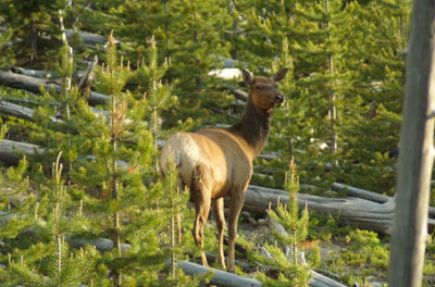
I thought that I might start to post works in progress which, one, always gives me something to blog on, and two, may provide one answer to “How do you artists do this stuff?” So, here we have a start of a cow elk that I photographed in Yellowstone in June of 2005, along with the reference photo. I was “game driving” between Mammoth and Norris and up on a hillside a group of elk were grazing. As you can see, they were in one of the burned areas. Lots of downed tree trunks and fresh new pines coming up.

The first questions I ask myself when I have an idea for a painting or am inspired by reference I shot are:
1. What makes me want to paint this? In this case, it’s a combination of the light, her graceful pose and I haven’t done an elk painting for awhile. A painting needs one strong idea and everything else is subordinated to it (Thanks, Scott Christensen). Every artist finds their own way to do that.
2. What is the best size and proportion of canvas to communicate the idea of this painting? (Thank you, John Banovich) As you can see, since my idea is the cow elk with the great light, most of the background was extraneous, so I chose a vertical format. This is a simple subject and, for me, didn’t really call for a big canvas, 16″x12″ seemed about right. But someone else might have decided that female animals don’t get the prominence in the art world they deserve and done her six feet high. Both are equally valid choices. I’ve had viewers of my paintings comment that they like seeing something besides bloated trophy males and enjoy my more off-beat subjects, which is encouraging. But ultimately I paint what I want, the way I want and then try to find a market.
3. As I lay in the drawing with a brush, I’m already thinking about the value (light/dark) pattern. I want the area of highest contrast where I intend the viewer’s eye to land. So, from the beginning I’m altering my reference to suit the idea of the painting. This brings us to the use of photographs in painting; the good, the bad and the sometimes seriously ugly. I have strong opinions about it (surprise. not.), but that’s a topic all by itself. Suffice to say for now that if you don’t have a strong idea of what your painting is about, then you may end up as one of those legion of artists who end up copying their photos, rather mindlessly sometimes. The key is “mindless”. Photorealists have made a quite conscious choice to work a certain way. Do what you want how you want, but do it by choice, not default.
So, here we are after two sittings. During the first, I solved the design: where the animal would be, how big and roughly how the surrounding habitat would go. In the second, which took about an hour. I refined the drawing, laid in my darkest tones and figured out roughly where the small pine trees would be, watching out for bad tangents (which is when two objects on different planes touch, which destroys the illusion of three dimensions) and deciding where the areas of highest contrast would be. California landscape painter Kevin Macpherson comments in one of his books (buy both if you want to self-study oil painting) that a painting is a series of corrections, which is so, so, SO true. When everything is corrected, you’re done. So simple, really.
Final notes (for now): I work mostly with round brushes. I like the calligraphic marks I can make with them, having been a calligrapher and sign painter at one time. I go 3-5 shades darker in value all over and then come back in with successively lighter values. I also try to work “lean to fat”, artist talk for going from thin paint to thick paint. Look at some traditional oils next time you’re at a fine art museum and you can see it. It’s one reason only seeing reproduction is of such limited use. Everything is flattened out. Original paintings have a literally third dimension of paint thickness. Fellow artist Julie Chapman’s work is a perfect contemporary example. You can’t really appreciate her lush, juicy brushwork unless you’re looking at the real thing.

So true! Nancy Glazier’s beautiful paintings are another great example of what you’re talking about for surface dimension of paint on an original. She really piles on the paint but this doesn’t show in her reproductions.
LikeLike
I’d go for the 6′ tall version, on the side of our rig. You’re hired!
LikeLike