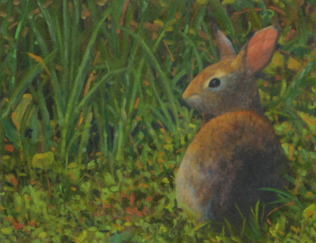
Thinking About Art: Simplification

Mongol Wrestler oil 12x12" 900
“Mongol Wrestler” oil 12×12″ $950 (Salmagundi Club Summer Exhibition, Certificate of Merit)

I’ve always remembered one of the first things my Illustration II teacher at the Academy of Art told us, which is that “the simpler statement is the stronger statement”. Easy to say, surprisingly hard to do. It’s easy to just accept what’s in front of you and put it in your painting or drawing, whether it’s individual the leaves on a tree or every hair of a coat of fur. It’s much more challenging (and ultimately rewarding) to edit and leave things out. That, however, is a judgement call and the possibility exists that one will make the wrong choice. Scary! Actually, it’s inevitable. But that’s ok as long as one is honest about it and is willing to keep trying. While a good teacher or experienced artist friend can help, ultimately you have to decide what to do based on your vision (you DO have a vision of where you want to end up, right?) of where and how to simplify. In future posts I’ll be discussing a variety of ways to approach simplifying your image.

Example: here’s a 12×12″ oil I did of a Mongolian wrestler. I started by deciding that the painting would be about his pose and the light/shadow pattern. Also the positive shape of the pose and the negative shapes that were then created in the background. I cropped the figure VERY carefully, taking into account the overlap of the frame. When I shot the reference photo kinds of stuff were going on around him on the event field, none of which I needed and which would just get in the way. The gutsy move for me was the golden yellow background. I had to control both color and value so that the subject would still pop out, but keep that sun-drenched feeling. It worked. But if it hadn’t I would have painted over it with something else, most likely still letting a bit of it show through. “Mongol Wrestler” was awarded a Certificate of Merit in the Salmagundi Club’s Members Show in 2017.

This is one example of what I’m offering on my Patreon site…solid, experience-based information. Please consider becoming one of my valued Patrons! https://www.patreon.com/susanfox/posts

Seeing the Light

I’ve spent a good chunk of this last week or so working on the “light thing”, which, when you get right down to it, is what representational painters are painting. Or, in other words, the effect of light on an object, whether is be a tree, a barn or an apple in a still life. Besides a lack of good drawing skills, failure to accurately perceive, understand and represent light is one of the things one consistently sees in poor or mediocre paintings. Everything tends to be in local color (the “native” color of the object) and the shadows are too dark and lack life. This tends to come from painting from photographs.

Dawn on Dunraven Pass, Yellowstone NP

Capturing the light is one of the major, almost addictive challenges of plein air painting. A given quality of light lasts about two hours at most, sometimes two minutes. It’s an opportunity to experience frustration and exhilaration almost simultaneously. Plein air painting also addresses the problem mentioned above about shadows. When you are in front of the scene, you see how much wonderful color and variation are in shadows that a camera doesn’t pick up, not even the digital ones, although they are much better than film was.

Another important point is that a given hue, value and temperature of a color exists only in relation to the colors around it. No color is dark and cool in and of itself. Not even black (if you mix your own, which you should) or white. It’s always a matter of “warmer than” or “lighter than”. How far one pushes the contrast between color value and temperature is a personal choice the artist makes in order to accurately express their vision and emotional response to their subject.

Along Goodall's Cutoff, Idaho

As primarily an animal artist, I found early on that when I wanted to put an animal in their habitat, I also became, ta da, a landscape artist. And that has proved to be much more difficult for me to get a handle on. I’ve taken at least as many, if not more, landscape painting workshops as wildlife ones.

I’ve done seven small landscape studies over the last few days, mostly just 6″x8″, working on two problems: that classic daybreak and afternoon glow and the wonderful effect of light on trees with dark clouds behind. The small size takes less time and lets me focus on the problem I’m trying to solve.

It’s a juggling act. What order to put the colors down, what values and what temperatures those colors should be. And I still try to do a decent composition and pay attention to the drawing.

Cottonwoods, late afternoon; Dubois, Wyoming

The above paintings took around two hours each and were done on canvas panels with a round brush.

Oh, and I have integrated the Permanent Green Light and Manganese Hue into my palette. Haven’t quite found out what I’ll use the Permanent Magenta for yet.

More Mongolian poetry on Monday!

ART THOUGHT FOR THE DAY

Nature is what you see and what you think about it. Artists change our thoughts about nature, and so, in sense, change nature. A masterpiece does not look like nature, because it is a work of art. The language you want to speak is art, so study art from the masters.

John Sloan

A Pot of Paint

Anyone who has been to art workshops knows that there always seems to be someone who is almost obsessive about finding out what paint, brushes and supports the instructor uses. The idea seems to be that if they can use what the teacher uses, by some kind of magical osmosis they’ll be able to paint like the teacher paints.

Fortunately, it doesn’t work that way. After all, if creating good work was only a matter of using the right combination of materials, it would take all the fun out of painting- for a sufficiently broad definition of “fun”. Sometimes trying to gain mastery or even competence in an art media is an exercise in frustration, disappointment and self-doubt. And then there are those too short times when the painting seems to paint itself and you’re just along for the ride.

With all that in mind, I thought I’d blog a bit about what materials I’ve ended up using after my first twelve+ years of painting in oil. Use any or all of it at your own risk. This week, I’ll start with paint.

I began with a pretty standard palette, courtesy of my first teacher. White, black, warm/cool red, yellow, blue, green, plus three or four earth colors and then some “fancy” colors that would have had Rembrandt spinning in his grave and Gauguin breaking into my studio in the dead of night.

Then I went to Scott Christensen’s ten day plein air intensive. Four color palette (plus a couple of tube greys): titanium white, Rembrandt Permanent Red Medium, Winsor Newton (W/N) Ultramarine Blue and Winsor Newton Cadmium Yellow Pale. And my “color choices” exploded. I discovered a whole world of more muted, restrained color that I was barely aware of before. A limited palette solves the “color harmony” problem, too, since every color probably has at least a titch (the technical term) of all the others in it.

Here’s my first four color study from before I left so I could see how it worked a little, followed by two 20 minute exercises done at his workshop-

These are two studies I did after I got home. I think you can see that one isn’t really limited at all as far as color and what you can do with it. Value relationships and color temperature shifts become more important than having a particular tube color.

I pretty much stayed with that palette for over two years. For me, the main limit I bumped up against is that I’m an animal artist, not a landscape painter, and I really felt the need for a color I picked up at a Paco Young workshop, Rembrandt Transparent Oxide Red. It’s perfect for so many animals that I do. Then I found that the warmer Cadmium Yellow Medium worked better for me than the cooler Pale. Then I found myself gazing longingly at the dioxine purple, then my beloved sap green……

Presently, having realized that I’m really more of a colorist than a tonalist, I’ve added more punchy colors back so my paintings will have the emotional content I want. These days I use, from left to right on my 18″z24″ glass palette:  Rembrandt Transparent Oxide Red, Rembrandt Permanent Red Medium, W/N Cadmium Orange, W/N Yellow Oxide Pale, W/N Cadmium Yellow Medium, W/N Titanium White, W/N Ultramarine Blue, Rembrandt King’s Blue, (sometimes Rembrandt Turquoise Blue, for extra warm blues), W/N Dioxine Purple, W/N Sap Green, W/N Viridian. I very occasionally use W/N Raw Sienna, mostly to tint my canvas before starting, but otherwise I mix my own earth colors, greys and black (ultramarine blue, transparent oxide red).

I do small (6″x8″ to 8″x10″) studies to try out painting ideas and for those I use the four-color palette because I can come back to them months later and I know exactly what colors I used. Here’s three, two of which went on to become finished paintings, so far. Yes, those are Roosevelt Elk on the beach north of where I live in Redwood National Park. The finished painting is called, what else, The Beach Boys, and is in a private collection.

The most important thing is not how many or how few colors you use, but that you know why you are using them and that you use them well.

The “Pot of Paint” reference in the post title is part of another of my favorite artist stories, which will be part of Friday Features.

The Elk, part two

ANIMAL STUFF

Went over to the shelter for my usual Wednesday afternoon gig yesterday. Almost didn’t go because I was feeling kind of tired. But working with the animals and getting out on my feet usually energizes me, so off I went.

And was dragooned by a kennel attendant about 10 seconds after I walked in to “help with an animal”. Dog or cat, I asked. Neither, she said. Hummm, I thought. We entered a small outdoor enclosure and there lying on the floor covered up with towels was a jersey bull calf, who had been brought in two hours earlier. He was a newborn, so new that his umbilical cord was still wet when he arrived. He was also pretty scrapped up. They don’t know yet if he was dumped (being a male of a dairy cow breed means you are of very limited use) or fell off a truck, but they needed to get some food in him immediately. So Kathy held the calf, I held the bottle of colostrum and with some sweet talk and stroking, I got him to start sucking at the nipple. Now, mind you, the only reason I ever wanted to go to the fair as a kid was to see the animals, but I’ve hardly ever even petted a cow and here I was getting to help save this (not-so-little) guy’s life. Deep satisfaction doesn’t begin to describe how I felt.

One of the animal control officers has extensive experience with cattle, both dairy and beef and also lives near the shelter, so he has volunteered to take care of him and make sure he eats. The calf also made the front page of the local newspaper this morning. I’ll post updates as I find out more and a photo if I can get one.

ART TALK

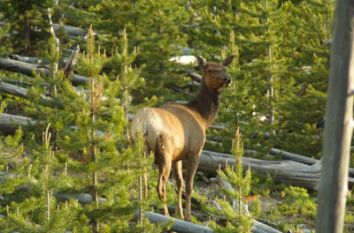
So, back to the *#@*!^ elk. Upon further review, something was seriously not right and I spent most of Tuesday and part of Wednesday fixing it. The drawing of the head was out a mile and the neck was too short, plus a few minor, quickly fixed problems with the hind end. I’ve now repainted the head, oh, I don’t know, six or so times. One of the challenges when faced with something like this is to do what needs to be done and still end up with something that doesn’t look labored.

Over at Julie Chapman’s blog, there is a comment thread discussing a common phenomena in art in which the artists who are competent professionals agonize and tear their hair out and artists who aren’t very good always seem to be pleased with what they’ve done, oblivious to the problems in their work and impervious to any criticism. I’m definitely in the “agonize” column. Just ask my husband.

One theory I have is that, as according to Buddhism, people don’t like to be uncomfortable. They move toward pleasurable things and cling to them and away from unpleasant or uncomfortable things. It’s hard to just be with whatever is going on without getting caught up in it one way or another. Really seriously creating art that is good, whatever the media, means living with frustration, mental exhaustion and doubt, none of which is particularly comfortable. Any dedicated artist reading this knows what it feels like when you’ve busted your butt all day and finally your mind just hits the wall and slides down to the floor. Then you know it’s quittin’ time.

But all that can be avoided if one takes the position that everything is fine, just fine. And, if you don’t get into juried shows or organizations, hey, it’s all subjective and they don’t know what they are talking about anyway. Letting go of that means that you have to take responsibility for your art and its shortcomings and, to improve, you have to be willing to do what it takes. And that’s one big thing that separates the amateurs from the professionals. You do what it takes to get it right. No excuses or rationalizations.

I remember when I made the conscious decision to pursue oil painting (and drop illustration, graphic design, etc.) and see just how good I could get. I realized that I had to face the possibility that I would give it everything I had and that, in the end, through an inability to exercise correct choices or judgement, that I would only ever be a mediocre painter. That thought made me sick inside. But I couldn’t turn away, so I accepted the challenge. None of this has ever come easily to me, so one thing I know how to do is hang in there and struggle through. Which brings us back to that bloody elk, part two-

cow-elk2.jpg

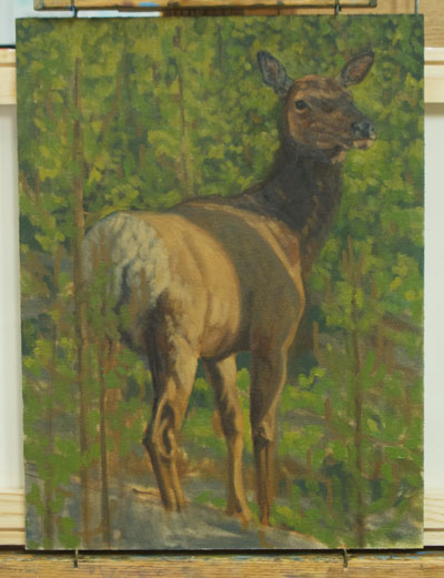
There’s still LOTS to do. The modeling of the head needs work to describe the structure. I’ll probably do a pencil drawing to work it out better, so I can lay the paint in with confidence.

And, here’s one of my newest finished paintings, called “Mutual Curiosity”. When I was at Ikh Nartiin Chuluu, I spent two days out in the reserve walking around alone with a GPS, looking for argali so I could do behavioral observations. The trick was that I had to find them, without them seeing me, in order to do the observations. It wasn’t easy. This big old ram spotted me pretty quickly, but he let me follow him around for about twenty minutes. He was very thin, but had a huge, heavy horns. I filled him out a little. It was spring, so he had made it through the winter of 2005. I wondered as I did the painting if he made to 2007.

mutual-curiousity.jpg

I also wanted to show the amazing environment that the argali of Ikh Nart live in. I compressed the scene a little from the photograph, but all those weird formations are within yards of each other.

Eggs and Elk

Ok, here it is, as promised. Sure to bring a million dollars at auction 1oo years after I’m dead and gone (which means it will probably go for about five bucks). Took about 30 minutes.

egg-in-water-glass.jpg

I thought that I might start to post works in progress which, one, always gives me something to blog on, and two, may provide one answer to “How do you artists do this stuff?” So, here we have a start of a cow elk that I photographed in Yellowstone in June of 2005, along with the reference photo. I was “game driving” between Mammoth and Norris and up on a hillside a group of elk were grazing. As you can see, they were in one of the burned areas. Lots of downed tree trunks and fresh new pines coming up.

yellowstone-elk2005-06-25.jpg

cow-elk-in-progress.jpg

The first questions I ask myself when I have an idea for a painting or am inspired by reference I shot are:

1. What makes me want to paint this? In this case, it’s a combination of the light, her graceful pose and I haven’t done an elk painting for awhile. A painting needs one strong idea and everything else is subordinated to it (Thanks, Scott Christensen). Every artist finds their own way to do that.

2. What is the best size and proportion of canvas to communicate the idea of this painting? (Thank you, John Banovich) As you can see, since my idea is the cow elk with the great light, most of the background was extraneous, so I chose a vertical format. This is a simple subject and, for me, didn’t really call for a big canvas, 16″x12″ seemed about right. But someone else might have decided that female animals don’t get the prominence in the art world they deserve and done her six feet high. Both are equally valid choices. I’ve had viewers of my paintings comment that they like seeing something besides bloated trophy males and enjoy my more off-beat subjects, which is encouraging. But ultimately I paint what I want, the way I want and then try to find a market.

3. As I lay in the drawing with a brush, I’m already thinking about the value (light/dark) pattern. I want the area of highest contrast where I intend the viewer’s eye to land. So, from the beginning I’m altering my reference to suit the idea of the painting. This brings us to the use of photographs in painting; the good, the bad and the sometimes seriously ugly. I have strong opinions about it (surprise. not.), but that’s a topic all by itself. Suffice to say for now that if you don’t have a strong idea of what your painting is about, then you may end up as one of those legion of artists who end up copying their photos, rather mindlessly sometimes. The key is “mindless”. Photorealists have made a quite conscious choice to work a certain way. Do what you want how you want, but do it by choice, not default.

So, here we are after two sittings. During the first, I solved the design: where the animal would be, how big and roughly how the surrounding habitat would go. In the second, which took about an hour. I refined the drawing, laid in my darkest tones and figured out roughly where the small pine trees would be, watching out for bad tangents (which is when two objects on different planes touch, which destroys the illusion of three dimensions) and deciding where the areas of highest contrast would be. California landscape painter Kevin Macpherson comments in one of his books (buy both if you want to self-study oil painting) that a painting is a series of corrections, which is so, so, SO true. When everything is corrected, you’re done. So simple, really.

Final notes (for now): I work mostly with round brushes. I like the calligraphic marks I can make with them, having been a calligrapher and sign painter at one time. I go 3-5 shades darker in value all over and then come back in with successively lighter values. I also try to work “lean to fat”, artist talk for going from thin paint to thick paint. Look at some traditional oils next time you’re at a fine art museum and you can see it. It’s one reason only seeing reproduction is of such limited use. Everything is flattened out. Original paintings have a literally third dimension of paint thickness. Fellow artist Julie Chapman’s work is a perfect contemporary example. You can’t really appreciate her lush, juicy brushwork unless you’re looking at the real thing.

Latest news!

I have been a member of Artists for Conservation (formerly The Worldwide Nature Artists Group) for quite a few years now. Two years ago, they instituted a recognition program called “The Conservation Artist Award”. One artist a month is chosen, which qualifies one for the Simon Combes Award at the end of the year. And (drum roll!) I’ve been chosen as the artist for March! Go to http://www.natureartists.com and you’ll see a box on the right hand side with my picture. It’s really an honor since the organization is now approaching 500 members.

Also, today I got my acceptance letter for the Marin Art Festival, so I’ll be at The Civic Center Lagoon, Mill Valley, June 14-15. I’m really excited to have gotten in on my first try. I’ll be publishing my full festival and show schedule as soon as all the info rolls in.

ART TALK

I recently had the privilege of doing a portrait of Cosimo, a Holsteiner imported from Germany for Grand Prix jumping events. He had some leg and foot problems, as it turned out, but with time and care it looks like he is back on track. His owner said that she would probably only really be seeing him in the arena, so she wanted a painting of him relaxing during his “down” time. Knowing that she grew up on a ranch in Ventura county, I couldn’t resist letting inspiration from the early California landscape painters take over. For Cosimo himself, I spent 90 minutes sketching and photographing him in an exercise paddock last spring.

cosimo.jpg

The interesting parts of painting Cosimo were the getting the shape around his eye right, since it really gave him a distinctive expression, and the top of his shoulders (withers, I guess, to be technically accurate), which were huge in comparison to other horses I have seen. I’ve never done a horse portrait before and spent a lot of time doing preliminary drawings and even a small study in oil to make sure that I captured an accurate likeness of a head that, in the finished painting, is less than 2″ long. I enjoyed getting that glossy sheen on his coat, too.

He isn’t what I would consider a pretty or beautiful horse, like an arabian, but even during the short time I had with him, I got a sense of a horse with quiet dignity and strength of mind. Not someone you’d joke around with. He apparently has a solid competitive drive too, which he’ll need.

The background elements include an oak tree, a sycamore, California poppies and a sprinkling of lupine, which are all plants the client grew up with. The quail were added for fun and to provide a narrative element.

The original is a 16″x20″ oil on canvas on board. My client is very pleased, which, of course, makes me very happy!

Hot off the easel

I usually have 4-6 paintings going at any one time for a variety of reasons. Sometimes it’s attention span (short), sometimes I’ve gone as far as I can for the day, sometimes I’m stuck and sometimes I just feel like starting something new. One thing I have found is when I’m interested in painting a species I haven’t done before is that I like to do a head study first to start to learn what the animal looks like. So that was the rather mundane motivation for this painting of a young Thompson’s gazelle that I photographed in Kenya. The horns were the most challenging part because I don’t like to dink and dork around with tight rendering but I had to understand the structure well enough to lay in shapes in the right hue and value so that it is drawn correctly.

I often start with a charcoal or carbon pencil drawing on bristol before I do a painting or even just felt tip pen sketches in a sketchbook.

grants-gazelle.jpg

Yesterday was quite a weather day. I did my third rescue transport in the morning. Ten five week old puppies, a pit/Am. bulldog mix and a 5 mo. old border collie puppy over to Willow Creek, which is about 40 minutes east of here. It was really, really, really windy at the shelter and I have to admit I was wondering what it was going be like going over 2800+ ft. Barry Summit in a Volkswagen Eurovan. There is one short stretch where the road is out in the open on the west side of the mountain, totally exposed. I was to meet up with two guys who live in Willow Creek who were going to take all the dogs on to Redding. The transport coordinator and I decided that if I couldn’t get over the mountain safely and didn’t show up by 10 am, that the men would drive west (in their nice solid Escalade) and look for me down in the valley. As it happened, it was pretty breezy at the summit, but no problem. As soon as I was on the other side though, I was in driving rain. Made the hand-off, went back over the hill, did some grocery shopping at the coop in Arcata and was home by noon. Within an hour all hell broke loose weather-wise. Howling wind, horizontal rain for the rest of the day. Lit a fire in the fireplace, kicked back and in the evening watched Glen Hansard and Marketa Irglova win the Best Song Oscar for “Falling Slowly” from the movie “Once”, one of my all-time favorites. Check it out!

Keep Them Doggies Movin’!

So, to pick up the story of my first rescue transport last month-

The plan was to go on Sunday. I got a call at 8:30 am on Saturday from Jean, the transport co-ordinator. Could I go that day since the weather looked like it was going to get really nasty on Sunday? You betcha. I had seen the forecast, too. Over to the shelter a little before ten. Loaded up four (yup, four) dogs into our Volkswagon Eurovan. One border collie, one Rhodesian ridgeback mix, one lab mix and a pit bull, all in crates. Spanky’s (the pit bull) crate was facing between the front seats, so we could look at each other en route. Finished the paperwork, loaded up towels and anti-stink spray and away we went. The route was from Humboldt County down to just north of Ukiah, east on Highway 20 and out to where it joins up I-5 at Williams. About a five hour drive. A little barking but no real fuss. Loaded up the CD player and locked in the cruise control. Ate a lunch while I rolled. The funniest part of the trip was when some harmonica (Bob Dylan?) came on and Spanky started to sing along. On the way on 20 through Lake County, lots of flooding near the road and small slides and “flooded” signs in the towns. Snow on the higher hills and some by the road. Made cell phone contact with the woman I was meeting right as I came down out of the hills. We both pulled into the gas station within a couple of minutes of each other. Whew. Got the dogs out, let them pee, loaded them into crates in her horse trailer, went to pee myself, called home and hit the road. Elapsed time at the rendevous: 20 minutes. Another five hours of driving. Ate dinner (another tuna sandwich) while I rolled. Got home around 8:45pm. Long, hard day, but four dogs have a chance at a great new life, so it was more than worth it!

Second transport was just over two weeks ago on Feb. 9. I was going down to the Bay Area to hook up with my husband anyway, so figured I might as well help move some more dogs out. There was one to go on Wednesday, two on Friday and a third by the time I got to the shelter on Saturday morning. This time it was a blue heeler, a real redbone hound and a shepherd mix and two drop off points. One dog, the heeler, in Petaluma and the other two in San Rafael. With some in-flight adjustments, it all went fine and then it was on to San Francisco. The top priority was to finally go to the new De Young Museum and generally kick back in The City for a couple of days. Mission accomplished. Here’s the sundown view from our 8th floor (out of 9) room at the Hotel Carleton, our favorite, reasonably moderately priced place to stay in San Francisco. Very convenient location on Sutter Street. Close to art galleries, Japanese, Indonesian, Italian and Vietnamese food and just down from Nob Hill.

view-from-hotel.jpg

The De Young was terrific, inside and out. I had been very skeptical of the outside, but when we stood across the street in front of the new, mind-blowing Academy of Sciences building, we decided that it worked. There is a whole “orchard” of trees in the sunken bandshell area and they look great against the flat plane of the museum’s facade. The tower still looks a little odd, but the design needed that. Too bad I forgot to take some pictures. Sorry.

The inside is everything a great place for showing and viewing art should be. They have so much more room now, so there is a lot more to see. Lots of old favorites like the Sargents and some I don’t ever remember seeing like two by William Keith, a killer Thomas Hill and a couple of Diebenkorns. One of the best modern works was a suspended cube made out of charred wood from a southern black church which had been burned by an arsonist. It was an amazing visualization of objects in three dimensions. It’s called “Anti-mass” and if you go to the De Young, don’t miss it!

We then drove on out to Ocean Beach. Winter in California. We are so spoiled. Here’s a view north towards the Cliff House. It was t-shirt weather warm at four in the afternoon.

gulls-and-cliff-house.jpg

One the way back to the hotel, we drove through Golden Gate Park and ended up timing it perfectly for “magic light” as you can see from this photo of the Conservatory of Flowers. Got lots of pictures of cypress trees in great light too, but you’ll have to wait for the paintings.

conservatory-of-flowers.jpg

The next day, we went to the Legion of Honor for more art, this time European (the De Young only has American art). I found, in both museums, that my eye and technical ability in painting has reached the point where I can probably seriously bore almost anyone talking about underpainting, in what order the colors were put down, how many strokes of the brush an area had, the variety of edges, etc. Here’s one of my new favorites from the Legion of Honor, “Portrait of a Miniaturist”, artist unknown. Stylistically, it could have been done last week. It was done quickly, with confidence and probably for the artist him or herself, maybe as a break from the much more tightly finished work that one usually sees from the time (late 18th century).

the-miniaturist.jpg

Had lunch at a fantastic Vietnamese place on Lombard St. called Pot of Pho. Pho being the “national soup” of Viet Nam. Then it was across the Golden Gate to the Marin Headlands, which I had never been to. We drove every road and went out to the ocean’s edge. It was another warm, sunny day and there were lots of people on bikes, at the beach and hiking the trails. The piece de resistance was on our way back, where we stopped for what has to be one of the all-time great views of San Francisco.

golden-gate-marin-headlands.jpg

You can see why millions “leave their heart” in San Francisco.

A Snowy Day at Sea Level

About 1:30 yesterday afternoon, while I was importing images to my iMac, it started to snow! Not powder, just wet icy stuff, but snow nonetheless. Here’s a couple of photos of the garden and yard. I really like the juxtaposition with the flamingos (they’re part of my in-progress “tropical” garden; the place where all the plants with hot colors will go).

snow-and-flamingos.jpg

For awhile it was really coming down

snow-in-back-yard.jpg

ART TALK

The painting below is called “Warmth of Spring”, which we’ll all be ready for soon, if not right now. It’s from reference that I shot a few years ago when we lived on 20 acres some miles north of where we are now. I loved the warm light coming through the brush rabbit’s ear and the variety of plant textures around him or her.

warmth-of-spring450.jpg

The original of this painting is available, as is a limited edition giclee.