Anyone who has been to art workshops knows that there always seems to be someone who is almost obsessive about finding out what paint, brushes and supports the instructor uses. The idea seems to be that if they can use what the teacher uses, by some kind of magical osmosis they’ll be able to paint like the teacher paints.
Fortunately, it doesn’t work that way. After all, if creating good work was only a matter of using the right combination of materials, it would take all the fun out of painting- for a sufficiently broad definition of “fun”. Sometimes trying to gain mastery or even competence in an art media is an exercise in frustration, disappointment and self-doubt. And then there are those too short times when the painting seems to paint itself and you’re just along for the ride.
With all that in mind, I thought I’d blog a bit about what materials I’ve ended up using after my first twelve+ years of painting in oil. Use any or all of it at your own risk. This week, I’ll start with paint.
I began with a pretty standard palette, courtesy of my first teacher. White, black, warm/cool red, yellow, blue, green, plus three or four earth colors and then some “fancy” colors that would have had Rembrandt spinning in his grave and Gauguin breaking into my studio in the dead of night.
Then I went to Scott Christensen’s ten day plein air intensive. Four color palette (plus a couple of tube greys): titanium white, Rembrandt Permanent Red Medium, Winsor Newton (W/N) Ultramarine Blue and Winsor Newton Cadmium Yellow Pale. And my “color choices” exploded. I discovered a whole world of more muted, restrained color that I was barely aware of before. A limited palette solves the “color harmony” problem, too, since every color probably has at least a titch (the technical term) of all the others in it.
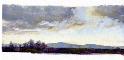
Here’s my first four color study from before I left so I could see how it worked a little, followed by two 20 minute exercises done at his workshop-


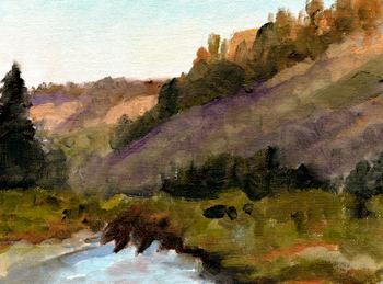
These are two studies I did after I got home. I think you can see that one isn’t really limited at all as far as color and what you can do with it. Value relationships and color temperature shifts become more important than having a particular tube color.


I pretty much stayed with that palette for over two years. For me, the main limit I bumped up against is that I’m an animal artist, not a landscape painter, and I really felt the need for a color I picked up at a Paco Young workshop, Rembrandt Transparent Oxide Red. It’s perfect for so many animals that I do. Then I found that the warmer Cadmium Yellow Medium worked better for me than the cooler Pale. Then I found myself gazing longingly at the dioxine purple, then my beloved sap green……
Presently, having realized that I’m really more of a colorist than a tonalist, I’ve added more punchy colors back so my paintings will have the emotional content I want. These days I use, from left to right on my 18″z24″ glass palette: Rembrandt Transparent Oxide Red, Rembrandt Permanent Red Medium, W/N Cadmium Orange, W/N Yellow Oxide Pale, W/N Cadmium Yellow Medium, W/N Titanium White, W/N Ultramarine Blue, Rembrandt King’s Blue, (sometimes Rembrandt Turquoise Blue, for extra warm blues), W/N Dioxine Purple, W/N Sap Green, W/N Viridian. I very occasionally use W/N Raw Sienna, mostly to tint my canvas before starting, but otherwise I mix my own earth colors, greys and black (ultramarine blue, transparent oxide red).
I do small (6″x8″ to 8″x10″) studies to try out painting ideas and for those I use the four-color palette because I can come back to them months later and I know exactly what colors I used. Here’s three, two of which went on to become finished paintings, so far. Yes, those are Roosevelt Elk on the beach north of where I live in Redwood National Park. The finished painting is called, what else, The Beach Boys, and is in a private collection.


The most important thing is not how many or how few colors you use, but that you know why you are using them and that you use them well.
The “Pot of Paint” reference in the post title is part of another of my favorite artist stories, which will be part of Friday Features.
