More about the warthog in a moment, but first some good Covid-19 news. As of this past Saturday there were no new cases in Humboldt County for four days in a row! I don’t think any of us expect this to last, but it suggests that by following the shelter in place order for the past three weeks, we’re at least flattening the curve. There was no update on Sunday but there should be one today after 4pm. I’ve seen estimates now of a five or fourteen day incubation period, so we’ll see. In the meantime we’ve got plenty to do around the house and property and it’s sunny!
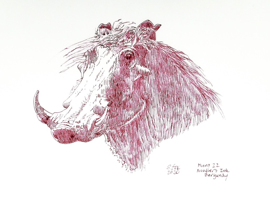
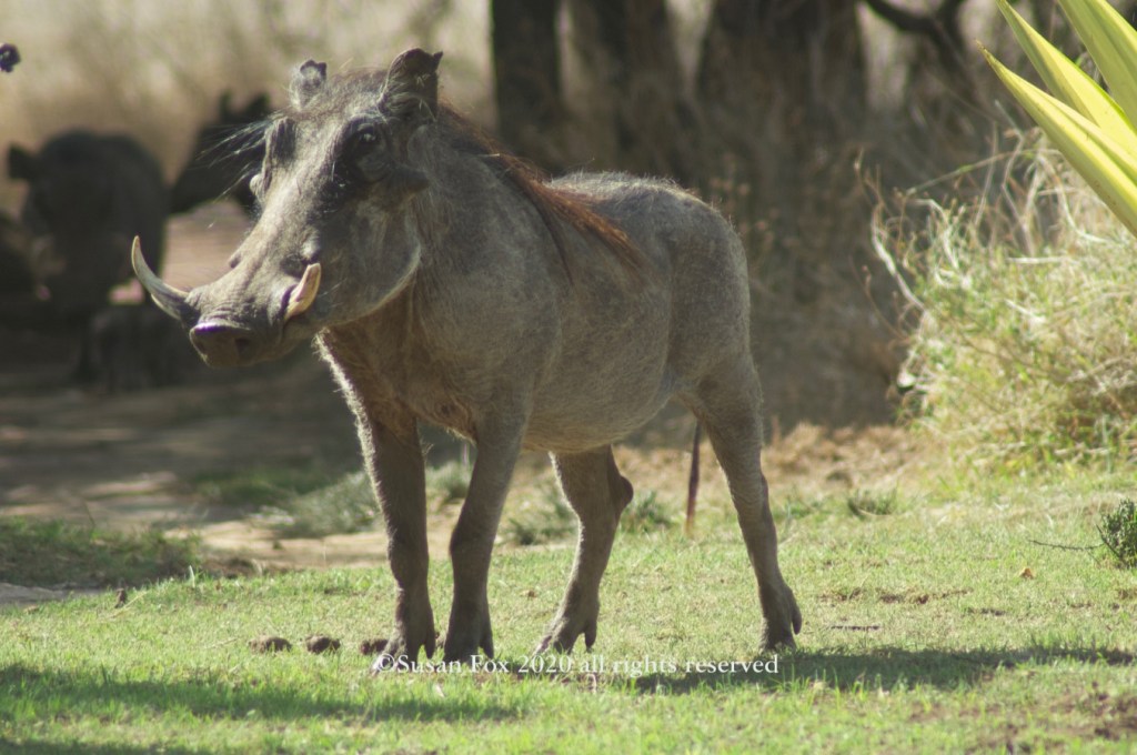
Now on to the warthog. During an art workshop safari I went on in October 2004, with the late Simon Combes, one of the places we went to was Lewa Downs Conservancy. The lodge was on a hilltop with a great view. We were watching Simon do a plein air demo and then set up to do our own. This warthog walked right in front of us less than 20′ away and stopped. I got some great photos, including this one.
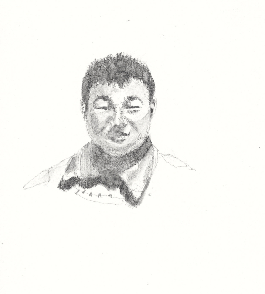
My model
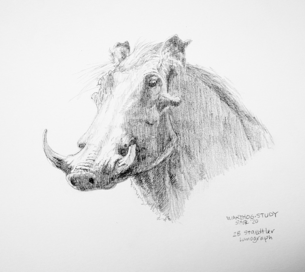
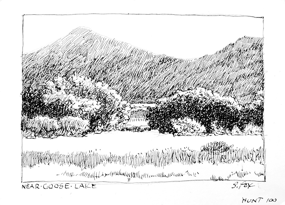
This week’s Inktober52 prompt is “Red”. I don’t have any “red” ink as it turns out (that will be remedied, I hope, on Friday when my order of Dr. PH Martin’s Bombay inks arrive). But I did have a small sample container of Noodler’s Ink Burgundy and that’s what I used, as seen above. The nib this time was a Hunt 22, a good sturdy drawing nib. I started out by doing a graphite drawing. This solves all the drawing and value problems first so on the final drawing I can focus on the penwork.
Graphite on Strathmore 300 vellum bristol
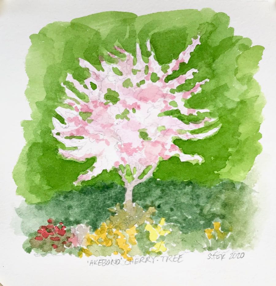
I overlaid the drawing with a piece of Clearprint Heavy Vellum. It worked well but I prefer to do pen and ink work on paper so experimentation will continue.
In other news, I belong to a Facebook group called Sunday Paintout, which meets around 10am on, well, Sunday mornings every week. It’s not the best day for me but I participate when I can. Because of Covid-19, the paintouts are happening virtually. Members are going out on their own on Sunday morning and posting images of the art they’ve done and maybe the location they went to. Our ornamental cherry trees are in full bloom and I’ve had the itch to paint them so yesterday morning I got out my watercolors for the first time in ages and did this quick sketch. I used Winsor Newton watercolors on Saunders Waterford 140lb coldpress paper. It’s 8×8″.
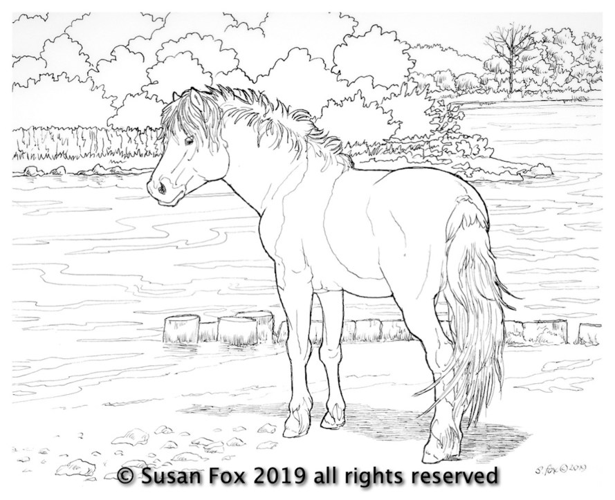
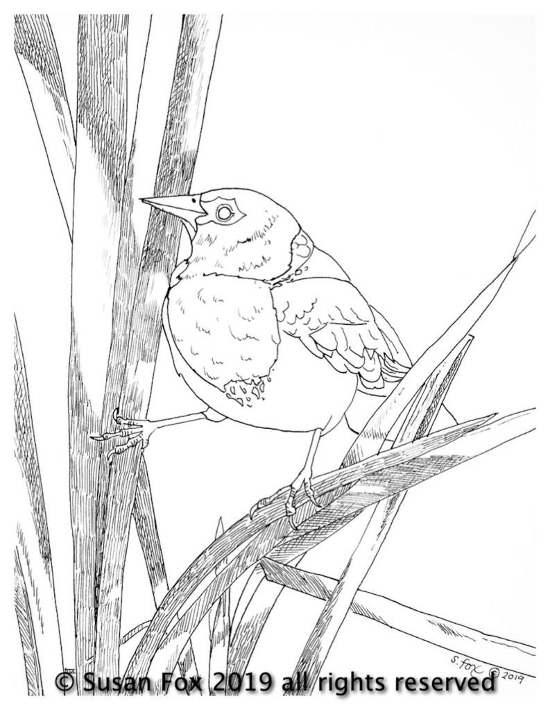
Come check them out! The originals are dip pen and ink drawings on Clearprint Heavy Vellum. All of the images are from photos I’ve taken myself on my travels over the years. You can buy them here:
I’ll have some paintings to show soon, but lately I’ve been mostly diving into dip pen and ink sketch studies, trying out various nibs I’ve been accumulating for the last year. I used dip pens for calligraphy and drawing back in the 1970s/1980s, but moved away from pen and ink for color illustration and then, for the last 20 years, oil painting.
Life moves on, changes are made and now I’m going to be painting somewhat less, but still entering a selection of good juried shows and doing subjects that I’ve wanted to get to for quite awhile. I’ve also realized that I don’t really enjoy painting on location. It’s always felt like, well, Work. But sketching? Never anything but a joy and a pleasure. So I’ll be doing my oil painting in the studio from now on and working on location in pen and ink, sometimes watercolor and maybe some other dry media like Berol color sticks.
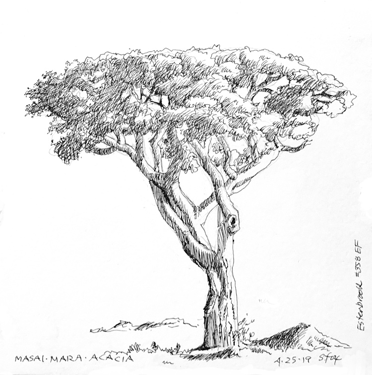
“Masai Mara Acacia” Esterbrook #358 EF on approx. 4×6″ Strathmore 300 vellum bristol
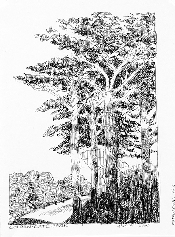
I’ve done these three landscape and tree studies in the last couple of days, trying out what are considered to be some of the finest nibs made specifically for artists.
I’ve also added handlettering back to the mix, something I’ve also did back in the last century. You can learn more about that and see three sketches that also use pen lettering over at my SketchWild site. Check it out and let me know what you think in the comments!
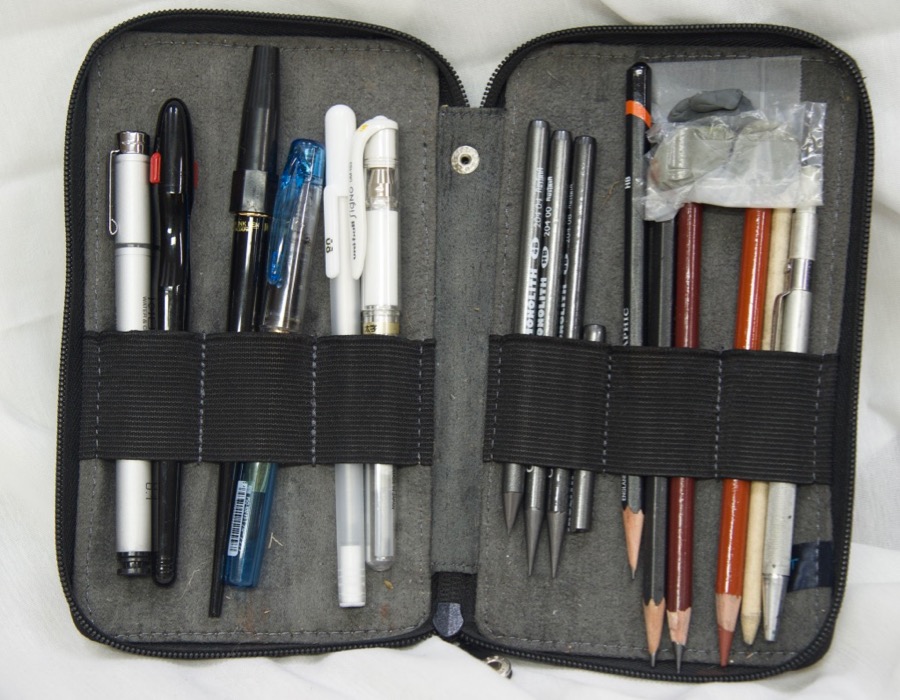
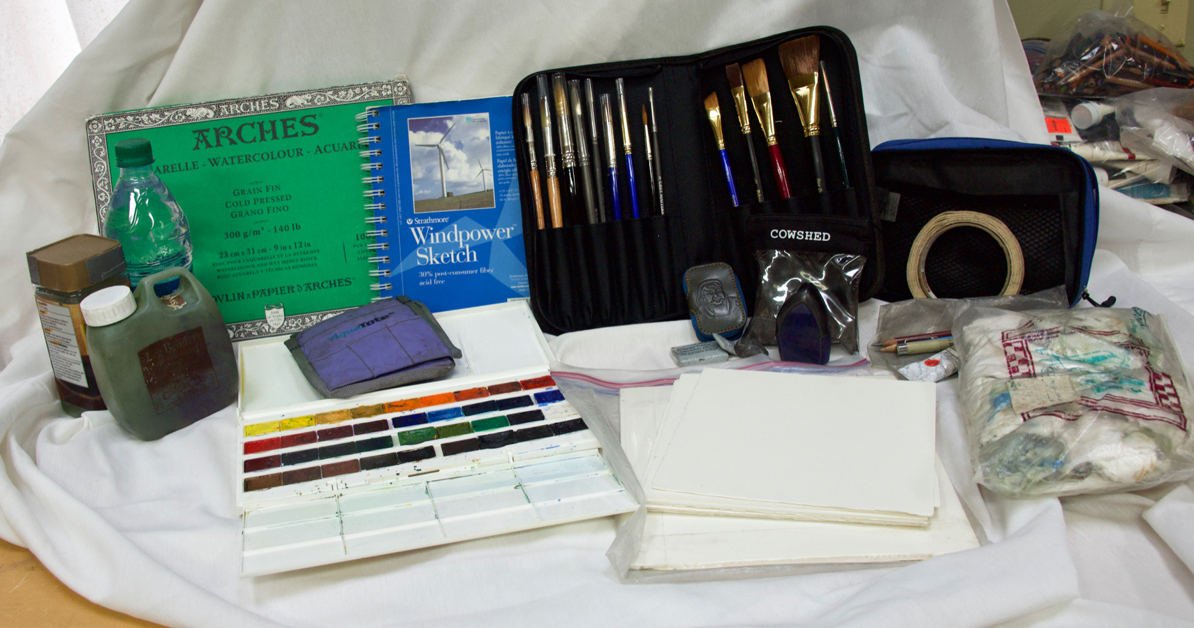
Most of you know me as an oil painter, but I’ve always loved to sketchand draw with pencils and pens and I also paint in watercolor on location. Dating back to 1989, I take at least a small sketchbook and kit like the one above with me when I travel.
I’ve enjoyed seeing sketching take-off as an international art phenomenon and I’ve decided to formally throw my well-loved field hat into the ring. Before the end of the month I’ll be debuting a new website dedicated to sketching called “SketchWild”. It will include not only my field and travel sketching and painting, but also art supply reviews, tutorials and online classes. Tell me in the comments what you’d like to learn!
My specialty and favorite subject has always been animals. I seem to be one of a surprisingly small number of artists who draw and paint from live animals and I’ll offering tutorials on how you can do that, too.
If you’ve never sketched before and want to try it but don’t know where to start or if you’re a landscape painter who occasionally wants to add animals like, say, a cow or horse, to your painting but don’t know how to draw them, I’ll be offering classes and/or sets of tutorials for both. I’ll also be offering instruction in pen and ink sketching/drawing with technical pens, fountain pens and dip pens regardless of subject and tutorials on sketching with an iPad, including a review of the variety of apps available. And there are a lot of them!
In the end it’s not about, or only about, making finished pretty pictures, but enjoying the process and seeing the world through art you’ve created yourself. Some of the best souvenirs you can take home are the sketches you did of what caught your eye.
To give you an idea of what I’ve done over the years, here’s a selection from my sketchbooks. Some, like the animals were done very quickly, in maybe one to three minutes, sometimes less. The landscapes hold still so I can spend more time on them. And if I can add an animal, so much the better!
Rolling Hills Wildlife Experience, 2010
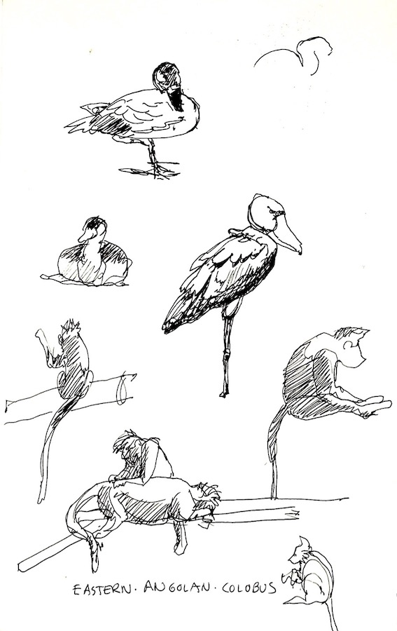
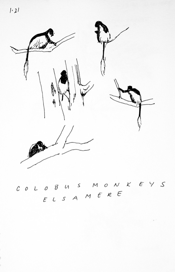
Monkeys don’t hold still for long so you have to work fast and see the basic shapes, in this case a quick indication of light and shadow to go with the drawing.
Colobus monkeys, Elsamere, Kenya, 1999
These colobus monkeys were fairly far up in the trees and jumping around so I simply and quickly sketched in the black bodies, leaving the white feathering the color of the paper.
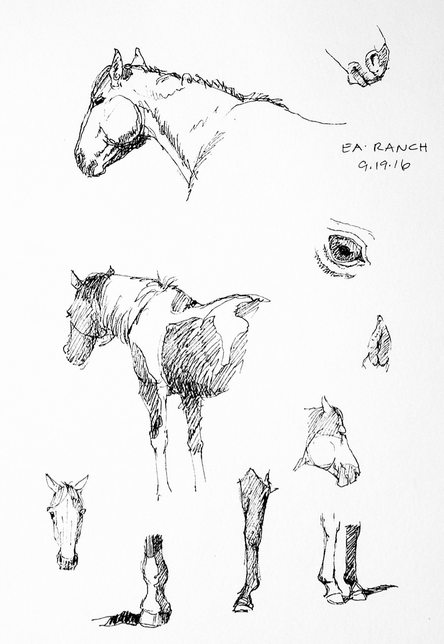
Horses, EA Ranch, Wyoming, 2014
The horses were in a corral standing around, so I had time to add things like the pinto markings and do eye, leg and hoof studies.
I was sitting up on the rocky hillside of a valley in the reserve when I did these quick sketches of the world’s largest mountain sheep. I’ve seen them many times and have painted them, so I “know what they look like”.
Berlin Zoo, 2004
These barbary sheep and tahr posed nicely for me so I was able to do much more finished sketches that I usually manage.
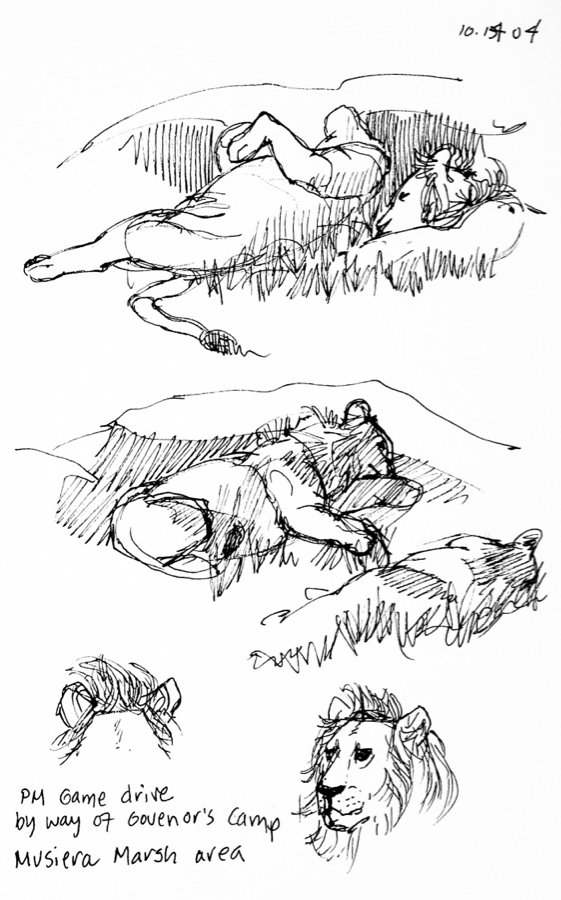
African Lions, Masai Mara, Kenya, 2004
I’ve had the good fortune to go to Kenya twice, once in 1999 and once in 2004 and would love to get back there sometime. We were driving to our campsite and came upon this lion and lioness in the throes of “temporary love”.
While animals are my favorites subject, I sketch pretty much anything interesting that crosses my path. I also like to record an animal’s habitat, which creates a specific kind memory that one doesn’t get from only taking photos.
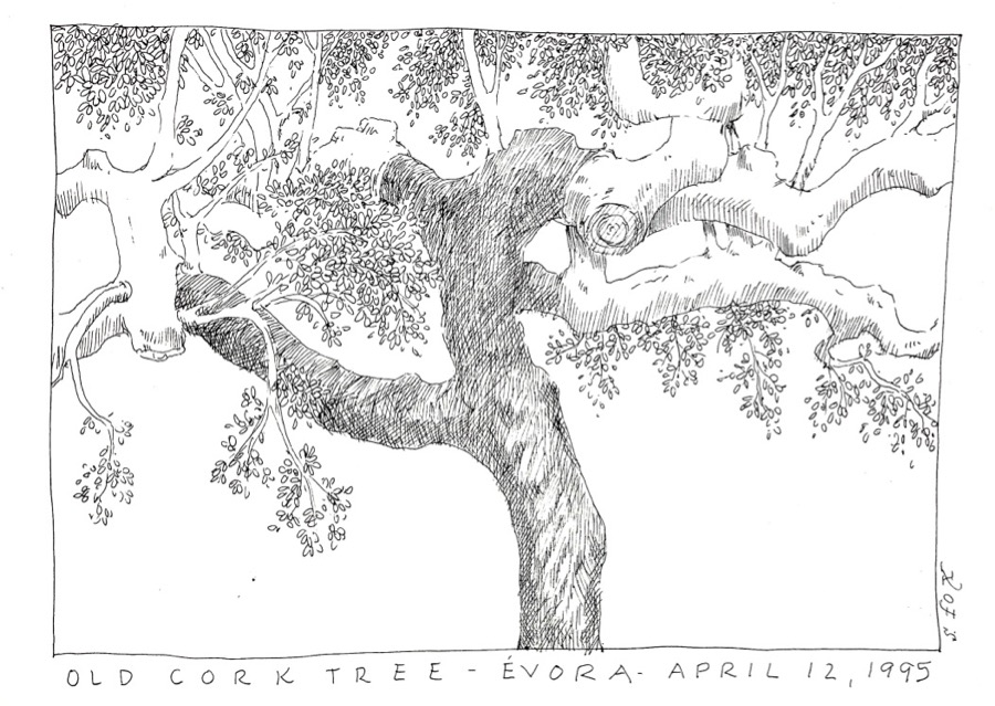
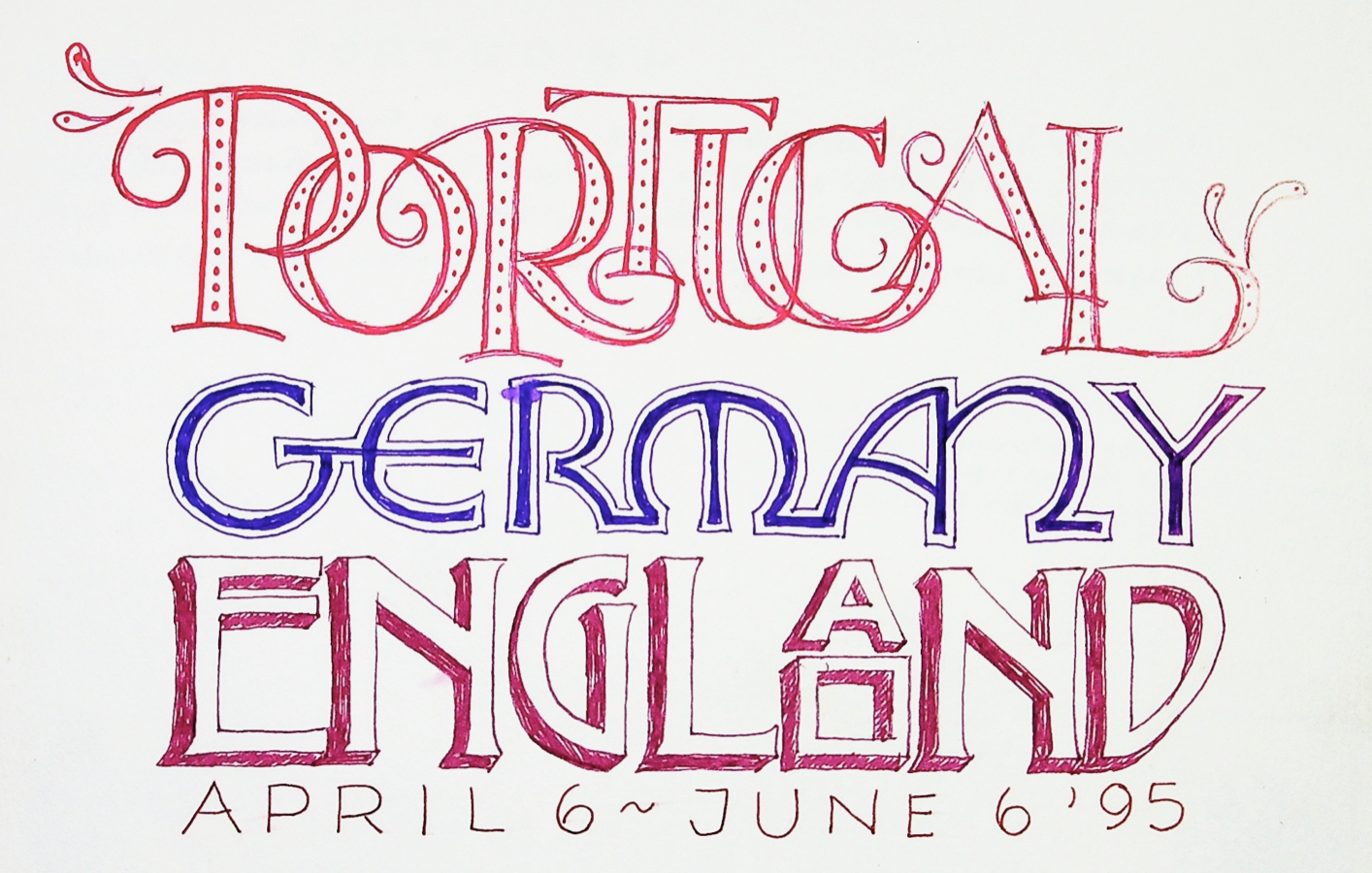
Cork tree, Portugal, 1995
On a trip to Portugal with a number of other artists we stayed at an old farmhouse that was surrounded by cork trees, the same ones that wine corks come from. They were full of character. I was interested in the twisting branches and trunk.
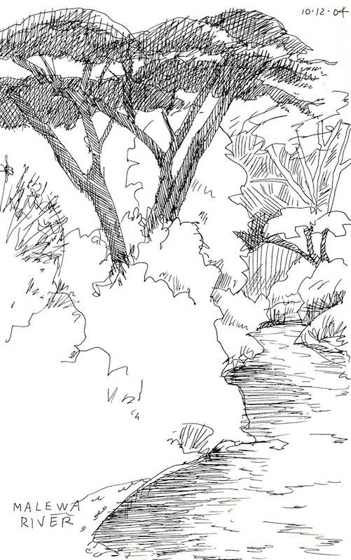
Malewa River, Kigio Wildlife Conservancy, Kenya, 2004
This scene was near the lodge we stayed at in the conservancy. I didn’t have a lot of time between breakfast and departure, so I focused on the river going back in space, the large, tree and left the rest of the vegetation as outlines.
I’ve had the good fortune to travel to England quite a bit over the years. I love drawing the wonderfully picturesque historic buildings.
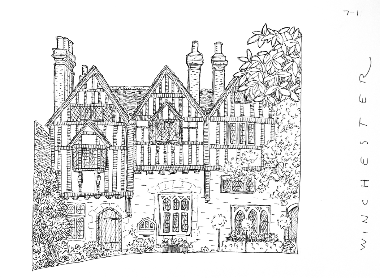
Winchester, England, 1995
I had plenty of time to lovingly sketch the half-timbering, windows and shrubs of this wonderful old building.
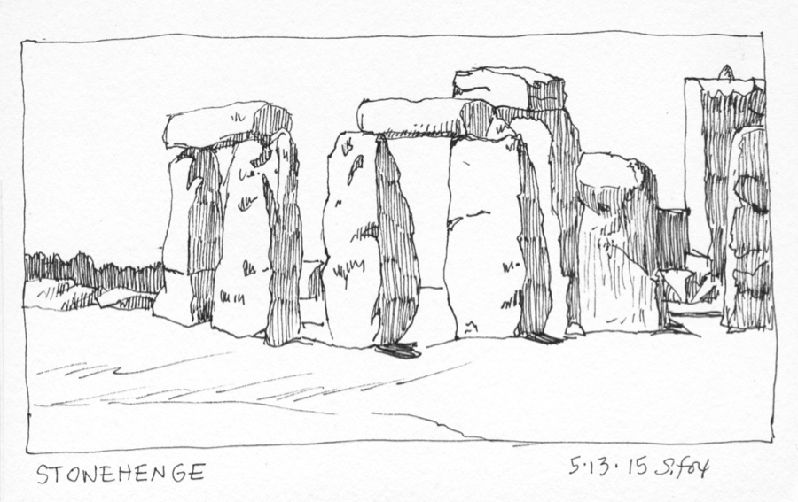
Stonehenge, England, 2015
Getting to sketch at Stonehenge a few years ago was a tremendous treat. In order to do a number of drawings from different angles I kept it really simple….the shapes of the stone themselves and then filling in the shadow sides.
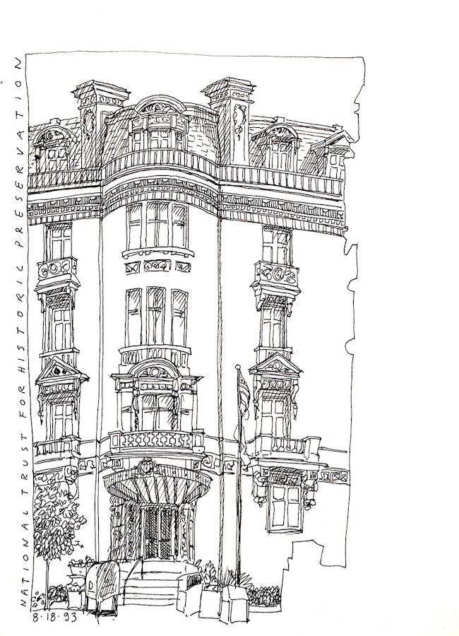
Washington D.C., 1993
I also sketch during trips around the USA. I enjoy playing around with edges, cropping in as needed. I didn’t want to bother with the building next to my subject, so I just left it as a silhouette in reverse.
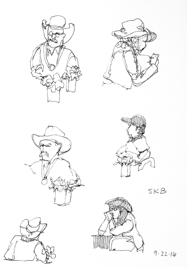
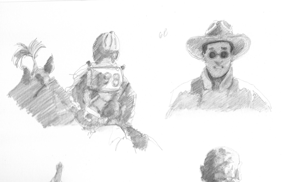
Susan K. Black Foundation workshop, Wyoming, 2016
When I did these super quick people sketches I was experimenting with contour drawing. None of them took more than a minute or so. I’ll be showing you how to do it.
The above sketches were done with pens, mostly Sakura Micron .01s. I also work in watercolor on location.
My current travel watercolor kit.
All of the above goes into an REI daypack.
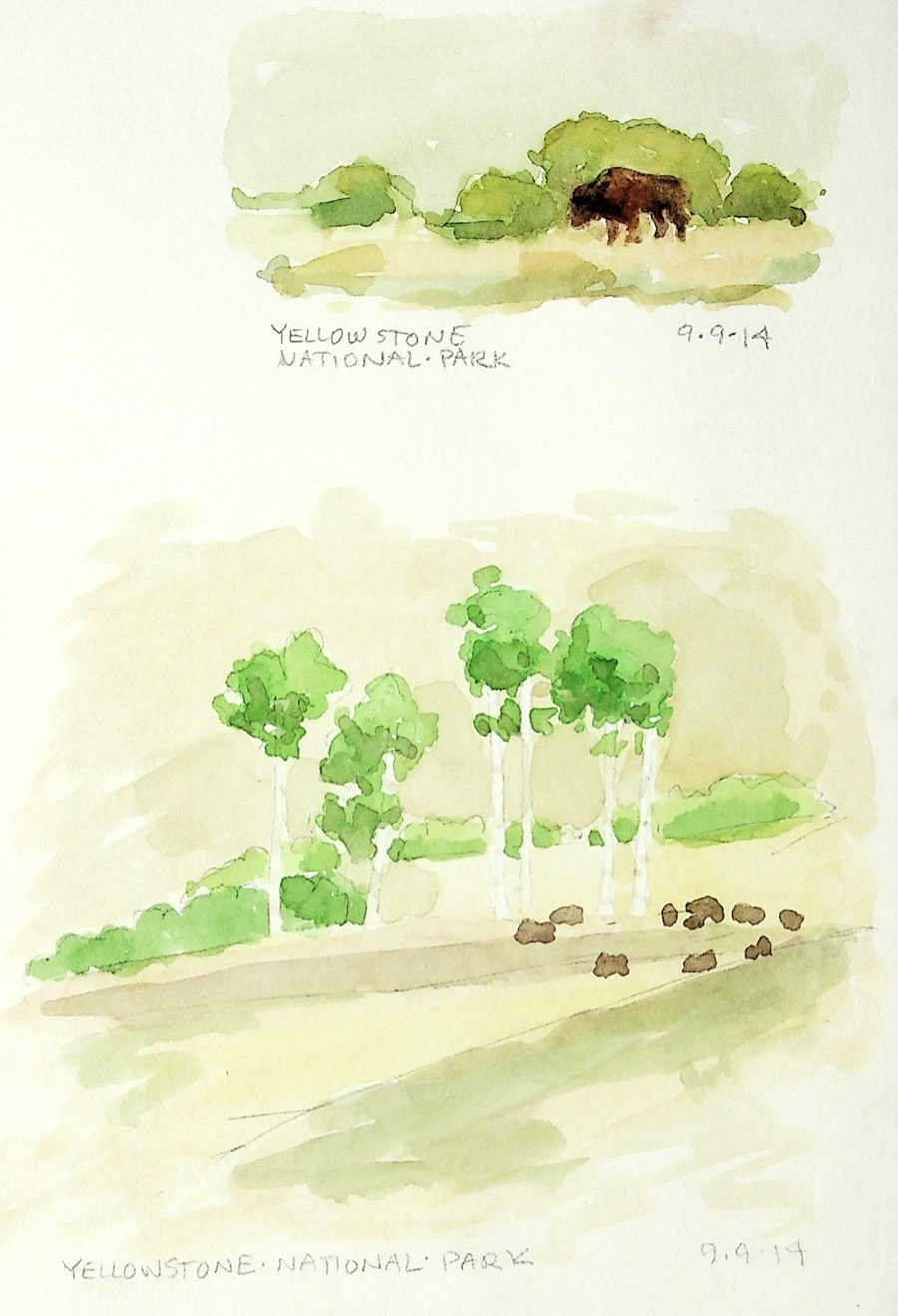
Bison, Yellowstone National Park, 2014
Quick watercolors just to capture the day and the bison.
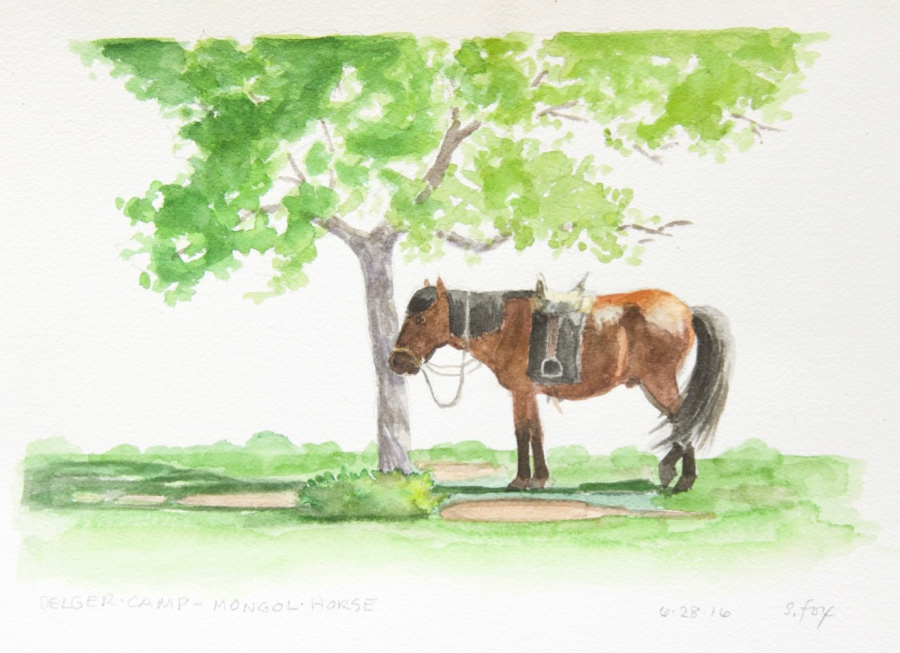
I spent a couple of hours on this painting, making sure that not only was the horse drawn correctly, but that the saddle and bridle were right. I went up close a number of times to check details. The horse would shift a bit, but then back into the position I’d drawn. Something to remember about sketching animals…they tend to move in a repeating pattern, so one can stop, wait, maybe start another sketch, then pick up the first one once your subject is back in place.
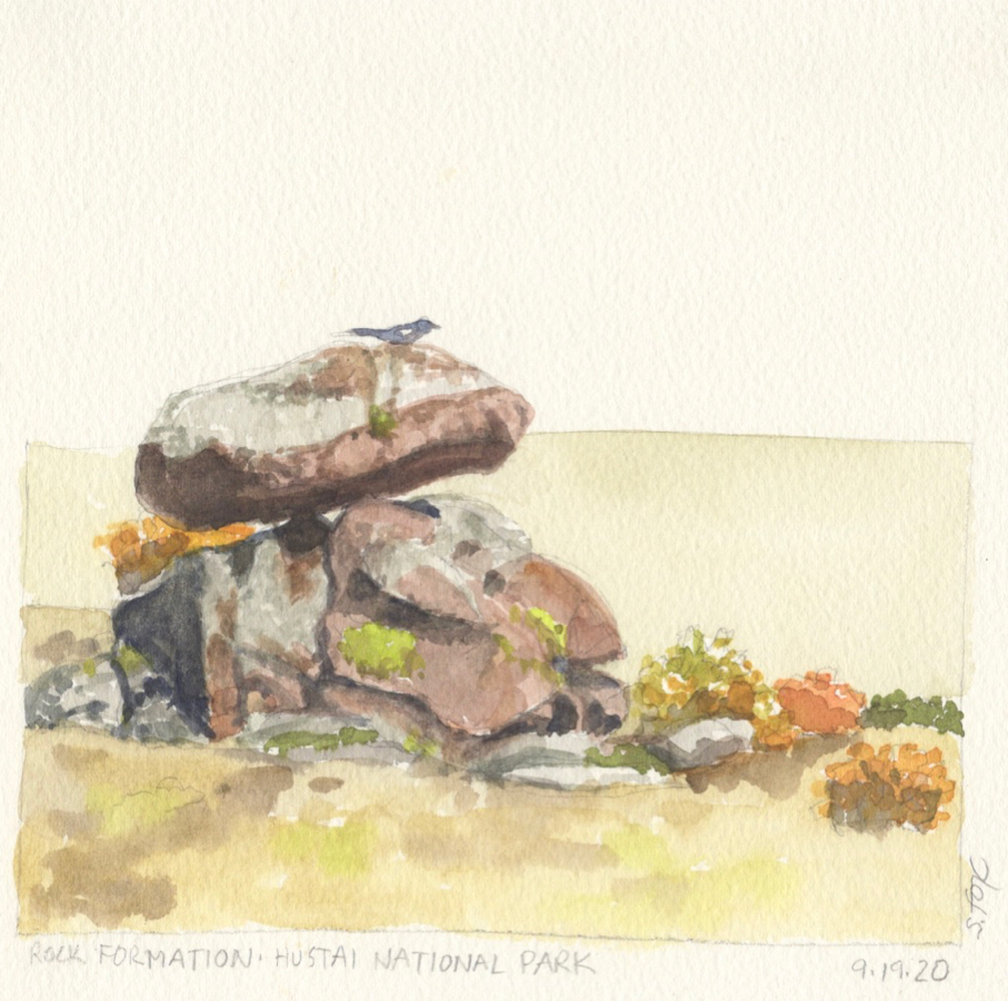
Bird on rock, Hustai National Park, 2012
I was sitting on a rock at Hustai, painting this interesting and colorful small rock formation and the surrounding fall foliage when the bird, I think it was a magpie, landed on the top one. I dropped my brush, grabbed a pencil and quickly sketched it in.
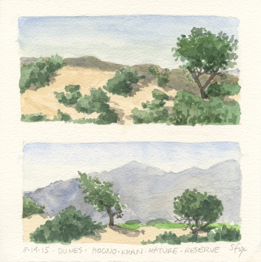
Dunes, Hogno Khan Nature Reserve, Mongolia, 2015
I carry a small stack of 8×8″ pieces of Sanders Waterford cold press watercolor paper with me in a gallon ziplock baggie, along with a small foamcore board with packing taped edges and a roll of drafting tape. I’ve found that I really like the small square size and can, as I did here, easily place two smaller horizontal format paintings on it.
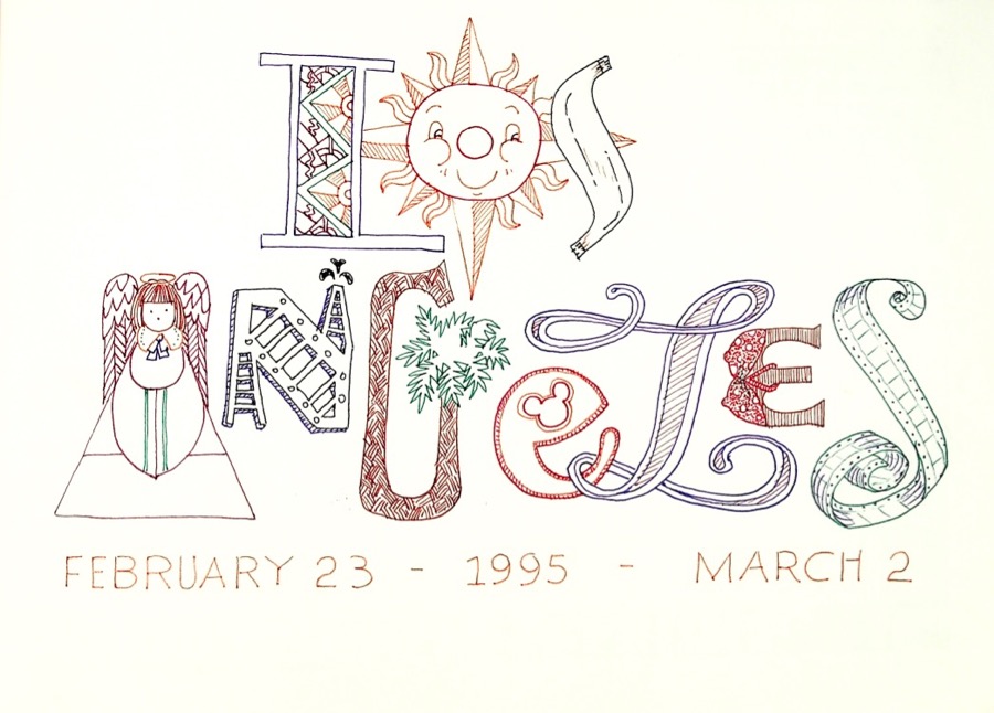
And, lastly, I’ve done calligraphy and handlettering for over forty years. Both are also undergoing a revival and I’m considering offering tutorials and maybe a online class or two for that. Here’s a few samples of my lettering…
Title page for 1995 trip to Los Angeles
Title page for 2016 sketchbook
Journal title page, Mongolia, 2016
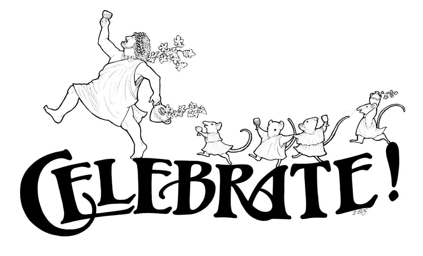
From my illustration days, the heading for wine tasting calendar,
I’ll be posting the latest news about SketchWild here on my regular website and also in my Facebook group, FoxStudio. Let me know in the comments what you think and what you’re interested in learning!
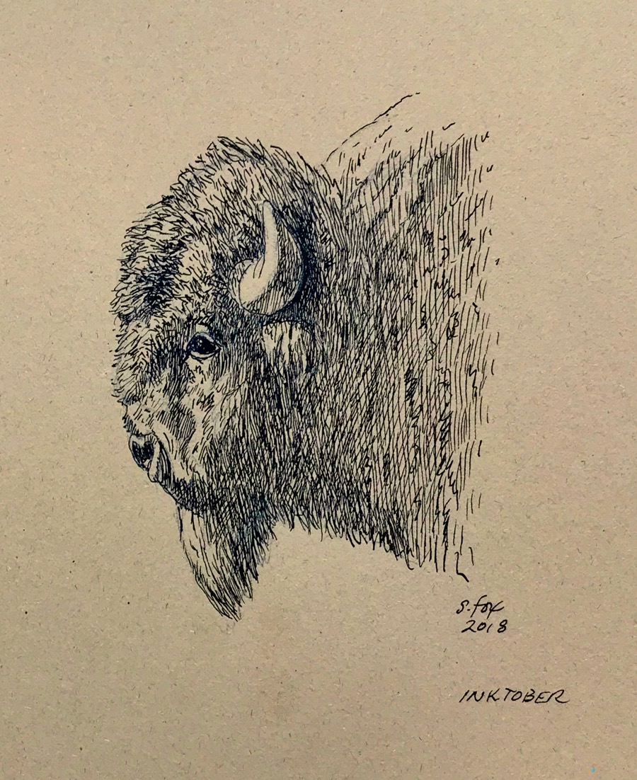
Inktober 16 “Bison”– I love drawing bison! Especially the big bulls who are attitude from one end to the other. I saw this one in Yellowstone National Park. Went international with the supplies this time…a Yaroslawl “Orgtechnika” nib from a Ukrainian seller on Etsy. The nib has a hammer and sickle stamped on it so maybe they bought or acquired the inventory of an old Soviet era pen nib factory since they offer lots of different types. In any case it’s a great nib for drawing even though I’m sure in was intended for writing only. Perle Noire ink from Herbin in France. And a Global Arts “hand-book” Kona Classic sketchbook.
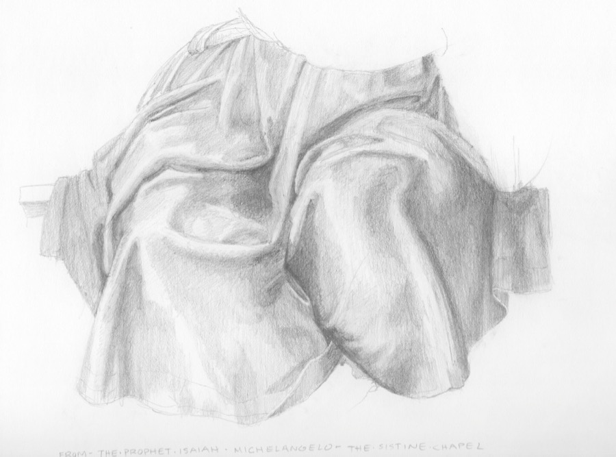
Study from Michaelangelo’s Sistine Chapel figure of the prophet Isaiah
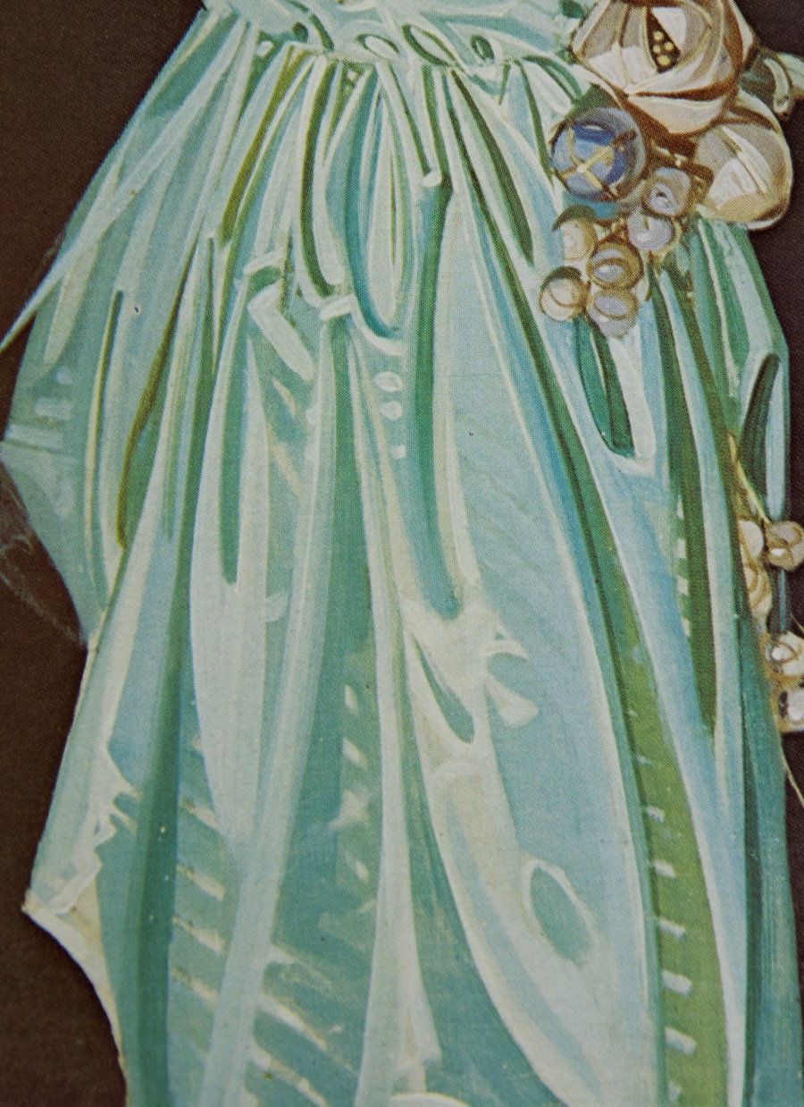
And the answer is: I’ve started a new painting which is part of a new direction I’m experimenting with, which is all I’ll say for now. One of them involves using a khadag, the traditional Mongolian offering scarf, as a design element. I haven’t done drapery since art school. I set up a khadag that I brought back and did some drawings from it, but could tell that I really didn’t understand what I was looking at or how to get where I wanted to go. Drapery has a structure and pattern and I just wasn’t seeing it with any confidence. Time to get out the art books and do some copywork from the masters. Who better to learn from? And I’ll do as many as it takes to get it. I was also able to go to the Metropolitan Museum of Art last month when I was in New York for the Explorers Club Annual Dinner. I focused on getting photos (with my iPhone 5S) of drapery details and I’ll be drawing from those next. But today I want to share what I was able to do working an “old-fashioned” way…from books.
Besides my immediate goal of learning to draw drapery again myself it was fascinating, through the copywork, to see how these artists solved the problems, some very naturalistically and some by simplifying with more stylistic handling.
The Michaelangelo copy above was the last one I did and took the better part of a day. It’s about 8×10″. I was working on technique along with creating the actual drawing.
All are done with Cretacolor Monolith pencils on either Canson drawing paper or Strathmore 400 with added help from a kneaded eraser that definitely got a work out.
Fresco painting detail by Michaelangelo, Sistine Chapel
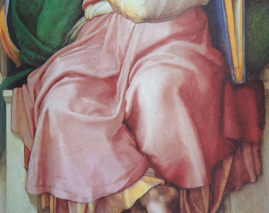
Below is the first one I tried. Notice that there are basically three values and some color temperature shifts. Get those relationships correct and you have…satin!
Sleeve detail by Jacques-Louis David
I wanted to start with a simple shape that had well-defined folds. And I was very curious to see a little of how David saw, given his great academic training and skill. I have some good details from one of his paintings at the Met that I’m looking forward to drawing.
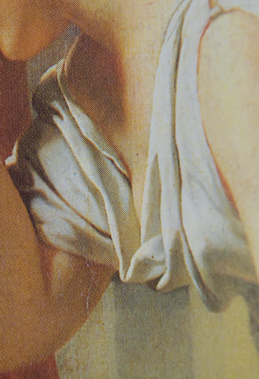
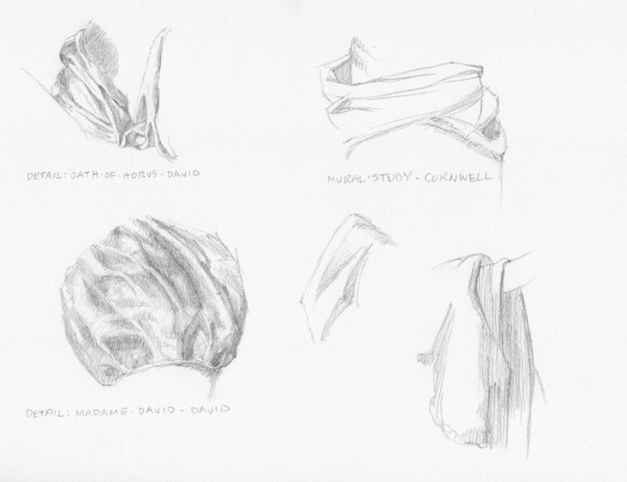
Neckline fold detail from “The Oath of the Horatii” by Jacques-Louis David
I specifically wanted to draw that neckline fold and the overlapping folds coming over the shoulder because they relate to the design I have for the khadag.
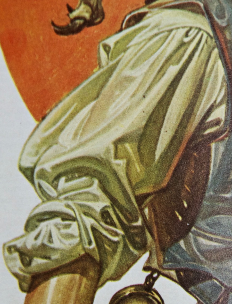
Garment details by Jacques-Louis David (left) and Dean Cornwell (right and middle)
Sash detail by Dean Cornwell
My study is above right. I wanted to understand how the sash drapped around the form.
Sleeve detail by Dean Cornwell
My study is lower left above. I wanted to get that feeling of the thickness of the fabric coming over the arm.
Coat detail by Dean Cornwell
Small drawing in the middle of the page above.
Cornwell had an interesting way of simplifying drapery and it’s a characteristic of his style. I remember one of my drawing teachers in art school doing a slide show of master drawings. When she got to the Cornwell, she matter-of-factly told us that if we could do a drawing like that we would get an “A”. We just kind of looked at each and thought “Yeah, well, in our dreams”. Ultimately, I realized that his approach, at least at this point, wasn’t going to be useful to me for what I want to do.
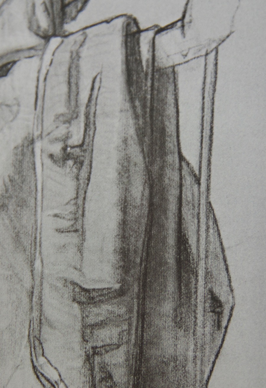
Gown and sleeve details
Gown detail by J.C. Leyendecker
Sleeve detail by J. C. Leyendecker
J.C. Leyendecker was another master stylist, instantly recognizable. Notice that I’m showing the work of two illustrators, along with traditional fine artists. That’s because the great illustrators were simply great artists and their drafting and design skills were impeccable. Plus, that’s my background since my formal art training was in illustration so I “speak” that language.
Through copying some of his work I hoped to understand better how to simplify and understand what I had to have to say “fold” and leave out everything else. Artists like Michaelangelo, David and, as you’ll see, Velasquez had a more naturalistic approach, but still edited and made choices, each in his own way. And the sum total of those choices is one of the ways a viewer can tell one artist from another.
The gown detail was challenging because every shape and its relationship to the other shapes had to be just right in order to read as drapery. By the time I decided to tackle the sleeve I felt that I was starting to get the hang of things and also to gain a little insight into his thinking through the choices he made in a way that would not be possible by just looking at the art.
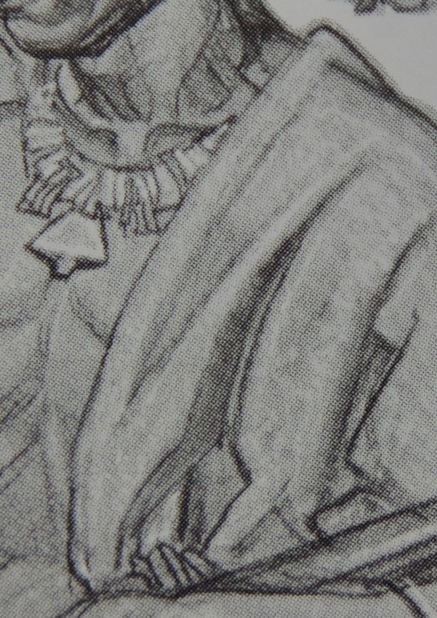
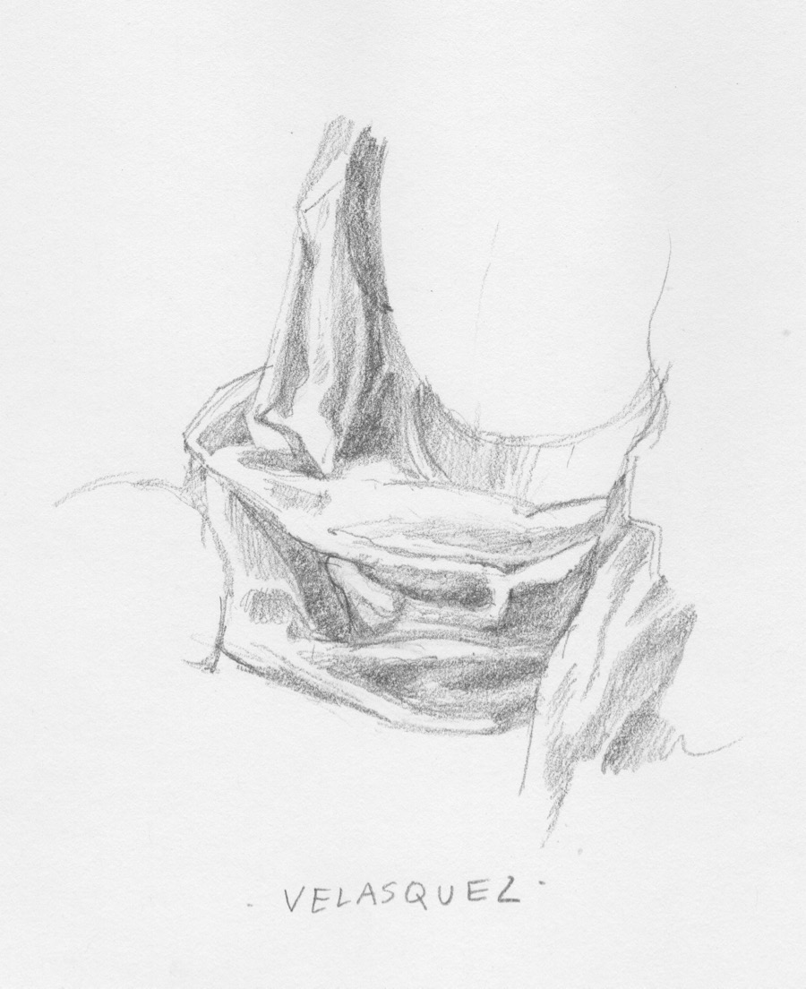
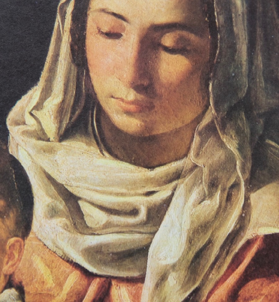
Head drape detail
Head drape by Velasquez
If one wants to learn from the best then you have to take on Velasquez, one of the best ever, a painter’s painter. And that ended up being a bit of a problem. When I looked through my book of the artist’s work I didn’t really find a lot in terms of drapery that would help me with what I was trying to do. I found his shapes, when looked at individually, to be idiosycratic in a way made them very abstract. It’s a very different way of seeing than I do. But what a great thing to learn. I am in awe of him as are so many others. I plan to start doing some human subjects and when it comes to heads and hands I will be returning to him for both drawing and painting study.
So that’s what I was up to last week. This week I’m back at the easel doing some repaints on small works, both to get my groove back and to build up stock for North Coast Open Studios, which I will be doing the first two weeks in June. More on that to come!
Three out of the last four years I’ve had exhibitions to paint for. I didn’t plan it that way, it’s just how it worked out. But what that means is creating a body of work with a deadline. It’s not the time to experiment, dork around and try new media and materials. You go with what you know. I don’t have an exhibition coming up for at least another year or so, but will have juried competitions and exhibitions to do new work for starting in January. So I finally have breathing space to explore, experiment and maybe integrate some new tools and techniques into my process or just do for fun. One part of that has been “gray studies” and you can see some of them here.
For the last few days I’ve been trying out Derwent Graphitone pencils on a variety of papers. When you’ve been at this as long as I have, art materials accumulate, including paper. Digging around in my flat file paper drawers and looking over my sketchbook options, I found 15 different ones to try, including also a a hot press watercolor block. The Graphitone pencils are water-soluble graphite. I use a waterbrush to wet them, so the paper has to be able to take that without buckling.
What I was after was a forgiving surface that could be layered, would let me control the damp to wet graphite and end up with something that was visually pleasing. Most did ok, but some have made the short list, including the piece at the top, done on Strathmore 300 vellum bristol. It’s 100lb. which worked fine, but a thicker ply would be even better.
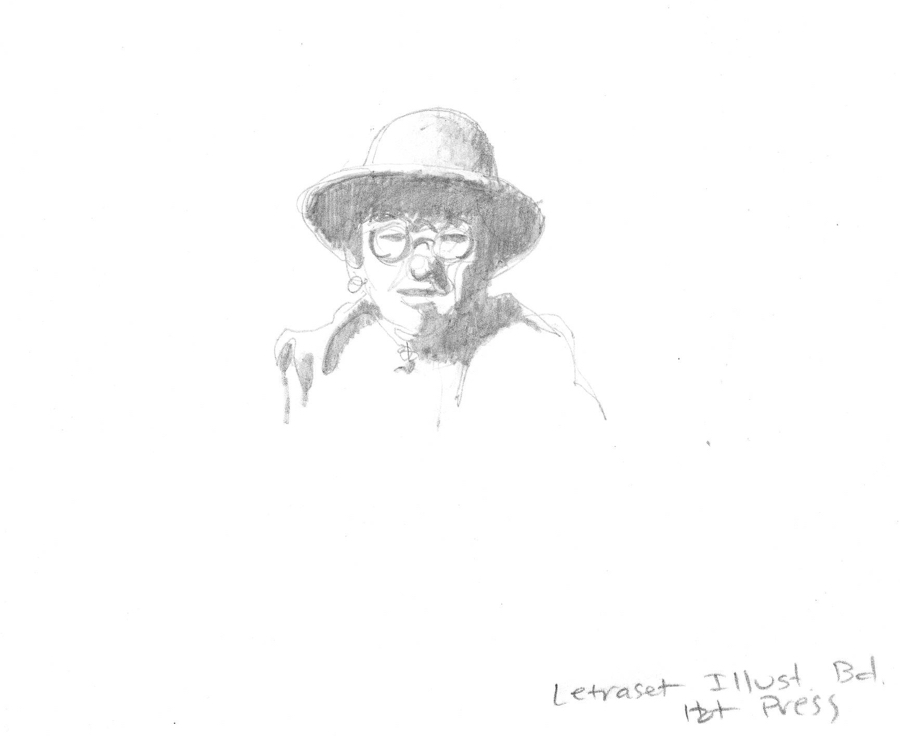
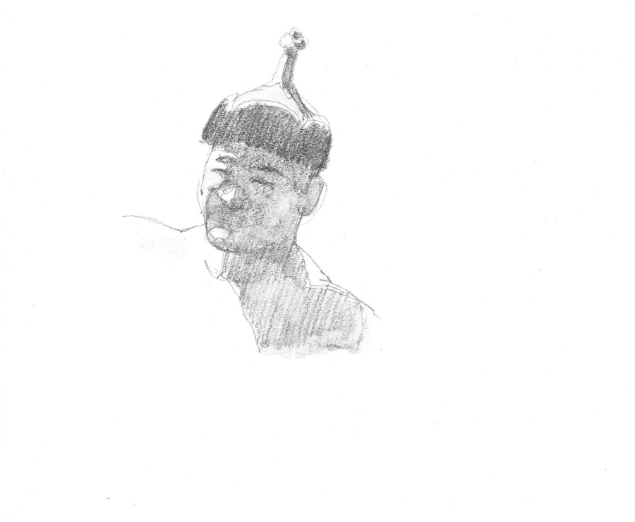
None of these are more than, at most, couple of inches in height and took no more than about twenty minutes. I need to get better at doing humans, so I used some of my Mongolia people reference and got a two-fer out of it.
The woman above was done on, as you can see, Letraset hot press illustration board. I liked the result, but I’m not sure about carrying a small pile of boards around if I want to use this technique on location, expecially Mongolia.
For the wrestler I used a Strathmore bristol vellum 476-2 that I found at the bottom of the flat file drawer. I only knew what it was because I’d jotted the name in the corner. It wasn’t bad, but I have no idea if it’s still available.
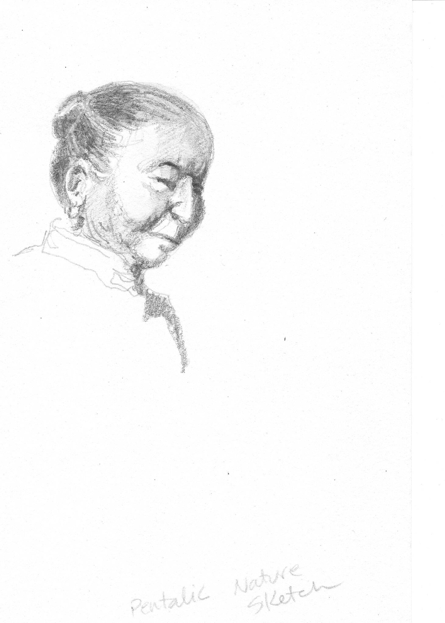
I’ve been very taken with the Pentalic Nature Sketchbooks. They seem to handle a variety of dry and “damp” media well. However, the paper is thinner in the newer sketchbooks from when I originally started to buy them (even though they still say 130lb. on the cover), but the Graphitone did act more like watercolor when wetted than on some of the other papers.
Finally, for this portrait head I used an off-white Strathmore 400 vellum bristol, which had also lived near the bottom of the paper drawer for many years. I like the way the media worked on this paper the best. It’s probably 3-ply which means it can take a fair amount of water. But paper formulas change over the years, not usually for the better, so I’ll be buying some to see how well it works today. Fingers crossed.
The other papers I test drove included: Rives BFK (my favorite for dry graphite drawings), Sennelier Album Carte d’Art, Rising (plate finish), a Canson drawing paper, Aquabee Super Deluxe (a great example of a paper that has been ruined by cheapening and thinning over the years as the company has changed hands), Crescent cold press illustration board and, finally, Daler Cartridge Paper. The watercolor paper was Lanaquarelle hot press.
Looks like we’re going to have rainy weather for the next week or so up here Behind the Redwood Curtain, perfect for continuing my explorations. Family coming up next week for Thanksgiving, so see you in a couple of weeks. Have a great holiday!
Here are the links to three art blogs I really like. There are a lot of them out there, but unfortunately too many artists don’t post regularly or don’t do much other than occasionally post images of their work.
These three stand out for quality of content and regular postings.
1. Gurney Journey is one of the top-rated art blogs. James Gurney is the author of the Dinotopia books, has written two books about art technique and craft and posts to his blog every day on everything from how the human eye tracks through a painting to short profiles of famous artists to how he creates his own marvelous works.
2. COLOR AND LIGHT is the blog of nationally known artist Adele Earnshaw. She started as a watercolorist, but switched to oils a few years ago and the story of why and how she did that makes very interesting reading. Recently she’s been doing what she calls 75 For 75. A painting a day for 75 days that she offered for sale as she finished them for $75. I managed to snag one a few months ago, but I had to be quick because most sell within minutes.
3. Cathy Johnson Fine Art Galleries is where you can find all kinds of great art instruction materials, along with images of Cathy’s art. I remember reading her column in Artist’s magazine many years ago and was tickled to find her on Facebook and see that she is still at it and then some. She offers CD courses, mini-classes and also information about various art media like her favorite drawing pen. Her instruction is real, not that rote “Here is how you paint a tree with my special brush and paint” stuff.
I firmly believe that drawing is the fundamental prerequisite for success in representational painting. There is no way around it. No excuses to be made if an artist wants to be an excellent, or even simply competent, painter. Good drawing is inextricably linked to good painting.
With that in mind, here are some quotes that I really like about drawing:
In spite of everything I shall rise again: I will take up my pencil, which I have forsaken in my great discouragement, and I will go on with my drawing. Vincent Van Gogh
The whole essence of good drawing – and of good thinking, perhaps – is to work a subject down to the simplest form possible and still have it believable for what it is meant to be. Chuck Jones
It is only by drawing often, drawing everything, drawing incessantly, that one fine day you discover to your surprise that you have rendered something in its true character. Camille Pisarro
Portrait of Louis Reiset, Ingres
Drawing is the honesty of the art. There is no possibility of cheating. It is either good or bad. Salvador Dali
Originality depends only on the character of the drawing and the vision peculiar to each artist. Georges Seurat
Pure drawing is an abstraction. Drawing and colour are not distinct, everything in nature is coloured. Paul Cezanne
Example sheet, Chuck Jones
A drawing is simply a line going for a walk. Paul Klee
Drawing is not the form; it is the way of seeing the form. Degas
To draw does not simply mean to reproduce contours; the drawing does not simply consist in the idea: the drawing is even the expression, the interior form, the plan, the model. Look what remains after that! The drawing is three fourths and a half of what constitutes painting. If I had to put a sign over my door [to the atelier], I would write: School of drawing, and I’m certain that I would create painters. Ingres
Portraits en Frise, Degas
From the age of six I had a mania for drawing the shapes of things. When I was fifty I had published a universe of designs. but all I have done before the the age of seventy is not worth bothering with. At seventy five I’ll have learned something of the pattern of nature, of animals, of plants, of trees, birds, fish and insects. When I am eighty you will see real progress. At ninety I shall have cut my way deeply into the mystery of life itself. At a hundred I shall be a marvelous artist. At a hundred and ten everything I create; a dot, a line, will jump to life as never before. To all of you who are going to live as long as I do, I promise to keep my word. I am writing this in my old age. I used to call myself Hokosai, but today I sign my self ‘The Old Man Mad About Drawing.’ – Hokusai, The Drawings of Hokosai