I’ve started a series of three small paintings of Mongolian race horses and thought I’d share the step-by-step of doing more than one painting at a time. First up was to choose my reference photos, picking three heads that would work together in a group.
I generally never post my reference images on the internet for obvious reasons, but in this case I wanted to show you the kind of photos I have to work with. The one above was taken at an aimag (province/state) naadam a couple of years ago. I was able to go out in the chase car for two races, so had a rare opportunity to shoot both stills and video not only as the jockeys, horses and trainers rode out to the starting point, but to travel parallel to the riders as they raced back. Looking through the many hundreds of race photos I’ve taken over the years I found a quite visible difference, which makes sense, in how fast the horses ran in the first part of the race and how much they’d slowed down by the last third or so. This really affected leg position and sense of the effort on the horse’s part as expressed in the body language.
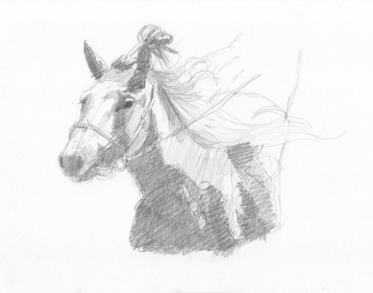
But for this set of three I only wanted the heads, so was looking for variety in coloring, angle and generally interesting shapes of light and shadow. I started with drawings, thinking in terms of “notan” the Japanese method of simplifying an image down to two values….light and dark or light side/shadow side. I was also working on capturing the expression, the bridle and some of the shapes in the manes.
I had originally intended to include the rider’s hands and legs in the frame, but those shapes seemed distracting, especially cut off at the edges, so right now my plan is to leave them out. But that could change…
The top two pieces will be 8×8″. The one above will be 8×10″. So an arrangement of two squares with a rectangle between them.
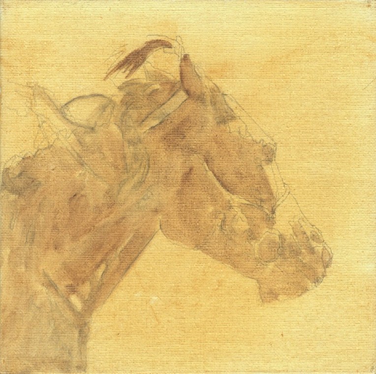
The next step was to scan the drawings and project them onto the pre-toned canvas panels, sketching each one lightly with a pencil.
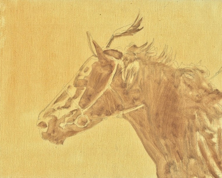
The panels were toned with Winsor Newton raw sienna. I indicated all the shadow shapes with a mix of that and a little Winsor Newton violet dioxazine, which creates a warm brown tone that is still related to the background tone.
I scanned the panels with my Epson XP-830 printer/scanner/copier and then imported them into Photos for cropping, color correction and any other adjustments. This works pretty well for small pieces that I want to post to my blog or other social media.
I like working this way because it gives me a lot of control over how much detail I add and where. I also like to leave “lost and found” shapes. What is important to me, though, is accuracy of both the horses and their tack, not detail per se. For me the game is to see how much I can simplify and leave out.
There is a great benefit art show that has happened for a number of years now that I’ve contributed to in the past but have been too busy to do again until now. It’s called “Cats in the Hall”, the hall being The Hall Gallery at 208 C Street Studios in Eureka, California, about 20 minutes from where I live.
There will be work by over 70 local artists working in various media. The Arts Alive! Reception will be on Sept. 2nd. The doors open at 12:00PM Saturday and Sunday. Costumes are encouraged for the opening. The show comes down Sept 27th. There will be cats available for adoption.
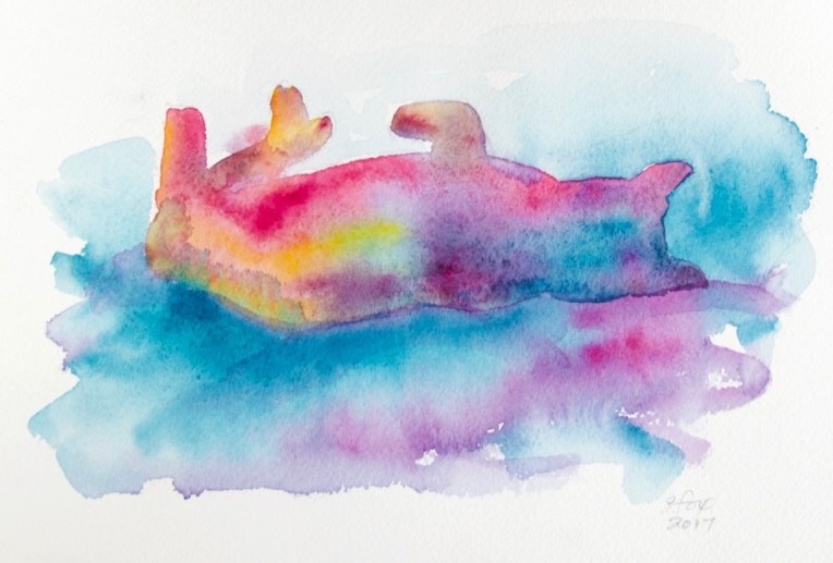
I’ve taken advantage of finally not staring down the barrel of show deadlines for awhile to splash around with my watercolors and have some fun painting from the zillions of photos I’ve taken of our cats over the years.
“Conked Out Cat” watercolor on paper 6.25×9″ $10
The pieces I’m posting here will only be available for now at the show. If any don’t sell, then I’ll post them for sale on my website.
“Comfy Cat” watercolor on paper 5×6″ $10
I really had fun loosening up with the watercolors. I drew each shape, added a layer of clear water and then started adding paint, just letting it do its thing. I used my new Yarka watercolor set so it was a chance to try out some new colors too.
“Tiny Cat” watercolor on paper 1 7/8″x3 7/8″ $5
So if you live in Humboldt County (or beyond) and you love art or cats or art and cats or cat art, come to the show!
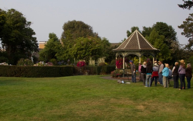
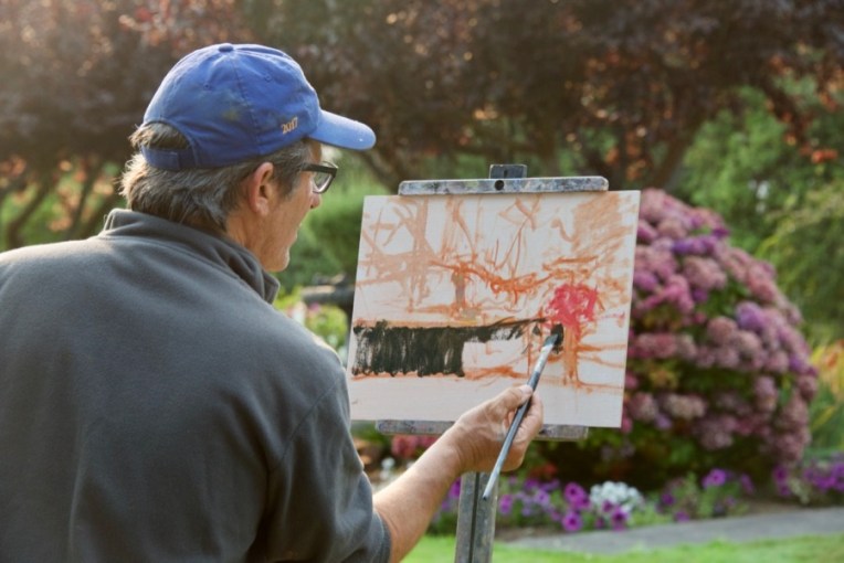
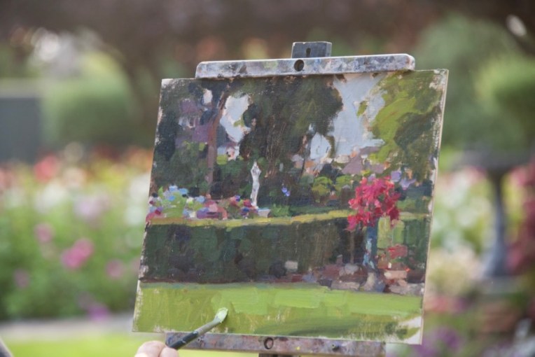
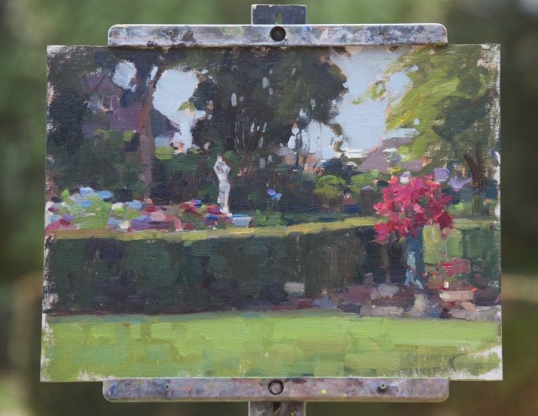
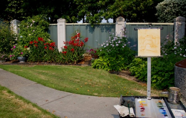
Jim McVicker doing a painting demo in the garden of the Carson Mansion, home of the Ingomar Club. He’s painting the area on the left with the hedge, a pot of petunias and a white statue.
As part of my regular routine I post to my blog on Fridays. I missed last Friday and for a very good reason….I was attending a local plein air painting workshop with nationally-known local artist Jim McVicker. I’ve known Jim for years and we own two small pieces of his work, but I’d never been able to learn from him before and this was a great chance right near home.
One thing I was very interested in was his start. He’s really a “pure” painter, having started with a brush in hand. I started out as a kid who loved to draw and didn’t take up painting in oil until 1995.
I photographed two of his demos, one from the first day at a beach that borders Trinidad Bay adjacent to the small fishing town of Trinidad, about fifteen minutes from our place, and the second in Eureka at the garden of the Ingomar Club which is located in the Carson Mansion, known as the “most photographed Victorian in the country”.
I’ll start with Trinidad. It was an overcast day, but the sun did come out in the afternoon.
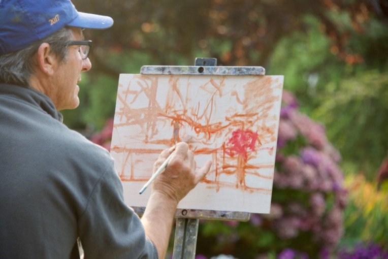
Ok, so this kind of blew me away….Jim’s first marks on the canvas. And they show the difference between someone who takes a painter’s approach and someone like me who starts their indication in line to define shapes.
When he laid in that large area of dark for the base of the rock, my brain kind of freaked out…”OMG that’s SO DARK!” It was a LOT darker than the actual rock, even allowing for knowing that one brings lights in over darks as a general approach in oil painting. This is why it’s so valuable to get to see how other painters work and see.
I want to thank the gull for adding a bit of additional interest…
Jim talked about working all over the canvas, not going from object to object, an approach that I heartily agree with and practice myself.
Adding tones to the water and last color notes in various spots.
Final touches.
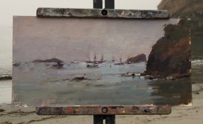
The finished painting of fishing boats in the harbor.
And then the sun came out, of course.
Yesterday, at the Ingomar Club in Eureka, it was overcast from the smoke of forest fires that are burning in southern Oregon, but there was still distinct light and shadow.
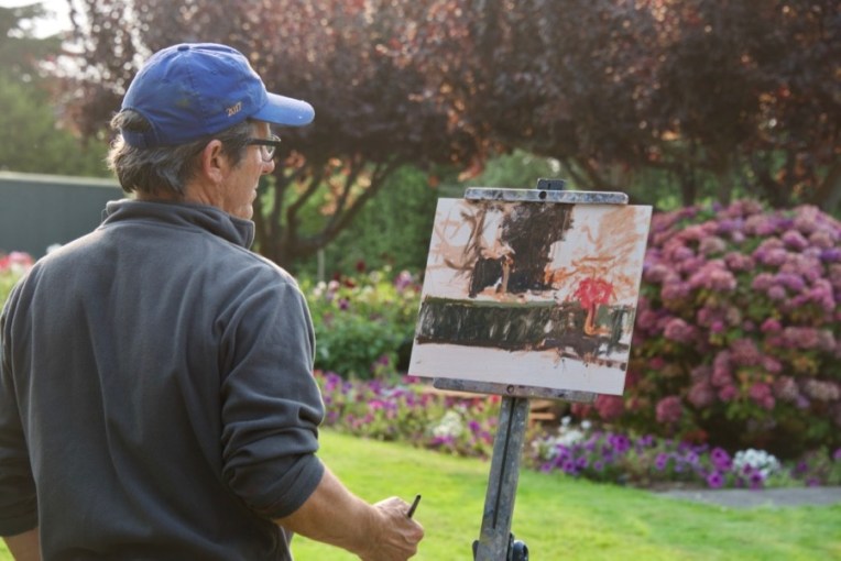
This start really shows the abstract underpinning that the painting will be built on.
Working all over the canvas.
Laying in the dark of the hedge.
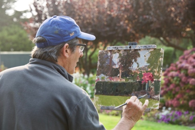
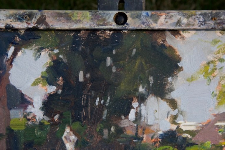
Adding the background trees. He actually did very little with them after this first step.
All the areas blocked in now. He can choose how far to go on any particular part or just leave it as is.
Notice that he is painting shapes, color, values and edges, not objects. There is no need to paint the individual petunia flowers in the pot on the right.
Bringing up the value of the grass, which is in sun light. It’s a warmer tone than what’s underneath, but still fairly cool. The hydrangas on the center left are pretty much as he first laid them in with the addition of some foliage around the flower shapes.
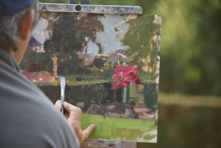
The finished painting.
Detail of the right side. I mentioned to him afterwards that I would have skipped putting in the background buildings, but that I know he also does cityscapes. I’m not personally that interested in man-made things as subjects so it was interesting for me to see his different choice.
Detail of the central tree. Oh, those “sky holes” . Necessary, but tricky to pull off. They require a solid knowledge of how tree trunks, branches and foliage are related. Random spots of sky color won’t do it. Jim also pointed out that sky holes need to be a little darker in value than the rest of the sky or they’ll stand out too much. It’s the little things…
So what did I do during the workshop? Well, the Trinidad painting was a bust. I had thought the sun would come out so set it up for that, but as the time went by and that didn’t happen, I switched to adding the fog drifting past the huge rock next to the dock which was my subject (and that of many other local artists). I was also using a canvas panel that became part of the problem. Talked with Jim about it and he said that if the panel surface is wrong and is not working it becomes a real battle. That’s what happened to me and the panel won. Won’t say what the brand was because all the matters is that it didn’t work for me.
Yesterday was much better. Nice light, a panel that I knew would work and a fun subject.
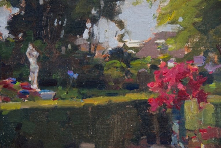
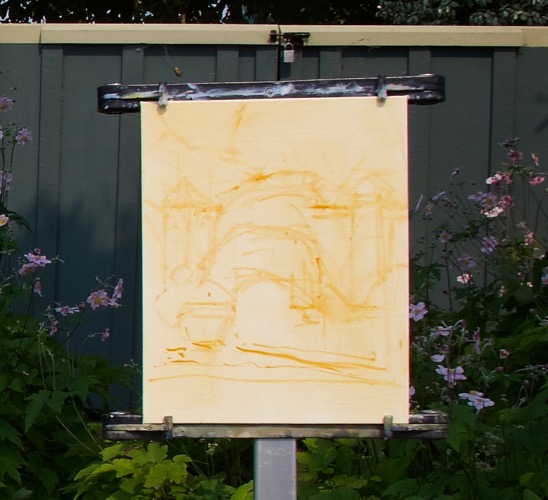
There were big free-standing beds of roses and dahlias, a gazebo, the statue and other features, but my eye was caught by the intense red cana lilies next to a pot of deep cool pink dahlias and the warm foliage greens against the cool green fence.
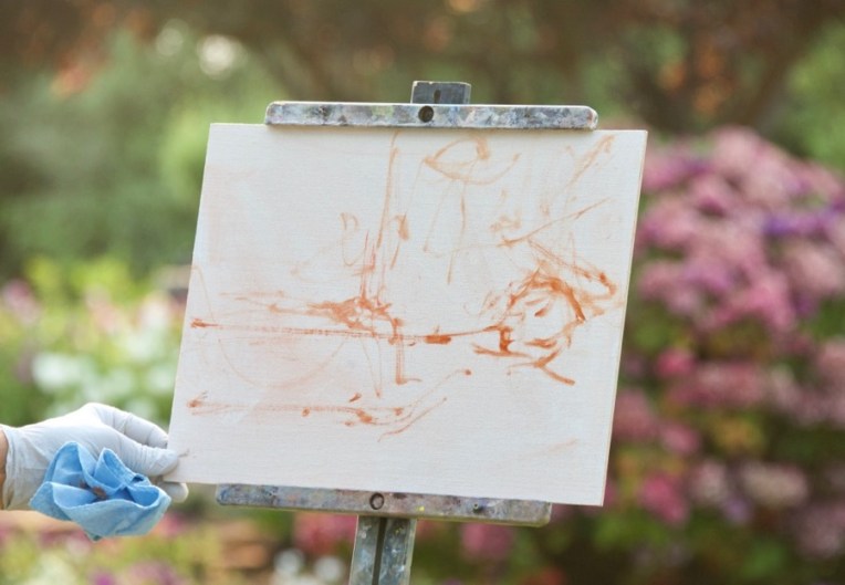
Jim likes to often use Rembrandt Transparent oxide red for a tone to knock back the white of the panel. I use it sometimes, but generally prefer Winsor-Newton raw sienna for the tone and my initial lay-in. You can see that I also do a rough lay-in with a brush.
My finished first pass. I debated about when to put in the red cannas and opted to do it early on to keep the color as pure and saturated as possible and then paint the foliage around them.
The finished piece, a 10×8″.
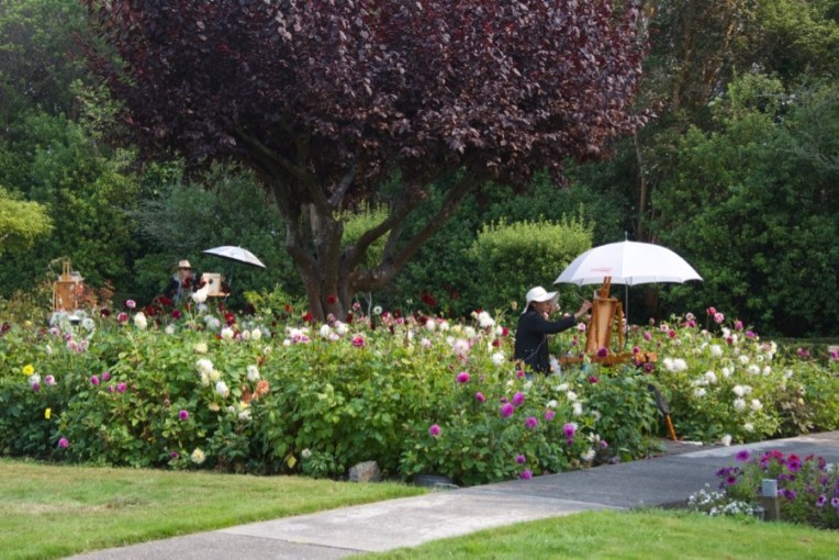
Some of the other participants in the beautiful garden.
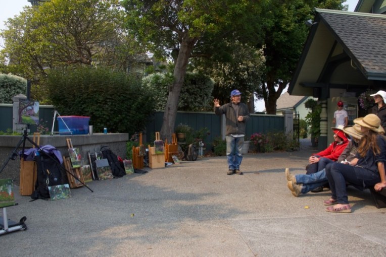
Finally our painting time was over and we had a critique session. The man from the club was kind enough to offer beer and wine to any who were interested. Also, you can see from the warm light on the pavement the effect of the smoke from the Oregon wildfires.
Jim was very positive about my painting, which I greatly appreciated. He pointed out two things that were spot on. One was that I’d added a lot of white to the earth tone I used for the dirt and that had given it a chalky look. Also that the grass was too dark in value for the light and sun that were on it, also quite correct.
So this morning I put the painting back on the easel in my studio and made those corrections, plus a few other little things that bugged me.
Now the ground is in tune with the rest of the piece.
I want to thank Claudia Lima, who put together the workshop and did a great job! And, of course, Jim McVicker. Thanks, Jim!
It’s been twenty years since I began painting in oil. Before then I was a graphic designer/illustrator and before that I worked as a sign painter for a local shop, starting at age 22 in 1976. Along the way I also did calligraphy, messed with typography and developed a great fondness for historic decorative styles like medieval and celtic illumination and art nouveau. All of them gradually fell by the wayside as I focused on gaining competency as an oil painter who specialized in animals. But those interests were always lurking out there, sometimes with a feel of longing. But then it was back to the easel. However, a few years ago I started to toy with how I might bring some of that back into my work. I let it perk as I did three exhibitions in four years, the final one being last March, the “Wildlife Art: Field to Studio” group show in Connecticut. With time and mental space available at last, I realized that, for the time being, I’d said all I wanted to say about representing animals in realistic habitats/backgrounds.
I started to seriously work on what a new direction would be. What elements would it include? I wanted to emphasize pure design more and include decorative elements and calligraphy. For the former I would draw on my fifteen years of experience as a freelance graphic designer. For the other two I still have my library of reference books and I knew, starting with my second trip to Mongolia in 2006, that the vertical Uigher script that Chinggis Khan chose for the Mongols was still taught in the schools, used in advertising and had also become a respected and breathtaking art form. I have experience in brush lettering, but wasn’t sure that I wanted to try to learn “bichig”, which would require finding a teacher in Ulaanbaatar.
The solution to the lettering came last year at the end of the 4th WildArt Mongolia Expedition. Our guide, Batana, has a son who is a budding artist. When told about me he said he wanted to meet me. So one evening I and the two other participants were invited to dinner at Batana’s home. I met his son and looked through his work, which was very, very good for a self-taught fifteen year old. Before leaving Batana surprised us each with a gift, our names written out in bichig.
I came home and started thinking again about my “new direction” as I had come to call it. And it occurred to me that I now knew of a Mongolian calligrapher with whom I had a mutual contact. Batana and I had become friends on Facebook, so I messaged him to ask if his calligrapher friend would be interested in writing out some words for me. The answer came back “yes”. We worked out a price per word. I made up a list of ten and sent them to Batana. Within 48 hours I had ten large jpg images in my inbox. They were wonderful! I ended up getting two more batches of ten, so I have thirty words in bichig now and will be getting more. There was the matter of payment. My tour company, for whom the calligrapher, who uses the nom de guerre “Bichig Soyol” on Facebook, had worked in the past, was kind enough to let me do a credit card charge on their website. Then they called him and he came to the office to pick up the cash.
I was going to be going to the Susan K. Black Foundation workshop in Dubois, Wyoming in September and decided to try to have a couple new works for show there. The first one still needs some re-working, so this is the first finished piece in my new style.
“Foal” oil 9×12″ (lettering design-Bichig Soyol)
Part of what drove me was the realization that my interest and passion is animals. To put them in a habitat means that, generally and by far, most of the painting will be landscape, not animal. And at this point, I want to focus on them. My new approach will let me use any and as much landscape as I want. Or none.
I’m taking my inspiration for the non-animal colors from landscape photos I’ve taken in Mongolia over the years. I have albums in Photos for “Warm”, “Cool” and Warm/cool” images. I’ve also got albums for design elements from monasteries, gers, patterns and symbols. I can mix and match all these elements as I wish. So now I’ve pulled all the threads together….animals, design, decorative motifs and lettering. And am I ever having fun!
Study from Michaelangelo’s Sistine Chapel figure of the prophet Isaiah
And the answer is: I’ve started a new painting which is part of a new direction I’m experimenting with, which is all I’ll say for now. One of them involves using a khadag, the traditional Mongolian offering scarf, as a design element. I haven’t done drapery since art school. I set up a khadag that I brought back and did some drawings from it, but could tell that I really didn’t understand what I was looking at or how to get where I wanted to go. Drapery has a structure and pattern and I just wasn’t seeing it with any confidence. Time to get out the art books and do some copywork from the masters. Who better to learn from? And I’ll do as many as it takes to get it. I was also able to go to the Metropolitan Museum of Art last month when I was in New York for the Explorers Club Annual Dinner. I focused on getting photos (with my iPhone 5S) of drapery details and I’ll be drawing from those next. But today I want to share what I was able to do working an “old-fashioned” way…from books.
Besides my immediate goal of learning to draw drapery again myself it was fascinating, through the copywork, to see how these artists solved the problems, some very naturalistically and some by simplifying with more stylistic handling.
The Michaelangelo copy above was the last one I did and took the better part of a day. It’s about 8×10″. I was working on technique along with creating the actual drawing.
All are done with Cretacolor Monolith pencils on either Canson drawing paper or Strathmore 400 with added help from a kneaded eraser that definitely got a work out.
Fresco painting detail by Michaelangelo, Sistine Chapel
Below is the first one I tried. Notice that there are basically three values and some color temperature shifts. Get those relationships correct and you have…satin!
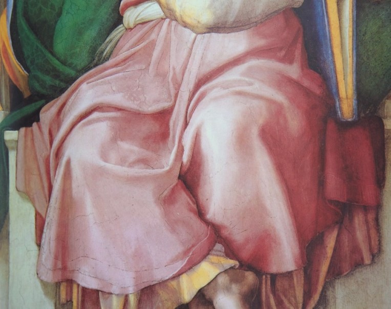
Sleeve detail by Jacques-Louis David
I wanted to start with a simple shape that had well-defined folds. And I was very curious to see a little of how David saw, given his great academic training and skill. I have some good details from one of his paintings at the Met that I’m looking forward to drawing.
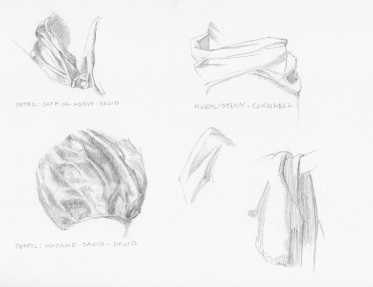
Neckline fold detail from “The Oath of the Horatii” by Jacques-Louis David
I specifically wanted to draw that neckline fold and the overlapping folds coming over the shoulder because they relate to the design I have for the khadag.
Garment details by Jacques-Louis David (left) and Dean Cornwell (right and middle)Sash detail by Dean Cornwell
My study is above right. I wanted to understand how the sash drapped around the form.
Sleeve detail by Dean Cornwell
My study is lower left above. I wanted to get that feeling of the thickness of the fabric coming over the arm.
Coat detail by Dean Cornwell
Small drawing in the middle of the page above.
Cornwell had an interesting way of simplifying drapery and it’s a characteristic of his style. I remember one of my drawing teachers in art school doing a slide show of master drawings. When she got to the Cornwell, she matter-of-factly told us that if we could do a drawing like that we would get an “A”. We just kind of looked at each and thought “Yeah, well, in our dreams”. Ultimately, I realized that his approach, at least at this point, wasn’t going to be useful to me for what I want to do.
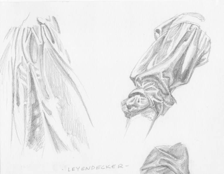
Gown and sleeve detailsGown detail by J.C. LeyendeckerSleeve detail by J. C. Leyendecker
J.C. Leyendecker was another master stylist, instantly recognizable. Notice that I’m showing the work of two illustrators, along with traditional fine artists. That’s because the great illustrators were simply great artists and their drafting and design skills were impeccable. Plus, that’s my background since my formal art training was in illustration so I “speak” that language.
Through copying some of his work I hoped to understand better how to simplify and understand what I had to have to say “fold” and leave out everything else. Artists like Michaelangelo, David and, as you’ll see, Velasquez had a more naturalistic approach, but still edited and made choices, each in his own way. And the sum total of those choices is one of the ways a viewer can tell one artist from another.
The gown detail was challenging because every shape and its relationship to the other shapes had to be just right in order to read as drapery. By the time I decided to tackle the sleeve I felt that I was starting to get the hang of things and also to gain a little insight into his thinking through the choices he made in a way that would not be possible by just looking at the art.
Head drape detailHead drape by Velasquez
If one wants to learn from the best then you have to take on Velasquez, one of the best ever, a painter’s painter. And that ended up being a bit of a problem. When I looked through my book of the artist’s work I didn’t really find a lot in terms of drapery that would help me with what I was trying to do. I found his shapes, when looked at individually, to be idiosycratic in a way made them very abstract. It’s a very different way of seeing than I do. But what a great thing to learn. I am in awe of him as are so many others. I plan to start doing some human subjects and when it comes to heads and hands I will be returning to him for both drawing and painting study.
So that’s what I was up to last week. This week I’m back at the easel doing some repaints on small works, both to get my groove back and to build up stock for North Coast Open Studios, which I will be doing the first two weeks in June. More on that to come!
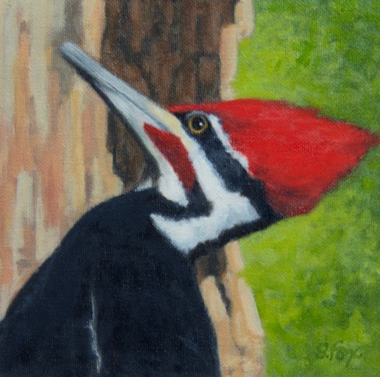
Piliated Woodpecker oil 6×6″- observed and photographed in the Okefenokee Swamp National Wildlife Refuge, Georgia
The juried show season is under way! I keep a long rectangular white board hanging on the wall next to my desk, divided into squares for each month, on which I list the shows I plan, to or am thinking about, entering. Sometimes I enter work I already have on hand and sometimes I do new work just for that exhibition. In this case, these have been submitted for the Spring Auction at the Salmagundi Club. Entry in their shows, for which all but one are members only, is free and it’s a chance to get my work seen in New York. Not easy when you live in northern California. Notification will be later this month. I’ll let you know what happens. But, in or out, I had fun doing them and will be painting more small pieces like these in the future, which I plan to list on eBay.
Except for a stint in September, I’ve gotten very little oil painting time in since May of last year. So these pieces served two goals.. One, to get back in the groove, and two, to create some small works that will be easy to ship and, with luck, attract buyers.
I chose for my subjects three east coast species of birds. Two I saw on my trip to Georgia and New York State last March and the other a few years ago when I and two artist friends went to Assateague and Chincoteague Islands on a very fun road trip.
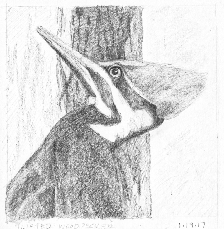
I wanted the emphasis to be on the birds with just a suggestion of location and habitat. So simple shapes and planning positive and negative shapes. I started with graphite drawings. I don’t do a lot of birds so I needed to make sure I understood what I was seeing in my reference photos and that I had the value pattern I wanted.
For this male piliated woodpecker I planned the composition to have the darkest dark behind the bird’s head to pop out the black and white head pattern and also the red. It’s a warmer dark than the black of the bird, so there’s also a temperature shift. There are three shapes: the bird, the tree trunk and the background. I used green because it’s the complement of red. In my reference photo, it being March, none of the trees had leaves and everything was brown. But so what? I’m the artist and can do anything I want.
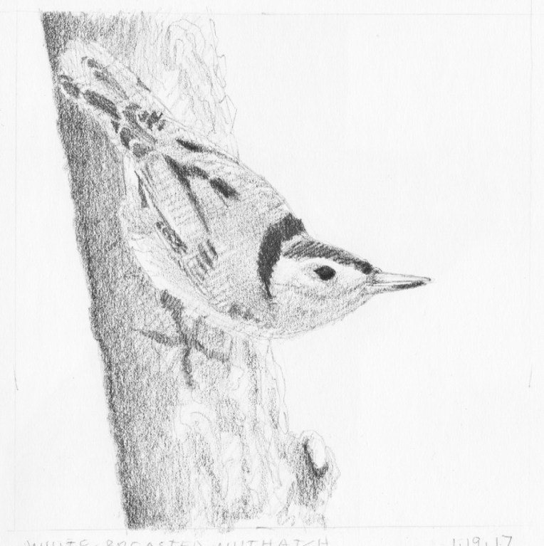
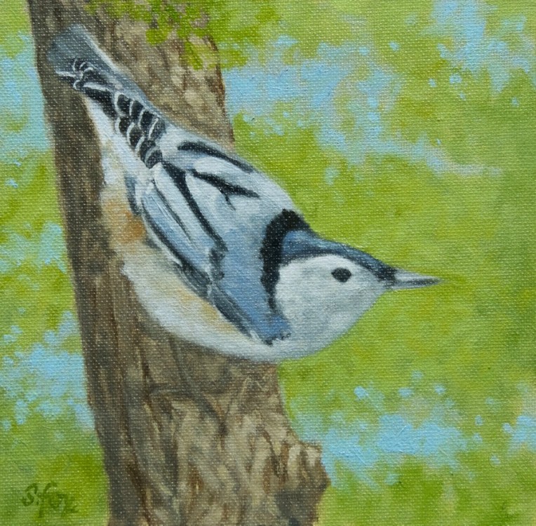
This is a white-breasted nuthatch that came to a bird feeder outside the window of an artist friend’s home I was staying at in the Hudson River Valley. I’d heard of them but had never seen one, so was happy to get some good reference. I didn’t want to include the feeder so I put the bird on a tree trunk instead, using a photo I shot of the trees that surround the home of famous Hudson Valley artist Thomas Cole, not far from my friend’s home, so I knew it would be correct.
White-breated Nuthatch oil 6×6″
For the background I wanted the suggestion of foliage with some sky showing through, which are called “sky holes”. I did the them quickly over the green. And pulled a little of the latter over the tree trunk to connect the foreground and background. Once again, three elements…the bird, tree trunk and background. No fussing.
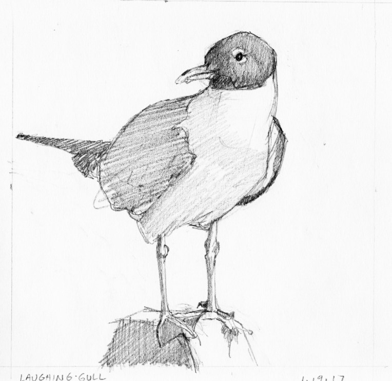
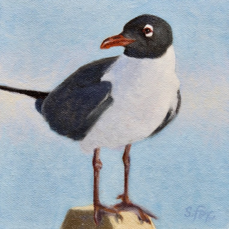
This laughing gull was perched on a post between a parking lot and the beach on Chincoteague Island. He was quite a good model and I had an excellent choice of reference to choose from. I’ll probably paint him again sometime. For this composition I went with one shape, the bird on his perch, against a plain background. No beach, surf or cars like were in the reference photo. Didn’t need or want them.
Laughing Gull oil 6×6″
As you can see, the gull’s proportions changed some from the drawing as I made corrections as needed on the painting while I consulted my reference photo. The blue sky alone didn’t seem like quite enough, so I added a soft band of warm white behind the bird. Notice also that I didn’t paint a single feather, but just treated each area as a shape that has a specific value and color. I had to get out a fine-tipped round synthetic brush to do the eye and bill, but I generally use Grand Prix Silver Brushes. I always use the biggest brush I can that will still get the job done.
“Gallimauphry” is great 16th century French term for “a jumble of things” or as we might say “this and that”. You never know what I’ll post on the final Friday of the month.
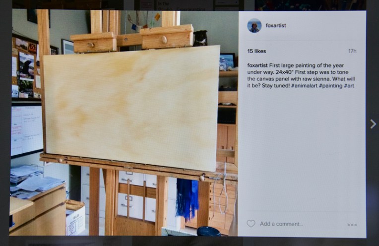
I tried an experiment last night on Instagram. I’d toned this 24x4o” canvas panel with raw sienna yesterday and plan to post the work in progress. Instagram has become known as a must-see/must-do place for artists and buyers since it’s the most purely image-oriented social media platform. So I thought it would be amusing to post a blank canvas and see what happens. In two hours I had eight Likes and this morning, about twelve hours later, there were fifteen, which is about what I get, give or take, for images of actual paintings. A few more will probably show up before it moves down the queue. What I think is going on is that people like seeing artist’s studios and watching their process, but I still think this is amusing. So if you’re on Instagram and want to follow along or if you’re not yet and are going to sign up, you can find me here. Come on along!
“African Lion” 13.5×9.5″ graphite on paper
In other news, my drawing “Relaxed (African Lion)” has been accepted into the Salmagundi Club‘s historic “Black and White Exhibition”! It was shipped off to New York yesterday.
Stillman and Birn Beta paper (a little smoother than a cold press watercolor paper)
Every year in the winter, I try to set aside time to review my painting process and experiment with new media and supports, both for painting and drawing. Last year in January I had to swing into action for the “Wildlife Art: Field to Studio” group exhibition at the Flinn Gallery, but after three exhibitions in four years I currently don’t have one scheduled for 2017 so have time to mess about and explore ways to improve my work.
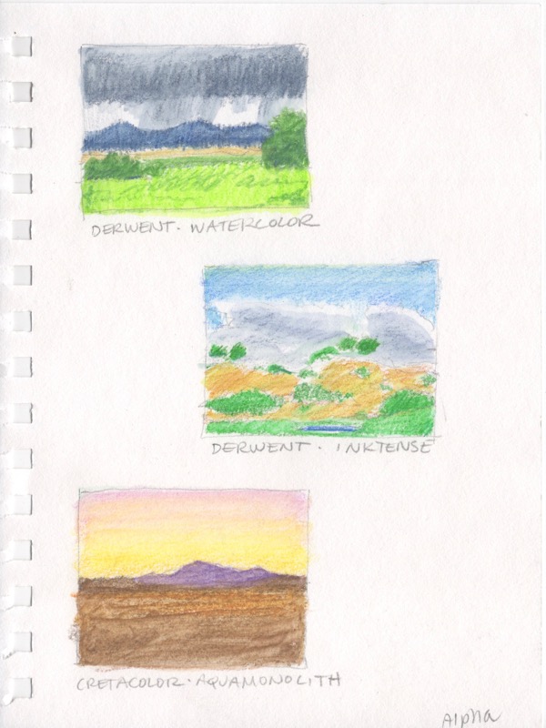
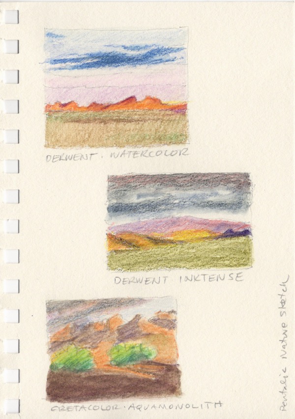
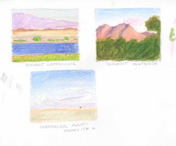
I purchased a set of Cretacolor AquaMonolith pencils last year, took them to Mongolia without much of a pre-departure tryout and wasn’t happy with what I did. Tough to test drive a new media in field conditions. I also had some Derwent Inktense water soluble pencils that had been sitting around for a year or so with no time to play with them. I’d been using their regular water soluble colored pencils on and off for years. So a couple of weeks ago I sat down with all three and a bunch of different papers.
Cretacolor is an Austrian company. I’d already started to use their Monolith graphite pencils and I like them a lot. I use them now for my finished drawings. They and the AquaMonoliths are woodless graphite with a lacquer coating. The difference is that the latter are color and water soluble. Derwent is an English company, based in the Lake District, which was founded in 1832. Wood pencils were invented by them and we’ve visited the factory during a past trip to England (a definite stop for artists if you’re there). I’ve used a variety of their products for years, including their wood drawing pencils.
Once I laid down the colors I went back with a waterbrush (more on those in a future post) and did some blending. It’s a “hit it and leave it” for the most part. On most of the papers continuing to wet and push the color around makes a mess. I experimented with how hard and thick to lay on the strokes and found that I liked leaving them visible.
I’m posting them in the reverse order that I did them because of how Google and other sites will choose the header image and I’d like the “good ones” to show up. Fingers crossed. :0)
None of them are more than about 2×2″, so thumbnail size.
Stillman and Birn Alpha paper (slight texture, a little on the thin side for adding water, but it didn’t buckle at all)
I had fun getting the rain effect in the top sketch.
Stillman and Birn Zeta paper (smooth, almost a plate finish)
The pencils worked, but I like them better on a paper with more tooth.
Pentalic Nature Sketch sketchbook (not thrilled with this first try, but I otherwise really like the paper so will experiment further; it does have some tooth and is off-white)
I’ve been using the Pentalic Nature Sketch sketchbooks for a couple of years, carrying a small one around with me and also to Mongolia. They’re reasonably priced, come in a variety of sizes including a 6×12″ which I like a lot. The paper is acid free and 25% cotton and really is multimedia, including watercolor if you don’t go too heavy on the washes.
Strathmore 400 vellum bristol
I’ve been using this paper, along with Rives BFK, for my finished drawings that I frame for sale at my local gallery, Strawberry Rock Gallery in Trinidad, California. While it has a bit of tooth, it was the least successful and is off the list for now, but I really like it with the Monolith pencils.
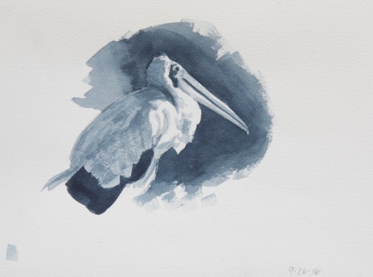
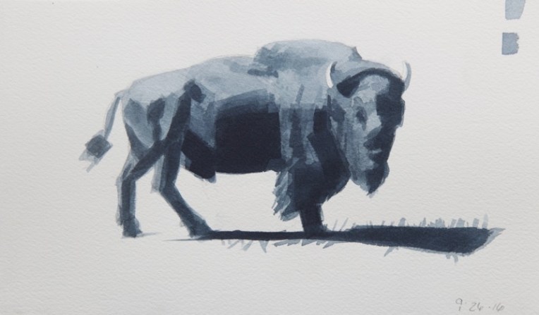
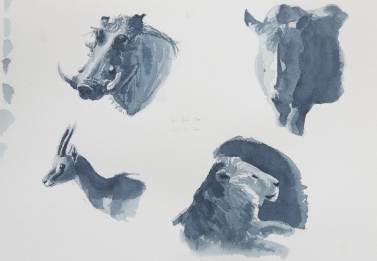
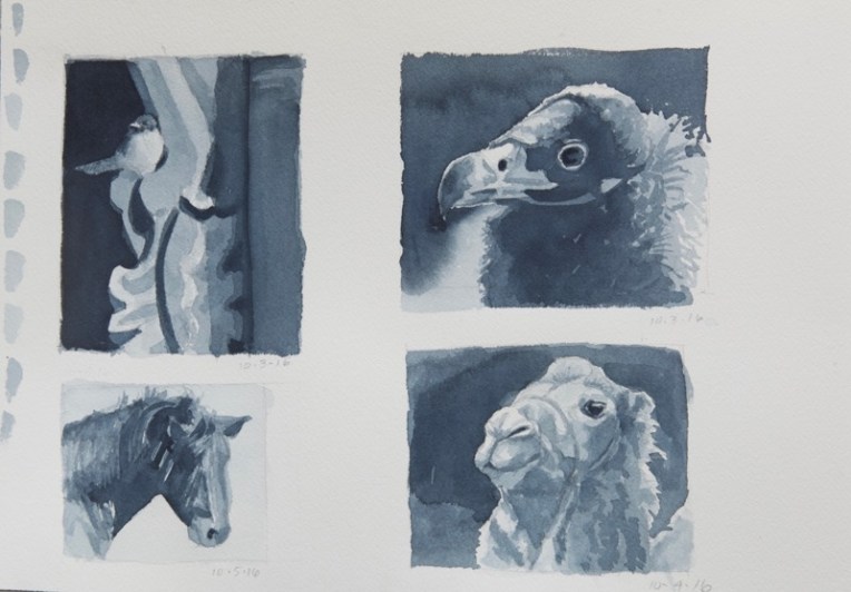
I’m back home after my Wyoming trip with no big juried show deadlines to paint for, so it’s my time of year to work on my painting process, in which I review the work I did over the last year thinking about what worked and what didn’t, what I might want to do in the coming year and how. I’m also going back to basics in a couple of areas to improve my skill set. One of those areas is contour drawing. I shared some of the those from the SKB workshop in last week’s post. Another is value studies or, as David Rankin, the nationally-known watercolorist who I studied with at the workshop, calls them, Gray Studies. You can find a number of his excellent tutorials on his Facebook page here and on his website here. (Go to “Watercolor Training Files” on the left hand side and then “Grey Studies Training Files”.
I spent quite a bit of time one afternoon at the workshop simply figuring out, with his help, how to put down a correct single tone watercolor wash (the *secret* is plenty of water) using a 1″ flat brush (I usually use rounds). The really important exercise was learning his four value “recipe” for doing gray studies by painting along with him as he did one.
Once back home in the studio I wanted to build on what I’d learned. I’ve done value studies as a preliminary step for my paintings for years and it was something I’d learned in art school. I’d done them as graphite drawings or very small oils and it always felt a bit time consuming, however necessary. But this way of doing them in watercolor was an eye-opener. So easy, really. Paint around the whites, covering everything else. Then add layers of middle values. Save the darkest dark, if there is one, for last. But it took some new thinking and seeing to be able to do it and know what I was doing.
So I’ve spent most of the week painting gray studies from my photo reference. It was fun to revisit some of my Kenya wildlife images. These are all in Payne’s Gray (which has a very nice blueish tone) on an Arches 140lb cold press watercolor block, using sometimes a flat and sometimes a round. None took more than an hour or so. The stork above was the second one. In order:
At this point I felt that I understood the process enough to paint some that might become finished oils.
I did the quick preliminary drawings with a 9B Cretacolor Monolith pencil. It’s important not to labor over them, just indicate the basic shapes, plus where the white of the paper will be. So there you have it…a quick and inexpensive way to try out art ideas and value patterns.