6 Favorite Art And Equipment Suppliers And…A Major Announcement!

Zun Odor (Summer Day)  oil  30x40"
Zun Odor (Summer Day) oil 30×40″

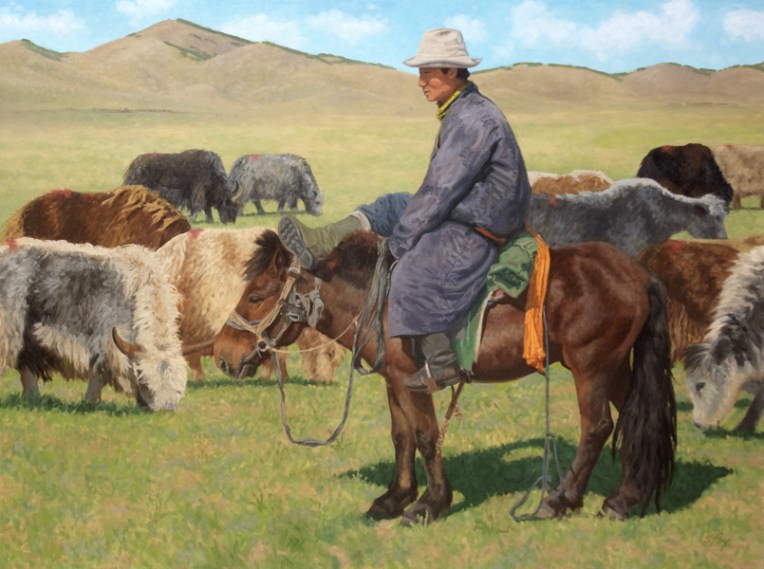
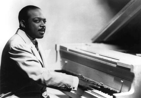
I am proud to announce that I am now represented on the west coast by Strawberry Rock Gallery, located just up the road from me in Trinidad, California. They’ll be showing a complete selection of my work, including my Mongolia subjects like the painting above. Strawberry Rock is a full-service, locally-owned gallery. They just picked up the first round of my art yesterday, so I’m not on their website yet, but I’ll post the link when it is.

********

Artists are always on the lookout for the best places to buy supplies and equipment. I thought I’d share some of my favorites which have proved themselves over the years. None of the companies know I’m posting this so this list represents my honest opinions.

susan fox 4000f-large1. Hughes Easels– I’ve had mine for over ten years now and have never for a moment regretted spending the money for what is the best easel available. I bought the Model #4000 with two masts and highly recommend that choice since it holds large and/or long pieces more securely than one mast and lets me put diptych or triptych pieces next to each other or two smaller pieces side by side. Hughes Easels

2. Silver Brush Grand Prix- Like most painters I’ve tried a variety of brushes over the years and these are the ones I keep coming back to. I wear them down to half their length before they finally stop working and they hold a decent tip to the end. They have just the amount of spring and flexibility I like, having worked as a sign painter at the beginning of my art career. I’m ambivalent about using natural bristle brushes from an animal welfare standpoint, but have been unable to find a substitute, although the Silver Brush Bristlon comes close. Silver Brush Grand Prix

3. Winsor & Newton oil and watercolors– I do use specific oil colors from a couple of other brands, but good old WN has been my choice since I started painting in oils in 1997. Not sexy or expensive compared to many brands, but reliable and a pleasure to paint with. Also a good choice for someone starting out because painting is hard enough as it is without handicapping yourself by using cheap student-grade paint with low pigment/high filler content. I’ve used their watercolors since art school and after a long hiatus am using them again for location painting. Winsor & Newton

4. Strathmore Series 300 Bristol, Vellum Surface– My basic “good” drawing paper. It has just the amount of tooth that I like for drawing with pencils, Wolff’s Carbon pencils and General’s charcoal pencils. I keep pads of it in various sizes. I’ve tried the higher end Series 400, but don’t like the way it feels under the pencil. So the takeaway for this is that you need to try different papers until you find one you personally like (and, with luck, it won’t be the most expensive one). Canson makes an inexpensive recycled paper that I like for preliminary drawings. Strathmore

5. RayMar Canvas Panels– I switched to these years ago and have never looked back. Panels, as opposed to the traditional stretched canvas, became popular when plein air painting took off and, in fact, I first encountered them a a plein air workshop. I love RayMar’s cotton canvas panels which have just the right amount of tooth for me. Two major advantages of panels are that they take up a lot less linear shelf space than stretched canvas and the hard back means not having to worry about the canvas being dinged or a hole poked in it, so transporting paintings is a lot less stressful. They sell packs of standard sizes, but will happily do custom cuts up to 48″. Their quality has been absolutely consistent over the years and they’re a family-owned business. RayMar Art

Finally, something new (at least to me) that I’m just trying out but am very excited about. Forget Renaissance-era grid transfers, graphite transfers and oil transfers…

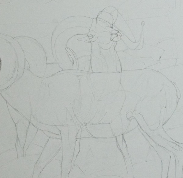
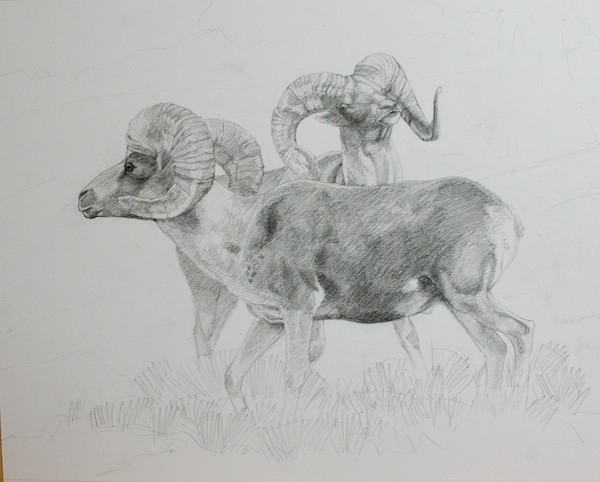
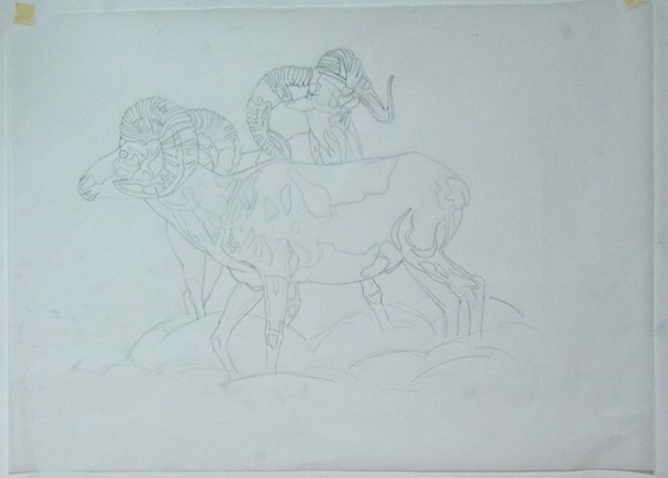
6. Optima Digital Projector– I have tried so many ways over the years to get a preliminary drawing done on paper onto the canvas, the grid being the main one. I’ve also tried doing the drawing at the final size and using a graphite transfer sheet. I recently learned about oil transfers from a great art site called “Underpaintings” (I’ve subscribed). But those methods I found time-consuming and imprecise, which just made for more work to get the drawing correct on the canvas. However, suddenly one fine day my subconscious must have finished its work because this idea popped into my head….why not do my drawings at whatever size and in whatever media I want? Then, depending on size, either scan or photograph them and dump them into Aperture, the image management software on my iMac. Plug the digital projector into the computer and project the drawing onto the canvas, then simply and precisely sketch it in. And, yes, I know I can do the same with the photos and will probably do that in the future for some simple subjects since I know how to draw, but what I love is being able to work from my drawings which is how I learn “what my subject looks like” in a way that I never could from just tracing a photo. So let me flatly say- THERE IS NO SUBSTITUTE FOR LEARNING HOW TO DRAW. I’ll probably do a future post about this transfer method as I move into my winter “painting season” and can document the process.


The *Value* of Value Studies & Some Examples

6x6" Horse studies
6×6″ Horse studies

I’m getting ready to begin my Fall Painting Season and decided to start by tweaking my working process. Every successful representational painting has two things: solid composition and a strong, well-thought out value pattern. Of course drawing, color and edges are important also, but one can make the case that the design and values are critical. So I’ve spent the last few days doing small value studies of reference photos that I’m thinking about painting. I’m working on the drawing part at the same time, too. None of them took more than an hour or so.

They are all done on various types of watercolor paper I already have on hand, experimenting to see which one serves my purpose best, and with one color…Winsor Newton Payne’s Gray. The brush is a Round No. 10 Prolene by ProArts. The study sizes run from 6×6″ to 7×10″, so not very big.

I got the idea to use watercolor for preliminary value studies (instead of, for instance, pencils or oils) from my friend and colleague, nationally-known watercolorist David Rankin. You can read his information about what he calls “Gray Studies” here.

I like it because it’s fast, effective, fun and let’s me practice with the media I use on location when I’m in Mongolia.

So, if your paintings are looking kind of flat or you’re finding that using color is confusing your values, I highly recommend that you get the simple set of materials listed below and try this. It may be a bit of a struggle at first to truly grasp the difference between color and value (the relative light and dark of something separate from its color) and to move away from your reference in order to get the right amount of contrast in the right places (a viewer’s eye is going to go first to the area of highest contrast, so you need to make a conscious decision about where your focal point is), but hang in there, just keep adjusting and experimenting and you’ll be rewarded by a visible improvement in your work.

Materials list:

1 tube Winsor Newton Payne’s Gray transparent watercolor

1 small dish or whatever you think will work for a palette.

Watercolor paper (I’m using “stock on hand”….small blocks of Art Lana Lanaquarelle hot press, Arches cold press and Saunders Waterford cold press; or you can get sheets of 300 lb, which doesn’t have to be stretched). If you buy sheets then you will need something to mount them to. I use a rectangular scrap of foamcore taped around the edges with clear packing tape and then use 1/2″ drafting tape to hold the corners of the paper to the board.

1 brush- Use at least a no. 10 round or 1/2” flat; your choice of brand (I like the Robert Simmons Sapphire synthetics, but also have a couple of the Prolene and Dick Blick rounds)

Reference photos with strong light and shadow patterns.

Here’s some more of what I’ve been doing:

Horses
Horses; I deliberately chose to put the darker wash along the contour of the left horse’s head, mane and back to make the white, lightest area pop out. Notice that it stops at the eye where the shadow area begins, so that part of the background was left lighter.
Short-tailed weasel or stoat
Short-tailed weasel or stoat; I learned from this one that my reference photo doesn’t have as much value contrast as it seemed when I picked it, so for this study I pushed the contrast between the weasel and the background. Still not happy with the shadow areas around the animal, so I’ll probably do another quick study just using shapes to get the values where I want them.
Mongolian yak
Mongolian yak
A more finished study of Siberian ibex
A more finished study of two Siberian ibex


3 Reasons Why Painters Should Listen To Count Basie

count-basie1

I “got into” jazz some years ago and quickly found that Count Basie was my favorite, particularly from his Kansas City days before he had a big orchestra. I’ve had this post in mind for quite awhile, but had to find the right video of him and then formulate why I believe his music is of value to visual artists.

Here’s what I think painters, or any artist really, can learn from listening to pieces like the one in the video:

1. Simplicity– Compared to everything going on in the orchestra, Basie plays very few notes in this version of “Good Time Blues”. It takes years of experience to be able to strip away all the “details” and play with such elegant simplicity. If you watch his older performances, he plays more conventionally. As he went along, he simplified his playing to an extremely sophisticated level. And, as one of my art teachers once said “The simpler statement is the stronger statement.” One could explore this idea with brushwork. Instead of ten strokes to define an area, can you do it in five? How much information can you convey in one? Can you say “grass” in 3 strokes instead of 300?

2. The spaces between the notes– artists call it “positive” and “negative” space. Both are equally important and a painting can be approached from either direction. In the Basie video, the spaces between the notes are every bit as important at the notes themselves. Watch the video for the notes, then watch it again for the spaces. When you do a drawing for a painting, do you check the negative spaces between the objects? If not, try it and see what happens to your visual perception. Try designing a painting by thinking about the negative shapes first.

3. Timing– Every one of those relatively few notes is played at EXACTLY the right instant. By this time in his career, his timing instincts were unerring and seemingly effortless. One can not imagine any note being the slightest bit earlier or later. How long is your brush actually in contact with the canvas? How does varying that change the appearance of the mark? How could you change the look of your painting by using this idea consciously?

New Painting Debut! “Rock Hoppin’ ” -Siberian Ibex

Rock Hoppin'  20x36"  oil
Rock Hoppin’ 20×36″ oil

I went to Ikh Nartiin Chuluu Nature Reserve last year with a plan to focus on getting good, paintable Siberian ibex reference. Boy, did that ever work out. On three out of four mornings, I shot over 1000 photos and watched ibex for at least five hours. They were a couple of groups of nannies, kids and juvenile billies who were hanging around some of the rock formations at the west end of the valley where the research camp is located, only a 30 minute walk.

I’ve got a lot to chose from, but loved the “rock hopping” that occurred when this group, who I had already been watching for over an hour as they rested, grazed and interacted, got up and started to move off when the big nanny did. So here she is, cautiously and seriously leading her group to wherever she’s decided they will go, while the youngsters goof off and play follow the leader up and down and on and off the rocks.

Here’s a step by step of “Rock Hoppin’ “:

Ibex group at Ikh Nartiin Chuluu
Ibex group at Ikh Nartiin Chuluu; one of the dozens of photos I shot of this group as they moved off from left to right, the nanny leading the way and stopping at times to evaluate what’s ahead. Most of my reference showed only the rocks, but I wanted some sky also, so chose this photo for the upper left hand part of the painting, particularly that unstable formation at the top, which gives a feeling for the habitat the ibex like best.  There had been a lot of rain and the reserve was as green as anyone could remember. Wildflowers were everywhere. The photos one usually sees of this species are from way up above the tree line in mountains where there is very little vegetation. I liked showing them in a different and more colorful habitat.
Preliminary graphite study
After doing a compositional drawing, I did a graphite transfer to the canvas and then re-stated the drawing with a brush
After doing a compositional drawing at the final size, I did a graphite transfer to the canvas and then re-stated the drawing with a brush. There had been a fifth ibex in the lower right, but something didn’t seem right design-wise and the solution seemed to be to remove that one, which I did. Then there was still something not right. I realized that I needed an adult ibex, the nanny who was leading the group, not a juvenal billy. This not only let me use a larger animal, which was visually more interesting, but made the painting behaviorally accurate, which is very important to me. I’ve developed a painting procedure that lets me make minor to major changes at any time in the process. I never have to put pressure on myself by “guessing right” at the beginning and then finding myself stuck when something isn’t working.
First color pass
First color pass, just laying in major shapes to make sure it all works. I used three pieces of reference for the ibex and at least three for the rocks. I planned the placement of the smallest ibex so that his/her head would be against the sky, which was not the case with the reference photo.
Modeling the ibex and the rocks
Modeling the ibex and the rocks. I’ve defined the shapes of the shadows on the rocks and can now see the pattern those create. I made sure there were large rocks pointing in from the right so that everything wasn’t moving off the canvas.
Detail of head in progress
Detail of a head in progress. From the base of the horns to the tip of the nose is 1 3/4″. I kept the shapes simple, but accurate. Detail per se is of no importance to me.
Detail of kid in progress
Detail of kid in progress. It was important to get the great gesture correct and show the muscles working.
Almost done.
Almost done. After this photo was taken, I punched up everything as needed, both ibex and the rocks and finished the grass, which has about six layers of warm/cool, light/dark colors, plus the summer flowers. I also refined the branches of the wild apricot shrubs. I basically did a repaint over the whole thing pulling up the light areas and adding color variations to the rocks, including the lichens, which give a warm touch that picks up the colors of the ibex and ties them to the landscape.
Detail; finished ibex, rocks, grass
Detail; finished ibex, rocks, grass. The grass was an almost acid green since it was so fresh. I knocked it back a little in intensity since it didn’t look quite believable in a painting. I also consciously varied the colors of the ibex and the proportion of light to dark on the bodies.
Rock Hoppin'  20x36"  oil
Rock Hoppin’ 20×36″ oil

How I Start A Painting

There are many artists who come up with a way of working that satisfies them and they never alter it. That would not be me. Every year about this time, I sit back and rethink my whole process of painting a picture. I’m perfectly willing to toss it all in the air and tweak and change whatever I think needs it. It’s very liberating.

I recently went to the Norman Rockwell show and was reminded of how thorough a process he used, how he broke down the elements of a picture and solved the problems as much as he could with each step, always leaving the door open for alterations down the road if needed. It’s the same procedure we were taught when I was getting a degree in illustration at the Academy of Art in the late 1980s. One didn’t need to do every step every time, but it was always there to fall back on if one got in trouble. (The steps are: thumbnails, rough drawing for composition, finished drawing, value study, color study, finish)

One of the things Rockwell did was very finished charcoal drawings at the final size. It always looked like a lot of work, even though I really love to draw, and I guess I never really got the point. I do now. I got into messes a couple of times in the past year, partly due to not solving all the drawing and value problems before I started to paint. I had begun doing drawings at the final size for the large pieces, but only outlines, no value. I’ve just started a series of three argali paintings and decided to take it up a notch.

I also needed to rethink how I got my image onto the canvas. I don’t have a projector anymore and don’t really want one. I’ve found a lot of value in drawing an animal multiple times because I really LEARN it. A painting shouldn’t be about saving time or doing it fast. It should be about doing what it takes to get it RIGHT.

One benefit of doing the drawings at the finished size is that it is then easy to make a tracing and do a graphite transfer. The alternative is the venerable grid system, which works just fine, but, dare I say it, takes a lot more time to no good purpose and, more importantly, didn’t give me as accurate a result.

These three pieces are compositionally simple. I have a clear idea in my head of where I want to end up. The main upfront decisions were how big and what proportions each one should be since they are intended to hang as a group, although they will be priced individually.

The reference photos (which I am not going to post due the vagaries of the internet) were taken during one action-packed hour with five argali rams at Ikh Nartiin Chuluu Nature Reserve in Mongolia in July 2010. And two afternoons I spent there this past August during an eleven day stay doing studies of argali horns at the research camp really paid off in being able to understand the horns in the photos.

I’ll start with that page from my sketch journal and then show you the steps so far for the three paintings. I didn’t do thumbnails or rough drawings, but went straight to finished working drawings of the animals, but still thinking about what the landscape will look like.

Argali horns, research camp, Ikh Nartiin Chuluu Nature Reserve, Mongolia, July 2012

Painting No. 1- Tentatively titled “Coming Through”, a big ram asserting his right to walk wherever he wants to, when he wants to

Beginning the graphite drawing; detail to show how I "drew through" the ram in back to make sure the parts all are in the right places. I used another piece of reference for the back legs since the ones in the photo didn't read well.
Beginning the graphite drawing; detail to show how I “drew through” the ram in back to make sure the parts all are in the right places. I used another piece of reference for the back legs since the ones in the photo didn’t read well.
Finished drawing; graphite on vellum bristol
I put tracing paper over the drawing and did an outline only drawing to use for transferring the image to the canvas
Brush drawing on canvas after graphite transfer
Argali horns, research camp, Ikh Nartiin Chuluu Nature Reserve, Mongolia, July 2012

Painting No. 2- No title yet

Finished drawing; graphite on vellum bristol
Outline on tracing paper
Outline on tracing paper; I’m drawing shapes of structure and values
Brush drawing on canvas

Painting No. 3- No title yet

Graphite drawing; this was the third one and felt that I didn't need to go all the way to the same point. It was more important to get all the size and position relationships between the rams correct. The one in the back looked very odd in the reference photo, so I changed out his head for a profile instead of three quarters view
Graphite drawing; this was the third one and felt that I didn’t need to go all the way to the same point. It was more important to get all the size and position relationships between the rams correct. The one in the back looked very odd in the reference photo, so I changed out his head for a profile instead of three quarters view. Notice that the single ram and the group are on separate pieces of paper so I can move them around.
The tracing paper transfer version
The brush drawing
The brush drawing

I should have a pretty good handle on argali horns by the time I’m done with all three paintings.

Getting Ready For The Big Cat Quick Draw On Sept. 17- Cheetah Studies!

I’ve been invited to participate in a very special event on September 17, The Big Cat Quick Draw, which will be held at the Bedford Gallery in Walnut Creek, California from 2-5pm. I’ll be one of nine artists painting and drawing from a live cheetah, Tango, from Sierra Big Cat Haven. We’ll have between 60 and 90 minutes to create our piece of original art.

Once we’re done, our work will be auctioned off to raise money for Project Survival’s Cheetah Education Center at the Soysambu Conservancy in Kenya.

If you’re in the area, you’re invited! More information here.

To get ready for this event, I needed to brush up on cheetahs and decide what media I think I will want to use. So I got out my pencils, watercolors and some different art papers yesterday and did some quick studies. My reference was photos I took of cheetahs in the Masai Mara, Kenya, in October 2004, when I was one of ten artists who went on a 16 day art workshop/safari with internationally known wildlife life artist, the late Simon Combes, the father of Guy Combes, who is one of the organizers of the quick draw.

First was a pencil drawing on illustration board with watercolor
Watercolor on Arches cold press paper
How fast can I do all those spots? Watercolor and pencil on paper I brought back many years ago from England, an unknown brand of very nice cold press
Graphite studies on vellum bristol

6 Thoughts About Color

Color is one of the things artists love about painting, but it can also be one of the most frustrating. There are lots of “rules” out there which try to make sense of it and they are a good starting point, but ultimately every artist, as with most other aspects of painting, has to find their own way.

Here are six thoughts on color, based on my own experience and information I’ve picked up over the years. Add some of your own in the comments!

1. Color is relative. How we perceive a color’s hue and value depends entirely on what’s around it.

2. Come up with a “color plan” for your painting. Decide if it will be monochrome, use complementary colors, analogous colors, etc. Do very small (5×7″ or smaller) color roughs, if necessary.

3. Value is how light or dark a color is, separate from what hue the color is. If you get the values right, you can do anything you want with the color.

4. A good rule of thumb is when you change the value, change the temperature. Warm highlights/cool shadows. Cool highlights/warm shadows.

5. While there are a variety of useful “rules” for using color, ultimately you do whatever works to let you say what you want to say.

6. Don’t be afraid of color. Go for it!

This post is illustrated with details from my latest painting in progress. Check back next Friday to see the whole thing, plus step-by-step photos.

And……I will have a major announcement on Monday about my next trip to Mongolia!

4 One-Hour Paintings

Artists need to do the equivalent of playing scales sometimes. I was reminded of that recently when an artist friend on Facebook posted about being frustrated by a plein air painting she had struggled with and then commented on how she wanted to get “looser”, a common wish among painters who are starting to feel trapped by detail.

I recommended a great book to her: 60 Minutes to Better Painting by Craig Nelson, who runs the Fine Art Dept. and teaches painting at my alma mater, the Academy of Art University (but who, unfortunately, didn’t arrive until a few years after I graduated).

The next day I realized that I could use some short study work myself, especially on landscapes. So that’s what I’ve been up to the past two days, doing some one-hour paintings.

I did the first couple with a big round brush, like the kind I generally use on my finished work, but it wasn’t the right brush for this kind of fast painting because I couldn’t get the type of edges I wanted. So I switched to a #6 Silver Brush Grand Prix flat and that was much better. All four are 8×10″, oil on canvasboard.

My main goal for this set was to work on value relationships and light effects.

Ocean View- near our home on the north coast of California (round brush)
Ikh Bogd Uul, the Gobi, Mongolia, July 2010
Stupa, Bogd Khan, near Ulaanbaatar, August 2011
The steppe at sundown, near Bayanuur, camping trip, Mongolia, August 2011

Three New Paintings From My Latest Mongolia Trip

It’s always interesting to sit down at the easel again after a “lay-off”. This time it was over six weeks. Things feel awkward and thoughts of “Oh, jeez, will I remember how to paint.” flit through one’s head.

But it always works out. I get back in the saddle by doing a few small, warm-up pieces using my newest reference. This time I picked three different subjects that I thought had great light, so that I could work on light/shadow and value relationships. The first two were done in two sittings with a some additional tweaking after I’d let them sit overnight. The third took somewhat more time since I was also working to catch a likeness and keep the shadow somewhat high key.

Shar Mor (Yellow Horse) 8x10" oil
Light On Hills 9x12" oil
Yak Herder 12x9" oil