The first post in my new series “Great Pen and Ink Artists”, a look at the work of Charles Dana Gibson in which I comment and analyse a variety of his fabulous pen and ink drawings, is now live at SketchWild, my sketching website. Click on over and read it here. Let me know what you think in the comments!
Long before I was an oil painter I worked in pen and ink. I used it in my graphic design and illustration business, for medieval and celtic calligraphy and illumination and for sketching. In the last year I’ve kind of gone full-circle back to my beloved black and white work. I’ll still be painting in oil and watercolor, but I’ve taken up my dip pens again and now, fountain pens also.
I’ve always been inspired by the great pen and ink artists of the past and, over the years, have built up a personal library of books that include their art, both instructional and for illustrated books and magazines. It’s time to share them with all of you.
I’ll particularly be searching out and posting location sketching and drawing, as that is the theme of SketchWild, since many of them considered it a prerequisite for their studio work. Here’s what Frank Brangwyn had to say about that (from my upcoming “A Beginner’s Guide to Sketching” pdf tutorial. “. He mentions a pencil but what he says holds true for pen and ink, too.
“Get some paper and a pencil. Not a beautifully bound sketch book – they’ll be afraid to spoil the paper! I often sketch on the back of an old envelope. Fear is the first thing they must conquer. Go for sketching with courage. Regard it as fun – as a natural thing to do – not as a task. Suppose you do muck up a few bits of paper? Think how cheap the pleasure is compared to other amusements…You’re out on your own, facing nature with a few bits of cheap paper and a pencil.” “From “Come Sketching” by Percy V. Bradshaw: He had asked Brangwyn “How would you advise them to start?”
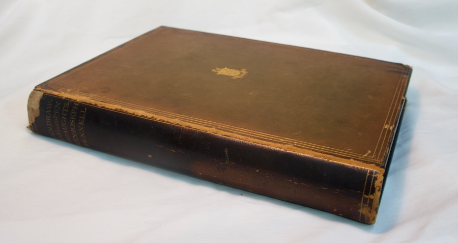
This series will cover artists both famous and not so well known, but in either case, superb at what they did. There will be American, British, French, German and Spanish artists, partly thanks to this incredible leatherbound book “Pen Drawing and Pen Draughtsmen” by Joseph Pennell, in his time a famous pen and ink artist (also etcher) in his own right. It’s 11×14″ and weighs 8.8 lbs.
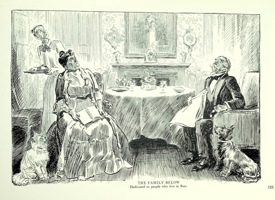
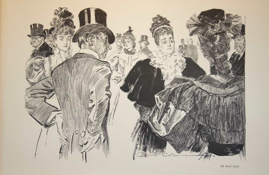
Next week, we’ll begin with a quintessential American artist, Charles
Dana Gibson. It will include images from two of his “coffee table”
books that I found in an antique shop many years ago. Here’s the cover
of one of them, called simply “London”.
There will be short biographies of the artists and, when I’ve been
able to find it, information on how they worked, sometimes including the
model of pen nib, ink and paper they used. And of course examples of
their work.
At the top: An illustration from Gibson’s “London”.
Note: This is cross-posted from my nature sketching site “SketchWild”. The series will only run on that site. I’ll still be posting my fine art news here. You can find SketchWild here.
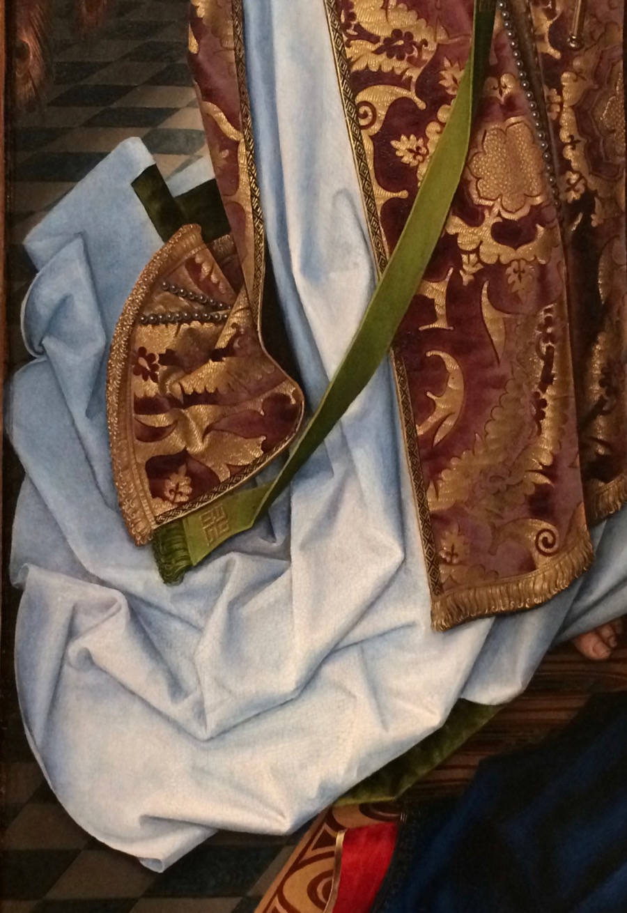
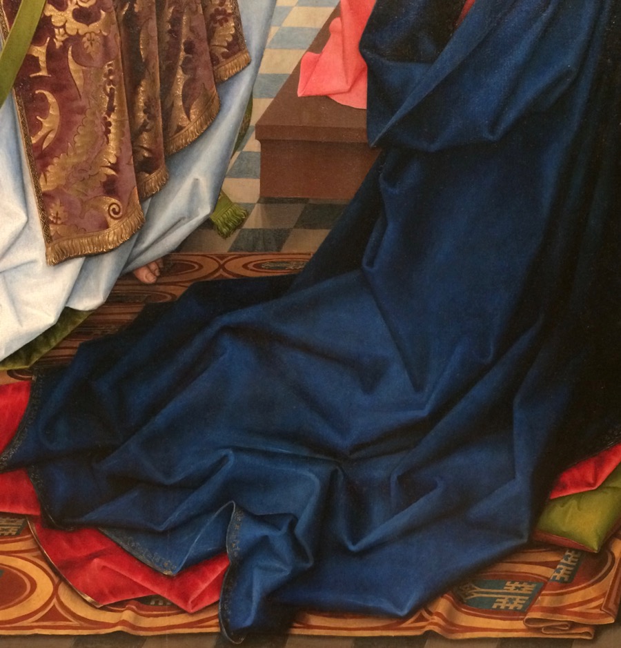
“The Annuciation”, Hans Memling, 1465-75, oil on wood
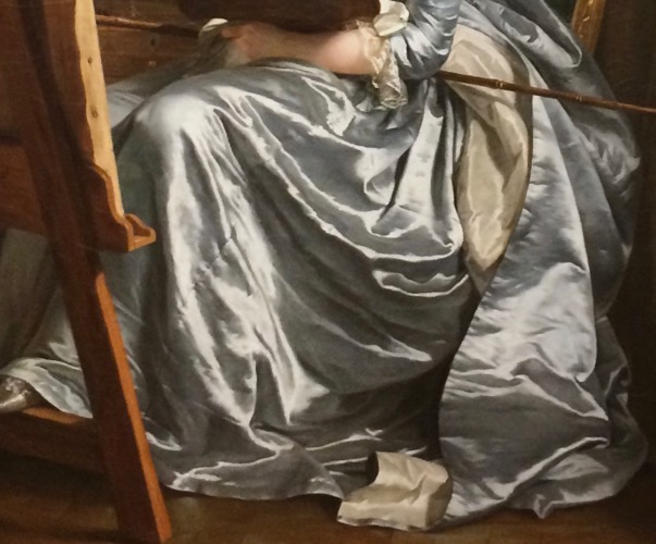
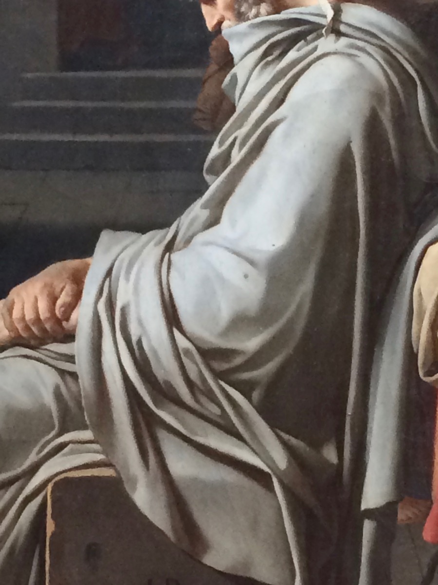
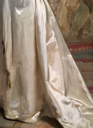
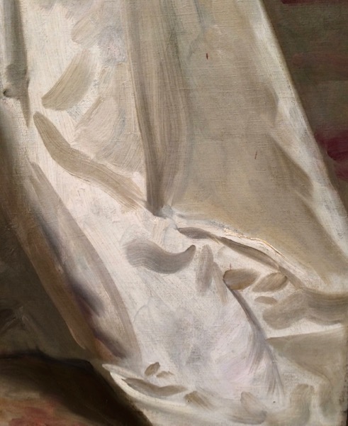
I spent most of a day at the Met during my recent trip to New York for the Explorers Club 113th Annual Dinner (I’m a Fellow of the Club). I’m working on an idea for a painting that involves drapery folds, something I haven’t done much since art school. I realized that I had a golden opportunity to learn from the best by taking drapery detail shots that I can study and, if I want, do studies from. I also did a few sketches, but it was Saturday and I couldn’t stand too long in front of anything. It was really interesting to focus on one pictorial element and see how different artists of the past solved the problem. Here are some examples. I’ve identified the painting and the artist. You can see the entire work on the Met site. I’d also like to note that the Met recently digitized and made available for use without restriction images of over 400,000 works in their collections.
(Photos taken with a iPhone 5S, which did a pretty good job all in all)
“The Annunciation” by Hans Memling, 1465-75, oil on wood
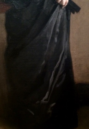
“Portrait of a Man” by Frans Hals, 1636-38, oil on canvas
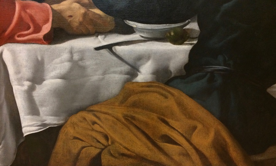
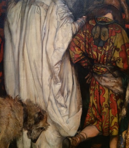
“The Supper at Emaus” by Velasquez, 1622-23, oil on canvas
“The Supper at Emaus” by Velasquex, 1622-23, oil on canvas
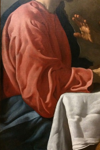
“The Fortune Teller” by Georges de La Tour, prob. 1630s, oil on canvas
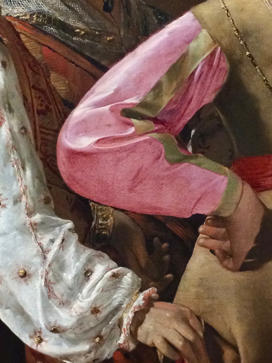
“Self-portrait with Two Pupils…” by Adelaide Labille Guiard, 1785, oil on canvas
“The Death of Socrates” by Jacques Louis David, 1787, oil on canvas
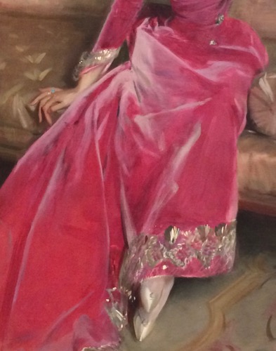
“Ada Rehan” by John singer Sargent, 1894-95, oil on canvas
Detail- the dark areas are single strokes put over the lighter areas; just kill me now
“Madame X” by John Singer Sargent, 1883-84, oil on canvas
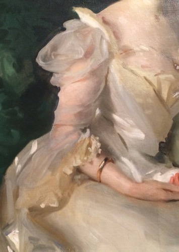
“Mrs. Hugh Hammersley” by John Singer Sargent, 1892, oil on canvas
“The Wyndham Sisters…” by John Singer Sargent, 1899, oil on canvas
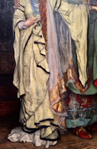
“King Lear, Act 1, Scene 1” by Edwin Austin Abbey, 1898, oil on canvas
“King Lear, Act 1, Scene 1” by Edwin Austin Abbey, 1898, oil on canvas
I flew into New York on Wednesday to attend the 113th Annual Explorers Club Annual Dinner (I’ve been a Fellow of the Club since 2014). Tonight is the opening reception at the Club headquarters. Tomorrow night will be the dinner, which will be held on Ellis Island. Noted polar explorer Sir Ranulph Fiennes will be the keynote speaker. The Master of Ceremonies will be joined onstage for the opening of the event by legendary actor Robert de Niro. So it’s going to be quite an evening.
In the meantime, yesterday I went to the Museum of Modern Art and walked around Central Park. It was pretty nippy, but sunny.
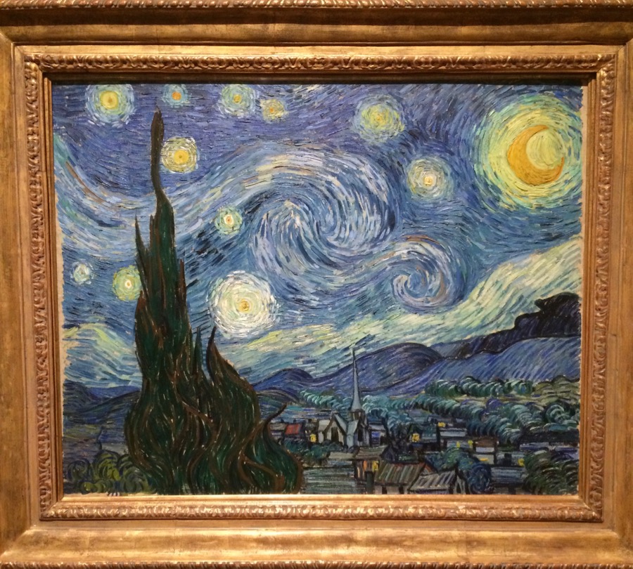
My main mission was to see the original of van Gogh’s “The Starry Night”, which has been one of my favorite works of art since I was a child. It’s smaller than I expected, but absolutely wonderful. I only had my iPhone with me but it did quite well.
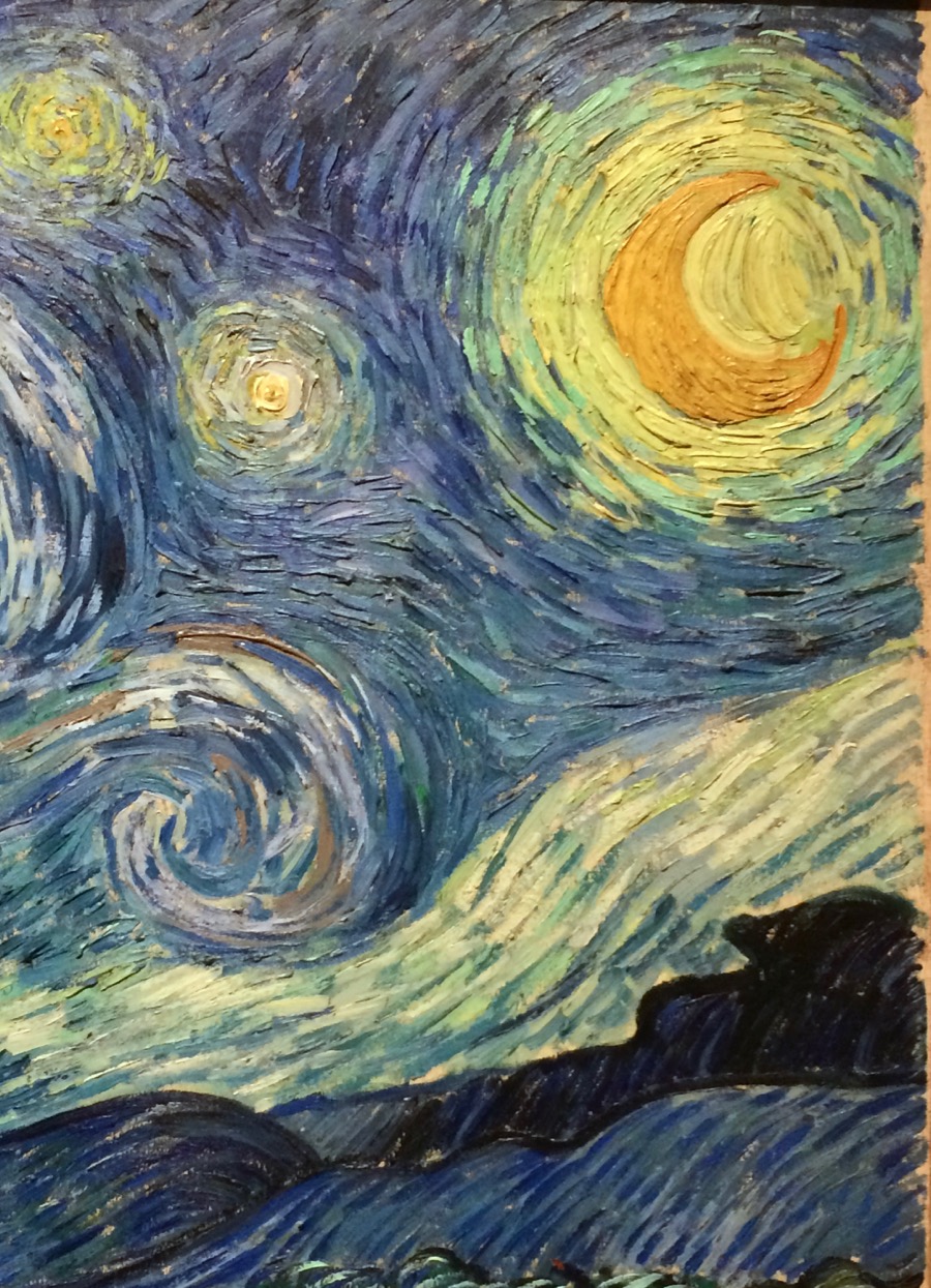
Detail: “The Starry Night”
One of the major differences between seeing an original instead of a print is being able to see the dimensionality of the paint as the artist has applied it. You can see some of that in the detail photo above.
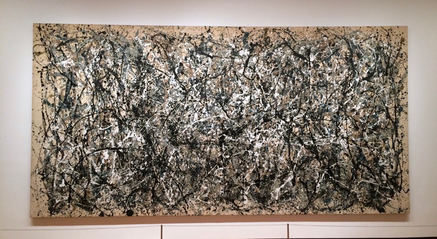
“One: Number 31” Jackson Pollock
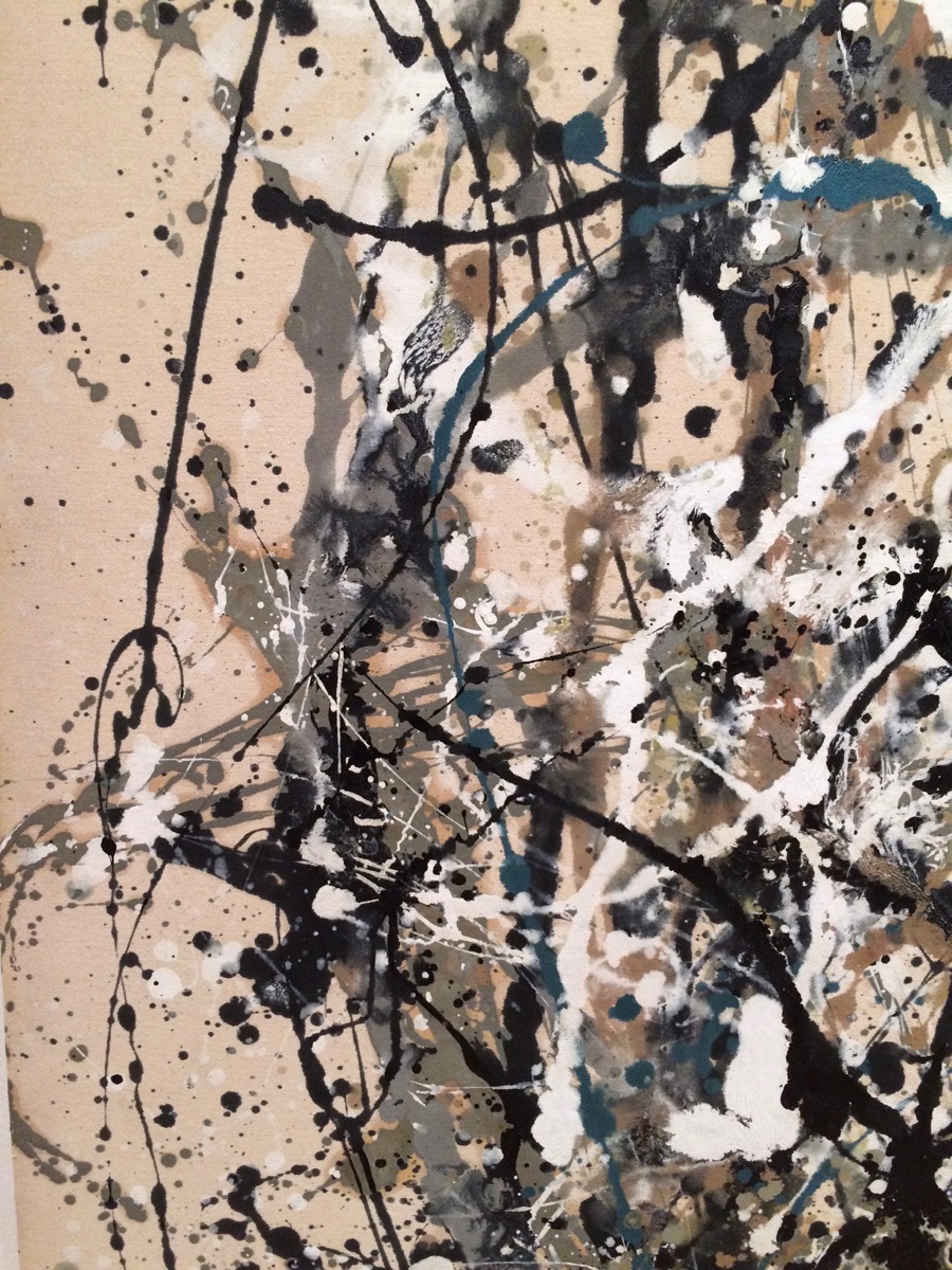
Another favorite artist is Jackson Pollock. The museum had one of his large pieces on display, “One: Number 31″ and it also really must be seen in person to appreciate it, if only for the scale. It’s 8’10″x 17′ 5 5/8”. I was able to get pretty close to it, enough to see the layering, and how thin or thick the paint was. Interestingly, it appears that, at least in this one, he mostly followed a very traditional approach of working “lean to fat”….from thin to thick. To many people it just looks like a bunch of random drips so, really, what was the point? But the method is clear when you’re in front of the painting itself. He started with some kind of basic idea and color scheme and then built on it, but also let “happy accidents” occur that he could build on and add to. The result is a tremendous visual rhythm that works whether you’re looking at the whole thing or just a detail. It could be cut (perish the thought) into twelve pieces and every single one would stand alone as a work of art.
Detail- “One: Number 31” Jackson Pollock
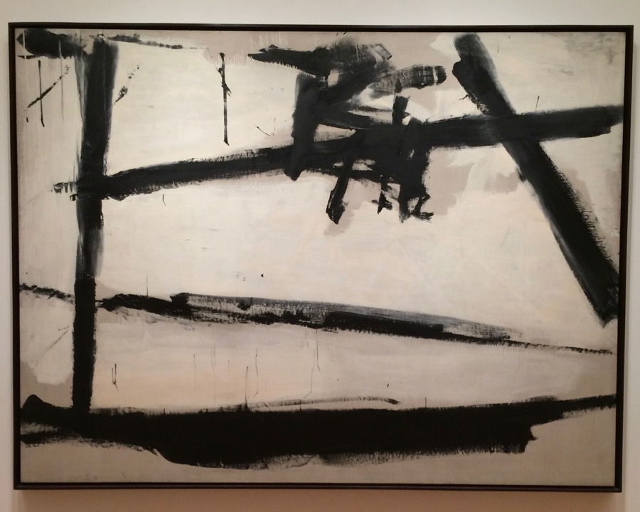
I also liked this work by Franz Klein, probably because I did calligraphy with both pen and brush for many years.
“Painting Number 2” Franz Klein
And this one by Mark Rothko. Some of you who know my work might be wondering why I like and am posting abstract work, which is held in contempt by many representational artists. Maybe it’s because I was a graphic designer for many years, so I like and appreciate non-representational work that is pure design in which the subject is the paint on the surface, not a picture “of something”.
“No. 10” Mark Rothko
The usual comment is often along the lines of “What’s the big deal? I could do that.” Well, maybe you could, but you didn’t. Rothko did. There’s also a thread of envy and resentment among some artists because apparently “simple” paintings like this are assumed not to have taken long but have brought fame and fortune to the artist, which somehow doesn’t seem fair. Yet, one of the things I’ve learned over the years is that simpicity is what is hard, not detail. There’s nothing wrong with either, of course, if it’s what the artist needs to do to express their vision. That’s the most important thing.
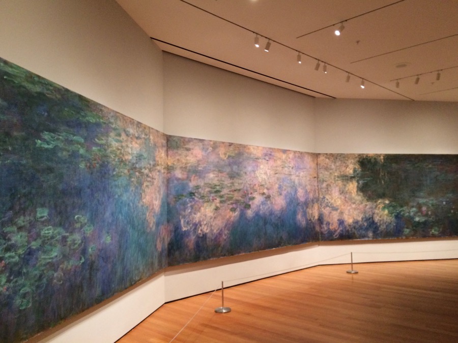
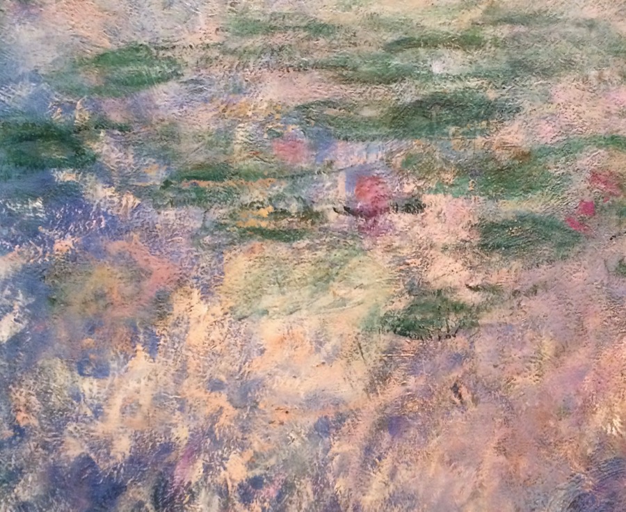
And then there’s Monet. I’ve seen his water lily paintings in other museums, but this is by far the largest. My biggest painting to this point is 36×48″ and that was a fair amount of real estate to cover. These three panels together measure 6′ 6 3/4″ x 41′ 10 3/4″. Forty-one feet long….
“Water Lilies” Claude Monet
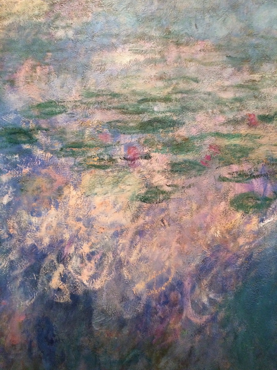
Here are a couple of detail photos:
And moving in a little closer:
Even closer and any sense of a subject would disappear into abstract brushwork. All good paintings have a solid abstract structure underneath to hold them together. The structure is the subject, along with paint color, texture and shape, in non-representational painting.
Abstract shapes and designs can be found in the real world if you learn how to look for them.
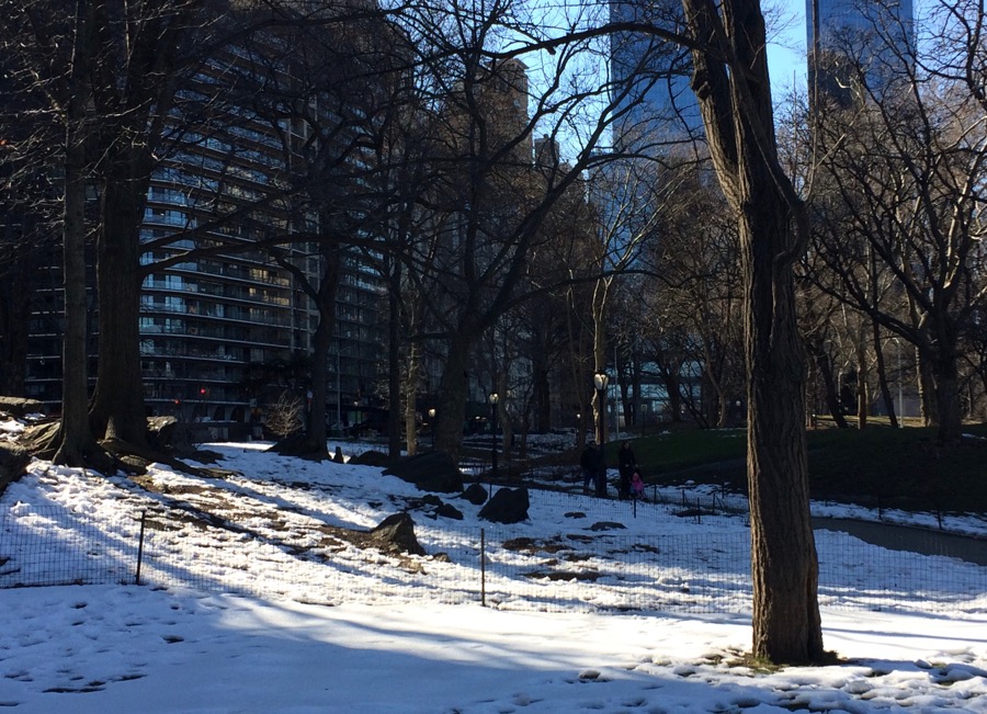
There’s still snow on the ground from last week’s storm. South end of Central Park
Vertical trees, sun and shadow on the snow. This could be turned into an interesting abstract design of shapes and colors.
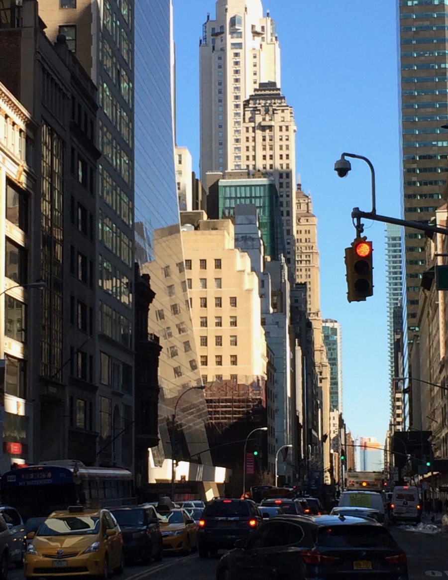
After I left the museum I walked around Central Park a bit and then south towards Times Square. On the way to the park, I stopped in the middle of a crosswalk because I just had to get a shot of this reflection.
Times Square is just ahead. I’d kind of run out of gas at this point, so stopped here and got a pretty typical New York street scene, complete with taxi cabs, before I headed back to the hotel.
And finally, how could I not like having this view from my window…
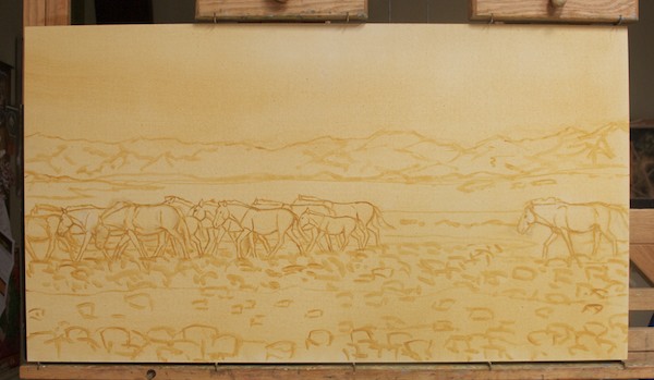
Takhi/Przewalsky’s horses at Takhiin Tal, 2013; this is the brush drawing
Working away on my paintings for a couple of juried shows and the WildArt Mongolia Expedition 2013 group art exhibition which will be held from June 3-13 at the National Museum of Mongolia in Ulaanbaatar.Hope to start sharing finished pieces in the next week or so, but, in the meantime, here’s the start of one from reference shot at Takhiin Tal, a takhi stallion moving his harem along.
Today, I’d like to share the links to some of my favorite art blogs.
1. Gurney Journey– James Gurney, the celebrated author of the Dinotopia series, also has one of the best and most interesting art blogs around. He posts every day on a wide range of topics, from great artists of the past, to practical how-tos, to the science of perception.
2. Pencil Shavings– Fine drawing doesn’t really get the respect (or prices) it deserves. My friend and colleague Terry Miller is a master of the medium and was chosen last year to receive the Master Wildlife Artist Award by the Lee Yawkey Woodson Art Museum in Wausau, Wisconsin.
3. Underpaintings– Mathew D. Innis’ blog is a great one-stop source of current and upcoming art exhibitions with lots of art to look at and drool over.
4. Jim McVicker Paintings– Jim and his wife, also an excellent painter, have been friends of mine for years. Jim’s dedication and the consistent high quality of his work is an inspiration for me. He lives and works here in Humboldt County, which is his main subject matter. He is outdoors painting all year around. And he will be one of the instructors at the big Plein Air Convention coming up in April in Monterey.
5. Making A Mark– Based in the UK, this one is a good source of general and interesting art-related topics of all kinds, including marketing, current exhibitions, the art market and artist materials.
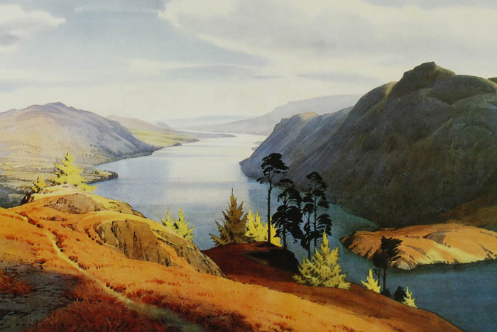
“Ullswater” by William Heaton Cooper (http://www.heatoncooper.co.uk/)- My favorite painting by one of my most favorite watercolor artists.
Although oil painting is my first love, I also have done watercolors on and off over the years and have decided to use them for my location work in Mongolia. I’ve been down with a flu/sinus infection/staph infection for almost a month, so have gotten no painting done. I don’t want to expose myself to the fumes from oil paint and solvents just yet, so decided to brush up on my watercolor skills now that I’m up and moving again. I’ve built up a pretty good collection of books on the media over the years and have been going through them. I thought that I would share with you a list of what’s in my library.
TECHNIQUE: Watercolor…Let’s Think About It! by Judi Betts- Aquarelle Press, 1984 Watercolor with Passion by Alvaro Castagnet- International Artist Publishing, 2000 Watercolor by Design by Mario Cooper- Watson-Guptill Publlcations, 1980 The Watercolor Bible by Joe Garcia- North Light Books, 2006 Mastering the Watercolor Wash by Joe Garcia- North Light Books, 2002 Water-Colour Guidance by J. Hullah Brown, A. & C. Black, Ltd. London, 1931 Painting Watercolor Florals That Glow by Jan Kunz, North Light Books, 1993 Figure Painting in Watercolor by Charles Reid- Watson-Guptill Publications, 1972 Painting What You Want To See by Charles Reid- Watson-Guptill Publications, 1987 Portrait Painting in Watercolor by Charles Reid- Watson-Guptill Publications, 1973 Pulling Your Paintings Together by Charles Reid- Watson-Guptill Publications, 1985 Fundamentals of Watercolor Painting by Leonard Richmond and J. Littlejohns, Watson-Guptill Publications, 1978 Breaking the Rules of Watercolor by Burt Silverman, Watson-Guptill Publications, 1983
WATERCOLOR ARTISTS: Irises and Other Flowers by Elizabeth Blackadder, Harry N. Abrams, Inc., 1994 Mackintosh Watercolors by Roger Billcliffe, Carter Nash Cameron, 1978 Mountain Painter, An Autobiography by W. Heaton Cooper, Frank Peters Publishing, Kendal, Cumbria 1984 Sir William Russell Flint by Ralph Lewis and Keith S. Gardner, David and Charles, London, 1988 Margaret Merry’s Cornish Garden Sketchbook– self-published, 1994 English Watercolors by Graham Reynolds, New Amsterdam, 1950, 1988 The Glory of Watercolour: The Royal Watercolour Society Diploma Collection by Michael Spender, David and Charles, London, 1987 Nature Into Art-English Landscape in Watercolours by Lindsay Stainton, British Museum Press, 1991 (exhibition catalog) Turner Watercolors– The Tate Gallery, 1987
The list has many books from England, both because watercolor has always been an accepted, important media there and because my husband and I traveled to England quite a few times in the late 1980s to the mid-1990s, so I regularly brought books back home with me.
Color is one of the things artists love about painting, but it can also be one of the most frustrating. There are lots of “rules” out there which try to make sense of it and they are a good starting point, but ultimately every artist, as with most other aspects of painting, has to find their own way.
Here are six thoughts on color, based on my own experience and information I’ve picked up over the years. Add some of your own in the comments!
1. Color is relative. How we perceive a color’s hue and value depends entirely on what’s around it.
2. Come up with a “color plan” for your painting. Decide if it will be monochrome, use complementary colors, analogous colors, etc. Do very small (5×7″ or smaller) color roughs, if necessary.
3. Value is how light or dark a color is, separate from what hue the color is. If you get the values right, you can do anything you want with the color.
4. A good rule of thumb is when you change the value, change the temperature. Warm highlights/cool shadows. Cool highlights/warm shadows.
5. While there are a variety of useful “rules” for using color, ultimately you do whatever works to let you say what you want to say.
6. Don’t be afraid of color. Go for it!
This post is illustrated with details from my latest painting in progress. Check back next Friday to see the whole thing, plus step-by-step photos.
And……I will have a major announcement on Monday about my next trip to Mongolia!
Although his name is not familiar to most people anymore,in his day Leigh was ranked with Remington and Russell for his depictions of the American West, mostly southwestern Native Americans.
He grew up in a southern family that struggled to maintain an acceptable level of gentility without much money. Through the kindness of family members and friends, Leigh studied art at the Munich Academy for 12 years, even though he’d really wanted to go to Paris (too expensive).
He ended up traveling to the West and found his subject matter among the Navajo, Hopi and Zuni people, gaining the fame and fortune he had always sought late in his career.
The Pottery Maker
I recently read Leigh’s biography by D. Duane Cummins, having gotten interested in the artist after stumbling across four of his original pen and ink drawings for his book “Frontiers of Enchantment” at an art gallery in New York, which unfortunately were way beyond my price range. The book is about his adventures in Africa with Carl Akeley.
He was apparently quite an unpleasant person to be around and didn’t marry until late adulthood.
The book quotes from Leigh’s writings and he seems to have had plenty to say both about the creation of art and the art scene of his time, of which he was not, shall we say, a fan.
Struggle for Existence- Leigh also did a fair number of wildlife paintings
Here are a few of my favorites:
On drawing:
From a letter from Leigh to his mother, who wanted him to “skip ahead” from drawing to painting at the Munich Academy so he would be done sooner with his stay in Europe, money to pay for it being difficult to come by:
“You ask if I do not think that it would be my better plan to go into the painting school. Well I will tell you just how it is. You probably think that after having studied drawing for the length of time which I have studied it, (three winters in Baltimore, and two winters here, five in all) that I ought to be a pretty good draftsman by this time, at least good enough to go into the painting school. And it is very natural of you to think so; having not a minute knowledge of what an artist has to know. but you only have to reflect what an enormous undertaking it is to become an artist. When a person begins to paint, think what he has to struggle with. The bare outline of the head, the modeling of each individual part, the color, and the manipulation of the paint. When one begins to paint before he can draw well, he finds the difficulties so increased that he is crushed and is at a loss to know how to advance. The only thing is to go back to the drawing school and draw, until drawing becomes easy to him so that when he begins to paint the color and handling of the paint are the only things he has trouble with…Art is not a thing that can be understood at a glance, or studied out by rule like long division sums, nor can it be pushed along by force or learned within a measured space of time. It is not simply the skill of long practice, it is mental creative process.”
And, one week later:
“Do not think that all I have to do is to go into the Antique for one year, Nature one year, Paint one year, and Composition school one year, and then come home an artist. I might as well, tell you now, that it will take much, much longer than you think….I have begun the study of art now and there is no turning back.
Study for "The Best of the Bunch"
On Post-Impressionism (this from someone who had wanted very badly to study art in Paris):
“A whole generation is being mentally indoctrinated with sophistical garbage and the philosophy of Paris sewer-psychology.” He also referred to French paintings as barbaric, vulgar imbecilities, brazen effronteries, hideous travesties, sadistic, psychological bamboozle, technical flub dub, and insults to the common intelligence.”
“Sodom and Gomorrah would have been contaminated by them.”
After viewing the Armory Show in 1913:
“When our country was first invaded by the excretions of the French absinth fiends & and soul-debased moral prostitutes at the armoury exhibition in 1913, few including myself, could have been brought to believe possible, the aberrations of which our land is capable.”, also referring to it as an “intellectual pigsty” and “a lunatic’s hangout”.
At that point in time art like that in the show was outselling the style of art he was doing, both in price and quantity.
A finally, quite a takedown of Whistler:
“Whistler never understood that the human message in a picture was weightier than his tonal effects. He was devoid of story telling qualities: human joys and sorrows, the tragedies and poetries of life, the problems of the world, the sublimity of the ocean, the clouds, the stars did not stur his imagination. Cold and cynical, he took no interest in anything outside himself and the technical; the milk of human kindness, if he had any of it, was in the form of a lump of ice. Never before had the mediocre and the ignorant such a champion.”
Here are the links to three art blogs I really like. There are a lot of them out there, but unfortunately too many artists don’t post regularly or don’t do much other than occasionally post images of their work.
These three stand out for quality of content and regular postings.
1. Gurney Journey is one of the top-rated art blogs. James Gurney is the author of the Dinotopia books, has written two books about art technique and craft and posts to his blog every day on everything from how the human eye tracks through a painting to short profiles of famous artists to how he creates his own marvelous works.
2. COLOR AND LIGHT is the blog of nationally known artist Adele Earnshaw. She started as a watercolorist, but switched to oils a few years ago and the story of why and how she did that makes very interesting reading. Recently she’s been doing what she calls 75 For 75. A painting a day for 75 days that she offered for sale as she finished them for $75. I managed to snag one a few months ago, but I had to be quick because most sell within minutes.
3. Cathy Johnson Fine Art Galleries is where you can find all kinds of great art instruction materials, along with images of Cathy’s art. I remember reading her column in Artist’s magazine many years ago and was tickled to find her on Facebook and see that she is still at it and then some. She offers CD courses, mini-classes and also information about various art media like her favorite drawing pen. Her instruction is real, not that rote “Here is how you paint a tree with my special brush and paint” stuff.