Every Artist Starts Somewhere- Art School

"Jazz"- Gouache on illustration board
“Jazz”- A classmate modeled for me in a tuxedo coat from the prop room, I went to a local music store and shot reference of one of the employees playing the clarinet to make sure I had the hand and finger positions correct and invented the mice and the lettering. This was for Illustration III. Gouache on illustration board.


This is the third installment of a series I started last year, my beginnings as an artist. You can find the previous posts here and here.

In the early 1980s I was living in Berkeley working as a freelance graphic designer. I hit a very rough patch, rough enough that I had to sit back and figure out what to do career-wise. I saw my choices as getting a job, re-dedicating myself to my freelance design business and really digging in on marketing or “taking some classes” to increase and improve my skill level. What ended up happening is that in 1987 at age 35 I went back to school full-time at what was then the Academy of Art College (now “University”) in San Francisco for three years and earned a BFA Illustration in 1989. While I had intended to focus on graphic design and also take some illustration classes (a relative and a friend had both trained as illustrators there so I knew it was a good program), within a few weeks I knew Illustration was what I wanted since I had FINALLY found the art field where traditional drawing skills were still highly valued.

I had up to nine hours of drawing a week. It was a struggle to undo all the tics and faulty perceptions I’d built up trying to teach myself and, in fact, had become so frustrated that I didn’t draw at all, other than for work-related jobs, for close to ten years. But class after class I just kept going, drawing after drawing. I never won any awards, but at the end I had the knowledge and skills to keep improving. Within a few years I felt that I could finally say that I knew how to draw.

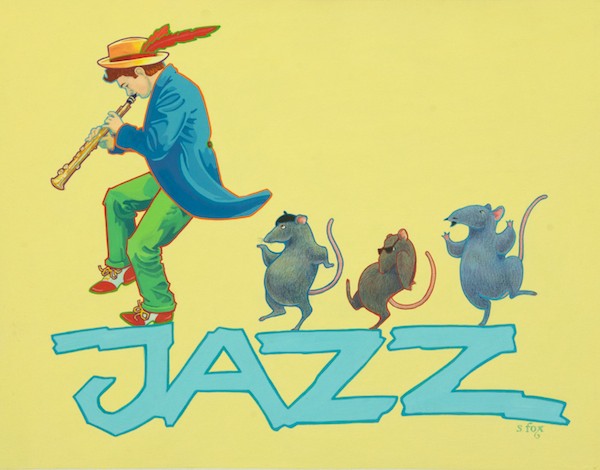
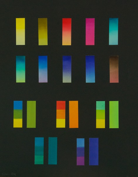
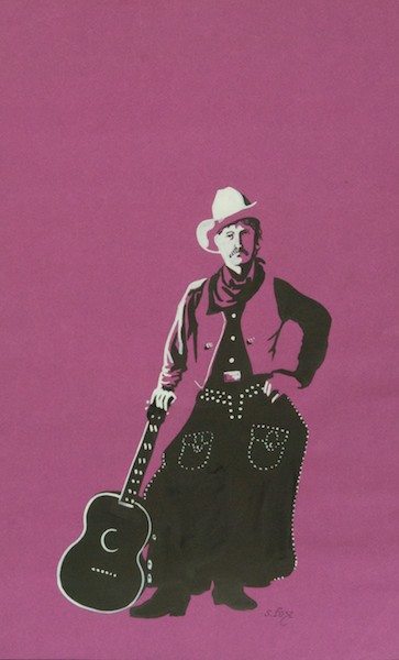
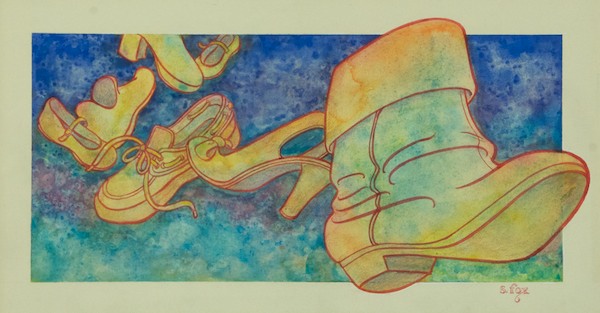
In the Illustration Department we had to do an illustration a week, every week. The first semester required us to use first pen and ink and also gouache. Below you’ll see some of the initial exercises we did. I was one of the very few who liked gouache and I was interested in greeting card work, much of which was painted in that media at the time, so I stayed with it all through school. The second semester was watercolor and dyes like Dr. Martin’s. From the third semester on we could use the media of our choice.

Among my favorite classes was one taught by Stan Fleming, who did storyboarding for quite a few LucasFilms, including at least of of the Indiana Jones movies. He would come to class in his leather Indie jacket, to our delight. Our assignments were movie-based, like doing a storyboard for Ghostbusters or object designs for a fantasy movie, and a lot of fun. Another favorite instructor was Dennis Ziemienski, who is now a nationally-known fine artist, but became a well-known illustrator for, among other things, his Elmore Leonard book covers. All his assignments were based on actual jobs that he’d done. He also brought in guest critiquers. For me the memorable one was Neil Shakery from the legendary design firm Pentagram. I’ve posted three images below, for a children’s magazine, from the assignment he critiqued. I encountered him downstairs afterwords and he took a minute to tell me how much he liked what I’d done. That meant a lot to me, as you can imagine. We also had guest speakers who included Robert Heindel and Drew Struzan.

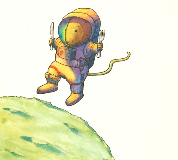
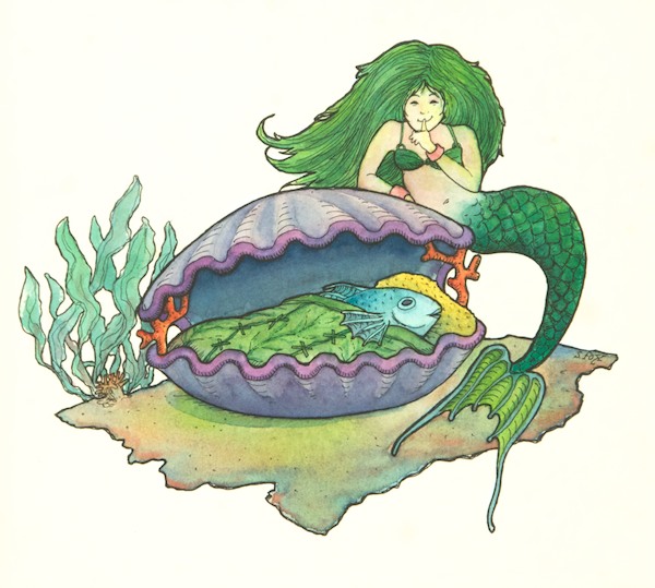
So here’s a trip down my illustration memory lane:

Color strips
Color strips, Yeah, I know, exciting stuff. But it’s how we learned to control the media we were going to be using.
Exercises using watercolors or dyes.
Exercises using dyes. Anyone who has followed this blog for any length of time won’t be surprised by my choice of subject matter. Dr. Martin’s dyes on vellum bristol.
Learning to see the largest shapes in two values plus the paper color.
Learning to see the largest shapes in two values plus the paper color. Gouache on construction paper.
Illustration II watercolor.
Illustration II watercolor. I remember vividly the lesson from this one….”Acknowledge the third dimension.” Critical and without which an artist cannot create the illusion of three dimensions on a two-dimensional surface. Watercolor on illustration board.
Watercolor assignment for Illustration II.
Watercolor assignment for Illustration II. The texture was created by sprinkling salt on the wet paint. Watercolor on illustration board.
The assignment was something like "dessert".
The assignment was something like “dessert”.  I bought the dessert (which was consumed after shooting it for reference, of course). Everything else were things I had and the rose was from the garden. Getting the perspective and ellipses correct was a challenge and I pretty much pulled it off, but not quite. I think the purple shadow is a bit much now, even though we were constantly encouraged to “plus” everything. Gouache on illustration board.
Assignment from Dennis Ziemienski's class.
Assignment from Dennis Ziemienski’s class for a children’s magazine. This one was one right up my alley.
The mouse and the moon.
What is the moon made of? Green cheese, of course. I did my research for the astronaut’s suit. It’s simplified, but accurate, Watercolor/pen and ink on hot press watercolor paper.
Do fish sleep? The mermaid thinks so.
Do fish sleep? The mermaid thinks so. Watercolor/pen and ink on hot press watercolor paper.
The assignment was to do an album cover.
This assignment for Illustration III was to do an album cover. I’d recently discovered Kitaro’s “Silk Road”. Gouache and watercolor on illustration board.
This was for Illustration IV, I think. And the assignment may have been an open one, the hardest to do.
This was for Illustration IV, I think. And the assignment may have been an open one, the hardest to do. I’d been doing medieval illumination for years as a member of the Society of Creative Anachronism, so it was fun to use that skill in art school. Gouache on illustration board.
One of my classmates posed
One of my classmates posed for me wrapped in a bed sheet. I’ve always loved Alphonse Mucha’s work and it was fun to try to capture the spirit of his wonderful work. Watercolor on cold-press watercolor paper.
For my final semester, I did an independent study one on one with an instructor. He assigned me a movie poster.
For my final semester, I did an independent study one on one with an instructor. He assigned me a movie poster and I chose “Camelot”. I really had to battle to get the likenesses in gouache, but I loved coming up with the design.

As you can see, I took advantage of the opportunity to try all kinds of styles and approaches. Next time I’ll share some of the work I did after graduation for my professional portfolio.


Leave a Reply

Fill in your details below or click an icon to log in:

WordPress.com Logo

You are commenting using your WordPress.com account. Log Out /  Change )

Facebook photo

You are commenting using your Facebook account. Log Out /  Change )

Connecting to %s