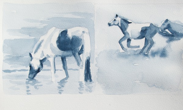
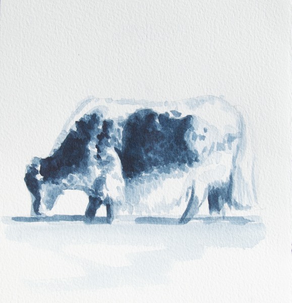
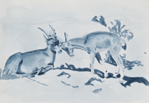
I’m getting ready to begin my Fall Painting Season and decided to start by tweaking my working process. Every successful representational painting has two things: solid composition and a strong, well-thought out value pattern. Of course drawing, color and edges are important also, but one can make the case that the design and values are critical. So I’ve spent the last few days doing small value studies of reference photos that I’m thinking about painting. I’m working on the drawing part at the same time, too. None of them took more than an hour or so.
They are all done on various types of watercolor paper I already have on hand, experimenting to see which one serves my purpose best, and with one color…Winsor Newton Payne’s Gray. The brush is a Round No. 10 Prolene by ProArts. The study sizes run from 6×6″ to 7×10″, so not very big.
I got the idea to use watercolor for preliminary value studies (instead of, for instance, pencils or oils) from my friend and colleague, nationally-known watercolorist David Rankin. You can read his information about what he calls “Gray Studies” here.
I like it because it’s fast, effective, fun and let’s me practice with the media I use on location when I’m in Mongolia.
So, if your paintings are looking kind of flat or you’re finding that using color is confusing your values, I highly recommend that you get the simple set of materials listed below and try this. It may be a bit of a struggle at first to truly grasp the difference between color and value (the relative light and dark of something separate from its color) and to move away from your reference in order to get the right amount of contrast in the right places (a viewer’s eye is going to go first to the area of highest contrast, so you need to make a conscious decision about where your focal point is), but hang in there, just keep adjusting and experimenting and you’ll be rewarded by a visible improvement in your work.
Materials list:
1 tube Winsor Newton Payne’s Gray transparent watercolor
1 small dish or whatever you think will work for a palette.
Watercolor paper (I’m using “stock on hand”….small blocks of Art Lana Lanaquarelle hot press, Arches cold press and Saunders Waterford cold press; or you can get sheets of 300 lb, which doesn’t have to be stretched). If you buy sheets then you will need something to mount them to. I use a rectangular scrap of foamcore taped around the edges with clear packing tape and then use 1/2″ drafting tape to hold the corners of the paper to the board.
1 brush- Use at least a no. 10 round or 1/2” flat; your choice of brand (I like the Robert Simmons Sapphire synthetics, but also have a couple of the Prolene and Dick Blick rounds)
Reference photos with strong light and shadow patterns.
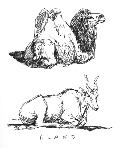
Here’s some more of what I’ve been doing: