
See the listing here

See the listing here
Happy bidding!
Since, judging from the stats, the subject seemed to be very popular, I thought I would continue today with more on the takhi, specifically how I take the reference I shoot and turn it into a painting. More and more I start with drawings to become familiar with a new species or figure out things about one I’ve painted before.
Here are three drawings from last year, the first two of which were published in the Society of Animal Artists newsletter.


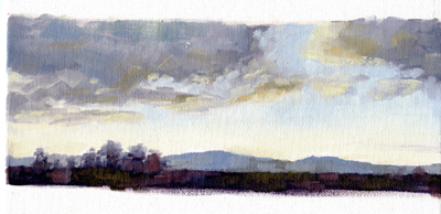
Now I’ll show you how I take an animal from one time and place and put her in a setting from another time and place, a challenge that every wildlife artist needs to meet successfully. Here’s the setting:

What a treat! We came around the bend in the dirt track early in the morning and there, right in front of us were two harems at the same time, sorting out who gets to go first.

I always try for a variety of shots; close-ups and the “big picture” for context. I used to come home with great close shots of something like a tree and found that I’d completely forgotten to get the surroundings, which really cut down on my options. Notice that the above photo is kinda fuzzy. But it’s still useable for reference.
Now here is the horse reference. Different part of the park, different year, different season. I’ve included two as an example of what to look for when evaluating images. These are similar, but the second, to me, is clearly superior. I love the rhythm of her gesture.


So next I did a drawing to capture that.

And, putting them together, here is the finished painting, completed in 2007. What I hope is that you can’t tell that I “stitched” together the reference from two sources.

I also wanted to let you know that two of my takhi images are available as limited edition giclees, framed or unframed. The full information is on my website. Click on “Limited edition giclees” under Fox Studio in the column on the right and it will take you directly to my giclee page.

I saw this foal on the same trip as the mare in the painting above. He or she was quite a character.

I posted this last week, as the original painting is still available, but have also published it as a giclee. It’s another example of how I took the mare and foal, who were against a grassy hillside and moved them to a ridge that has Hustai’s famous mountain as the background. The third horse was added as a design element.
All my giclees are available for holiday delivery.
ART THOUGHT FOR THE DAY
Let this be plain to all: design, or as it is called by another name, drawing, constitutes the fountain-head and substance of painting and sculpture and architecture and every other kind of painting, and is the root of all sciences. Let him who has attained the possession of this be assured that he possesses a great treasure…:
Michaelangelo (who ought to know)
Like many artists, I’m trying to figure out what my sales options are given the current economic climate. I’m also interested in seeing if I can sell art directly on the internet. And, a few months ago, I was showing some friends some of the small studies I do to work on various aspects of painting and one encouraged me to try selling them. Taking this all together, I have decided to offer a “new line” of small oils that I am calling “Studio Studies”, because, well, that’s what they are.
As anyone who paints most days a week knows, they do stack up after awhile and I have a few dozen that I’ve decided I’m willing to find new homes for.
I plan to start offering them a few at a time on EBay, starting next week. Here’s a small preview, starting with one that I photographed in progress, so it’s a short step-by-step demo of how I do these mostly 6″x8″ studies that usually take less than two hours. The idea is to quickly capture a light effect, so detail isn’t relevant. This should look familiar to anyone who has taken Scott Christensen’s Ten Day Plein Air Intensive, because that’s who I learned this approach from and I really like it.
STEP-BY-STEP 8″X 6″ STUDY (from last Friday’s post)-
An image I shot up on Dunraven Pass in Yellowstone National Park at first light. What I was working on the was the color temperature shifts from shadow to light.


Here’s a couple more. First a demo that I did in about an hour at the Marin Art Festival of a small kangaroo which I photographed at a zoo.
And a landscape a few minutes from our house looking east from Clam Beach to the bluff. It was summer and the foxgloves were blooming. They’re not a native, but they look like they belong here in Humboldt County.
Finally, since I strongly believe that artists should help and support each other, here, from Alison Stanfield, who runs ArtBizCoach, is some solid advice on “Community”. Thanks, Alison! (Hope it’s readable. Let me know if it’s not.)

ART THOUGHT FOR THE DAY
The artistic mind is one that takes years to develop. Painting never gets easier. Struggle is not something that one goes looking for. It will find you. Just give it time.
Scott Christensen, The Nature of Light
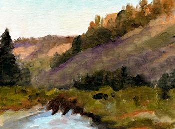
One among many of the great things about our visit to Arburd Sands ger camp in Mongolia was the herd of domestic bactrian camels that lived at the camp. They tended to wander off during the day, but were around in the mornings and late afternoons when the light was at its best (how did they know?) I had fun sketching them and here is my first painting of one.

I really enjoyed trying to get the feel of the wooly coat and painting the pattern of light and shadow.
I’m always looking for ways to live more sustainably and responsibly. More and more it involves conscious choices, which means remembering to think about what one is buying or whether or not to buy at all. There is no way to live on the planet without using resources and, currently, the deck is stacked in favor of certain ways of doing things. But it’s been changing and I’ll bet the rate of change is going to increase Real Soon Now.
And, as anyone who has read this blog for awhile knows, I’m very interested in animal welfare issues.
With that in mind, I needed to get some new brushes. I’ve been using Silver Brush Limited Grand Prix Bristles for quite a few years now. Generally speaking, real hog bristle brushes for oil painting are the superior choice. Then I got one of my regular promotional emails from Jerry’s Artarama, who I have ordered art supplies from for twenty years. They were having a sale on Silver Brush brushes and this caught my eye: “How can you save the life of animals and actually help yourself at the same time?”
On offer was a synthetic brush Silver Brush calls “Silverwhite”. And that got me thinking about the use of animal products. I have no idea where the hog bristles in my current brushes come from. Probably China. What kind of conditions are the pigs kept in? No clue. My husband and I already don’t eat meat that we can’t source to a humane producer. What about something like painting brushes?
So, I ordered the synthetics and used a couple for the first time today and I like them a lot. I plan to switch to them. But then the question becomes “What are the Silverwhites made from?” Some kind of petroleum-based material most likely. Sigh. See what I mean? Choices. Synthetic brushes have been around for years, but I’ve never seen them marketed as “animal friendly” and had never thought of it that way before. The idea is kind of “buzzy” in that, assuming the bristles come from hogs raised for meat, it’s not clear how not buying brushes made from their bristles “saves” their lives, but, as I said, I did find it thought provoking.
I’m not going to get doctrinaire about it, but at this point I’m choosing the synthetic. Thoughts, anyone?
On the color front, I want to start pushing more toward a colorist approach. Camille Przewodek is a great contemporary example. She pushes color waaay out there. I looked at the supply list for her workshops (hope to take one sometime when I have the money) and decided to buy these, for me, exciting new colors: Permanent Green Light, Permanent Magenta and Manganese Bue Hue, all Winsor-Newton. Experimentation begins next week.
ART THOUGHTS FOR THE DAY
Everyone has talent at 25. The difficulty is to have it at 50.
Edgar Degas
Every good painter paints who he is.
Jackson Pollock
I realized that all the good ideas I’d ever had came to me while milking a cow. So I went back to Iowa.
Grant Wood
Anyone who has been to art workshops knows that there always seems to be someone who is almost obsessive about finding out what paint, brushes and supports the instructor uses. The idea seems to be that if they can use what the teacher uses, by some kind of magical osmosis they’ll be able to paint like the teacher paints.
Fortunately, it doesn’t work that way. After all, if creating good work was only a matter of using the right combination of materials, it would take all the fun out of painting- for a sufficiently broad definition of “fun”. Sometimes trying to gain mastery or even competence in an art media is an exercise in frustration, disappointment and self-doubt. And then there are those too short times when the painting seems to paint itself and you’re just along for the ride.
With all that in mind, I thought I’d blog a bit about what materials I’ve ended up using after my first twelve+ years of painting in oil. Use any or all of it at your own risk. This week, I’ll start with paint.
I began with a pretty standard palette, courtesy of my first teacher. White, black, warm/cool red, yellow, blue, green, plus three or four earth colors and then some “fancy” colors that would have had Rembrandt spinning in his grave and Gauguin breaking into my studio in the dead of night.
Then I went to Scott Christensen’s ten day plein air intensive. Four color palette (plus a couple of tube greys): titanium white, Rembrandt Permanent Red Medium, Winsor Newton (W/N) Ultramarine Blue and Winsor Newton Cadmium Yellow Pale. And my “color choices” exploded. I discovered a whole world of more muted, restrained color that I was barely aware of before. A limited palette solves the “color harmony” problem, too, since every color probably has at least a titch (the technical term) of all the others in it.
Here’s my first four color study from before I left so I could see how it worked a little, followed by two 20 minute exercises done at his workshop-


These are two studies I did after I got home. I think you can see that one isn’t really limited at all as far as color and what you can do with it. Value relationships and color temperature shifts become more important than having a particular tube color.


I pretty much stayed with that palette for over two years. For me, the main limit I bumped up against is that I’m an animal artist, not a landscape painter, and I really felt the need for a color I picked up at a Paco Young workshop, Rembrandt Transparent Oxide Red. It’s perfect for so many animals that I do. Then I found that the warmer Cadmium Yellow Medium worked better for me than the cooler Pale. Then I found myself gazing longingly at the dioxine purple, then my beloved sap green……
Presently, having realized that I’m really more of a colorist than a tonalist, I’ve added more punchy colors back so my paintings will have the emotional content I want. These days I use, from left to right on my 18″z24″ glass palette: Rembrandt Transparent Oxide Red, Rembrandt Permanent Red Medium, W/N Cadmium Orange, W/N Yellow Oxide Pale, W/N Cadmium Yellow Medium, W/N Titanium White, W/N Ultramarine Blue, Rembrandt King’s Blue, (sometimes Rembrandt Turquoise Blue, for extra warm blues), W/N Dioxine Purple, W/N Sap Green, W/N Viridian. I very occasionally use W/N Raw Sienna, mostly to tint my canvas before starting, but otherwise I mix my own earth colors, greys and black (ultramarine blue, transparent oxide red).
I do small (6″x8″ to 8″x10″) studies to try out painting ideas and for those I use the four-color palette because I can come back to them months later and I know exactly what colors I used. Here’s three, two of which went on to become finished paintings, so far. Yes, those are Roosevelt Elk on the beach north of where I live in Redwood National Park. The finished painting is called, what else, The Beach Boys, and is in a private collection.


The most important thing is not how many or how few colors you use, but that you know why you are using them and that you use them well.
The “Pot of Paint” reference in the post title is part of another of my favorite artist stories, which will be part of Friday Features.
Hope everyone has a fun and safe holiday weekend!
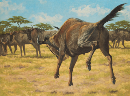
“Wildebeest Whoop-de-doo” oil 18″x24″
from reference shot in the Masai Mara, October 2004
ART THOUGHT FOR THE DAY
To paraphrase a famous advertising guy- Creating art is the most fun you can have with your clothes on.
