In March of 2011 I was one of thirty artists invited to go on a “dream junket” to San Carlos, Mexico to paint, sketch and shoot reference for a Sea of Cortez exhibition at the Arizona-Sonora Desert Museum in Tucson, Arizona. And of course I happily accepted the chance to spend a week in a beachfront condo with 29 fellow artists.
One of the truly special things we got to do was to spend a day in a boat cruising some of the islands. There were birds everywhere and just about every one of them was a new species for me.
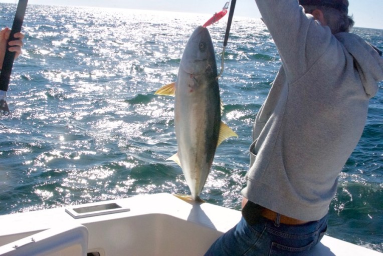
At one point, fishing lines were put in the water. I didn’t pay much attention since I was riveted by the bird life, which included brown pelicans blue-footed boobies, gannets, cormorants, frigatebirds and wonderfully graceful tropicbirds.
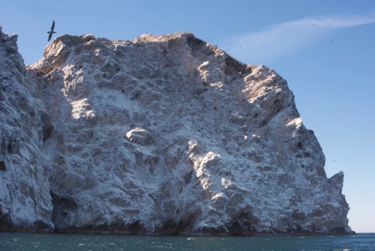
We cruised around near this outcropping on one of the islands.
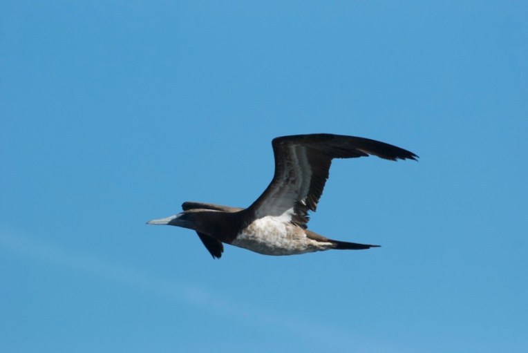
A gannet flew by.
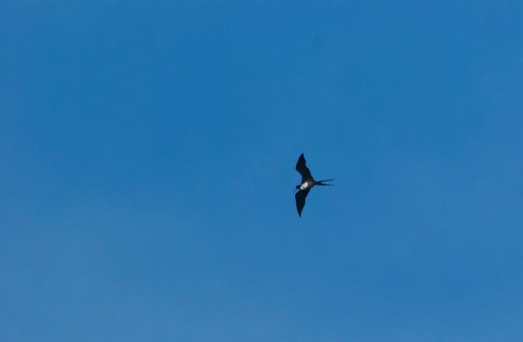
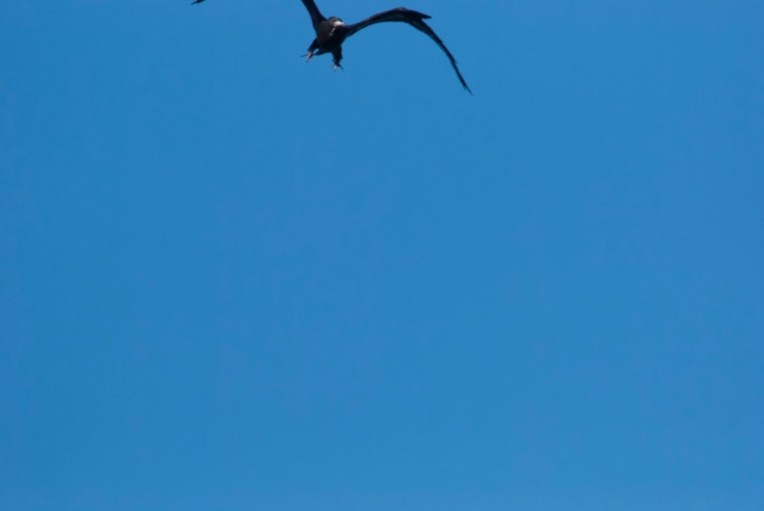
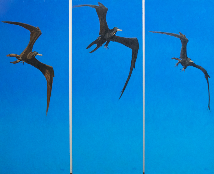
And, at a distance, a magnificent frigatebird flew by. In the meantime, someone hooked a yellowjack and hoisted it onto the boat. We were all gathered around admiring it when I looked up and spotted a frigatebird flying towards the boat, coming closer and closer. I had my camera with the long lens and started to shoot photos as fast as I could as the bird came right over our heads.
Frigatebirds mostly make their living stealing fish from other birds and this one had spotted ours, hoping for an opportunity to snag it. Alas, no. But I snagged enough good photos to create a triptych I titled “Magnificent Flyer”. I was honored when it was chosen to be used for the exhibition and direction banners at the museum.
“Magnificent Flyer” oil triptych each panel is 25×16″ (price on request; not sold separately)
There is a great benefit art show that has happened for a number of years now that I’ve contributed to in the past but have been too busy to do again until now. It’s called “Cats in the Hall”, the hall being The Hall Gallery at 208 C Street Studios in Eureka, California, about 20 minutes from where I live.
There will be work by over 70 local artists working in various media. The Arts Alive! Reception will be on Sept. 2nd. The doors open at 12:00PM Saturday and Sunday. Costumes are encouraged for the opening. The show comes down Sept 27th. There will be cats available for adoption.
I’ve taken advantage of finally not staring down the barrel of show deadlines for awhile to splash around with my watercolors and have some fun painting from the zillions of photos I’ve taken of our cats over the years.
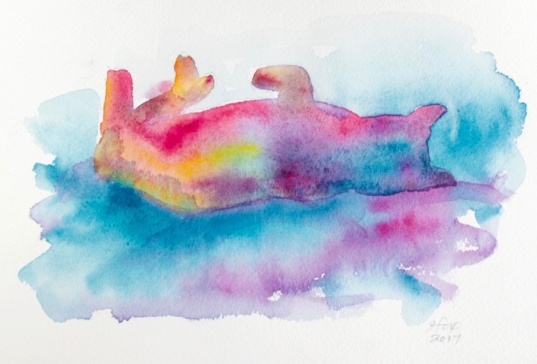
“Conked Out Cat” watercolor on paper 6.25×9″ $10
The pieces I’m posting here will only be available for now at the show. If any don’t sell, then I’ll post them for sale on my website.
“Comfy Cat” watercolor on paper 5×6″ $10
I really had fun loosening up with the watercolors. I drew each shape, added a layer of clear water and then started adding paint, just letting it do its thing. I used my new Yarka watercolor set so it was a chance to try out some new colors too.
“Tiny Cat” watercolor on paper 1 7/8″x3 7/8″ $5
So if you live in Humboldt County (or beyond) and you love art or cats or art and cats or cat art, come to the show!
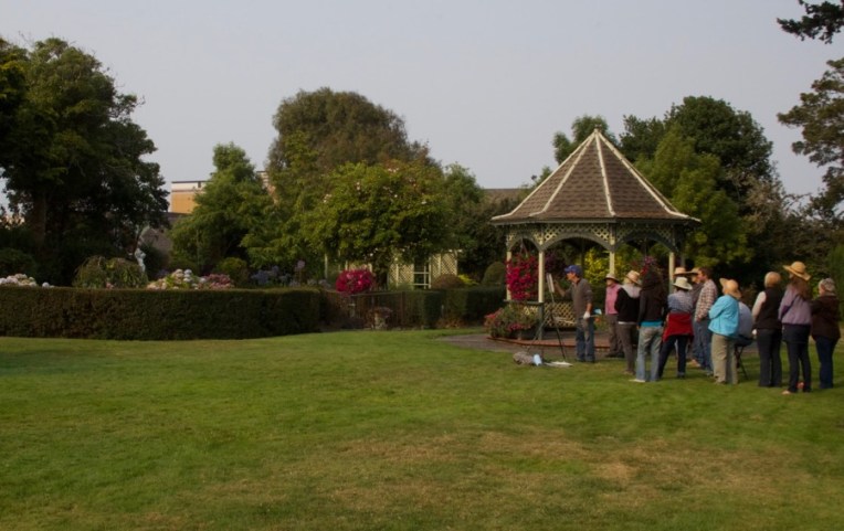
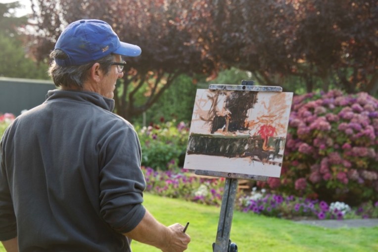
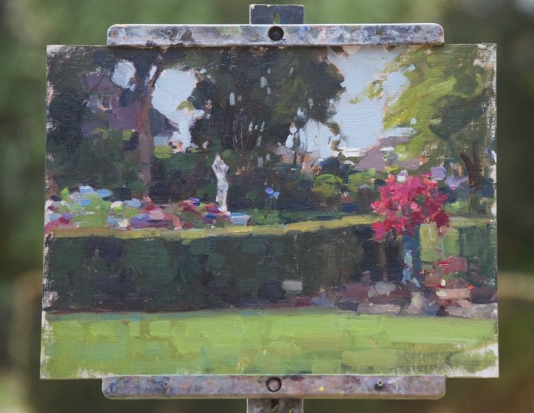
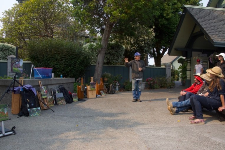
Jim McVicker doing a painting demo in the garden of the Carson Mansion, home of the Ingomar Club. He’s painting the area on the left with the hedge, a pot of petunias and a white statue.
As part of my regular routine I post to my blog on Fridays. I missed last Friday and for a very good reason….I was attending a local plein air painting workshop with nationally-known local artist Jim McVicker. I’ve known Jim for years and we own two small pieces of his work, but I’d never been able to learn from him before and this was a great chance right near home.
One thing I was very interested in was his start. He’s really a “pure” painter, having started with a brush in hand. I started out as a kid who loved to draw and didn’t take up painting in oil until 1995.
I photographed two of his demos, one from the first day at a beach that borders Trinidad Bay adjacent to the small fishing town of Trinidad, about fifteen minutes from our place, and the second in Eureka at the garden of the Ingomar Club which is located in the Carson Mansion, known as the “most photographed Victorian in the country”.
I’ll start with Trinidad. It was an overcast day, but the sun did come out in the afternoon.
Ok, so this kind of blew me away….Jim’s first marks on the canvas. And they show the difference between someone who takes a painter’s approach and someone like me who starts their indication in line to define shapes.
When he laid in that large area of dark for the base of the rock, my brain kind of freaked out…”OMG that’s SO DARK!” It was a LOT darker than the actual rock, even allowing for knowing that one brings lights in over darks as a general approach in oil painting. This is why it’s so valuable to get to see how other painters work and see.
I want to thank the gull for adding a bit of additional interest…
Jim talked about working all over the canvas, not going from object to object, an approach that I heartily agree with and practice myself.
Adding tones to the water and last color notes in various spots.
Final touches.
The finished painting of fishing boats in the harbor.
And then the sun came out, of course.
Yesterday, at the Ingomar Club in Eureka, it was overcast from the smoke of forest fires that are burning in southern Oregon, but there was still distinct light and shadow.
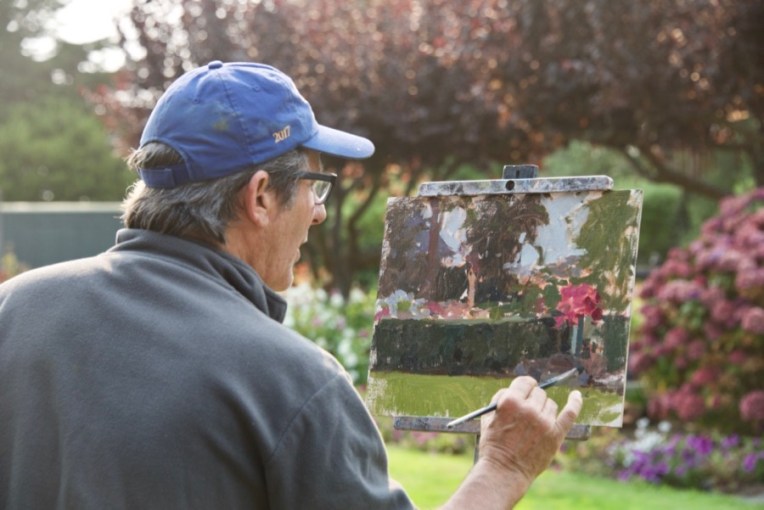
This start really shows the abstract underpinning that the painting will be built on.
Working all over the canvas.
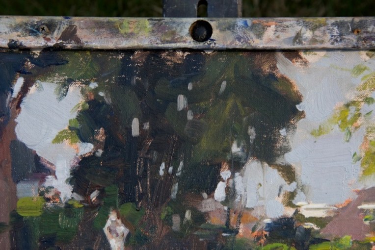
Laying in the dark of the hedge.
Adding the background trees. He actually did very little with them after this first step.
All the areas blocked in now. He can choose how far to go on any particular part or just leave it as is.
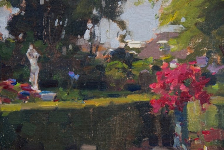
Notice that he is painting shapes, color, values and edges, not objects. There is no need to paint the individual petunia flowers in the pot on the right.
Bringing up the value of the grass, which is in sun light. It’s a warmer tone than what’s underneath, but still fairly cool. The hydrangas on the center left are pretty much as he first laid them in with the addition of some foliage around the flower shapes.
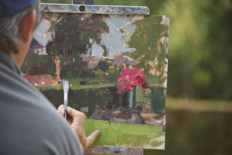
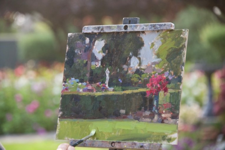
The finished painting.
Detail of the right side. I mentioned to him afterwards that I would have skipped putting in the background buildings, but that I know he also does cityscapes. I’m not personally that interested in man-made things as subjects so it was interesting for me to see his different choice.
Detail of the central tree. Oh, those “sky holes” . Necessary, but tricky to pull off. They require a solid knowledge of how tree trunks, branches and foliage are related. Random spots of sky color won’t do it. Jim also pointed out that sky holes need to be a little darker in value than the rest of the sky or they’ll stand out too much. It’s the little things…
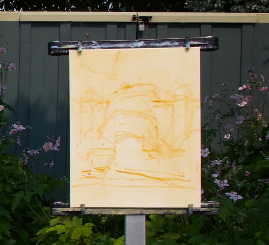
So what did I do during the workshop? Well, the Trinidad painting was a bust. I had thought the sun would come out so set it up for that, but as the time went by and that didn’t happen, I switched to adding the fog drifting past the huge rock next to the dock which was my subject (and that of many other local artists). I was also using a canvas panel that became part of the problem. Talked with Jim about it and he said that if the panel surface is wrong and is not working it becomes a real battle. That’s what happened to me and the panel won. Won’t say what the brand was because all the matters is that it didn’t work for me.
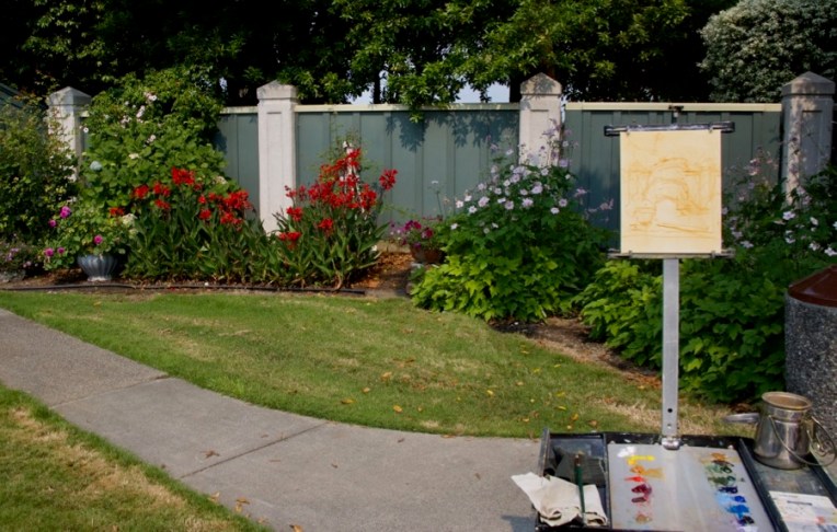
Yesterday was much better. Nice light, a panel that I knew would work and a fun subject.
There were big free-standing beds of roses and dahlias, a gazebo, the statue and other features, but my eye was caught by the intense red cana lilies next to a pot of deep cool pink dahlias and the warm foliage greens against the cool green fence.
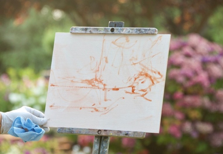
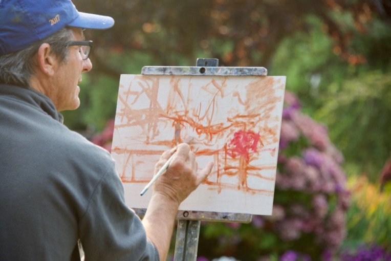
Jim likes to often use Rembrandt Transparent oxide red for a tone to knock back the white of the panel. I use it sometimes, but generally prefer Winsor-Newton raw sienna for the tone and my initial lay-in. You can see that I also do a rough lay-in with a brush.
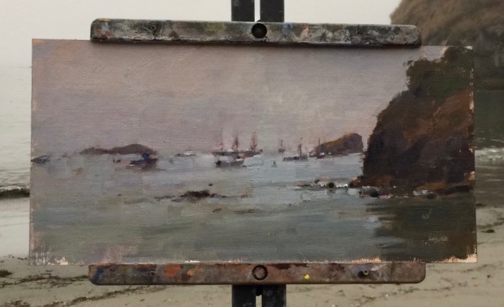
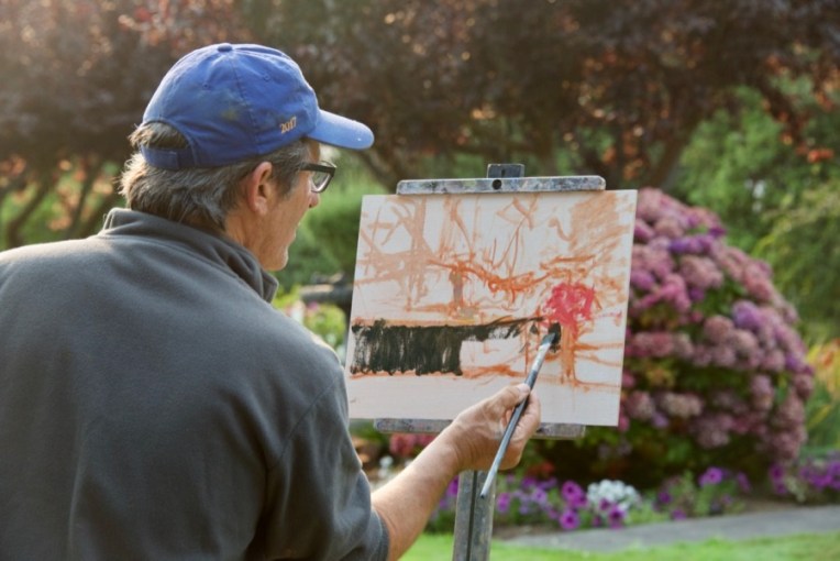
My finished first pass. I debated about when to put in the red cannas and opted to do it early on to keep the color as pure and saturated as possible and then paint the foliage around them.
The finished piece, a 10×8″.
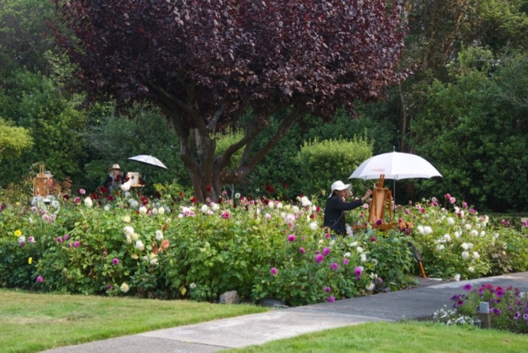
Some of the other participants in the beautiful garden.
Finally our painting time was over and we had a critique session. The man from the club was kind enough to offer beer and wine to any who were interested. Also, you can see from the warm light on the pavement the effect of the smoke from the Oregon wildfires.
Jim was very positive about my painting, which I greatly appreciated. He pointed out two things that were spot on. One was that I’d added a lot of white to the earth tone I used for the dirt and that had given it a chalky look. Also that the grass was too dark in value for the light and sun that were on it, also quite correct.
So this morning I put the painting back on the easel in my studio and made those corrections, plus a few other little things that bugged me.
Now the ground is in tune with the rest of the piece.
I want to thank Claudia Lima, who put together the workshop and did a great job! And, of course, Jim McVicker. Thanks, Jim!
I’ve had a number of new paintings in progress for quite awhile now. Last week I finally, really got back to the easel and finished up what amounts to a new body of work. They are all part of an idea that I have been thinking about for the past few years and what I’ve been calling to myself my “New Direction” in which I focus on the animals as design elements, adding historic decorative symbols, motifs and patterns that are used in Mongolia. The very special element is “bichig”, the Mongolian vertical script that Chinggis Khan adapted from the alphabet of the Uighur people who allied with the Mongols rather than fighting them (which would have ended badly for them as they had seen for themselves).
I introduced my “New Direction” in a previous post in regard to doing repaints of older work, using “Friends” as an example, in which I added a border around what had been a plain background.
“Friends” oil 18×24″
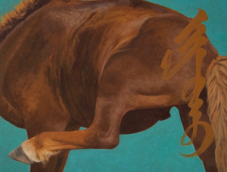
One of the ideas that has had me excited about this new work is to go through my reference and find images that, properly cropped, had a strong design. So this one of an otherwise fairly non-descript brown horse became much more interesting. And it was fun to paint!
“Scratching” oil 14×18″
For this one I used the Mongolian word for “scratching” written out in bichig as the additional design element. I didn’t want it to detract from the horse, so kept the value contrast low while using a color that was related to the color of the horse.
“Two Takhi” oil 20×10″
One of the things I wanted to get away from was putting animals in a realistic full landscape. My solution with “Two Takhi” was to use a traditional symbolic cloud motif for the sky and a simple color field of overlapping marks of warm and cool greens for “the ground”. I kept the value contrast fairly low except for the horse’s heads. The vertical format let me focus on what was interesting in the reference…the shapes of the overlapping heads and forequarters of the two horses, takhi/Przwalski’s horses that I saw at Hustai National Park.
“Watching You” oil 12×24″
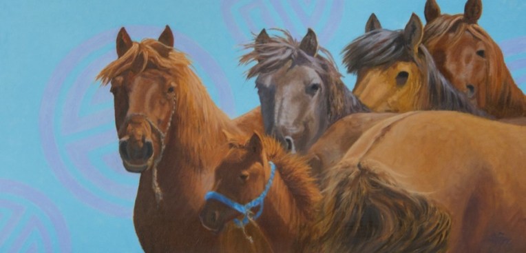
This one was another that never quite made it after I originally “finished” it in 2012 and then set it aside . I added the longevity symbols to the plain background and now it works. I did a pretty thorough repaint on the horses, too. One of the things l love about working in oil is the ability to pull out an older piece, look at it, say “hey, I know how to fix that” and then do it. These horses were part of a good-sized herd I saw as we headed south towards the Gobi from Hustai in 2010. The flies were pretty bad so they kept moving around as one after another tried to get its head and body into the middle of the group. The painting above, “Friends”, came out of that same encounter and there will be more to come. The morning light was wonderful.
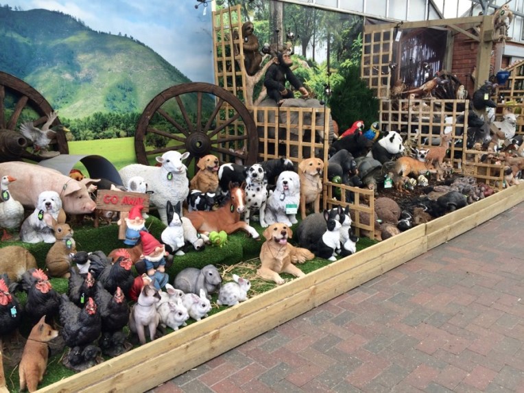
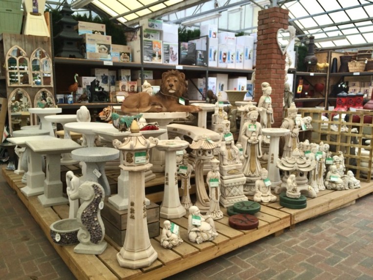
Two years ago, in 2015, we spent a some time in England before going on to a business meeting my husband had in Bucharest, Romania ( you can read about my adventure there here). My main hobby is gardening. In England it’s a passion, to put it mildly. And one of the things I learned on our first trips there in the 1990s was about the GARDEN SHOPS. Oh my. We may have big garden centers in the US, but I’m pretty sure there are few, if any, that are anything like this typical one, Stewart’s Garden Centre, just outside of Christchurch.
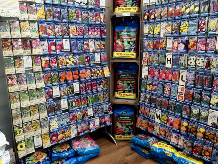
I had a list of seeds I was looking for…
This was one of about eight display racks from various companies. I managed to not limit out the credit card. I love the quintessential English wallflower. In the tiniest pocket garden in the front of an attached house, if there’s anything planted there it will probably be a wallflower. So I made it easy for myself and got a packet each of every color I could find. The English also love, love, love their peas, so this was the place to pick up some. It was late in the season and there weren’t a lot to choose from, so I got three and hit the jackpot with Hurst Green Shaft. The best pea we’ve ever eaten. Had plenty of seed left from last year so growing a bunch of it this year.
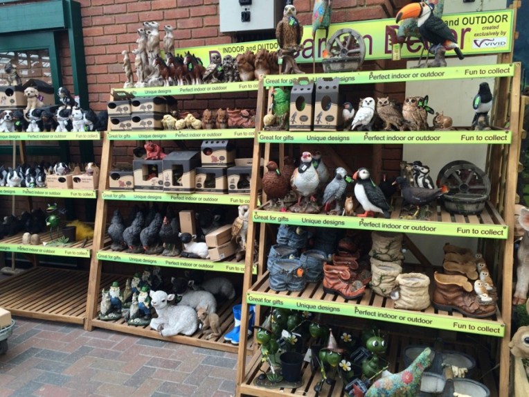
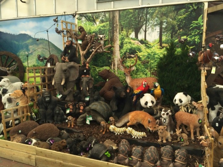
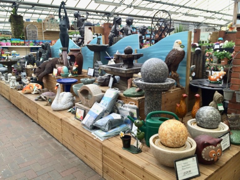
But what really grabbed me, starting with the display of everything barnyard at the top, plus gnomes, was the vast number of animal species available, many quite exotic. Really, have YOU ever seen garden statues of meerkats in four sizes available at Home Depot? Didn’t think so.
Seriously, how cool is this?
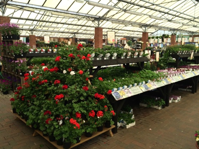
And of course there are plants. Lots of plants. Hibiscus. So very English.
MUST have red geraniums, of course.
Bedding plants. Petunias front and center.
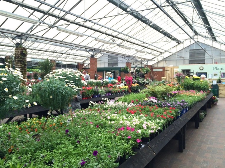
Part of one aisle, about halfway down. I think there were at least four, plus various side areas. And of course a place to get a cup of tea.
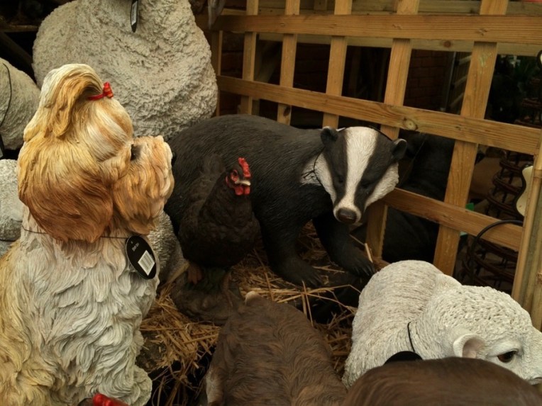
But back to the animals. This juxtaposition of species stopped me in my tracks.
It was a little overwhelming. Oh, look! a lion on plant pedestal. I think staff is having too much fun.
This display is what the fine old English word “gallimauphry” was invented for. A nude, an eagle and a modern sculpture fountain thingie.
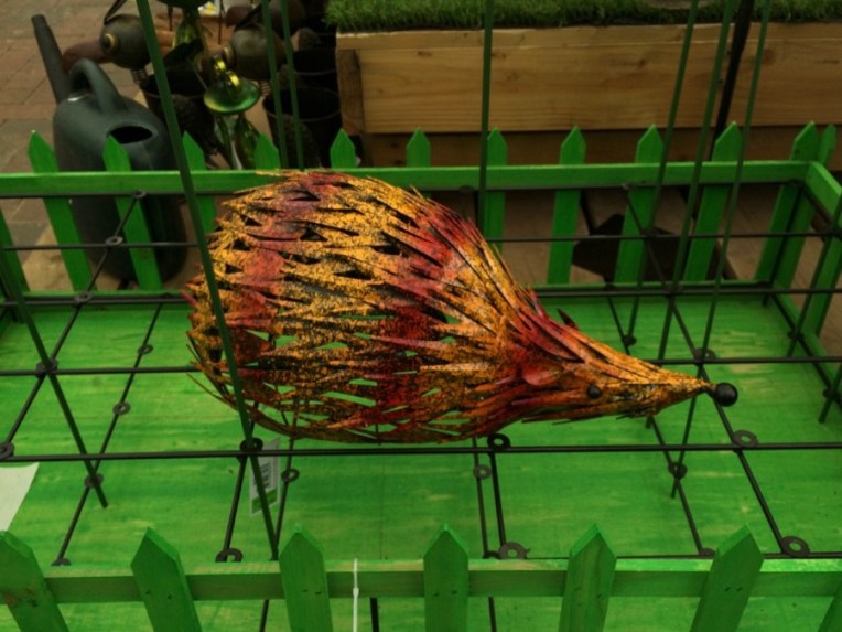
The English do love their hedgehogs. And I know you want a closer look at this one.
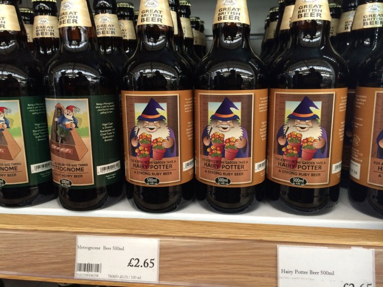
Finally, after all that one needed a good tipple. And it just so happened they had “Hairy Potter Beer”.
“Well-seeded” we were finally done and ready to head north to Stonehenge. You can see more photos from the trip here.
I have a cat (one of three we share our home with). Her name is Eowyn and she’s fourteen years old, thin but in good health. In her day I do believe that she could have slain a Nazgul. One of her nicknames is “My Mean Widdle Cat”. She likes to sit on a side table in the kitchen and occasionally snag my husband with one claw if he walks by too close to her. I have to remember to look before sitting in my studio chair sometimes lest she has occupied it while I’ve gone into the house for something. There have been close calls. I really don’t want Pancake Cat.
She usually comes into the studio each working day to hang out, interrupt me and catch some zzzzs. I’ve set up a spot for her on my desk and sometimes she even deigns to use it. Having her on my lap while I paint is…interesting, but I’ve managed.
She has a newish thing that she likes to do which is to jump the 3 feet (I just measured it) from a small rolling file drawer next to my drawing table (behind my easel in the photo at the top) to the middle of a row of three-drawer vertical file cabinets stacked with loose stuff to be filed. From there she will try to winkle her way onto the shelf that has my amplifier on it. This does not work. So then she’ll do a tour of the next shelf up.
Or she’ll cut to the chase and jump up onto the top shelf and look around.
I don’t even hold my breath anymore. Somehow she manages not to disturb any of the tchotchkes on it.
Until she’s ready to get down. Then she neatly knocks the stuffed owl off the shelf and jumps back onto the tall filing cabinets, then onto the shorter ones and finally to my desk or the floor.
Amazingly, I manage to catch her in mid-jump a couple of weeks ago.
When I was working towards a degree in illustration at what was then the Academy of Art Collegs in the late 1980s, the question came up in one class about how far to go trying to make a piece work and, if it’s not, should one start over. The advice the teacher gave us and that I have followed until last year was that past a certain point, well, there was no point. Time to move on to the next piece and not repeat oneself. Made sense to me. Don’t beat the proverbial dead horse.
Fast forward to March of 2016 when I spent two wonderful days visiting and painting with superb landscape painter and friend James Coe at his home near the Hudson River Valley south of Albany, New York. We spent a few hours in his studio talking shop. He pulled out one piece after another, both plein air and studio paintings. And started to talk about how this one or that one had sat for months or years until he figured out what was needed and fixed it. Or how he’d done a small piece of a scene and was planning on doing it again larger. Some he’d painted four or five times from his plein air study. I’d never heard of such a thing! Gobsmacked I was.
Like anyone who has been at the painting game for awhile I have a lot of paintings that I either got stuck on and never finished or didn’t feel were good enough to show anyone except the cat. But now….now! Somehow Jim had given me “permission” to go back to those old pieces and see what I could do with them and it would not be wasting my time or mistreating the horse, which was now alive and well.
So there’s that. The other thing that has happened is that after toying with the idea for close to three years now, I decided to see how I could integrate my love of pure design, lettering and historic decoration back into my work with my Mongolia subjects. After painting a dozen new pieces for “Wildlife Art: Field to Studio” last year I felt that for the time being I’d had said all I had to say about depicting an animal or animals in a traditionally realistic landscape and it was time to move in what I call to myself my “new direction”. I did a couple of small pieces last fall as tryouts and have a number of larger ones under way, all new. But I’ve also gone back to paintings that just never seemed to work for one reason or another and gave them another look.
I’d also created albums in Photos for images I’ve shot that suggest possibilities for interesting designs and also some for a variety of elements, both natural ones like landscapes with warm, cool or warm and cool colors and human-made like ger or monastery decorative painting. And I found a Mongolian calligrapher who was willing to write words for me and email them as large jpgs, so I can integrate the vertical script, bichig, into my work.
What I’m finding is that adding the decorative elements is not just fun, but makes these old ones visually more interesting so they now work. I’ll be showing more of my “salvage” efforts in the future. In the meantime here’s the painting above as I originally did it in 2012, without the decorative border. I also repainted the horses, tweaking the drawing of them, and generally punching up the color.
I’m sure there are artists out there who can happily grab whatever paper and drawing media they have at hand and get to it. I’m not one of them, at least not for my finished drawings that I will sell. And I’ve gotten pickier over the years. Every combination of paper and drawing media is different in feel, performance and result. Hence the comparison to Goldilocks. After a fairly major break for a variety of reasons, I’ve spent the last week or so getting back in the studio groove by revisiting a variety of combinations to see what is now “just right”.
I’m also planning to add human subjects back into to my oeuvre. It’s been awhile, so I collected a whole bunch of head shot photos from Google, many of movie stars because the lighting tends to be very good for revealing structure, dumped them into an Evernote and have started working from them, one feature at a time, starting with noses.
Facial features: Derwent Drawing Pencil Venetian Red, Wolff’s Carbon Pencil 6B, Cretacolor Monolith Pencil 6B and Cretacolor Monolith Pencil, 4B on Canson Mi-Tientes drawing paper, smooth side. One thing I like about the darker toned papers in that you can come in with the lightest lights using a Prismacolor white pencil, as I did with the noses and the eye. This is a pretty typical work sheet for me. Nothing fancy, nothing at stake, just focusing on how the media feels on the paper, but also working to get the anatomy correct
I also worked on bits of other toned paper, but didn’t like what I ended up with. I do like the brown-tone though. I moved on to either white or off-white papers, mostly the two mentioned below.
A famous nose- Cretacolor Monolith pencil on Strathmore 400 cold press bristolTwo famous noses- Derwent Graphic pencils on Strathmore 400 cold press bristol
Both media worked well on the Strathmore, which has a fairly hard finish, but stiil with a bit of tooth. Back to animals….
Baboon- Cretacolor Monolith pencil on Rives BFK paper (which has been a favorite for awhile)Bat-eared fox, Derwent Venetian Red Drawing Pencil and baby impala, Cretacolor Monolith pencil on cream-colored Rives BFK paper
The Rives BFK is quite soft in comparison with the Strathmore. One nice thing about it is that one can erase it. A lot. Without a trace.
I wanted to explore getting a very crisp line and also laying down a tone on the Rives BFK. As I expected, it passed wtih flying colors. I used the same pencils as mentioned above: Wolff’s Carbon Pencil for the hawk’s head and bird leg, Cretacolor Monolith for the murre, Derwent Drawing Pencil in Venetian Red for the yellowthroat and A Derwent Graphic pencil for the quick sketch of a pine siskin
The last one I did before writing this post is the drawing of the vulture at the top. It is available for purchase. Message me on my contact page for price.
I went on my first trip to Kenya in January of 1999 to participate in an Earthwatch Institute-sponsored project studying lake ecology at Lake Naivasha. But first I arranged to spend five days in the Masai Mara at what was then called Camp Kicheche. I arrived incredibly jet-lagged from the long flights from California but was also equally excited to finally see African wildlife in their native habitats.
The photo at the top is my first sighting of wild African elephants. a family group moving into the bush. My driver, Daniel, stopped the car and turned off the engine. I had the car to myself. He had the hatch was open and the windows rolled down so I could get good photos. At this point I was using a Nikon N2000 SLR with a built-in motor drive (first time I’d had one with that), a Tamron 28-300mm lens and 2x doubler. and had brought 78 rolls of Kodak 200 and 400 ASA print film. Not a “pro” set up but pretty good for what we could afford.
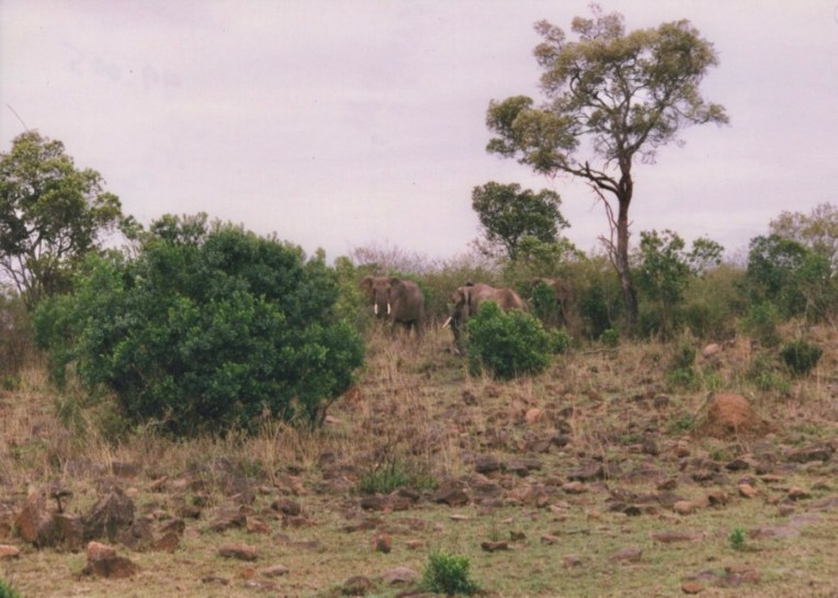
The rest of the family group appeared, saw us, turned and headed away out of sight. And I thought that was it for my first elephant experience. Closer would have been great, but at least I’d seen some, and early in my first game drive on my first day, so no complaints.
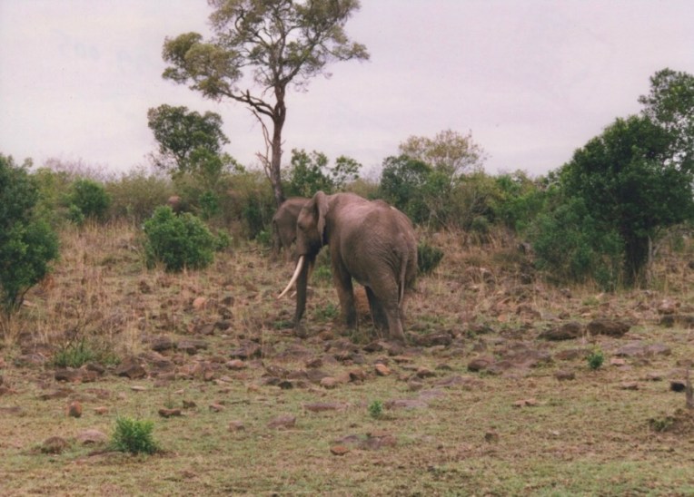
But, no, two reappeared with one looking straight at us.
Then they started down the slope towards us….
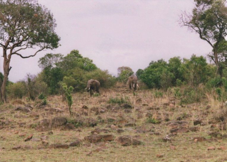
The smaller of the two turned and walked away into the bush.
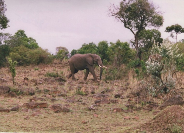
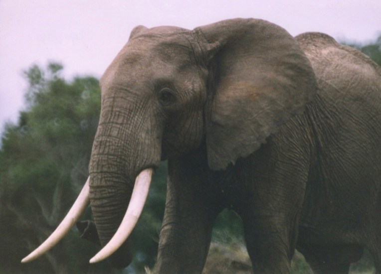
The big one came on down the hill towards the car, which as you will recall, was sitting with the hatch and windows open. I kept taking photos as he got closer and closer.
Full zoom-in on this wonderful creature. At this point, Daniel said in a low tone of voice “It would be good to be quiet now”. Oh, right. The motor drive. So I set the camera in my lap as the elephant came closer and closer, straight towards the car. I realized that he was so tall that he could have rested his chin on the roof of the Land Cruiser. Or reached in and plucked me right out of my seat through the hatch. At that moment I became a fatalist. Whatever was going to happen would happen and there wasn’t a thing to be done about it. At about six feet from the front of the car, he turned and crossed in front of us on a diagonal. Daniel and I just quietly sat and watched him.
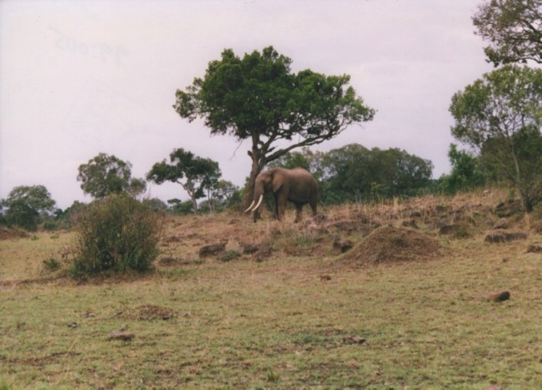
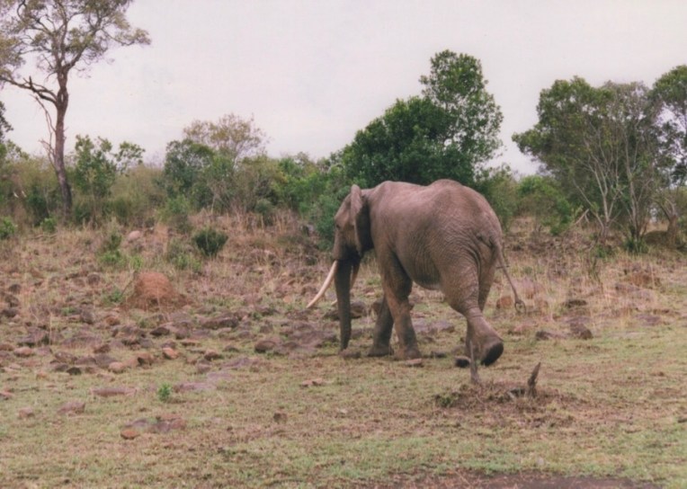
Once past the car he turned and went back up the slope to rejoin the group, stopping just for this instant to give us one last look.
Business attended to and, point made, he walked off into the bush.