There was a full page ad in a recent Southwest Art for a retrospective show at the Telluride Gallery of the art of legendary illustrator/artist Bernie Fuchs. At one time, he was one of the most imitated illustrators in the country due to the popularity of his “lost and found” style. There was a color catalog available and it arrived a few days ago. I was transported back to my time as an illustration student at art school, remembering how blown away I was by his work- the draftsmanship, the design and how he said so much with such simple shapes.
As I poked around my files and illustration books in my library, I was reminded of how many illustrators have made the move to “fine art” over the years, quite a few into wildlife and western art. My sister-in-law, an illustrator, and I used to play a game when we’d visit a gallery with representational work, which we thought of as “Who has illustration training?” We could generally nail it with no difficulty. Why? Impeccable draftsmanship, excellent design and a sense that the piece was done with utter confidence. Think of Bob Kuhn, Guy Coholeach, Richard Sloan, John Schoenherr, John Clymer, Howard Rogers, Kenneth Riley and Howard Terpening, to name a few who come to mind. They all had successful careers as illustrators, which meant they made a LOT of pictures, often on very tight deadlines, so they became extremely efficient; no wasted motion. And then they brought all that experience to “easel painting”, creating work that really stands out from the crowd.
I thought I’d occasionally share some of the things I learned back when I was an illustrator which have influenced and inspired me as a painter.
“Lost and found” describes a way of seeing shapes and then only adding detail where you need and want it. You “lose” and “find” edges. It’s a way to think about making a picture that can free you from painting every leaf, every hair, every blade of grass. But it takes practice and training, maybe re-training, your eye. It’s worth it because it opens up a whole new range of options for expressing yourself. Here are some examples I found, starting with Mr. Fuchs:
 Notice that he hasn’t rendered a single individual leaf. But you know by the shape that it’s a tree. He’s “lost” all the leaf edges, but has “found” the backlighting. This design has only three major shapes: the tree, the background and the ground at the bottom. When you can simplify this way and see the big shapes, you gain so much control instead of letting detail control you.
 Ludwig Hohlwein was a master of shape design. Too bad he was happy to do work for the Nazis. In any case, here is a camel, done in two values and mostly in shadow. Add the rider and you have three values total. Nothing more is needed. As my Illustration 2 teacher said, “The simpler statement is the stronger statement”.
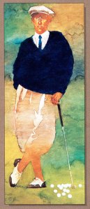
 Bart Forbes was working at the same time as Fuchs. He had his own take on “lost and found” and this is one of his best known images. Once again, very limited values. No excruciating rendering of the folds in the pants, but you still know exactly what they are, what color they are and that the light is coming from the left. The figure is fully defined and separated from the background by the shapes.
 David Grove came along and pushed things a little farther. Now most of the edges of the figure are lost. Or you could say that the light side of the figure is found and pulled from the background. Either way, you won’t miss that plaid shirt.
 Then Robert Heindel took lost and found to a whole new level with his paintings of dancers. (He also did the posters for Cats.). You have no trouble seeing what is going on. Her head is down and one leg is bent, with the edges appearing and disappearing seemingly at random, but of course it’s all carefully planned and the result of years of experience.

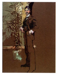
Most of us baby boomers have seen Bob Peak’s posters for movies like Camelot, Apocalypse Now, Rollerball, Funny Girl and Missouri Breaks. Here’s a drawing that Peak did of Robert Henri. Notice how he lets the color of the background also form the color of the suit and then only adds the shadow shapes. The fern in the back mostly has the grey tone cut in around it and is really a silhouette. The only area of color is where he wants your eye to go, Henri’s face.
 Finally, sometimes you encounter an image that causes a permanent perceptual shift. This is one that did it for me, by one of my all-time favorite painters, Frank Frazetta. A lot of people never got past the subject matter, but this is someone who knew the craft of painting inside out and backwards and could draw rings around most people. He was one of the masters of lost and found. This tasty piece is painted on bare masonite! Heaven knows how archival it will be, but jeez. The warm shadow in the torso of the middle figure is the masonite showing through. I was totally blown away when I realized what he had done. Now this was before I was able to go to any major art museums and once I did, I saw that letting the ground show through is a classical approach that has been around for a long time. Another reason why it’s so important to see originals. Fragonard did a famous painting of a girl in a yellow dress, reading. The warm shadow on her back is the ground showing, same as in the Frazetta, except it was a paint layer, not the support itself. Maybe that’s where Frazetta got the idea. He just did it with Neanderthals instead of a pretty girl.
What a wonderful art lesson! Now I am going to apply it to my photography.
LikeLike