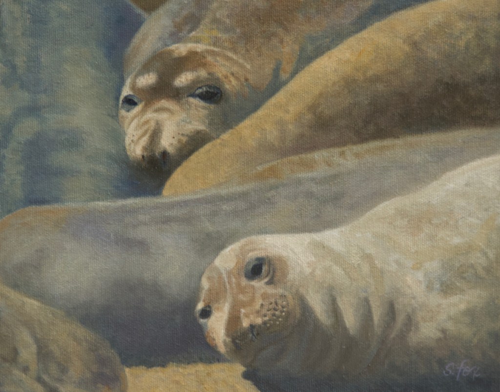
“Elephant Seals, Piedras Blancas” is currently in “Magnificent Migrations: A Journey Through Central California” a joint exhibition of the California Art Club and the Pacific Grove Museum of Natural History.
I haven’t shared a step-by-step for awhile, so I documented the stages of this one more than I usually do. Below is the scene…hundreds of elephant seals hauled out on the beach, some just conked out in the warm sun, others getting into tiffs of one kind or another. We saw them on a trip back from Southern California in May, 2007. Piedras Blancas is located just north of San Simeon, home of Hearst Castle.
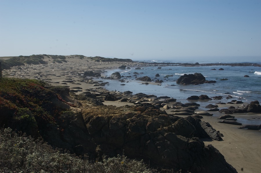
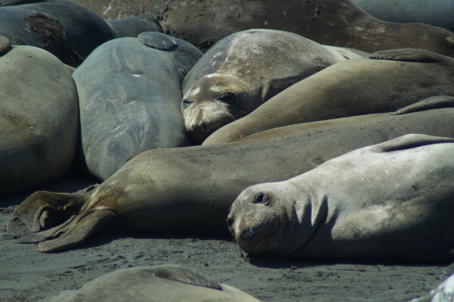
When I started looking through my reference I wanted strong shapes that would lend themselves to an abstract design, interesting heads and expressions and color variety. I finally settled on this one:
The next step was to do a drawing to set the composition and value pattern.

I scanned the drawing and then projected it onto a 8×10″ RayMar canvasboard panel which I’d precoated with a raw sienna tone. It doesn’t show up in the photo because the drawing was on white paper.
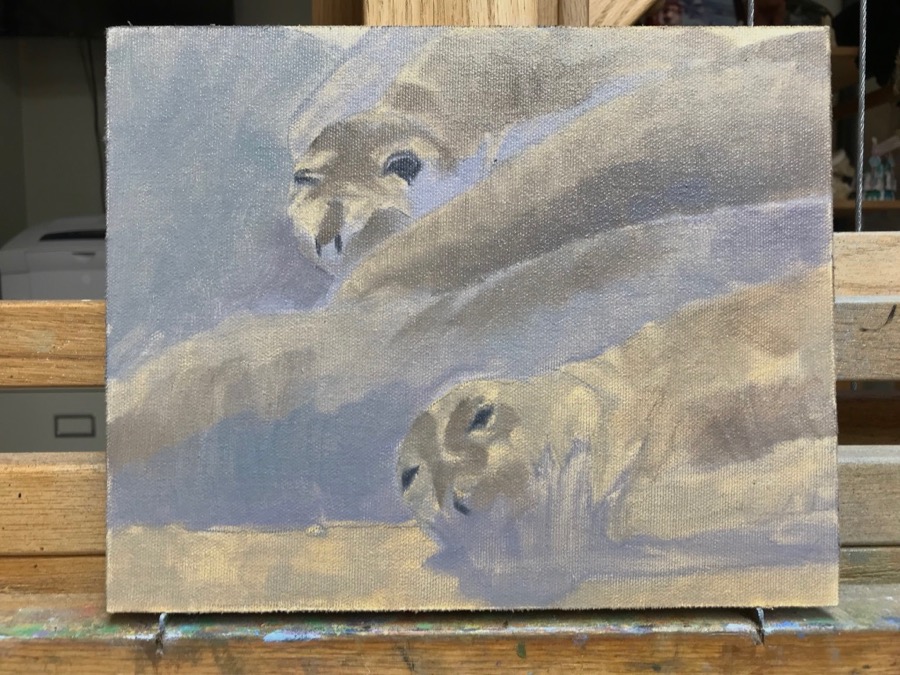
I restated the drawing with a round brush, paying particular attention to the features.

I used a “dirty” purple tone to lay in the shadow shapes that would be a relative warm that the cooler shadow color would go over.

Here’s the palette I used for the painting, a very limited one, but it worked well. There’s titanium white, ultramarine blue, raw sienna, Payne’s gray, …., raw umber, all Winsor Newton and Rembrandt Cold Gray and Transparent Oxide Red. So I have my warm and cool colors and primaries (the blue, raw sienna and oxide red), just going more toward earth tones than crayon colors.

The second pass covers the entire canvas. Loose and ugly at this stage. It is not at all unusual for a painting to seemingly fall apart and look really bad, but experience teaches one that if the artist has a clear vision of where they want to end up, then the painting will come out the other side just fine.
Then it’s a matter of refining the shapes, their colors and getting the value relationships right. One change I made between the one above and the one below was to add the tail flippers from a seal in another location to the lower left corner. It felt like something was missing and that the viewer’s eye might easily exit the painting there. And it added a third (uneven number) point of interest besides the heads.

All the cool tones are in and the darkest dark areas mostly established. And, once again, below is the finished painting, warmer than the reference photo with the emphasis where I wanted it, on those two faces with the interesting markings. I also liked the grey and greenish tones of the seal body on the far left. Notice also that between the step above and the finished piece below I removed the two front flippers at the top. Not interesting and visually distracting.

“Elephant Seals, Piedras Blancas” is available for purchase. Price on request. Please message me and I’ll put you in touch with the museum.


 Here’s the reference image that I started with. It was taken in September 2008 at Ikh Nartiin Chuluu Nature Reserve. This group of horses wandered right past the ger camp one evening. I got lots of great pictures. Looking at them when I got home, I was struck by the stallion’s pose as he showed off around the mares. I haven’t done too many domestic horse paintings and I wanted to really focus in on understanding their structure and capturing the sheen of the coat, so I decided to use a fairly large canvas and only paint the horse.
 Here’s how I started. The support is gessoed canvas on hardboard and measures 24″x36″. I did an initial lay-in with a brush. All I cared about at this point was getting the horse where I wanted him on the canvas and indicating the proportions correctly. You can see on the front leg that is lifted where I have started to do the actual drawing.
 This step shows the finished drawing for the head, shoulder and front legs. At this point, I had dragged out all my books on horse anatomy to double check the structure and confirm that I had understood it correctly. Changes are easy to make at the drawing stage, but I’ll wipe out and re-do at any point if I see something that’s wrong. That’s just the way it goes sometimes and I don’t fight it or make excuses to myself anymore. I also have a full-length mirror behind me and I use it constantly to check the drawing for accuracy. I’ve designed the mane and the tail shapes, some of which are planned to go off the edge of the canvas so the horse isn’t floating and looks more like he just happened to be walking through the frame.
 I’ve finished the initial color layers and am starting to paint with the knowledge that the strokes I make now will quite possibly be visible in the finished painting. I’m always refining the drawing as I go. One of the things that interested me about doing this particular piece is that you can’t see his eyes at all, so I wanted to capture his attitude and character from his body language and by painting him big on the canvas. I was also thinking of the design of the positive space -the horse- and the negative space -the background.
 Most of the basic lay in is done. All my darkest darks and medium tones are in, except for those patchy looking bits that I haven’t gotten to yet. Now the fun starts….all the juicy highlights, modeling and finishing touches that are a reward for the prep work leading up to it.
