Spent a good chunk of Friday finally coming to grips with The Journal. I need a title page and a page with a map of Mongolia on it. The backstory on all this is that from 1976, when I was mumblety years old, until 1988, I was a freelance sign painter, graphic designer, calligrapher and generally a lettering and type nut. All that was peeled away as I decided to concentrate on illustration and then easel painting. But I have always kept my lettering and type books and also the late 19th-early 20th century illustrated storybooks and historic decoration books that I had accumulated way back then, always kind of thinking and hoping that maybe some day….
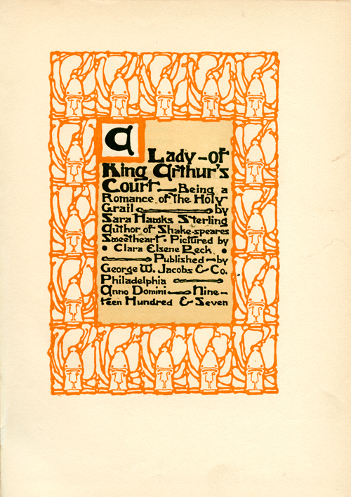
Well, some day is here. I was blanking out on how to approach the journal when I realized that it was time to do what I know- the lettering and stylistic approach of the Art Nouveau and Edwardian eras. I got out a stack of books for inspiration and to jog my memory. Here’s motifs from a couple of them, which helped get the juices going:


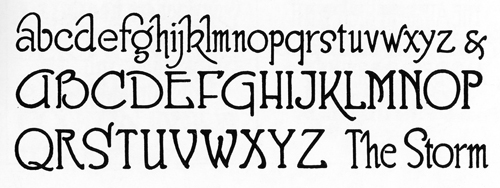
Then I needed to look at some lettering samples, once again to jog my memory. I have a number of old commercial handlettering handbooks. The sign painter I worked for and who taught me brush lettering used the same kind of letterforms for the basis of his sign designs:
 The name of my Flag Expedition is rather long and when I came upon these pages, I realized that I could use that to my advantage:

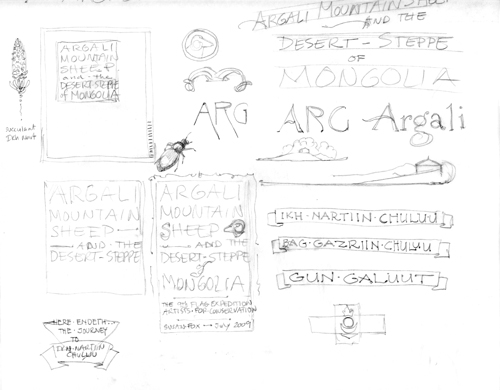
I got out the tracing paper and started to scribble any ideas that occurred to me- thinking with a pencil. I liked the block in the lower middle of the page with the sheep’s head and decided to develop that further to see how it worked. This is half the sheet:

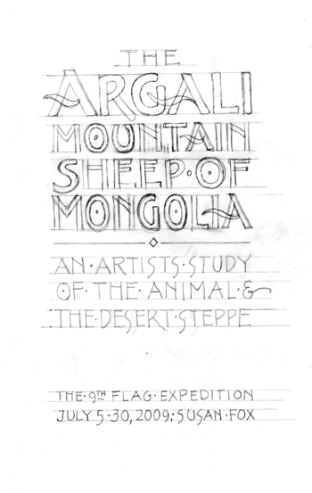
I did a rough layout next:

I needed to leave a space for the sheep’s head and also started to refine and design the lettering.

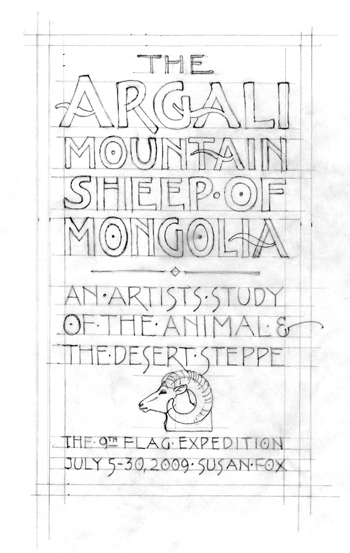
This is the final layout from which I’ll do a graphite transfer onto the Journal page.

I based the letters on the kind of thing I always liked and have done a lot of. I let the forms vary without worrying about consistency. I don’t want to and don’t have time to agonize over this for weeks, so decided to take it to the next step and refine the letterforms.
I settled on a more rounded small serif, used the curved cross stroke for the “A” and added the little dots in the centers of the “o”s, kind of a tribute to my old sign painter boss, since it was one of the things that made his signs instantly recognizable as being done in his shop. I’ll post the finished page as soon as it is done.
Visit the AFC site here

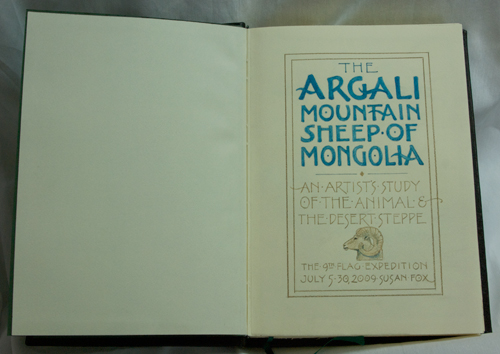


 The name of my Flag Expedition is rather long and when I came upon these pages, I realized that I could use that to my advantage:
