In The Studio: Why Is An Animal Artist Doing Drapery Studies?

Michaelangelo
Study from Michaelangelo’s Sistine Chapel figure of the prophet Isaiah

And the answer is: I’ve started a new painting which is part of a new direction I’m experimenting with, which is all I’ll say for now. One of them involves using a khadag, the traditional Mongolian offering scarf, as a design element. I haven’t done drapery since art school. I set up a khadag that I brought back and did some drawings from it, but could tell that I really didn’t understand what I was looking at or how to get where I wanted to go. Drapery has a structure and pattern and I just wasn’t seeing it with any confidence. Time to get out the art books and do some copywork from the masters. Who better to learn from? And I’ll do as many as it takes to get it. I was also able to go to the Metropolitan Museum of Art last month when I was in New York for the Explorers Club Annual Dinner. I focused on getting photos (with my iPhone 5S) of drapery details and I’ll be drawing from those next. But today I want to share what I was able to do working an “old-fashioned” way…from books.

Besides my immediate goal of learning to draw drapery again myself it was fascinating, through the copywork, to see how these artists solved the problems, some very naturalistically and some by simplifying with more stylistic handling.

The Michaelangelo copy above was the last one I did and took the better part of a day. It’s about 8×10″. I was working on technique along with creating the actual drawing.

All are done with Cretacolor Monolith pencils on either Canson drawing paper or Strathmore 400 with added help from a kneaded eraser that definitely got a work out.

Isiah
Fresco painting detail by Michaelangelo, Sistine Chapel

Below is the first one I tried. Notice that there are basically three values and some color temperature shifts. Get those relationships correct and you have…satin!

David
Sleeve detail by Jacques-Louis David

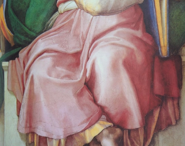
I wanted to start with a simple shape that had well-defined folds. And I was very curious to see a little of how David saw, given his great academic training and skill. I have some good details from one of his paintings at the Met that I’m looking forward to drawing.

David Horus (1)
Neckline fold detail from “The Oath of the Horatii” by Jacques-Louis David

I specifically wanted to draw that neckline fold and the overlapping folds coming over the shoulder because they relate to the design I have for the khadag.

Cornwell D
Garment details by Jacques-Louis David (left) and Dean Cornwell (right and middle)
Cornwell sash
Sash detail by Dean Cornwell

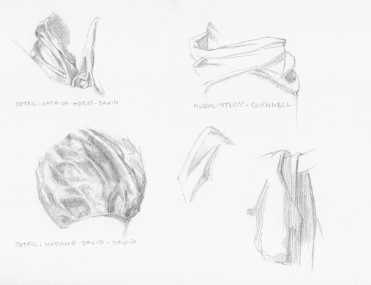
My study is above right. I wanted to understand how the sash drapped around the form.

Cornwell sleeve
Sleeve detail by Dean Cornwell

My study is lower left above. I wanted to get that feeling of the thickness of the fabric coming over the arm.

Cornwell fold
Coat detail by Dean Cornwell

Small drawing in the middle of the page above.

Cornwell had an interesting way of simplifying drapery and it’s a characteristic of his style. I remember one of my drawing teachers in art school doing a slide show of master drawings. When she got to the Cornwell, she matter-of-factly told us that if we could do a drawing like that we would get an “A”. We just kind of looked at each and thought “Yeah, well, in our dreams”. Ultimately, I realized that his approach, at least at this point, wasn’t going to be useful to me for what I want to do.

Leyendecker
Gown and sleeve details
Leyebdecker
Gown detail by J.C. Leyendecker
Leyendecker sleeve
Sleeve detail by J. C. Leyendecker

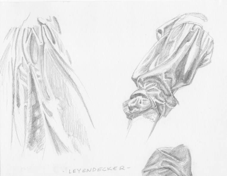
J.C. Leyendecker was another master stylist, instantly recognizable. Notice that I’m showing the work of two illustrators, along with traditional fine artists. That’s because the great illustrators were simply great artists and their drafting and design skills were impeccable. Plus, that’s my background since my formal art training was in illustration so I “speak” that language.

Through copying some of his work I hoped to understand better how to simplify and understand what I had to have to say “fold” and leave out everything else. Artists like Michaelangelo, David and, as you’ll see, Velasquez had a more naturalistic approach, but still edited and made choices, each in his own way. And the sum total of those choices is one of the ways a viewer can tell one artist from another.

The gown detail was challenging because every shape and its relationship to the other shapes had to be just right in order to read as drapery. By the time I decided to tackle the sleeve I felt that I was starting to get the hang of things and also to gain a little insight into his thinking through the choices he made in a way that would not be possible by just looking at the art.

Velasquez (1)
Head drape detail
Velasquez
Head drape by Velasquez

If one wants to learn from the best then you have to take on Velasquez, one of the best ever, a painter’s painter. And that ended up being a bit of a problem. When I looked through my book of the artist’s work I didn’t really find a lot in terms of drapery that would help me with what I was trying to do. I found his shapes, when looked at individually, to be idiosycratic in a way made them very abstract. It’s a very different way of seeing than I do. But what a great thing to learn. I am in awe of him as are so many others. I plan to start doing some human subjects and when it comes to heads and hands I will be returning to him for both drawing and painting study.

So that’s what I was up to last week. This week I’m back at the easel doing some repaints on small works, both to get my groove back and to build up stock for North Coast Open Studios, which I will be doing the first two weeks in June. More on that to come!

5 Books For Animal Artists That Are Not About Animal Art, Just Great Art

To be a well-rounded artist with as much information as possible at one’s disposal, I think it’s important get outside of one’s genre and see what else is out there.

The classic piece of advice is to visit great museums and see masterpieces in the original and I agree with that.

But, seeing a great painting and understanding what one can and maybe, should, learn from it are two different things.

Today I’m going to present two works each from five great artists, none of whom are “animal artists”, although almost all of them included animals in their work at one time or another.

I’m going to offer you a thought or two about how you might explore what I believe the artist has to offer. See what you can think of that uses the ideas in these paintings, but with animal subjects.

First is Roy Anderson, one of the great living painters of Native Americans. These images are from a book “Dream Spinner, The Art of Roy Anderson”, which I found at Settlers West Gallery in Tucson this past March for, can you believe it, $10. They may still have some. I don’t know if they will mail them out, but it can’t hurt to call and ask.

At the back of the book is a whole section on how Mr. Anderson creates his paintings, worth more than twice the price of the book for the excellent advice and information he offers.

Here is a master class in color and value relationships. The painting has three “layers” from front to back. Imagine if this was a herd of wildebeest trudging through the dust of the Serengeti.

This one is similar to the first Roy Anderson painting I saw and which just blew me away. I love the strength of the backgrounds. No fear of color here! How could one vignette an animal with this as an inspiration? I must admit, though, that I’ve thought about how to present a Mongol herder in his traditional garb, using my own ideas of shapes and colors for the background.

Second is Edgar Degas, who was equally accomplished in painting, pastel and sculpture.

What inspires me personally about his work is his revolutionary compositions, in which figures and other elements are “cut-off’ by the edge of the canvas.

If you find your compositions getting a little stale or have realized that you tend to plop your subject in the middle of the canvas, looking through a book of Degas’ work will blast you loose.

Third is Richard Diebenkorn, an abstract painter who scandalized his contemporaries in the 1950s by introducing recognizable figures into his work at a time when that was considered beyond the pale.

How could this composition be adapted to an animal subject? Like Degas, Diebenkorn has used an unconventional placement of his subject, tight against the left edge and facing more or less off the canvas.

All good painting has a solid abstract structure underneath. Robert Bateman, the legendary wildlife artist, started as an abstract painter and then applied that knowledge to his animal art. Here is a Diebenkorn abstract from the 1990s that could inspire a representational composition.

Fourth is Dean Cornwell, known as the Dean of American Illustrators. He trained in mural painting with Frank Brangwyn in England and it shows in his ability to put together panoramic images with lots going on.

The inspiration in this piece is having the foreground and even the main character in shadow, contrasted with the bright, colorful background.

Cornwell’s rich, decorative approach and fantastic draftsmanship have something to offer artists in any genre.

Fifth is Joaquin Sorolla, known for his incredible ability to paint light.

It’s easy to get caught up in what is called “local color”, the inherent color of a subject. This and the next painting illustrate the truth that the color of something depends on the light (and also what the object is next to). We accept that the three ladies in the foreground are wearing white, but there is not a speck of pure white paint on any of their dresses.

How many colors can you count in this “white” dress?

The paintings:

They Sing Towards the Sun  40×72″ oil (detail)

Elk Robe Medicine  36×26″ oil

The Song of the Dog  22 5/8×17 7/8″ gouache and pastel over monotype on paper

The Green Dancer (Dancers on Stage)  26×14 1/4″ pastel and gouache on paper

Coffee 57 1/2x 52 1/4′ oil

Untitled No. 12  38×25″ crayon, graphite and acrylic on paper

Pontius Pilate’s Banquet from The Robe  23×30″ oil

“Ransom”, a Captain Blood story 26×51 1/2″ oil

Bajo el toldo (Zarauz)  39 3/8×45 1/4″  oil

Maria en la Granja  67×33 1/2″  oil