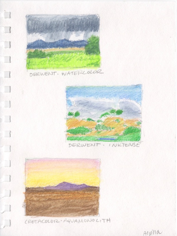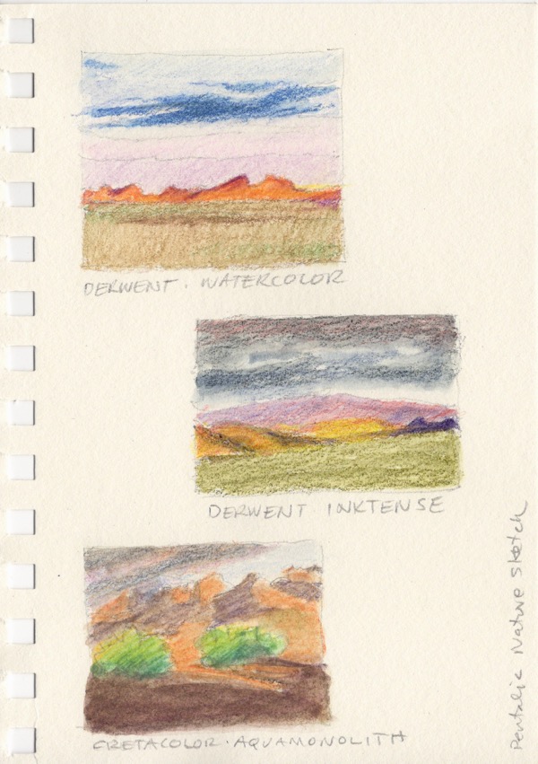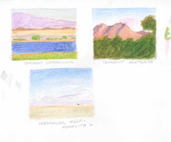
The juried show season is under way! I keep a long rectangular white board hanging on the wall next to my desk, divided into squares for each month, on which I list the shows I plan, to or am thinking about, entering. Sometimes I enter work I already have on hand and sometimes I do new work just for that exhibition. In this case, these have been submitted for the Spring Auction at the Salmagundi Club. Entry in their shows, for which all but one are members only, is free and it’s a chance to get my work seen in New York. Not easy when you live in northern California. Notification will be later this month. I’ll let you know what happens. But, in or out, I had fun doing them and will be painting more small pieces like these in the future, which I plan to list on eBay.
Except for a stint in September, I’ve gotten very little oil painting time in since May of last year. So these pieces served two goals.. One, to get back in the groove, and two, to create some small works that will be easy to ship and, with luck, attract buyers.
I chose for my subjects three east coast species of birds. Two I saw on my trip to Georgia and New York State last March and the other a few years ago when I and two artist friends went to Assateague and Chincoteague Islands on a very fun road trip.
I wanted the emphasis to be on the birds with just a suggestion of location and habitat. So simple shapes and planning positive and negative shapes. I started with graphite drawings. I don’t do a lot of birds so I needed to make sure I understood what I was seeing in my reference photos and that I had the value pattern I wanted.
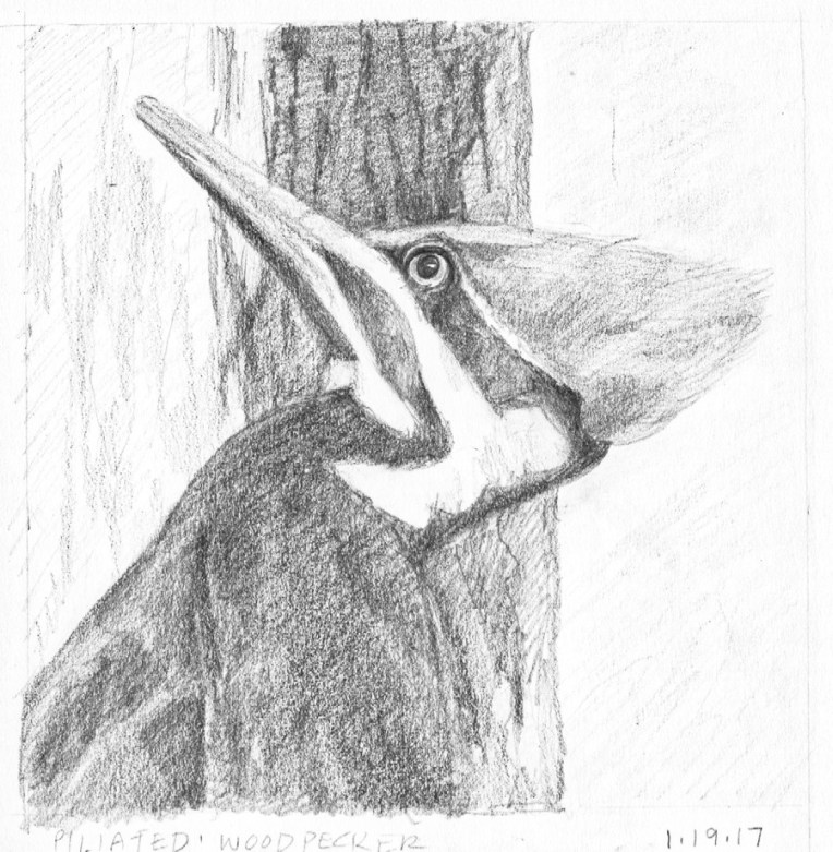
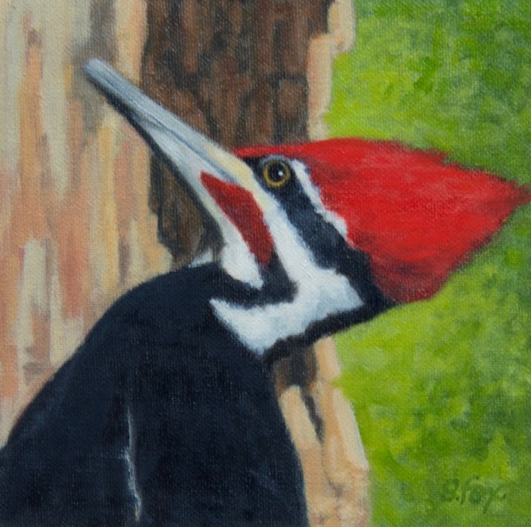
For this male piliated woodpecker I planned the composition to have the darkest dark behind the bird’s head to pop out the black and white head pattern and also the red. It’s a warmer dark than the black of the bird, so there’s also a temperature shift. There are three shapes: the bird, the tree trunk and the background. I used green because it’s the complement of red. In my reference photo, it being March, none of the trees had leaves and everything was brown. But so what? I’m the artist and can do anything I want.
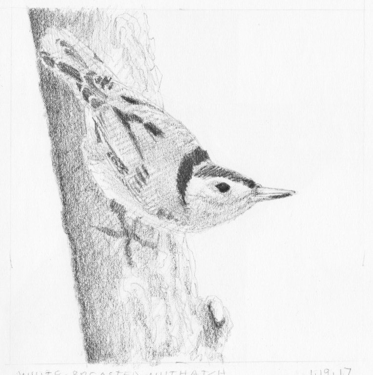
This is a white-breasted nuthatch that came to a bird feeder outside the window of an artist friend’s home I was staying at in the Hudson River Valley. I’d heard of them but had never seen one, so was happy to get some good reference. I didn’t want to include the feeder so I put the bird on a tree trunk instead, using a photo I shot of the trees that surround the home of famous Hudson Valley artist Thomas Cole, not far from my friend’s home, so I knew it would be correct.
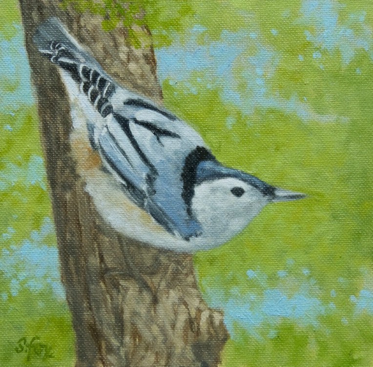
For the background I wanted the suggestion of foliage with some sky showing through, which are called “sky holes”. I did the them quickly over the green. And pulled a little of the latter over the tree trunk to connect the foreground and background. Once again, three elements…the bird, tree trunk and background. No fussing.
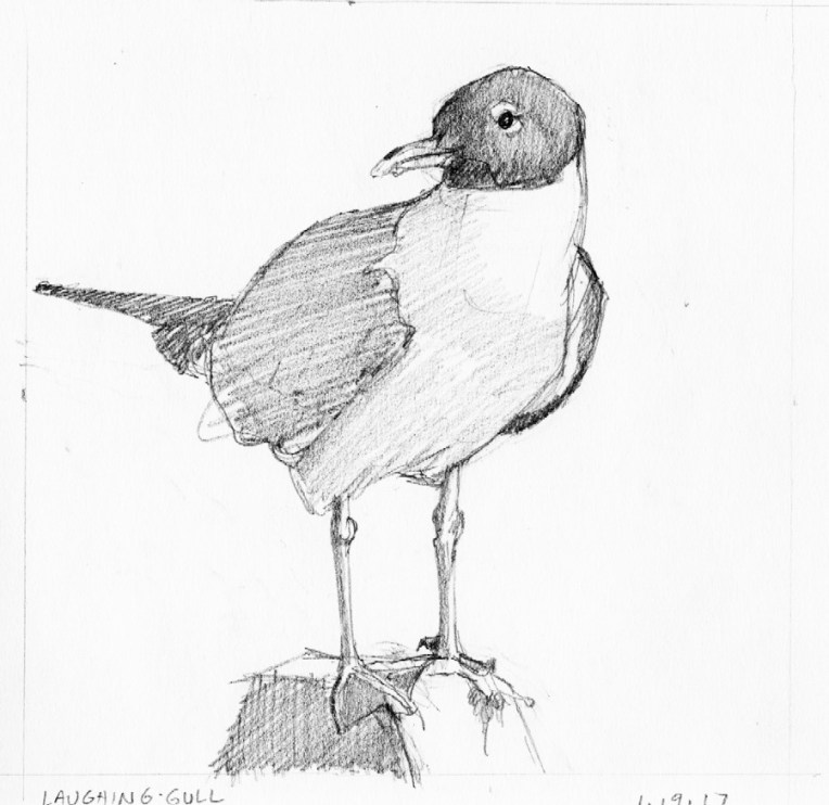
This laughing gull was perched on a post between a parking lot and the beach on Chincoteague Island. He was quite a good model and I had an excellent choice of reference to choose from. I’ll probably paint him again sometime. For this composition I went with one shape, the bird on his perch, against a plain background. No beach, surf or cars like were in the reference photo. Didn’t need or want them.
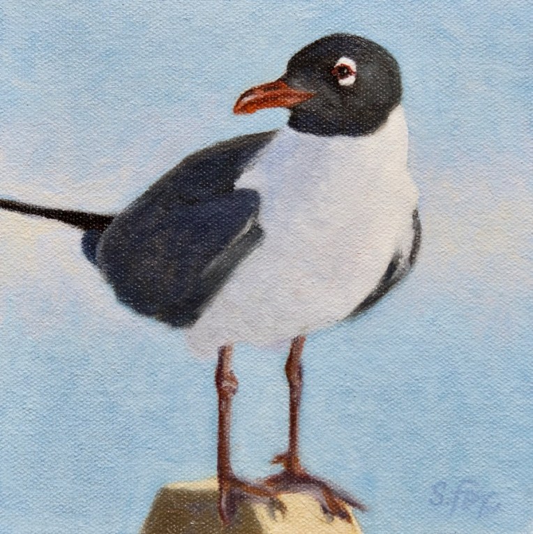
As you can see, the gull’s proportions changed some from the drawing as I made corrections as needed on the painting while I consulted my reference photo. The blue sky alone didn’t seem like quite enough, so I added a soft band of warm white behind the bird. Notice also that I didn’t paint a single feather, but just treated each area as a shape that has a specific value and color. I had to get out a fine-tipped round synthetic brush to do the eye and bill, but I generally use Grand Prix Silver Brushes. I always use the biggest brush I can that will still get the job done.